Pycs-Layout
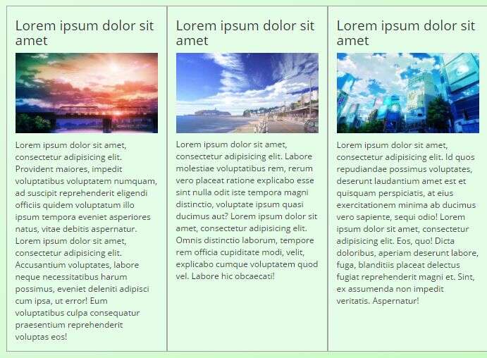
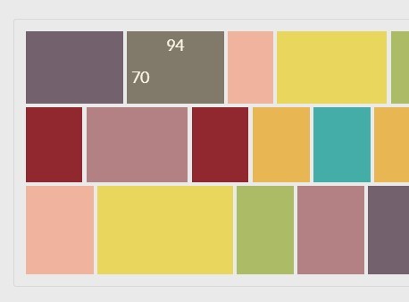
Pycs-Layout is a JQuery plugin allowing you to distribute pictures by preserving their aspect-ratios and filling the maximum amount of space.
It uses the Chromatic algorithm which is detailed on this blog post.
Demo
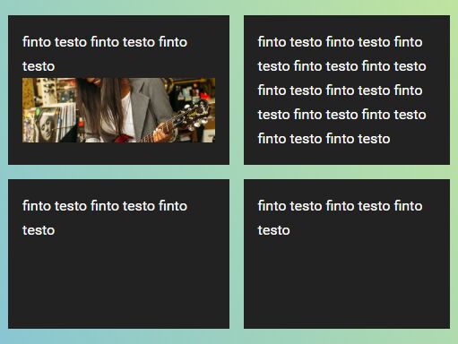
You can see a demo here: Pycs-Layout demo
Usage
<body> <div class="gallery"> <div class="picture"> <img src="mypicture.jpg" /> </div> <div class="picture"> <img src="mypicture1.jpg" /> </div> <div class="picture"> <img src="mypicture2.jpg" /> </div> </div> <script src="js/jquery.min.js"></script> <script src="js/pycs-layout.jquery.js"></script> <script> $(document).ready(function() { /* Be careful, you have to wait for the images to be loaded, otherwise pycsLayout won't have the images dimensions. Look at the demo to see how it can be done. */ $(".gallery").pycsLayout({ /* The class of the elements to layout */ pictureContainer: ".picture", /* How many pixels between each pictureContainer */ gutter: 4, /* Height of the rows */ idealHeight: 70, }); }); </script> </body>If you already know the dimensions of the pictures, you can use the data-pycs-width and data-pycs-height attributes on the div.picture element to specify it. This allows you to lazy-load the pictures.
Contributors
- Mathieu Lavigne @Bludwarf