jQuery.equalize 1.8
A small jQuery plugin to equalize the height of elements within groups, or the entire page.


jQuery.equalize is a small jQuery plugin to equalize the height of elements with the equalize class within groups, or the entire page. It is open-sourced by eustasy under the MIT License, and the minified version is less than 1 KB in size. That's small enough to inline into each page you want it on, or add it in to any existing script files. You might want to take a look at the unminified version if you want to understand what it is doing.
It looks something like this.
function equalize(g,e){'use strict';g=g||'.group';e=e||'.equalize';$(g).each(function(){var h=0;$(e,this).css('height','auto');$(e,this).each(function(){if($(this).innerHeight()>h){h=$(this).innerHeight()}});$(e,this).innerHeight(h)})} That's actually all one line, promise.
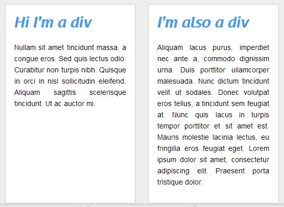
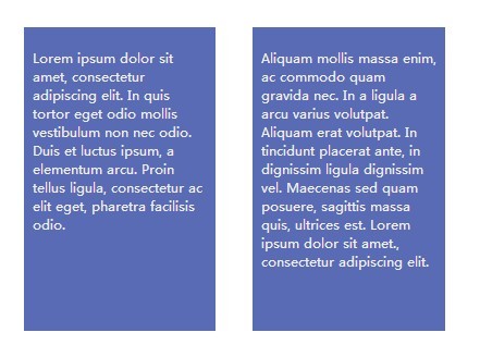
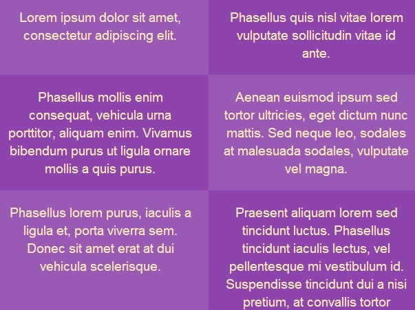
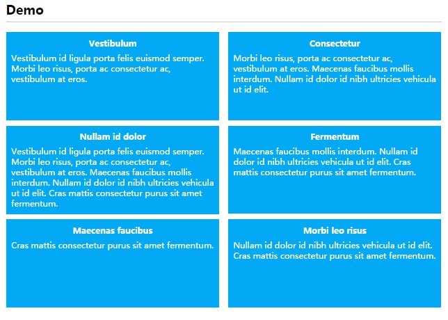
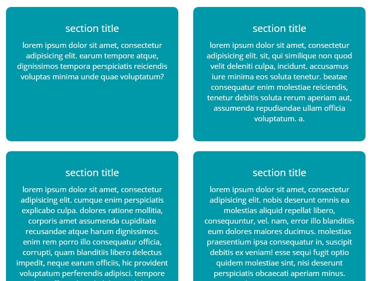
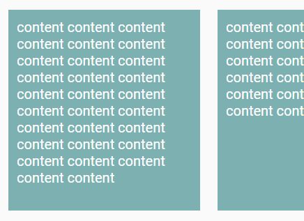
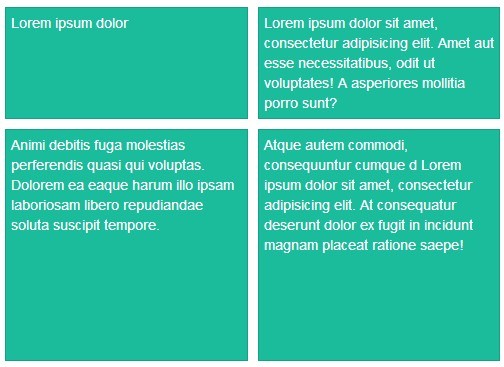
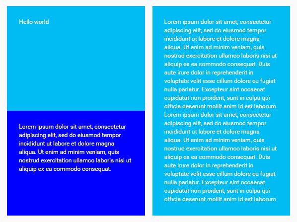
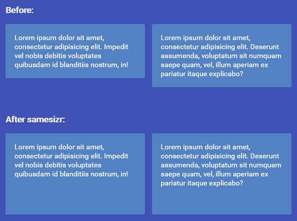
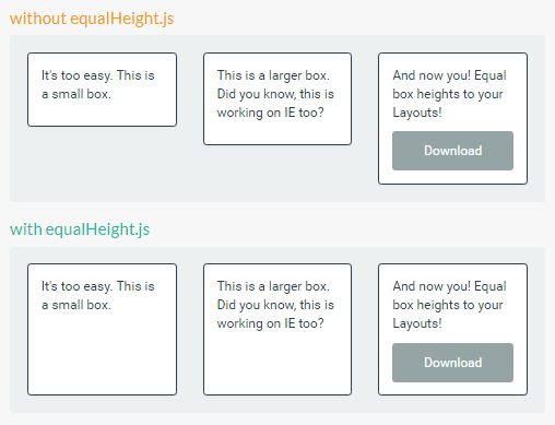
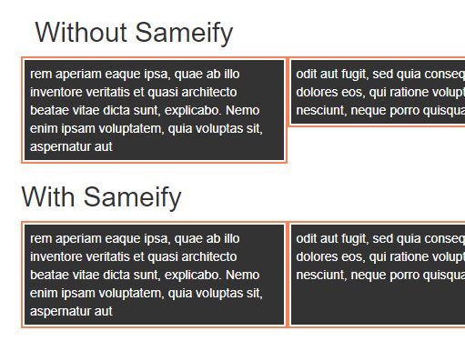
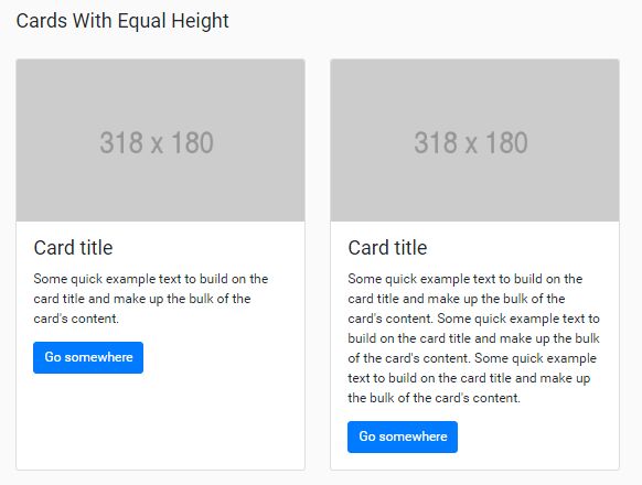
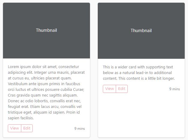
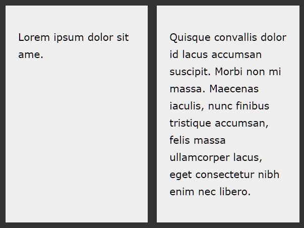
Columns that are equalized look neater and are easier to understand. Equalized columns can be achieved by adding the equalize class within a group class. Designers eerywhere will rejoice as things are pixel perfect.
The Syntax
The syntax of jQuery.equalize is ridiculously simple, it uses the group class that is already utilized in many bootstraps, templates and boilerplates, and the equalize class to detect what elements it should be targeting. Don't forget to include a nice, recent version of jQuery and your copy of jQuery.equalize, or you can load it from Git (it's not on any CDNs i know of yet).
<script src="jquery.min.js"></script> <script src="jquery.equalize.min.js></script> <script>$(function(){equalize()});window.onresize=function(){equalize()}</script> <div class="group"> <div class="equalize"></div> <div class="equalize"></div> <div class="equalize"></div> </div> Nested
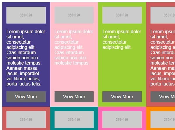
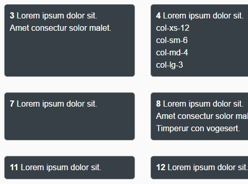
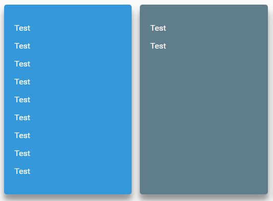
The equalized divs don't need to be directly below the group div, in fact, they don't even need to be divs. Anything that can have the height set via CSS will work fine. Note that it doesn't take padding into account, so that's up to you to handle how you will, either keeping them all the same or adding a div specifically for padding.
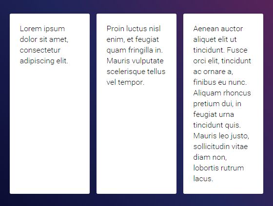
<div class="whole grid group"> <div class="whole smablet-third equalize"> Div elements… </div> <div class="whole smablet-third"> <h2 class="equalize">Headers</h2> </div> <div class="whole smablet-third"> <span class="equalize">Inline elements</span> </div> </div> What Not To Do, Sort Of
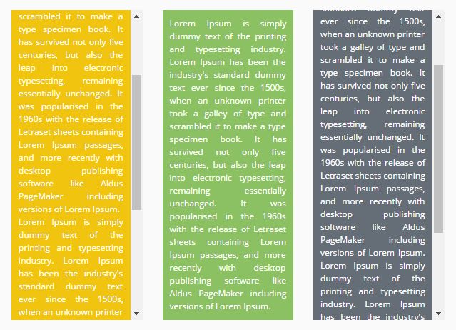
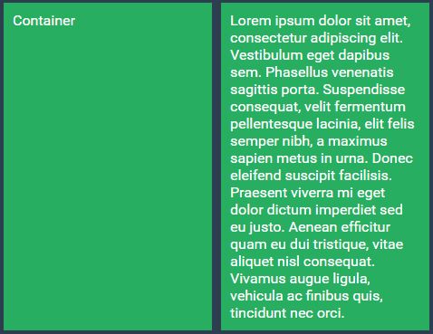
Here, there is a group within another group. This is actually okay, so long as you don't mind the equalized divs inside the second group expanding to match the first group, which they are technically a part of too.
<div class="whole grid group"> <div class="whole smablet-third"> <div class="box equalize"></div> </div> <div class="whole smablet-third"> <div class="box equalize"></div> </div> <div class="whole smablet-third"> <div class="whole grid group"> <div class="whole smablet-half"> <div class="box equalize"></div> </div> <div class="whole smablet-half"> <div class="box equalize"></div> </div> </div> </div> </div> Custom Classes
Custom group and equalize classes can be passed quickly and simply without modifying the source files and breaking your upgradability.
<script src="jquery.min.js"></script> <script src="jquery.equalize.min.js></script> <script> $(function(){ equalize('.some-strange-group','.equalize-me'); }); window.onresize=function(){ equalize('.some-strange-group','.equalize-me'); }; </script> <div class="some-strange-group"> <div class="equalize-me"></div> <div class="equalize-me"></div> <div class="equalize-me"></div> </div> Responsive CSS
This example shows a small snippet of CSS designed to force height back to automatic when the screen width is smaller than a set amount. This stops large empty spaces appearing on mobile devices. You can modify the width and any other variables to suit your needs.
@media only screen and (max-width:799px) { .equalize { height: auto !important; } }