react-player-controls
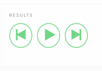
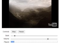
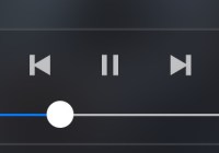
This is a minimal set of modular, tested and hopefully useful React components for composing media player interfaces. It is designed for you to compose media player controls yourself using a small and easy-to-learn API.
👴 Check the old README for version 0.5.x, which contained more pre-baked components, if you are still on that version.👵
From a library point of view, creating and providing components like <Player /> or <ProgressBar /> tends to result in abstractions with tons of props, often preventing arbitrary customisation, whilst providing little real value. These abstractions prove especially hindering when it comes to styling child elements. Therefor, instead of shipping these composite components, there is a collection of recipies that you can more or less copy-paste right into your project. Along with these plain components are a few boilerplate sets of styles in different forms that you can use if you want.
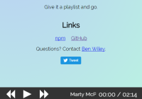
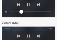
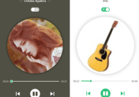
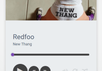
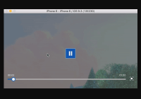
You can see the base components in action on the examples page.
Table of contents
Installation
npm i react-player-controlsUsage
// ES2015+ import import { Slider, Direction } from 'react-player-controls' // Using CommonJS const { Slider, Direction } = require('react-player-controls')API
<Button />
<Button /> is basically a simple HTML button.
<Button onClick={() => alert('clicked')}> Click me </Button>| Prop name | Default value | Description |
|---|---|---|
onClick | - | Required. A callback function that is invoked when the button is clicked. |
isEnabled | true | Whether the button is enabled. Setting this to false will set the disabled attribute on the button element to true. |
className | null | A string to set as the HTML class attribute |
style | {} | Styles to set on the button element. |
children | null | Child elements. |
Direction
An enum describing a slider's active axis.
| Key | Value |
|---|---|
HORIZONTAL | "HORIZONTAL" |
VERTICAL | "VERTICAL" |
<FormattedTime />
<FormattedTime /> translates a number of seconds into the player-friendly format of m:ss, or h:mm:ss if the total time is one hour or higher.
// This will render -1:01:02 <FormattedTime numSeconds={-3662} />| Prop name | Default value | Description |
|---|---|---|
numSeconds | 0 | A number of seconds, positive or negative |
className | null | A string to set as the HTML class attribute |
style | {} | Styles to set on the wrapping span element. |
<PlayerIcon />
<PlayerIcon /> is not really a component in itself, but a container of a number of icon components.
<PlayerIcon.Play /> <PlayerIcon.Pause /> <PlayerIcon.Previous /> <PlayerIcon.Next /> <PlayerIcon.SoundOn /> <PlayerIcon.SoundOff />Any props passed to a <PlayerIcon.* /> component will be passed onto the underlying svg element.
<Slider />
The <Slider /> helps you build things like volume controls and progress bars. Slightly counterintuitively, it does not take a value prop, but expects you to keep track of this yourself and render whatever you want inside it.
What this component actually does is that it renders an element inside itself, on top of its children, which listens to mouse events and invokes change and intent callbacks with relative, normalised values based on those events.
<Slider direction={Direction.HORIZONTAL} isEnabled onIntent={intent => console.log(`hovered at ${intent}`)} onIntentStart={intent => console.log(`entered with mouse at ${intent}`)} onIntentEnd={() => console.log('left with mouse')} onChange={newValue => console.log(`clicked at ${newValue}`)} onChangeStart={startValue => console.log(`started dragging at ${startValue}`)} onChangeEnd={endValue => console.log(`stopped dragging at ${endValue}`)} > {/* Here we render whatever we want. Nothings is rendered by default. */} </Slider>| Prop name | Default value | Description |
|---|---|---|
direction | Direction.HORIZONTAL | The slider's direction |
isEnabled | true | Whether the slider is interactable |
onIntent | () => {} | A function that is invoked with the relative, normalised value at which the user is hovering (when not dragging). |
onIntentStart | () => {} | A function this is invoked with the relative, normalised value at which the user started hovering the slider (when not dragging). |
onIntentEnd | () => {} | A function this is invoked when the mouse left the slider area (when not dragging). |
onChange | () => {} | A function that is invoked with the latest relative, normalised value that the user has set by either clicking or dragging. |
onChangeStart | () => {} | A function that is invoked with the relative, normalised value at which the user started changing the slider's value. |
onChangeEnd | () => {} | A function that is invoked with the relative, normalised value at which the user stopped changing the slider's value. When the component unmounts, this function will be invoked with a value of null. |
children | null | Child elements. |
className | null | A string to set as the HTML class attribute. |
style | {} | Styles to set on the wrapping div element. |
overlayZIndex | 10 | The z-index of the invisible overlay that captures mouse events |
Recipies
Styled buttons with icons
import { Button, PlayerIcon } from 'react-player-controls' // A base component that has base styles applied to it const PlayerButton = ({ style, children, ...props }) => ( <Button style={{ appearance: 'none', outline: 'none', border: 'none', borderRadius: 3, background: 'white', color: 'blue', '&:hover': { 'color': 'lightblue', }, ...style, }} {...props} > {children} </Button> ) // Compose buttons with matching icons. Use whatever icon library // you want. If you don't have any particular logic for each of the // buttons, you might not need this abstraction. const PlayButton = props => <Button {...props}><PlayerIcon.Play /></Button> const PauseButton = props => <Button {...props}><PlayerIcon.Pause /></Button> const PreviousButton = props => <Button {...props}><PlayerIcon.Previous /></Button> const NextButton = props => <Button {...props}><PlayerIcon.Next /></Button>Styled slider
import { Direction, Slider } from 'react-player-controls' const WHITE_SMOKE = '#eee' const GRAY = '#878c88' const GREEN = '#72d687' // A colored bar that will represent the current value const SliderBar = ({ direction, value, style }) => ( <div style={Object.assign({}, { position: 'absolute', background: GRAY, borderRadius: 4, }, direction === Direction.HORIZONTAL ? { top: 0, bottom: 0, left: 0, width: `${value * 100}%`, } : { right: 0, bottom: 0, left: 0, height: `${value * 100}%`, }, style)} /> ) // A handle to indicate the current value const SliderHandle = ({ direction, value, style }) => ( <div style={Object.assign({}, { position: 'absolute', width: 16, height: 16, background: GREEN, borderRadius: '100%', transform: 'scale(1)', transition: 'transform 0.2s', '&:hover': { transform: 'scale(1.3)', } }, direction === Direction.HORIZONTAL ? { top: 0, left: `${value * 100}%`, marginTop: -4, marginLeft: -8, } : { left: 0, bottom: `${value * 100}%`, marginBottom: -8, marginLeft: -4, }, style)} /> ) // A composite progress bar component const ProgressBar = ({ isEnabled, direction, value, ...props }) => ( <Slider isEnabled={isEnabled} direction={direction} onChange={/* store value somehow */} style={{ width: direction === Direction.HORIZONTAL ? 200 : 8, height: direction === Direction.HORIZONTAL ? 8 : 130, borderRadius: 4, background: WHITE_SMOKE, transition: direction === Direction.HORIZONTAL ? 'width 0.1s' : 'height 0.1s', cursor: isEnabled === true ? 'pointer' : 'default', }} {...props} > <SliderBar direction={direction} value={value} style={{ background: isEnabled ? GREEN : GRAY }} /> <SliderHandle direction={direction} value={value} style={{ background: isEnabled ? GREEN : GRAY }} /> </Slider> ) // Now use <ProgressBar /> somewhere <ProgressBar isEnabled direction={Direction.HORIZONTAL} value={currentTime / currentSong.duration} onChange={value => seek(value * currentSong.duration)} />Playback controls
import { Button } from 'react-player-controls' import Icon from 'some-icon-library' const PlaybackControls = ({ isPlaying, onPlaybackChange, hasPrevious, onPrevious, hasNext, onNext, }) => ( <div> <Button disabled={hasPrevious === false} onClick={onPrevious}> <Icon.Previous /> </Button> <Button onClick={() => onPlaybackChange(!isPlaying)}> {isPlaying ? <Icon.Pause /> : <Icon.Play />} </Button> <Button disabled={hasNext === false} onClick={onNext}> <Icon.Next /> </Button> </div> ) // Use PlaybackControls in a player context <PlaybackControls isPlaying={player.isPlaying} onPlaybackChange={isPlaying => player.setIsPlaying(isPlaying)} hasPrevious={songs.indexOf(currentSong) > 0} hasNext={songs.indexOf(currentSong) < songs.length - 1} onPrevious={player.setSong(songs[songs.indexOf(currentSong) - 1])} onNext={player.setSong(songs[songs.indexOf(currentSong) + 1])} />Progress bar with buffer
import { Direction, Slider } from 'react-player-controls' const Bar = ({ style, children, ...props }) => ( <div style={{ height: 6, width: '100%', ...style, }} > {children} </div> ) const ProgressBarWithBuffer = ({ amountBuffered, ...props, }) => ( <Slider direction={Direction.HORIZONTAL} {...props} > {/* Background bar */} <Bar style={{ background: 'gray', width: '100%' }} /> {/* Buffer bar */} <Bar style={{ background: 'silver', width: `${amountBuffered * 100}%` }} /> {/* Playtime bar */} <Bar style={{ background: 'blue', width: `${100 * currentTime / duration}%` }} /> </Slider> ) // Use buffer bar somewhere <ProgressBarWithBuffer amountBuffered={secondsBuffered / duration} {/* callback props etc */} />Progress bar that shows the target time on hover
import { Direction, FormattedTime, Slider } from 'react-player-controls' // Create a basic bar that represents time const TimeBar = ({ children }) => ( <div style={{ height: 6, width: '100%', background: 'gray', }} > {children} </div> ) // Create a tooltip that will show the time const TimeTooltip = ({ numSeconds, style = {} }) => ( <div style={{ display: 'inline-block', position: 'absolute', bottom: '100%', transform: 'translateX(-50%)', padding: 8, borderRadius: 3, background: 'darkblue', color: 'white', fontSize: 12, fontWeight: 'bold', lineHeight: 16, textAlign: 'center', ...style, }} > <FormattedTime numSeconds={numSeconds} /> </div> ) // Create a component to keep track of user interactions class BarWithTimeOnHover extends React.Component { static propTypes = { duration: PropTypes.number.isRequired, } constructor(props) { super(props) this.state = { // This will be a normalised value between 0 and 1, // or null when not hovered hoverValue: null, } this.handleIntent = this.handleIntent.bind(this) this.handleIntentEnd = this.handleIntentEnd.bind(this) } handleIntent(value) { this.setState({ hoverValue: value, }) } handleIntentEnd() { // Note that this might not be invoked if the user ends // a control change with the mouse outside of the slider // element, so you might want to do this inside a // onChangeEnd callback too. this.setState({ hoverValue: null, }) } render() { const { duration } = this.props const { hoverValue } = this.state return ( <Slider direction={Direction.HORIZONTAL} style={{ position: 'relative', }} onIntent={this.handleIntent} onIntentEnd={this.handleIntentEnd} > <TimeBar /> {hoverValue !== null && ( <TimeTooltip numSeconds={hoverValue * duration} style={{ left: `${hoverValue * 100}%`, }} /> )} </Slider> ) } } // Let's use it somewhere <BarWithTimeOnHover duration={video.duration} />Base CSS styles (as seen on the docs page)
/* Root slider component */ .slider { position: relative; } .slider.is-horizontal { width: 200px; height: 8px; } .slider.is-vertical { width: 8px; height: 200px; } /* Bars – can be progress. value, buffer or whatever */ .bar { position: absolute; border-radius: 50%; } .bar.is-background { background: #878c88; } .bar.is-value { background: #72d687; } .bar.is-horizontal { top: 0; bottom: 0; left: 0; /* width: set dynamically in js */; height: 100%; } .bar.is-vertical { right: 0; bottom: 0; left: 0; width: 100%; /* height: set dynamically in js */; } /* Slider handle */ .handle { position: absolute; width: 16px; height: 16px; background: 'green'; border-radius: 50%; transform: scale(1); transition: transform 0.2s; } .handle:hover { transform: scale(1.3); } .handle.is-horizontal { top: 0; /* left: set dynamically in js to x %; */ margin-top: -4px; margin-left: -8px; } .handle.is-vertical { left: 0; /* bottom: set dynamically in js to x %; */ margin-bottom: -8px; margin-left: -4px; }Contribute
Contributions are very welcome, no matter your experience! Please submit a PR and we'll take it from there.
