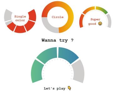

vue-css-donut-chart
Lightweight Vue component for drawing pure CSS donut charts
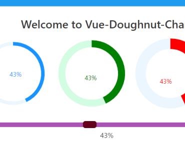
Live demo
Live demo can be found on the project page - https://dumptyd.github.io/vue-css-donut-chart
Features
- Pure CSS. Vue is only used for calculations.
- No external dependencies
- ~3KB min+gzipped JS and ~0.4KB min+gzipped CSS
Installation
1. Install via yarn or npm
yarn add vue-css-donut-chartOR
npm install vue-css-donut-chart2. Import and use vue-css-donut-chart
- ES6
import Donut from 'vue-css-donut-chart'; import 'vue-css-donut-chart/dist/vcdonut.css'; Vue.use(Donut); - In-browser (using unpkg.com's CDN)
<link href="https://unpkg.com/vue-css-donut-chart/dist/vcdonut.css"> <script src="https://unpkg.com/vue-css-donut-chart"></script> <script> Vue.use(vcdonut.default); </script>Usage
Basic usage
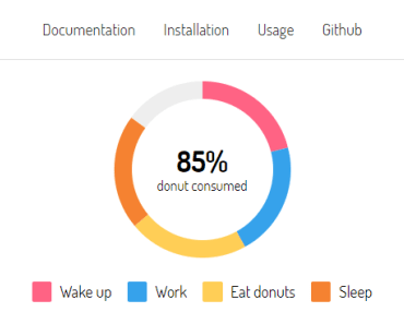
With sane defaults in place, basic usage is as simple as passing a sections array of objects with a value prop to vc-donut component.
<template> <vc-donut :sections="sections">50%</vc-donut> </template> <script> export default { data() { return { sections: [{ value: 25 }, { value: 25 }, { value: 25 }, { value: 25 }] }; } }; </script>Usage with all the available props
<template> <vc-donut background="white" foreground="grey" :size="200" unit="px" :thickness="30" has-legend legend-placement="top" :sections="sections" :total="100" :start-angle="0" @section-click="handleSectionClick" > <h1>100%</h1> </vc-donut> </template> <script> export default { data() { return { sections: [ { label: 'Red section', value: 25, color: 'red' }, { label: 'Green section', value: 25, color: 'green' }, { label: 'Blue section', value: 25, color: 'blue' } ] }; }, methods: { handleSectionClick(section) { console.log(`${section.label} clicked.`); } } }; </script>Props
size
- type:
Number - default:
250 - Diameter of the donut. Can be any positive value.
unit
- type:
String - default:
px - Unit to use for
size. Can be any valid CSS unit. Use%to make the donut responsive.
thickness
- type:
Number - default:
20 - Percentage thickness of the donut ring. Can be any positive value between 0-100.
text
- type:
String - Donut text. This can also be provided through the default slot.
background
- type:
String - default:
#ffffff - Background color of the donut. In most cases, this should be the background color of the parent element.
foreground
- type:
String - default:
#eeeeee - Foreground color of the donut. This is the color that is shown for empty regions of the donut ring.
start-angle
- type:
Number - default:
0 - Angle measure in degrees where the first section starts.
total
- type:
Number - default:
100 - Total for calculating the percentage for each section.
has-legend
- type:
Boolean - default:
false - Specifies whether the donut should have a legend.
legend-placement
- type:
String - default:
bottom - Specifies where the legend should be placed. Valid values are
top,right,bottomandleft.
sections
- type:
Array - default:
[] - An array of objects. Each object in the array represents one section. Every object must have a
valueproperty. Sum of all the sections'valueshould not exceedtotal, an error is thrown otherwise. -
Object properties
value- Size of the section. Should be <=total.color- Color of the section. vc-donut comes with 24 predefined colors, so this property is optional if you have <= 24 sections without thecolorproperty.label- Name of this section. This is used in the legend as well as tooltip text.
Events
section-click
- parameter(s):
section- section object - Emitted when a section is clicked.
sectionobject of the clicked section is passed as a parameter. Make sure to add a custom property (eg:name) to the section objects to uniquely identify them.
Slots
default slot
If you want more control over text content of the chart, default slot can be used instead of the text prop.
legend
Slot for plugging in your own legend.
Contributing
- vue-css-donut-chart issues - https://github.com/dumptyd/vue-css-donut-chart/issues
License
Code released under MIT license.