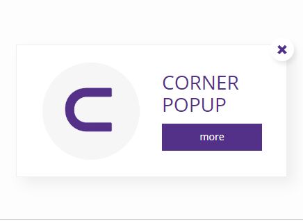
Corner Popup v1.14
Fully customizable pop-up box created to display all types of messages in corner of your browser.
Website: https://espritdesign.pl/corner-popup
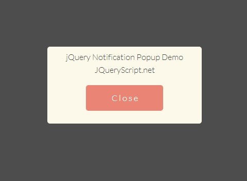
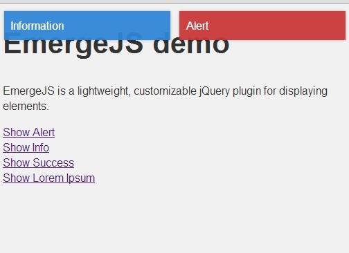
Demo: https://espritdesign.pl/corner-popup/demo
More about Corner Popup
What is Corner Popup? It's a simple pop-up component that can be used on almost all modern websites. It simply displays small pop-up box in corner of browser. Corner Popup is fully configurable and you can change many parameters - position, window color, content inside etc. Corner Popup is easy to use and you don't need any programming skills. As a component Corner Popup needs only jQuery to work. It is fully responsive without using any framework.
How to use
Using Corner Popup is very simple. As the first step, add jQuery and Corner Popup files for the project (remember to add appropriate files to folders):
<link rel="stylesheet" href="css/corner-popup.min.css"> <script src="https://code.jquery.com/jquery-3.3.1.min.js"></script> <script src="js/corner-popup.min.js"></script> In step 2 call script from your website code:
<script> $('body').cornerpopup({ }); </script> In step 3 you can (but it's not necessary) set some options in previously added code:
<script> $('body').cornerpopup({ variant: 1, slide: 1 }); </script> All available options with description:
| Option | Default | Description |
|---|---|---|
| active | 1 | Makes popup enabled or disabled. If it is set to 1 popup will show. If set to 0 it's disabled. |
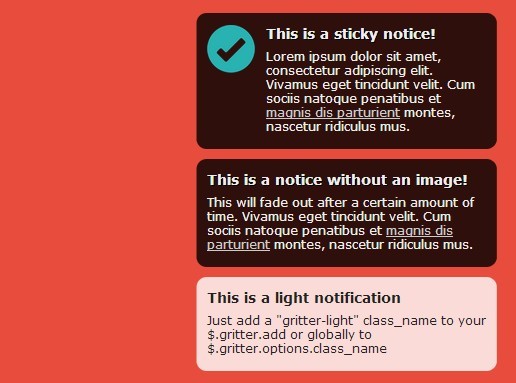
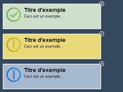
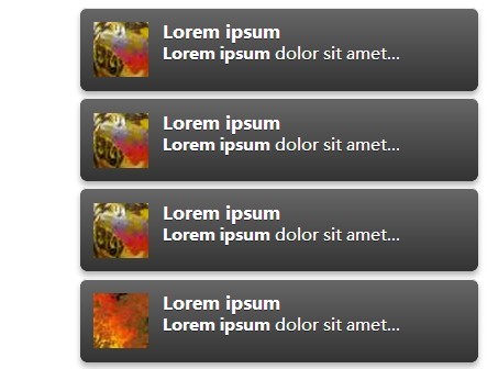
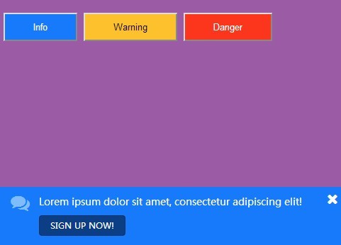
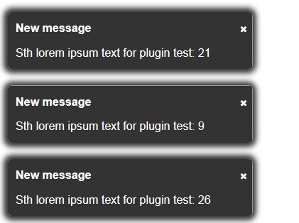
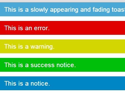
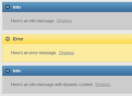
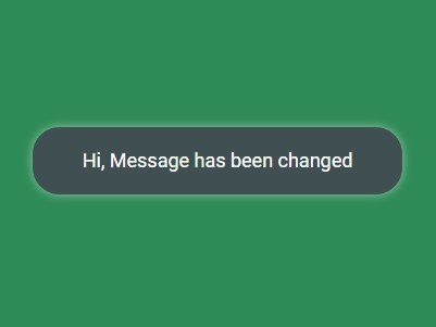
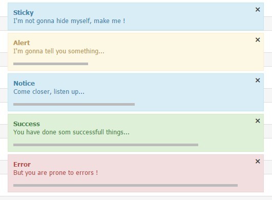
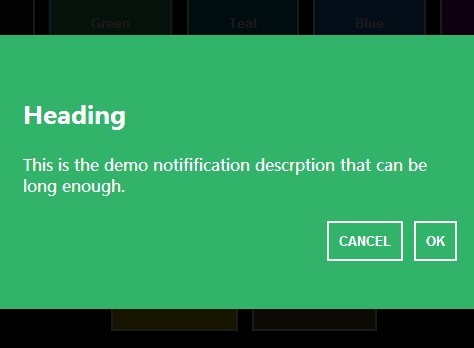
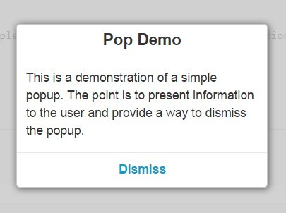
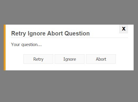
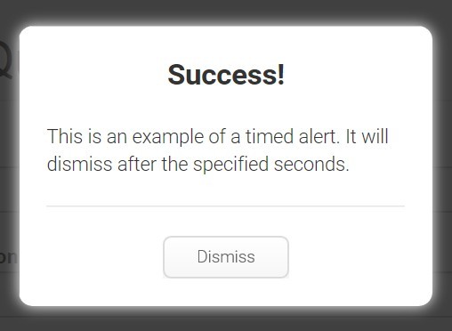
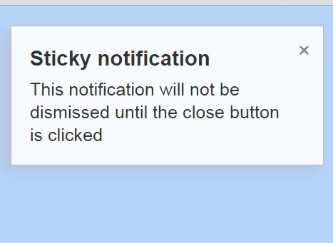
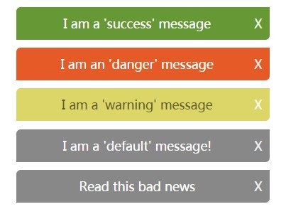
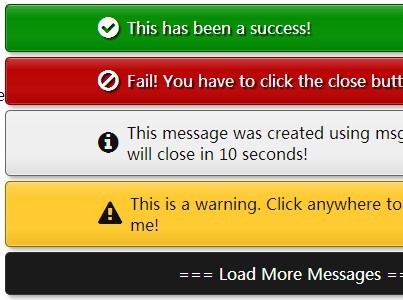
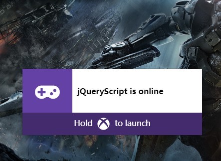
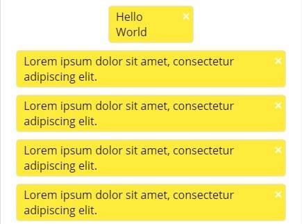
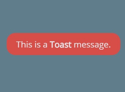
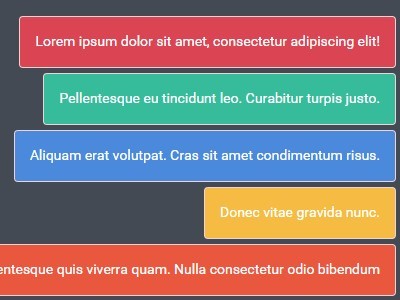
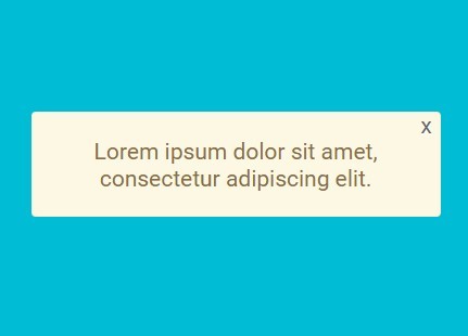
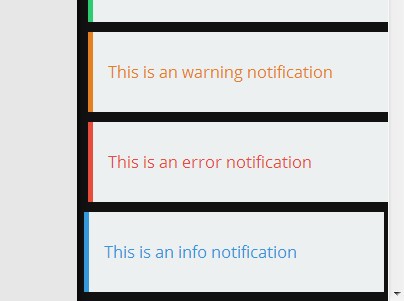
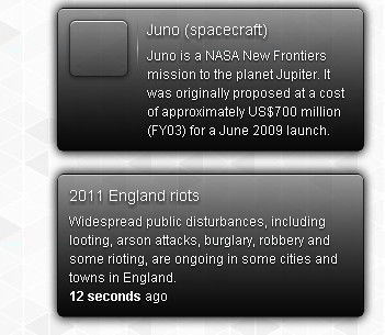
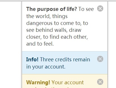
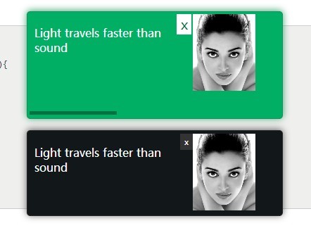
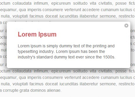
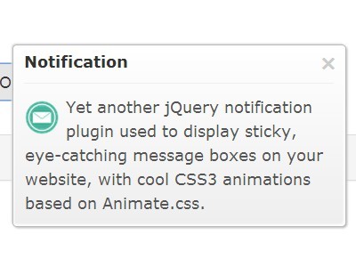
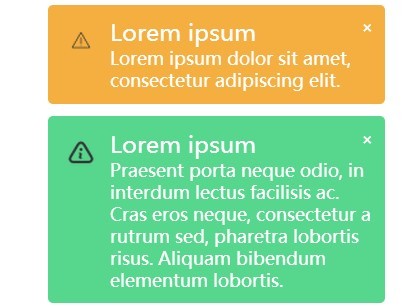
| variant | 1 | Using this option you can set a variant of the popup window. There are 10 variants which could be used for different purposes - for example variant 2 is an option used for cookies information - it even creates and saves cookie for you. |
| slide | 0 | If this option is set to 1 standard method of showing a popup (fade) will change to slide. |
| slidetop | 0 | This option could be used only if "slide" is set to 1. It makes slide always work from bottom to top. |
| timeout | 0 | This option sets the timeout to popup, so it will appear and disappear after the amount of time you set as parameter. If you set for example 500 it will disappear after 500ms. |
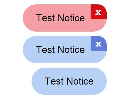
| closebtn | 1 | Sets close button visibility - if it is set to 0 close button will not show in any variant of the popup. |
| shadow | 1 | Sets popup shadow visibility - if it is set to 0 shadow won't be visible in any variant of the popup. |
| link1 | You can change the link that is used in variant 1 of popup. Just type a new address as parameter. | |
| link2 | # | You can change the link that is used in most of popup variants. Just type a new address as parameter. |
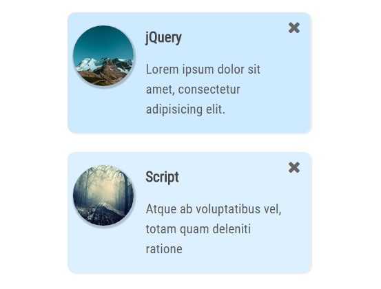
| popupimg | You can change the image used in popup variant 1. Type your own link to image here. | |
| cookieimg | You can change the image used in popup variant 2 (cookies). Type your own link to image here. | |
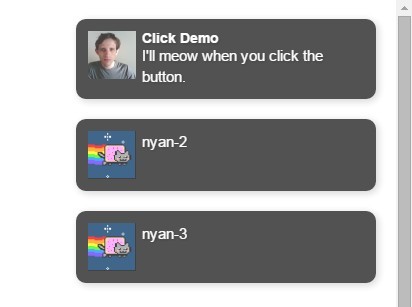
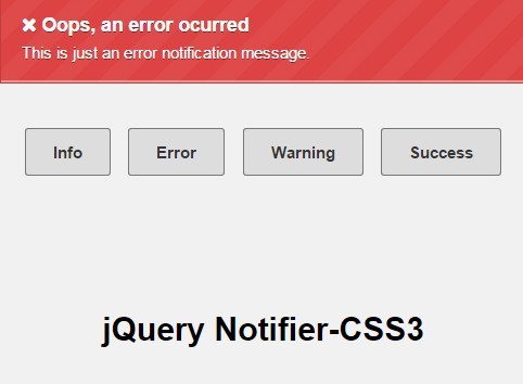
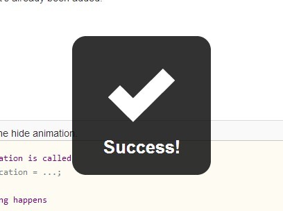
| messageimg | You can change the image used in popup variant 3 (message). Type your own link to image here. | |
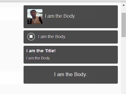
| header | In this option you can change header used in some of popup variants. You can use html tags here. | |
| text1 | In this 2 options you can change text used in popup variants - text1 is for cookie message. You can use html tags here. | |
| button1, button2, button3 | In this 3 options you can change label used in the buttons. "button2" is used in cookies popup. | |
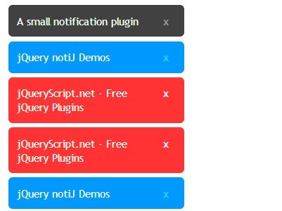
| content | You can place in this option text (including html tags) which is displayed in variant nr.10 of popup - this variant is made to show your own content. | |
| loadcontent | No | This option loads data from another file (e.g. html file with prepared content). Just write the file address as parameter. |
| width | 390px | This option is used to change the popup width. Use here css units. |
| font | This option is used to change the font used in popup elements. Use here css code - e.g. "'Open Sans', 'Halvetica', sans-serif". | |
| colors | #543189 | This option changes color of primary elements - close button icon, headers, buttons. |
| bgcolor | #fff | This option changes background color of popup. |
| bordercolor | #efefef | This option changes border color of popup. |
| textcolor | #181818 | This option changes text color in popup. |
| iconcolor | #543189 | This option changes close button color. |
| btncolor | #543189 | This option changes color of buttons in popup. |
| btntextcolor | #fff | This option changes color of text in buttons. |
| corners | 0px | This option is used to change popup corner radius. |
| position | right | This option is used to change position of the popup. You can change position to left, center or right. |
| escClose | 0 | Closes pop-up window after Escape key is pressed. This option works if it is set to 1. |
License
Corner Popup is licensed under the Creative Commons Attribution 4.0 International License: https://creativecommons.org/licenses/by/4.0
Author
Łukasz Brzostek
Have a question about usage? Found a bug?
Feel free to write a message to me: [email protected]


