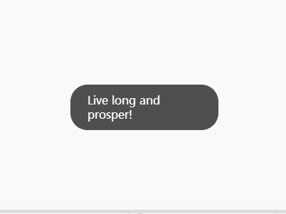
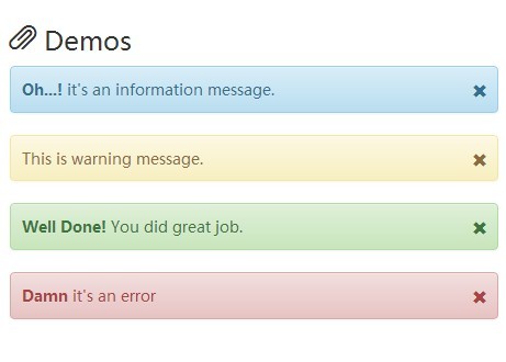
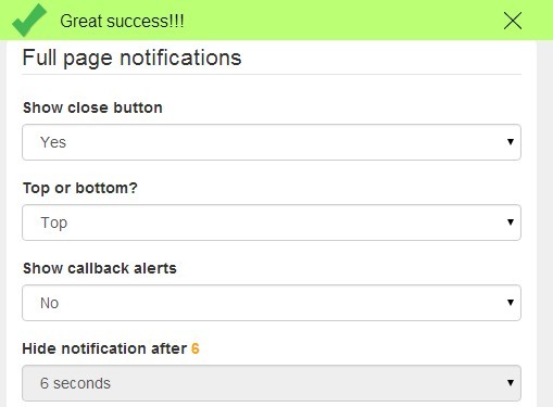
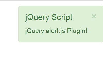
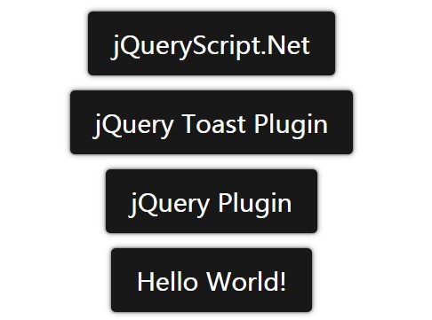
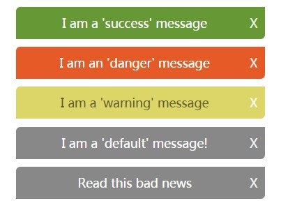
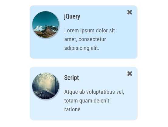
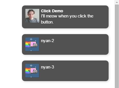
Notify
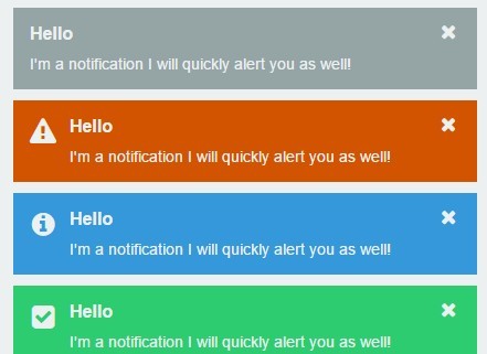
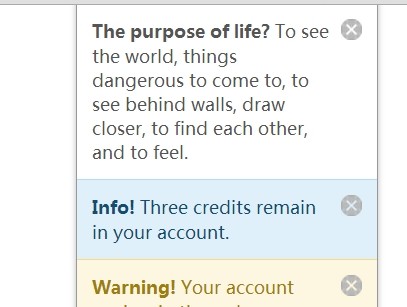
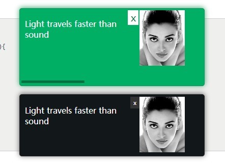
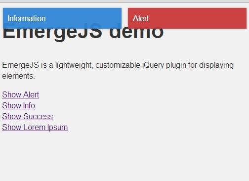
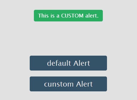
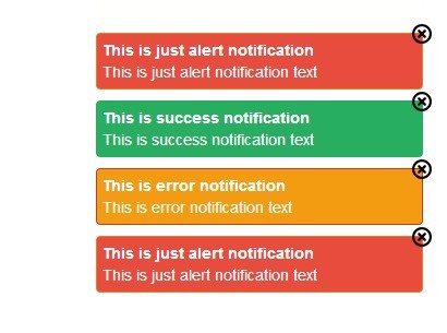
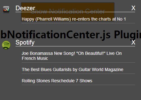
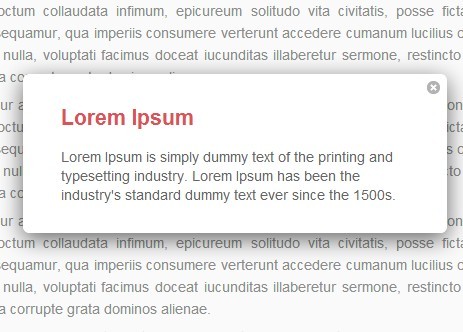
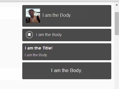
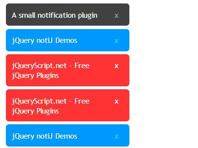
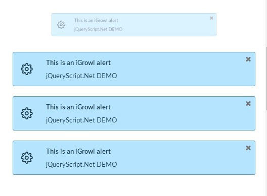
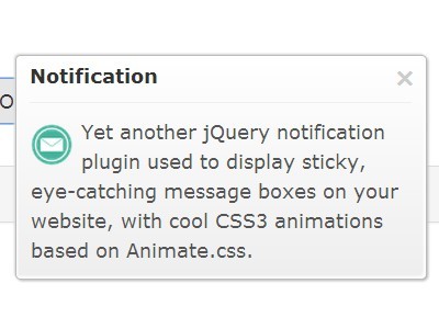
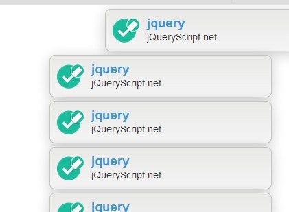
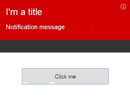
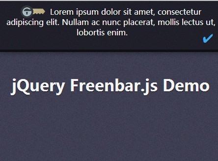
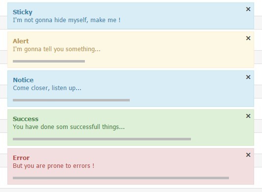
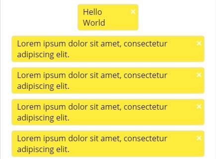
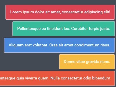
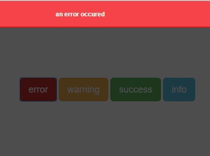
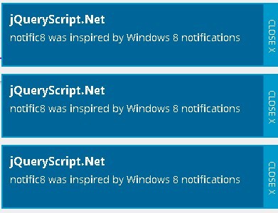
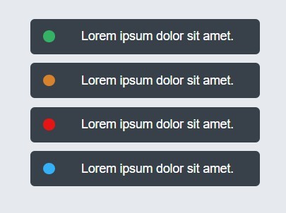
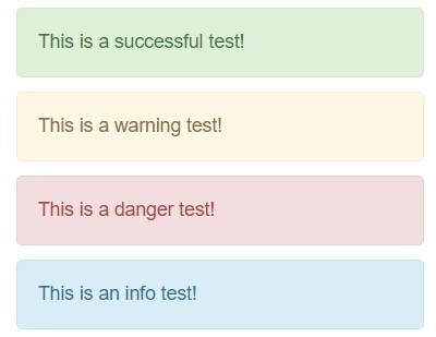
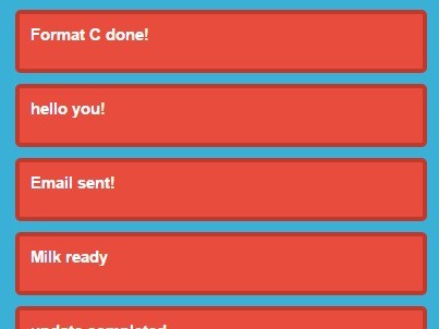
Notify is an easily integratable and flexible jquery plugin which allows you to show notifications of various types to your users
Installation
<!DOCTYPE html> <html> <head> <link href="css/notify-flat.css" rel="stylesheet"> </head> <body> <div id="notes"></div> <script src="js/notify.min.js"></script> <script> var notes = $('#notes').notify(); </script> </body> </html> General Options
| Option | Info | Default | Options |
|---|---|---|---|
| type | Allows you to deferentiate between the various notification types so you may style them differently | 'notes' | 'notes', 'messages' or string |
| speed | The speed at which an effect happens | 500 | integer |
| delay | Timer which determines when the notification should close | 3000 | integer |
| easing | Easing is used in-conjunction with the closing effect to give you more control on how a notification should close | 'easeInBounce' | Available effects |
| effect | Type of effect used when closing the notification | 'fade' | 'fade', 'slide', 'toggle' |
| removeIcon | Button icon shown to the right of the notification used to close it | false |
Show Options
| Option | Info | Default | Options |
|---|---|---|---|
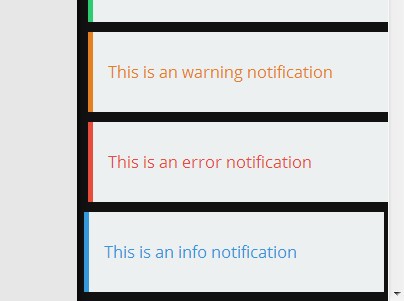
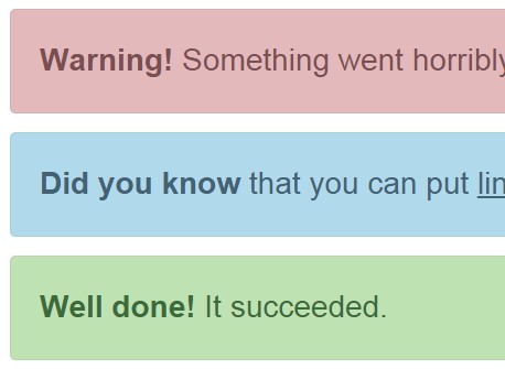
| type | Lets you set the message colours by setting the type (pro tip: you can custom create types as you see fit and simply add the styles for it in the css) | false | 'success', 'info', 'warning', 'danger' or string |
| title | Notification title | false | string |
| message | Notification text | false | string |
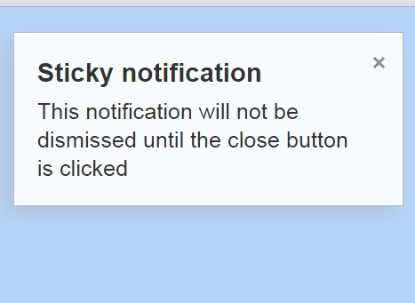
| sticky | If set to true, the notification doesn't close automatically and can only be closed by the user | false | boolean |
| speed | The speed at which an effect happens | (inherited from General Options) | integer |
| delay | Timer which determines when the notification should close | (inherited from General Options) | integer |
| easing | Easing is used in-conjunction with the closing effect to give you more control on how a notification should close | (inherited from General Options) | Available effects |
| effect | Type of effect used when closing the notification | (inherited from General Options) | 'fade', 'slide', 'toggle' |
| icon | Icon is shown to the left of the notification title | false | string |
| removeIcon | Icon shown inside a button, used to remove a notification | (inherited from General Options) | string |
Styling Notifications
<!-- type - notes, messages or a custom type --> <div class="notify notify-[type]"> <!-- id - integer value --> <div class="note note-[id]"> <!-- image - icon to be shown left of the title --> <span class="image">[icon]</span> <button type="button" class="remove">[removeIcon]</button> <div class="content"> <strong class="title">[title]</strong> [message] </div> </div> <!-- type - note type such as success, warning, info, etc. --> <div class="note note-[type] note-[id]"> <span class="image">[icon]</span> <button type="button" class="remove">[removeIcon]</button> <div class="content"> <strong class="title">[title]</strong> [message] </div> </div> </div> How to Use
Example #1
<div id="notes"></div> $(function() { var notes = $('#notes').notify({ speed: 250, delay: 5000, easing: 'swing', effect: 'slide', removeIcon: '<i class="icon icon-remove"></i>' }); notes.show('This is my very first message!', { title: 'Hello World' }); notes.show('This is my very second message!', { type: 'info', title: 'Hey', sticky: true, }); }); Example #2
<div id="notes"></div> <div id="messages"></div> $(function() { var notes = $('#notes').notify({ removeIcon: '<i class="icon icon-remove"></i>' }); var messages = #('#messages').notify({ type: 'messages', // resulting class: notify notify-messages removeIcon: '<i class="icon icon-remove"></i>' }); notes.show('My first notification message', { title: 'Hello World', sticky: true, }); messages.show("I'm a message", { type: 'success', title: 'HI', }); }); Example #3
<div id="custom"></div> $(function() { var custom = $('#custom').notify({ type: 'custom' // resulting class: notify notify-custom delay: 5000, easing: 'swing' }); custom.show('This is my custom notification', { title: 'Wow', sticky: true }); }); 