jQuery mobile select
What's it all about?
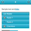
It's simple as abc. If you have some kind of navigation that you want to replace with a dropdown for mobile devices (read: screenwidth less than 480 pixels) then you've found what you're looking for.
How to use?
Download the jquery.mobileselect.js. Removing comments and minifying it will get you bonus points!
To use it:
$(document).ready(function(){ // your navigation ul selector $('#nav-main ul').mobileSelect(); })You can optionally change these default parameters:
$(document).ready(function(){ // your navigation ul selector $('#nav-main ul').mobileSelect({ autoHide: true, // Hide the ul automatically defaultOption: "Go to...", // The default select option deviceWidth: 480, // The select will be added for screensizes smaller than this appendTo: '#mycustomloc', // Used to place the drop-down in some location other than where the primary nav exists className: 'mobileselect', // The class name applied to the select element useWindowWidth: false // Use the width of the window instead of the width of the screen }); })And that's it that's all.
However...
There are still some things that need to be taken care of:
- create a before / after hook so we can fix some things euhm... before and after I suppose