Editable Listview (jQuery Mobile Plugin)
A customized version of the jQuery Mobile Listview Widget that supports insertion of new list items and removal of existing list items out of the box.

Why
Many a times, you come across a situation where you want to allow editing of list items. To do this simple task, you have to build extra functionality around the Listview widget to allow for insertion of new list items and removal of existing list items. Editable Listview plugin is designed to take the pain out of this situaiton by having all this functionality baked-in.
Features
- Allows insertion of new list items right in the Listview.
- Allows easy removal of existing list items.
Installation
-
Pick any one of the following way.
-
Download and unzip the package into your project folder (Scroll up and you will see the "Download ZIP" button on the right side).
-
Install using bower.
bower install jqm-editable-istview -
Use the CDN hosted version.
js:
//cdn.jsdelivr.net/jquery.editable-listview/x.y.z/jqm.editable.listview.min.js
css://cdn.jsdelivr.net/jquery.editable-listview/x.y.z/jqm.editable.listview.min.csswhere
x.y.zis the version number.
-
-
Include the javascript file after the jQuery Mobile javascript file. Similarly include the stylesheet after the jQuery Mobile stylesheet
How to Use it?
The listview comes in two flavors: simple and complex. Their usage is described below.
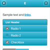
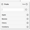
Simple Type
Use the following HTML/DOM structure
<ul data-role="listview" data-editable="true"> <li>Apple</li> <li>Banana</li> <li>Cranberry</li> <li>Cherry</li> </ul>See below for a full list of available "data-" attributes
Complex Type
For complex type, link a form to the listview through data-editable-form attribute by putting in the id of the form as the value. That form will be shown embedded in the collapsible listview in Edit Mode. The user is at liberty to make the form look however they feel like, but they are supposed to add some specific data attributes to form elements. See the working example below.
<ul data-role="listview" data-editable="true" data-editable-type="complex" data-editable-form="editing-form" data-title="Fruits" data-empty-title="No Fruits"> <li> <a> <h3><span id="fruitName">Apple</span></h3> <p><em>Shape:</em> <strong><span id="fruitShape">round</span></strong></p> <p><em>Color:</em> <strong><span id="fruitColor">red</span></strong></p> </a> </li> <li> <a> <h3><span id="fruitName">Pineapple</span></h3> <p><em>Shape:</em> <strong><span id="fruitShape">oval</span></strong></p> <p><em>Color:</em> <strong><span id="fruitColor">yellow</span></strong></p> </a> </li> <li> <a> <h3><span id="fruitName">Orange</span></h3> <p><em>Shape:</em> <strong><span id="fruitShape">round</span></strong></p> <p><em>Color:</em> <strong><span id="fruitColor">orange</span></strong></p> </a> </li> </ul> <form id="editing-form" data-editable-form="true"> <input type="text" data-item-name="fruitName" data-item-template="<h3><span id='fruitName'>%%</span></h3>"> <input type="text" data-item-name="fruitShape" data-item-template="<p><em>Shape:</em> <strong><span id='fruitShape'>%%</span></strong></p>"> <input type="text" data-item-name="fruitColor" data-item-template="<p><em>Color:</em> <strong><span id='fruitColor'>%%</span></strong></p>"> <button class="ui-btn ui-corner-all" data-add-button="true">Add</button> <button class="ui-btn ui-corner-all" data-clear-button="true">Clear</button> </form> data-item-name is the name of the variable to hold the value of the input field.
data-item-template holds the HTML template that will be used to render the new value. Use %% as placeholder for the variable. data-add-button indicates the button that can be clicked/tapped/pressed to insert the new list item having values specified in the input fields. data-clear-button clears all the text from the input fields.
Roadmap
This is a preliminary list of planned fatures.
- In-place editing of existing list items.
- Re-ordering of list items tap and hold on the list item and drag it back and forth.
- Deleting item by swiping left or right.
List of data- Attributes
See the List of data attributes wiki page.
License
Copyright © 2014 – 2015 Wasif Hasan Baig
Source code is released under the Terms and Conditions of MIT License.
Please refer to the License file in the source code project directory.