Stepper.js
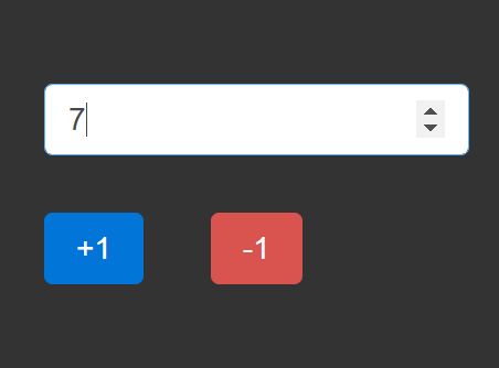
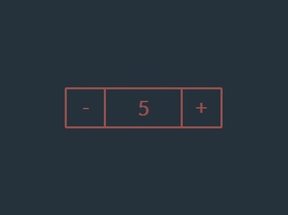
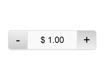
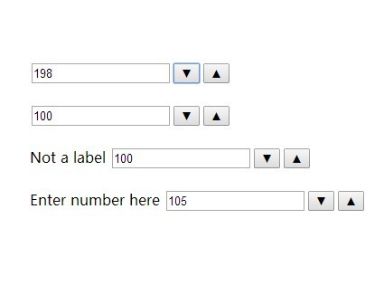
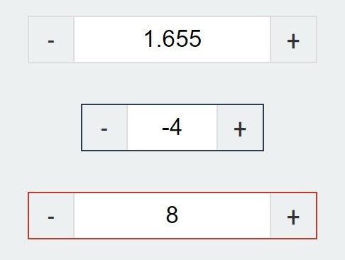
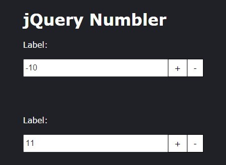
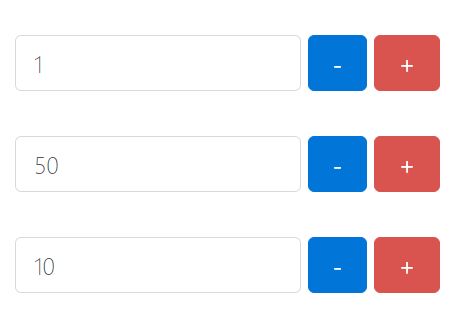
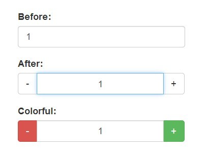
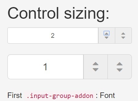
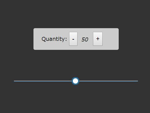
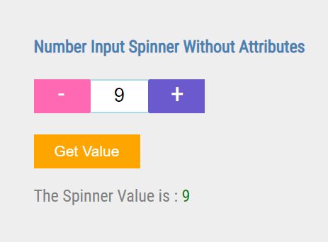
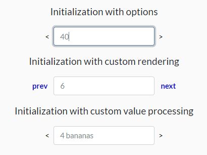
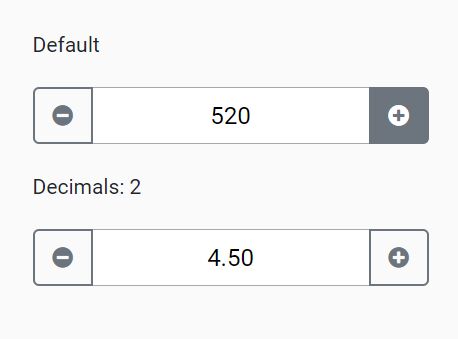
Themeable stepper control buttons that sits on top of a native input[type="number"] element to preserve all browser specific UX enhancements that the input[type=number] provides.
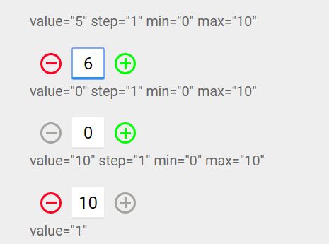
Setting options is as simple as using the native step, min, max attributes.
Demo
Usage
<!DOCTYPE html> <body> <div class="js-spinner"> <input type="number" step="1" max="10" min="0" data-stepper-debounce="400" class="js-stepper"> <button type="button" spinner-button="up" title="add 1">+</button> <button type="button" spinner-button="down" title="subtract 1">-</button> </div> <script src="jquery.js"></script> <script src="stepper.js"></script> </body>Options
All options can be added inline as attributes on the element. See the example above.
step: "1", // Amount to increment on each step. Also accepts decimals. min: "1000", // Min amount max: "10", // Max amount debounce: 400, // Time in milliseconds to debounce the change eventInstall
- yarn:
yarn add stepper.js - npm:
npm install --save stepper.js
