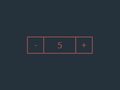
bootstrap-input-spinner
A Bootstrap 4 / jQuery plugin to create input spinner elements for number input.
Features
The Bootstrap 4 InputSpinner is
- mobile friendly and responsive,
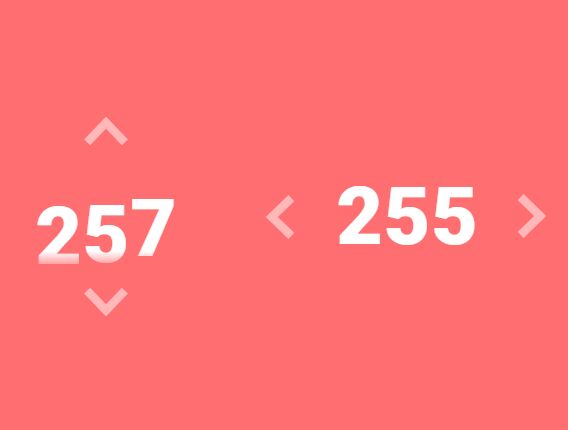
- automatically changes value when holding button, boosts value change when holding button longer,
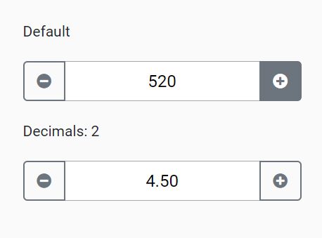
- has internationalized number formatting,
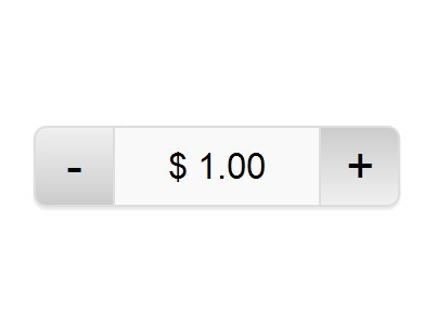
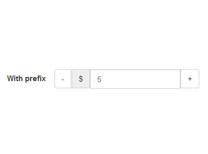
- allows setting a prefix or a suffix text in the input,
- handles
val()like the native element, - dynamically handles changing attribute values like
disabledorclass, - dispatches
changeandinputevents on value change like the native element and - works without extra css, only the bootstrap 4 standard css is needed.
Installation
npm install -save bootstrap-input-spinnerOr just download the GitHub repository and include src/bootstrap-input-spinner.js.
Usage
HTML
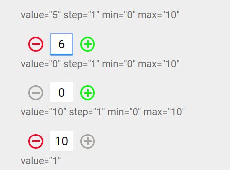
Create the element in HTML. The attributes are compatible to the native input[type="number"] element.
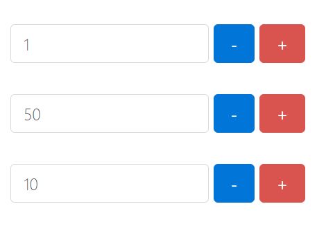
<input type="number" value="50" min="0" max="100" step="10"/>Script
It is a jQuery plugin. So, enable the InputSpinner for all inputs with type='number' with the following script.
<script src="./src/bootstrap-input-spinner.js"></script> <script> $("input[type='number']").inputSpinner(); </script>Thats it. No extra css needed, just Bootstrap 4 and jQuery.
Syntax and configuration
HTML
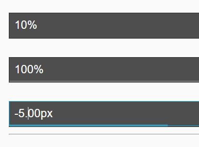
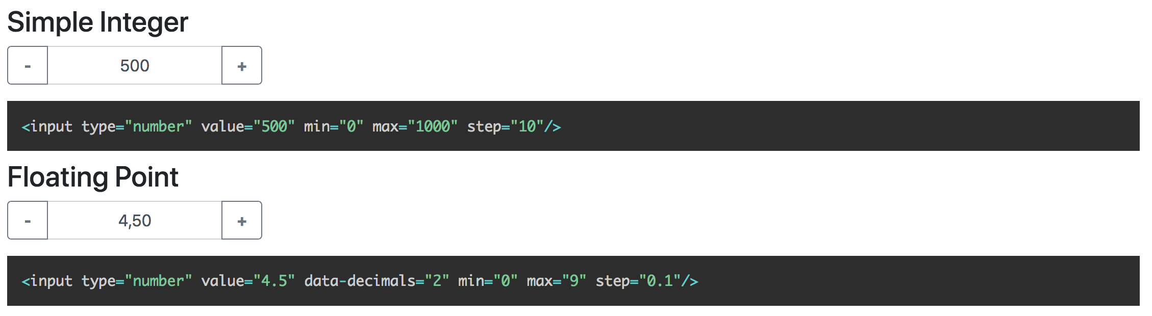
<input type="number" value="4.5" min="0" max="9" step="0.1" data-decimals="2" data-suffix="°C"/>These are the possible attributes
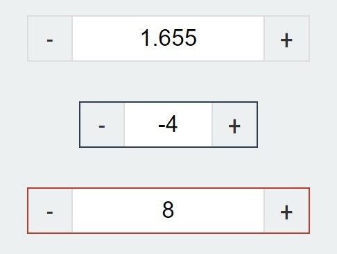
value// starting value on element creationmin// minimum value when steppingmax// maximum value when steppingstep// step sizedata-step-max// max boost when steppingdata-decimals// shown decimal placesdata-prefix// show a prefix text in the input elementdata-suffix// show a suffix text in the input element
The InputSpinner also handles the standard input attributes required and placeholder.
JavaScript
Use JavaScript to create the instance as a jQuery plugin. You may provide additional configuration in an object as a config parameter.
$(element).inputSpinner(config);Configuration
The default configuration is
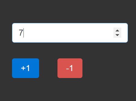
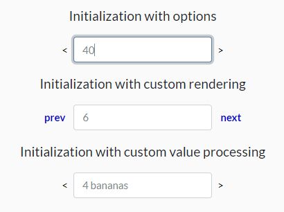
var config = { decrementButton: "<strong>-</strong>", // button text incrementButton: "<strong>+</strong>", // .. groupClass: "", // css class of the resulting input-group buttonsClass: "btn-outline-secondary", buttonsWidth: "2.5rem", textAlign: "center", autoDelay: 500, // ms holding before auto value change autoInterval: 100, // speed of auto value change boostThreshold: 10, // boost after these steps boostMultiplier: "auto", // you can also set a constant number as multiplier locale: null // the locale for number rendering; if null, the browsers language is used }decrementButton, incrementButton
HTML of the texts inside the buttons.
groupClass
Additional css class for the input-group, results in
<div class="input-group ' + config.groupClass + '">buttonsClass
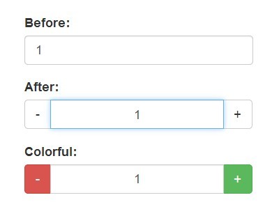
The css class of the buttons. Use it to style the increment and decrement buttons as described here. Maybe buttonsClass: btn-primary or btn-success or whatever type of buttons you want.
buttonsWidth
The width of the increment and decrement buttons.
textAlign
The text alignment inside the <input>
autoDelay
The delay in ms after which the input automatically changes the value, when holding the increment or decrement button.
autoInterval
Speed of the value change when holding the button in ms. Lower value makes it faster.
boostThreshold
After these auto value changes the speed will increase with boostMultiplier.
boostMultiplier
The speed multiplier after boostThreshold steps of auto value change. If set to "auto" (default value) the multiplier will increase over time.
locale
Set a locale for the number formatting. Use values like "en-US" or "de-DE". If not set, the locate will be set automatically from the browser language.
Programmatic change and read of value
The change or read the value just use the jQuery val() function on the input, like this
var currentValue = $(element).val() // read $(element).val(newValue) // writeHint: Reading the value in vanilla JS with
element.valuewill also work, but to set the value you have to useelement.setValue(newValue)or$(element).val(newValue)
Handling attributes
The attributes min, max, step, stepMax, decimals, placeholder, required, disabled and class are handled dynamically. The class attribute value is dynamically copied to the input element.
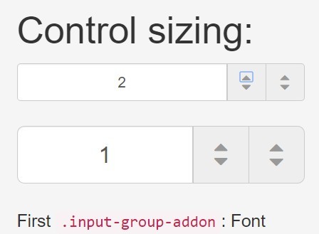
Sizing
If the original elements class is set to form-control-sm of form-control-lg the class of the resulting input-group is dynamically set to input-group-sm or input-group-lg.
Events
The InputSpinner handles input and change events like the native element.
Event handling with vanilla JavaScript
element.addEventListener("change", function(event) { newValue = this.value })Event handling with jQuery syntax
$(element).on("change", function (event) { newValue = $(this).val() })Minified version
I don't provide a minified version because I think it should be up to the using programmer to create minified versions, with all the used script sources concatenated to one file.
But, if you want it, it is easy to create your minified version with uglify: https://www.npmjs.com/package/uglify-js
Just install uglify
npm install uglify-js -gand then in the src-folder
uglifyjs bootstrap-input-spinner.js --compress --mangle > bootstrap-input-spinner.min.jsViolà! :)
Browser support
The spinner works in all modern browsers and in the Internet Explorer. Not tested with IE < 11.