jsGrid Lightweight Grid jQuery Plugin
Project site js-grid.com
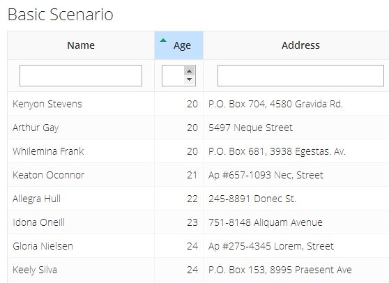
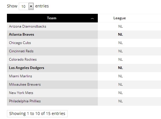
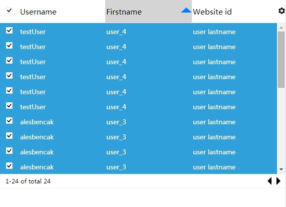
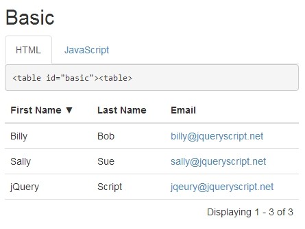
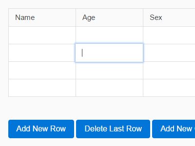
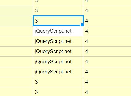
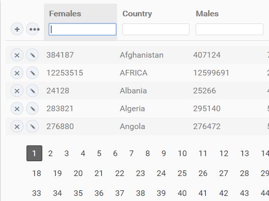
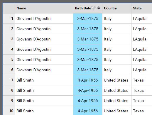
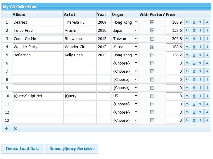
jsGrid is a lightweight client-side data grid control based on jQuery. It supports basic grid operations like inserting, filtering, editing, deleting, paging, sorting, and validating. jsGrid is tunable and allows to customize appearance and components.
Table of contents
- Demos
- Installation
- Basic Usage
- Configuration
- Grid Fields
- Methods
- Callbacks
- Grid Controller
- Validation
- Localization
- Sorting Strategies
- Load Strategies
- Load Indication
- Requirement
- Compatibility
Demos
See Demos on project site.
Sample projects showing how to use jsGrid with the most popular backend technologies
- PHP - https://github.com/tabalinas/jsgrid-php
- ASP.NET WebAPI - https://github.com/tabalinas/jsgrid-webapi
- Express (NodeJS) - https://github.com/tabalinas/jsgrid-express
- Ruby on Rail - https://github.com/tabalinas/jsgrid-rails
- Django (Python) - https://github.com/tabalinas/jsgrid-django
Installation
Install jsgrid with bower:
$ bower install js-grid --save Find jsGrid cdn links here.
Basic Usage
Ensure that jQuery library of version 1.8.3 or later is included.
Include jsgrid.min.js, jsgrid-theme.min.css, and jsgrid.min.css files into the web page.
Create grid applying jQuery plugin jsGrid with grid config as follows:
$("#jsGrid").jsGrid({ width: "100%", height: "400px", filtering: true, editing: true, sorting: true, paging: true, data: db.clients, fields: [ { name: "Name", type: "text", width: 150 }, { name: "Age", type: "number", width: 50 }, { name: "Address", type: "text", width: 200 }, { name: "Country", type: "select", items: db.countries, valueField: "Id", textField: "Name" }, { name: "Married", type: "checkbox", title: "Is Married", sorting: false }, { type: "control" } ] }); Configuration
The config object may contain following options (default values are specified below):
{ fields: [], data: [], autoload: false, controller: { loadData: $.noop, insertItem: $.noop, updateItem: $.noop, deleteItem: $.noop }, width: "auto", height: "auto", heading: true, filtering: false, inserting: false, editing: false, selecting: true, sorting: false, paging: false, pageLoading: false, insertRowLocation: "bottom", rowClass: function(item, itemIndex) { ... }, rowClick: function(args) { ... }, rowDoubleClick: function(args) { ... }, noDataContent: "Not found", confirmDeleting: true, deleteConfirm: "Are you sure?", pagerContainer: null, pageIndex: 1, pageSize: 20, pageButtonCount: 15, pagerFormat: "Pages: {first} {prev} {pages} {next} {last} {pageIndex} of {pageCount}", pagePrevText: "Prev", pageNextText: "Next", pageFirstText: "First", pageLastText: "Last", pageNavigatorNextText: "...", pageNavigatorPrevText: "...", invalidNotify: function(args) { ... } invalidMessage: "Invalid data entered!", loadIndication: true, loadIndicationDelay: 500, loadMessage: "Please, wait...", loadShading: true, loadIndicator: function(config) { ... } loadStrategy: function(config) { ... } updateOnResize: true, rowRenderer: null, headerRowRenderer: null, filterRowRenderer: null, insertRowRenderer: null, editRowRenderer: null, pagerRenderer: null } fields
An array of fields (columns) of the grid.
Each field has general options and specific options depending on field type.
General options peculiar to all field types:
{ type: "", name: "", title: "", align: "", width: 100, visible: true, css: "", headercss: "", filtercss: "", insertcss: "", editcss: "", filtering: true, inserting: true, editing: true, sorting: true, sorter: "string", headerTemplate: function() { ... }, itemTemplate: function(value, item) { ... }, filterTemplate: function() { ... }, insertTemplate: function() { ... }, editTemplate: function(value, item) { ... }, filterValue: function() { ... }, insertValue: function() { ... }, editValue: function() { ... }, cellRenderer: null, validate: null } - type is a string key of field (
"text"|"number"|"checkbox"|"select"|"textarea"|"control") in fields registryjsGrid.fields(the registry can be easily extended with custom field types). - name is a property of data item associated with the column.
- title is a text to be displayed in the header of the column. If
titleis not specified, thenamewill be used instead. - align is alignment of text in the cell. Accepts following values
"left"|"center"|"right". - width is a width of the column.
- visible is a boolean specifying whether to show a column or not. (version added: 1.3)
- css is a string representing css classes to be attached to the table cell.
- headercss is a string representing css classes to be attached to the table header cell. If not specified, then css is attached instead.
- filtercss is a string representing css classes to be attached to the table filter row cell. If not specified, then css is attached instead.
- insertcss is a string representing css classes to be attached to the table insert row cell. If not specified, then css is attached instead.
- editcss is a string representing css classes to be attached to the table edit row cell. If not specified, then css is attached instead.
- filtering is a boolean specifying whether or not column has filtering (
filterTemplate()is rendered andfilterValue()is included in load filter object). - inserting is a boolean specifying whether or not column has inserting (
insertTemplate()is rendered andinsertValue()is included in inserting item). - editing is a boolean specifying whether or not column has editing (
editTemplate()is rendered andeditValue()is included in editing item). - sorting is a boolean specifying whether or not column has sorting ability.
- sorter is a string or a function specifying how to sort item by the field. The string is a key of sorting strategy in the registry
jsGrid.sortStrategies(the registry can be easily extended with custom sorting functions). Sorting function has the signaturefunction(value1, value2) { return -1|0|1; }. - headerTemplate is a function to create column header content. It should return markup as string, DomNode or jQueryElement.
- itemTemplate is a function to create cell content. It should return markup as string, DomNode or jQueryElement. The function signature is
function(value, item), wherevalueis a value of column property of data item, anditemis a row data item. - filterTemplate is a function to create filter row cell content. It should return markup as string, DomNode or jQueryElement.
- insertTemplate is a function to create insert row cell content. It should return markup as string, DomNode or jQueryElement.
- editTemplate is a function to create cell content of editing row. It should return markup as string, DomNode or jQueryElement. The function signature is
function(value, item), wherevalueis a value of column property of data item, anditemis a row data item. - filterValue is a function returning the value of filter property associated with the column.
- insertValue is a function returning the value of inserting item property associated with the column.
- editValue is a function returning the value of editing item property associated with the column.
- cellRenderer is a function to customize cell rendering. The function signature is
function(value, item), wherevalueis a value of column property of data item, anditemis a row data item. The function should return markup as a string, jQueryElement or DomNode representing table celltd. - validate is a string as validate rule name or validation function or a validation configuration object or an array of validation configuration objects. Read more details about validation in the Validation section.
Specific field options depends on concrete field type. Read about build-in fields in Grid Fields section.
data
An array of items to be displayed in the grid. The option should be used to provide static data. Use the controller option to provide non static data.
autoload (default false)
A boolean value specifying whether controller.loadData will be called when grid is rendered.
controller
An object or function returning an object with the following structure:
{ loadData: $.noop, insertItem: $.noop, updateItem: $.noop, deleteItem: $.noop } - loadData is a function returning an array of data or jQuery promise that will be resolved with an array of data (when
pageLoadingistrueinstead of object the structure{ data: [items], itemsCount: [total items count] }should be returned). Accepts filter parameter including current filter options and paging parameters whenpageLoadingistrue. - insertItem is a function returning inserted item or jQuery promise that will be resolved with inserted item. Accepts inserting item object.
- updateItem is a function returning updated item or jQuery promise that will be resolved with updated item. Accepts updating item object.
- deleteItem is a function deleting item. Returns jQuery promise that will be resolved when deletion is completed. Accepts deleting item object.
Read more about controller interface in Grid Controller section.
width (default: "auto")
Specifies the overall width of the grid. Accepts all value types accepting by jQuery.width.
height (default: "auto")
Specifies the overall height of the grid including the pager. Accepts all value types accepting by jQuery.height.
heading (default: true)
A boolean value specifies whether to show grid header or not.
filtering (default: false)
A boolean value specifies whether to show filter row or not.
inserting (default: false)
A boolean value specifies whether to show inserting row or not.
editing (default: false)
A boolean value specifies whether editing is allowed.
selecting (default: true)
A boolean value specifies whether to highlight grid rows on hover.
sorting (default: false)
A boolean value specifies whether sorting is allowed.
paging (default: false)
A boolean value specifies whether data is displayed by pages.
pageLoading (default: false)
A boolean value specifies whether to load data by page. When pageLoading is true the loadData method of controller accepts filter parameter with two additional properties pageSize and pageIndex.
insertRowLocation (default: "bottom")
Specifies the location of an inserted row within the grid.
When insertRowLocation is "bottom" the new row will appear at the bottom of the grid. When set to "top", the new row will appear at the top.
rowClass
A string or a function specifying row css classes. A string contains classes separated with spaces. A function has signature function(item, itemIndex). It accepts the data item and index of the item. It should returns a string containing classes separated with spaces.
rowClick
A function handling row click. Accepts single argument with following structure:
{ item // data item itemIndex // data item index event // jQuery event } By default rowClick performs row editing when editing is true.
rowDoubleClick
A function handling row double click. Accepts single argument with the following structure:
{ item // data item itemIndex // data item index event // jQuery event } noDataContent (default "Not found")
A string or a function returning a markup, jQueryElement or DomNode specifying the content to be displayed when data is an empty array.
confirmDeleting (default true)
A boolean value specifying whether to ask user to confirm item deletion.
deleteConfirm (default "Are you sure?")
A string or a function returning string specifying delete confirmation message to be displayed to the user. A function has the signature function(item) and accepts item to be deleted.
pagerContainer (default null)
A jQueryElement or DomNode to specify where to render a pager. Used for external pager rendering. When it is equal to null, the pager is rendered at the bottom of the grid.
pageIndex (default 1)
An integer value specifying current page index. Applied only when paging is true.
pageSize (default 20)
An integer value specifying the amount of items on the page. Applied only when paging is true.
pageButtonCount (default 15)
An integer value specifying the maximum amount of page buttons to be displayed in the pager.
pagerFormat
A string specifying pager format. The default value is "Pages: {first} {prev} {pages} {next} {last} {pageIndex} of {pageCount}"
There are placeholders that can be used in the format:
{first} // link to first page {prev} // link to previous page {pages} // page links {next} // link to next page {last} // link to last page {pageIndex} // current page index {pageCount} // total amount of pages {itemCount} // total amount of items pageNextText (default "Next")
A string specifying the text of the link to the next page.
pagePrevText (default "Prev")
A string specifying the text of the link to the previous page.
pageFirstText (default "First")
A string specifying the text of the link to the first page.
pageLastText (default "Last")
A string specifying the text of the link to the last page.
pageNavigatorNextText (default "...")
A string specifying the text of the link to move to next set of page links, when total amount of pages more than pageButtonCount.
pageNavigatorPrevText (default "...")
A string specifying the text of the link to move to previous set of page links, when total amount of pages more than pageButtonCount.
invalidMessage (default "Invalid data entered!")
A string specifying the text of the alert message, when invalid data was entered.
invalidNotify
A function triggered, when invalid data was entered. By default all violated validators messages are alerted. The behavior can be customized by providing custom function.
The function accepts a single argument with the following structure:
{ item // inserting/editing item itemIndex // inserting/editing item index errors // array of validation violations in format { field: "fieldName", message: "validator message" } } In the following example error messages are printed in the console instead of alerting:
$("#grid").jsGrid({ ... invalidNotify: function(args) { var messages = $.map(args.errors, function(error) { return error.field + ": " + error.message; }); console.log(messages); } ... }); loadIndication (default true)
A boolean value specifying whether to show loading indication during controller operations execution.
loadIndicationDelay (default 500)
An integer value specifying the delay in ms before showing load indication. Applied only when loadIndication is true.
loadMessage (default "Please, wait...")
A string specifying the text of loading indication panel. Applied only when loadIndication is true.
loadShading (default true)
A boolean value specifying whether to show overlay (shader) over grid content during loading indication. Applied only when loadIndication is true.
loadIndicator
An object or a function returning an object representing grid load indicator. Load indicator could be any js object supporting two methods show and hide. show is called on each loading start. hide method is called on each loading finish. Read more about custom load indicator in the Load Indication section.
loadStrategy
An object or a function returning an object representing grid load strategy. Load strategy defines behavior of the grid after loading data (any interaction with grid controller methods including data manipulation like inserting, updating and removing). There are two build-in load strategies: DirectLoadingStrategy and PageLoadingStrategy. Load strategy depends on pageLoading option value. For advanced scenarios custom load strategy can be provided. Read more about custom load strategies in the Load Strategies section.
updateOnResize (default true)
A boolean value specifying whether to refresh grid on window resize event.
rowRenderer (default null)
A function to customize row rendering. The function signature is function(item, itemIndex), where item is row data item, and itemIndex is the item index. The function should return markup as a string, jQueryElement or DomNode representing table row tr.
headerRowRenderer (default null)
A function to customize grid header row. The function should return markup as a string, jQueryElement or DomNode representing table row tr.
filterRowRenderer (default null)
A function to customize grid filter row. The function should return markup as a string, jQueryElement or DomNode representing table row tr.
insertRowRenderer (default null)
A function to customize grid inserting row. The function should return markup as a string, jQueryElement or DomNode representing table row tr.
editRowRenderer (default null)
A function to customize editing row rendering. The function signature is function(item, itemIndex), where item is row data item, and itemIndex is the item index. The function should return markup as a string, jQueryElement or DomNode representing table row tr.
pagerRenderer (default null)
version added: 1.2
A function to customize pager rendering. The function accepts a single argument with the following structure:
{ pageIndex, // index of the currently opened page pageCount // total amount of grid pages } The function should return markup as a string, jQueryElement or DomNode representing the pager. If pagerRenderer is specified, then pagerFormat option will be ignored.
Grid Fields
All fields supporting by grid are stored in jsGrid.fields object, where key is a type of the field and the value is the field class.
jsGrid.fields contains following build-in fields:
{ text: { ... }, // simple text input number: { ... }, // number input select: { ... }, // select control checkbox: { ... }, // checkbox input textarea: { ... }, // textarea control (renders textarea for inserting and editing and text input for filtering) control: { ... } // control field with delete and editing buttons for data rows, search and add buttons for filter and inserting row } Each build-in field can be easily customized with general configuration properties described in fields section and custom field-specific properties described below.
text
Text field renders <input type="text"> in filter, inserting and editing rows.
Custom properties:
{ autosearch: true, // triggers searching when the user presses `enter` key in the filter input readOnly: false // a boolean defines whether input is readonly (added in v1.4) } number
Number field renders <input type="number"> in filter, inserting and editing rows.
Custom properties:
{ sorter: "number", // uses sorter for numbers align: "right", // right text alignment readOnly: false // a boolean defines whether input is readonly (added in v1.4) } select
Select field renders <select> control in filter, inserting and editing rows.
Custom properties:
{ align: "center", // center text alignment autosearch: true, // triggers searching when the user changes the selected item in the filter items: [], // an array of items for select valueField: "", // name of property of item to be used as value textField: "", // name of property of item to be used as displaying value selectedIndex: -1, // index of selected item by default valueType: "number|string", // the data type of the value readOnly: false // a boolean defines whether select is readonly (added in v1.4) } If valueField is not defined, then the item index is used instead. If textField is not defined, then item itself is used to display value.
For instance the simple select field config may look like:
{ name: "Country", type: "select", items: [ "", "United States", "Canada", "United Kingdom" ] } or more complex with items as objects:
{ name: "Country", type: "select" items: [ { Name: "", Id: 0 }, { Name: "United States", Id: 1 }, { Name: "Canada", Id: 2 }, { Name: "United Kingdom", Id: 3 } ], valueField: "Id", textField: "Name" } valueType defines whether the field value should be converted to a number or returned as a string. The value of the option is determined automatically depending on the data type of valueField of the first item, but it can be overridden.
checkbox
Checkbox field renders <input type="checkbox"> in filter, inserting and editing rows. Filter checkbox supports intermediate state for, so click switches between 3 states (checked|intermediate|unchecked).
Custom properties:
{ sorter: "number", // uses sorter for numbers align: "center", // center text alignment autosearch: true // triggers searching when the user clicks checkbox in filter } textarea
Textarea field renders <textarea> in inserting and editing rows and <input type="text"> in filter row.
Custom properties:
{ autosearch: true, // triggers searching when the user presses `enter` key in the filter input readOnly: false // a boolean defines whether textarea is readonly (added in v1.4) } control
Control field renders delete and editing buttons in data row, search and add buttons in filter and inserting row accordingly. It also renders button switching between filtering and searching in header row.
Custom properties:
{ editButton: true, // show edit button deleteButton: true, // show delete button clearFilterButton: true, // show clear filter button modeSwitchButton: true, // show switching filtering/inserting button align: "center", // center content alignment width: 50, // default column width is 50px filtering: false, // disable filtering for column inserting: false, // disable inserting for column editing: false, // disable editing for column sorting: false, // disable sorting for column searchModeButtonTooltip: "Switch to searching", // tooltip of switching filtering/inserting button in inserting mode insertModeButtonTooltip: "Switch to inserting", // tooltip of switching filtering/inserting button in filtering mode editButtonTooltip: "Edit", // tooltip of edit item button deleteButtonTooltip: "Delete", // tooltip of delete item button searchButtonTooltip: "Search", // tooltip of search button clearFilterButtonTooltip: "Clear filter", // tooltip of clear filter button insertButtonTooltip: "Insert", // tooltip of insert button updateButtonTooltip: "Update", // tooltip of update item button cancelEditButtonTooltip: "Cancel edit", // tooltip of cancel editing button } Custom Field
If you need a completely custom field, the object jsGrid.fields can be easily extended.
In this example we define new grid field date:
var MyDateField = function(config) { jsGrid.Field.call(this, config); }; MyDateField.prototype = new jsGrid.Field({ css: "date-field", // redefine general property 'css' align: "center", // redefine general property 'align' myCustomProperty: "foo", // custom property sorter: function(date1, date2) { return new Date(date1) - new Date(date2); }, itemTemplate: function(value) { return new Date(value).toDateString(); }, insertTemplate: function(value) { return this._insertPicker = $("<input>").datepicker({ defaultDate: new Date() }); }, editTemplate: function(value) { return this._editPicker = $("<input>").datepicker().datepicker("setDate", new Date(value)); }, insertValue: function() { return this._insertPicker.datepicker("getDate").toISOString(); }, editValue: function() { return this._editPicker.datepicker("getDate").toISOString(); } }); jsGrid.fields.date = MyDateField; To have all general grid field properties custom field class should inherit jsGrid.Field class or any other field class. Here itemTemplate just returns the string representation of a date. insertTemplate and editTemplate create jQuery UI datePicker for inserting and editing row. Of course jquery ui library should be included to make it work. insertValue and editValue return date to insert and update items accordingly. We also defined date specific sorter.
Now, our new field date can be used in the grid config as follows:
{ fields: [ ... { type: "date", myCustomProperty: "bar" }, ... ] } Methods
jsGrid methods could be called with jsGrid jQuery plugin or directly.
To use jsGrid plugin to call a method, just call jsGrid with method name and required parameters as next arguments:
// calling method with jQuery plugin $("#grid").jsGrid("methodName", param1, param2); To call method directly you need to retrieve grid instance or just create grid with the constructor:
// retrieve grid instance from element data var grid = $("#grid").data("JSGrid"); // create grid with the constructor var grid = new jsGrid.Grid($("#grid"), { ... }); // call method directly grid.methodName(param1, param2); cancelEdit()
Cancels row editing.
$("#grid").jsGrid("cancelEdit"); clearFilter(): Promise
Clears current filter and performs search with empty filter. Returns jQuery promise resolved when data filtering is completed.
$("#grid").jsGrid("clearFilter").done(function() { console.log("filtering completed"); }); clearInsert()
Clears current inserting row.
$("#grid").jsGrid("clearInsert"); deleteItem(item|$row|rowNode): Promise
Removes specified row from the grid. Returns jQuery promise resolved when deletion is completed.
item|$row|rowNode is the reference to the item or the row jQueryElement or the row DomNode.
// delete row by item reference $("#grid").jsGrid("deleteItem", item); // delete row by jQueryElement $("#grid").jsGrid("deleteItem", $(".specific-row")); // delete row by DomNode $("#grid").jsGrid("deleteItem", rowNode); destroy()
Destroys the grid and brings the Node to its original state.
$("#grid").jsGrid("destroy"); editItem(item|$row|rowNode)
Sets grid editing row.
item|$row|rowNode is the reference to the item or the row jQueryElement or the row DomNode.
// edit row by item reference $("#grid").jsGrid("editItem", item); // edit row by jQueryElement $("#grid").jsGrid("editItem", $(".specific-row")); // edit row by DomNode $("#grid").jsGrid("editItem", rowNode); getFilter(): Object
Get grid filter as a plain object.
var filter = $("#grid").jsGrid("getFilter"); getSorting(): Object
version added: 1.2
Get grid current sorting params as a plain object with the following format:
{ field, // the name of the field by which grid is sorted order // 'asc' or 'desc' depending on sort order } var sorting = $("#grid").jsGrid("getSorting"); fieldOption(fieldName|fieldIndex, optionName, [optionValue])
version added: 1.3
Gets or sets the value of a field option.
fieldName|fieldIndex is the name or the index of the field to get/set the option value (if the grid contains more than one field with the same name, the first field will be used).
optionName is the name of the field option.
optionValue is the new option value to set.
If optionValue is not specified, then the value of the field option optionName will be returned.
// hide the field "ClientName" $("#grid").jsGrid("fieldOption", "ClientName", "visible", false); // get width of the 2nd field var secondFieldOption = $("#grid").jsGrid("fieldOption", 1, "width"); insertItem([item]): Promise
Inserts row into the grid based on item. Returns jQuery promise resolved when insertion is completed.
item is the item to pass to controller.insertItem.
If item is not specified the data from inserting row will be inserted.
// insert item from inserting row $("#grid").jsGrid("insertItem"); // insert item $("#grid").jsGrid("insertItem", { Name: "John", Age: 25, Country: 2 }).done(function() { console.log("insertion completed"); }); loadData([filter]): Promise
Loads data calling corresponding controller.loadData method. Returns jQuery promise resolved when data loading is completed. It preserves current sorting and paging unlike the search method .
filter is a filter to pass to controller.loadData.
If filter is not specified the current filter (filtering row values) will be applied.
// load data with current grid filter $("#grid").jsGrid("loadData"); // loadData with custom filter $("#grid").jsGrid("loadData", { Name: "John" }).done(function() { console.log("data loaded"); }); exportData([options])
Transforms the grid data into the specified output type.
Output can be formatted, filtered or modified by providing options.
Currently only supports CSV output.
//Basic export var csv = $("#grid").jsGrid("exportData"); //Full Options var csv = $("#grid").jsGrid("exportData", { type: "csv", //Only CSV supported subset: "all" | "visible", //Visible will only output the currently displayed page delimiter: "|", //If using csv, the character to seperate fields includeHeaders: true, //Include header row in output encapsulate: true, //Surround each field with qoutation marks; needed for some systems newline: "\r\n", //Newline character to use //Takes each item and returns true if it should be included in output. //Executed only on the records within the given subset above. filter: function(item){return true}, //Transformations are a way to modify the display value of the output. //Provide a key of the field name, and a function that takes the current value. transformations: { "Married": function(value){ if (value === true){ return "Yes" } else{ return "No" } } } }); openPage(pageIndex)
Opens the page of specified index.
pageIndex is one-based index of the page to open. The value should be in range from 1 to [total amount of pages].
option(optionName, [optionValue])
Gets or sets the value of an option.
optionName is the name of the option.
optionValue is the new option value to set.
If optionValue is not specified, then the value of the option optionName will be returned.
// turn off paging $("#grid").jsGrid("option", "paging", false); // get current page index var pageIndex = $("#grid").jsGrid("option", "pageIndex"); refresh()
Refreshes the grid. Renders the grid body and pager content, recalculates sizes.
$("#grid").jsGrid("refresh"); render(): Promise
Performs complete grid rendering. If option autoload is true calls controller.loadData. The state of the grid like current page and sorting is retained. Returns jQuery promise resolved when data loading is completed. If auto-loading is disabled the promise is instantly resolved.
$("#grid").jsGrid("render").done(function() { console.log("rendering completed and data loaded"); }); reset()
Resets the state of the grid. Goes to the first data page, resets sorting, and then calls refresh.
$("#grid").jsGrid("reset"); rowByItem(item): jQueryElement
version added: 1.3
Gets the row jQuery element corresponding to the item.
item is the item corresponding to the row.
var $row = $("#grid").jsGrid("rowByItem", item); search([filter]): Promise
Performs filtering of the grid. Returns jQuery promise resolved when data loading is completed. It resets current sorting and paging unlike the loadData method.
filter is a filter to pass to controller.loadData.
If filter is not specified the current filter (filtering row values) will be applied.
// search with current grid filter $("#grid").jsGrid("search"); // search with custom filter $("#grid").jsGrid("search", { Name: "John" }).done(function() { console.log("filtering completed"); }); showPrevPages()
Shows previous set of pages, when total amount of pages more than pageButtonCount.
$("#grid").jsGrid("showPrevPages"); showNextPages()
Shows next set of pages, when total amount of pages more than pageButtonCount.
$("#grid").jsGrid("showNextPages"); sort(sortConfig|field, [order]): Promise
Sorts grid by specified field. Returns jQuery promise resolved when sorting is completed.
sortConfig is the plain object of the following structure { field: (fieldIndex|fieldName|field), order: ("asc"|"desc") }
field is the field to sort by. It could be zero-based field index or field name or field reference
order is the sorting order. Accepts the following values: "asc"|"desc"
If order is not specified, then data is sorted in the reversed to current order, when grid is already sorted by the same field. Or "asc" for sorting by another field.
When grid data is loaded by pages (pageLoading is true) sorting calls controller.loadData with sorting parameters. Read more in Grid Controller section.
// sorting grid by first field $("#grid").jsGrid("sort", 0); // sorting grid by field "Name" in descending order $("#grid").jsGrid("sort", { field: "Name", order: "desc" }); // sorting grid by myField in ascending order $("#grid").jsGrid("sort", myField, "asc").done(function() { console.log("sorting completed"); }); updateItem([item|$row|rowNode], [editedItem]): Promise
Updates item and row of the grid. Returns jQuery promise resolved when update is completed.
item|$row|rowNode is the reference to the item or the row jQueryElement or the row DomNode.
editedItem is the changed item to pass to controller.updateItem.
If item|$row|rowNode is not specified then editing row will be updated.
If editedItem is not specified the data from editing row will be taken.
// update currently editing row $("#grid").jsGrid("updateItem"); // update currently editing row with specified data $("#grid").jsGrid("updateItem", { ID: 1, Name: "John", Age: 25, Country: 2 }); // update specified item with particular data (row DomNode or row jQueryElement can be used instead of item reference) $("#grid").jsGrid("updateItem", item, { ID: 1, Name: "John", Age: 25, Country: 2 }).done(function() { console.log("update completed"); }); jsGrid.locale(localeName|localeConfig)
version added: 1.4
Set current locale of all grids.
localeName|localeConfig is the name of the supported locale (see available locales) or a custom localization config. Find more information on custom localization config in Localization.
// set French locale jsGrid.locale("fr"); jsGrid.setDefaults(config)
Set default options for all grids.
jsGrid.setDefaults({ filtering: true, inserting: true }); jsGrid.setDefaults(fieldName, config)
Set default options of the particular field.
jsGrid.setDefaults("text", { width: 150, css: "text-field-cls" }); Callbacks
jsGrid allows to specify a callback function to be executed on a particular event.
The following callbacks are supported:
{ onDataLoading: function(args) {}, // before controller.loadData onDataLoaded: function(args) {}, // on done of controller.loadData onDataExporting: function() {}, // before data export onInit: function(args) {}, // after grid initialization onItemInserting: function(args) {}, // before controller.insertItem onItemInserted: function(args) {}, // on done of controller.insertItem onItemUpdating: function(args) {}, // before controller.updateItem onItemUpdated: function(args) {}, // on done of controller.updateItem onItemDeleting: function(args) {}, // before controller.deleteItem onItemDeleted: function(args) {}, // on done of controller.deleteItem onItemInvalid: function(args) {}, // after item validation, in case data is invalid onError: function(args) {}, // on fail of any controller call onOptionChanging: function(args) {}, // before changing the grid option onOptionChanged: function(args) {}, // after changing the grid option onPageChanged: function(args) {}, // after changing the current page onRefreshing: function(args) {}, // before grid refresh onRefreshed: function(args) {}, // after grid refresh } onDataLoading
Fires before data loading.
Has the following arguments:
{ grid // grid instance filter // loading filter object } Cancel Data Loading
version added: 1.2
To cancel data loading set args.cancel = true.
In the following example loading is canceled when the filter has empty 'name' field:
$("#grid").jsGrid({ ... onDataLoading: function(args) { // cancel loading data if 'name' is empty if(args.filter.name === "") { args.cancel = true; } } }); onDataLoaded
Fires after data loading.
Has the following arguments:
{ grid // grid instance data // load result (array of items or data structure for loading by page scenario) } In the following example the loaded data is written to the browser console.
$("#grid").jsGrid({ ... onDataLoaded: function(args) { console.log(args.data); } }); onInit
version added: 1.5
Fires after grid initialization right before rendering. Usually used to get grid instance.
Has the following arguments:
{ grid // grid instance } In the following example we get the grid instance on initialization:
var gridInstance; $("#grid").jsGrid({ ... onInit: function(args) { gridInstance = args.grid; } }); onError
Fires when controller handler promise failed.
Has the following arguments:
{ grid // grid instance args // an array of arguments provided to fail promise handler } onItemDeleting
Fires before item deletion.
Has the following arguments:
{ grid // grid instance row // deleting row jQuery element item // deleting item itemIndex // deleting item index } Cancel Item Deletion
version added: 1.2
To cancel item deletion set args.cancel = true. This allows to do a validation before performing the actual deletion.
In the following example the deletion of items marked as protected is canceled:
$("#grid").jsGrid({ ... onItemDeleting: function(args) { // cancel deletion of the item with 'protected' field if(args.item.protected) { args.cancel = true; } } }); onItemDeleted
Fires after item deletion.
Has the following arguments:
{ grid // grid instance row // deleted row jQuery element item // deleted item itemIndex // deleted item index } onItemEditing
version added: 1.4
Fires before item editing.
Has the following arguments:
{ grid // grid instance row // editing row jQuery element item // editing item itemIndex // editing item index } Cancel Item Editing
To cancel item editing set args.cancel = true. This allows to prevent row from editing conditionally.
In the following example the editing of the row for item with 'ID' = 0 is canceled:
$("#grid").jsGrid({ ... onItemEditing: function(args) { // cancel editing of the row of item with field 'ID' = 0 if(args.item.ID === 0) { args.cancel = true; } } }); onItemInserting
Fires before item insertion.
Has the following arguments:
{ grid // grid instance item // inserting item } Cancel Item Insertion
version added: 1.2
To cancel item insertion set args.cancel = true. This allows to do a validation before performing the actual insertion.
In the following example insertion of items with the 'name' specified is allowed:
$("#grid").jsGrid({ ... onItemInserting: function(args) { // cancel insertion of the item with empty 'name' field if(args.item.name === "") { args.cancel = true; alert("Specify the name of the item!"); } } }); onItemInserted
Fires after item insertion.
Has the following arguments:
{ grid // grid instance item // inserted item } onItemInvalid
Fired when item is not following validation rules on inserting or updating.
Has the following arguments:
{ grid // grid instance row // inserting/editing row jQuery element item // inserting/editing item itemIndex // inserting/editing item index errors // array of validation violations in format { field: "fieldName", message: "validator message" } } The following handler prints errors on the console
$("#grid").jsGrid({ ... onItemInvalid: function(args) { // prints [{ field: "Name", message: "Enter client name" }] console.log(args.errors); } }); onItemUpdating
Fires before item update.
Has the following arguments:
{ grid // grid instance row // updating row jQuery element item // updating item itemIndex // updating item index previousItem // shallow copy (not deep copy) of item before editing } Cancel Item Update
version added: 1.2
To cancel item update set args.cancel = true. This allows to do a validation before performing the actual update.
In the following example update of items with the 'name' specified is allowed:
$("#grid").jsGrid({ ... onItemUpdating: function(args) { // cancel update of the item with empty 'name' field if(args.item.name === "") { args.cancel = true; alert("Specify the name of the item!"); } } }); onItemUpdated
Fires after item update.
Has the following arguments:
{ grid // grid instance row // updated row jQuery element item // updated item itemIndex // updated item index previousItem // shallow copy (not deep copy) of item before editing } onOptionChanging
Fires before grid option value change.
Has the following arguments:
{ grid // grid instance option // name of option to be changed oldValue // old value of option newValue // new value of option } onOptionChanged
Fires after grid option value change.
Has the following arguments:
{ grid // grid instance option // name of changed option value // changed option value } onPageChanged
version added: 1.5
Fires once grid current page index is changed. It happens either by switching between the pages with the pager links, or by calling the method openPage, or changing the option pageIndex.
Has the following arguments:
{ grid // grid instance pageIndex // current page index } In the following example we print the current page index in the browser console once it has been changed:
$("#grid").jsGrid({ ... onPageChanged: function(args) { console.log(args.pageIndex); } }); onRefreshing
Fires before grid refresh.
Has the following arguments:
{ grid // grid instance } onRefreshed
Fires after grid refresh.
Has the following arguments:
{ grid // grid instance } Grid Controller
The controller is a gateway between grid and data storage. All data manipulations call accordant controller methods. By default grid has an empty controller and can work with static array of items stored in option data.
A controller should implement the following methods:
{ loadData: function(filter) { ... }, insertItem: function(item) { ... }, updateItem: function(item) { ... }, deleteItem: function(item) { ... } } Asynchronous controller methods should return a Promise, resolved once the request is completed. Starting v1.5 jsGrid supports standard JavaScript Promise/A, earlier versions support only jQuery.Promise.
For instance the controller for typical REST service might look like:
{ loadData: function(filter) { return $.ajax({ type: "GET", url: "/items", data: filter }); }, insertItem: function(item) { return $.ajax({ type: "POST", url: "/items", data: item }); }, updateItem: function(item) { return $.ajax({ type: "PUT", url: "/items", data: item }); }, deleteItem: function(item) { return $.ajax({ type: "DELETE", url: "/items", data: item }); }, } loadData(filter): Promise|dataResult
Called on data loading.
filter contains all filter parameters of fields with enabled filtering
When pageLoading is true and data is loaded by page, filter includes two more parameters:
{ pageIndex // current page index pageSize // the size of page } When grid sorting is enabled, filter includes two more parameters:
{ sortField // the name of sorting field sortOrder // the order of sorting as string "asc"|"desc" } Method should return dataResult or jQuery promise that will be resolved with dataResult.
dataResult depends on pageLoading. When pageLoading is false (by default), then data result is a plain javascript array of objects. If pageLoading is true data result should have following structure
{ data // array of items itemsCount // total items amount in storage } insertItem(item): Promise|insertedItem
Called on item insertion.
Method should return insertedItem or jQuery promise that will be resolved with insertedItem. If no item is returned, inserting item will be used as inserted item.
item is the item to be inserted.
updateItem(item): Promise|updatedItem
Called on item update.
Method should return updatedItem or jQuery promise that will be resolved with updatedItem. If no item is returned, updating item will be used as updated item.
item is the item to be updated.
deleteItem(item): Promise
Called on item deletion.
If deletion is asynchronous, method should return jQuery promise that will be resolved when deletion is completed.
item is the item to be deleted.
Validation
version added: 1.4
Field Validation Config
validate option of the field can have 4 different value types string|Object|Array|function:
validate: "validatorName"
validatorName - is a string key of the validator in the jsGrid.validators registry. The registry can be easily extended. See available built-in validators here.
In the following example the required validator is applied:
$("#grid").jsGrid({ ... fields: [{ type: "text", name: "FieldName", validate: "required" }] }); validate: validationConfig
validateConfig - is a plain object of the following structure:
{ validator: string|function(value, item, param), // built-in validator name or custom validation function message: string|function, // validation message or a function(value, item) returning validation message param: any // a plain object with parameters to be passed to validation function }In the following example the range validator is applied with custom validation message and range provided in parameters:
$("#grid").jsGrid({ ... fields: [{ type: "number", name: "Age", validate: { validator: "range", message: function(value, item) { return "The client age should be between 21 and 80. Entered age is \"" + value + "\" is out of specified range."; }, param: [21, 80] } }] }); validate: validateArray
validateArray - is an array of validators. It can contain
string- validator nameObject- validator configuration of structure{ validator, message, param }function- validation function asfunction(value, item)
In the following example the field has three validators: required, range, and a custom function validator:
$("#grid").jsGrid({ ... fields: [{ type: "number", name: "Age", validate: [ "required", { validator: "range", param: [21, 80] }, function(value, item) { return item.IsRetired ? value > 55 : true; } ] }] }); validate: function(value, item, param)
The parameters of the function:
value- entered value of the fielditem- editing/inserting itemparam- a parameter provided by validator (applicable only when validation config is defined at validation object or an array of objects)
In the following example the field has custom validation function:
$("#grid").jsGrid({ ... fields: [{ type: "text", name: "Phone", validate: function(value, item) { return value.length == 10 && phoneBelongsToCountry(value, item.Country); } }] }); Built-in Validators
The jsGrid.validators object contains all built-in validators. The key of the hash is a validator name and the value is the validator config.
jsGrid.validators contains the following build-in validators:
- required - the field value is required
- rangeLength - the length of the field value is limited by range (the range should be provided as an array in
paramfield of validation config) - minLength - the minimum length of the field value is limited (the minimum value should be provided in
paramfield of validation config) - maxLength - the maximum length of the field value is limited (the maximum value should be provided in
paramfield of validation config) - pattern - the field value should match the defined pattern (the pattern should be provided as a regexp literal or string in
paramfield of validation config) - range - the value of the number field is limited by range (the range should be provided as an array in
paramfield of validation config) - min - the minimum value of the number field is limited (the minimum should be provided in
paramfield of validation config) - max - the maximum value of the number field is limited (the maximum should be provided in
paramfield of validation config)
Custom Validators
To define a custom validator just add it to the jsGrid.validators object.
In the following example a custom validator time is registered:
jsGrid.validators.time = { message: "Please enter a valid time, between 00:00 and 23:59", validator: function(value, item) { return /^([01]\d|2[0-3]|[0-9])(:[0-5]\d){1,2}$/.test(value); } } Localization
version added: 1.4
Current locale can be set for all grids on the page with the jsGrid.locale(localeName) method.
New custom locale can be added to jsGrid.locales hash like the following:
jsGrid.locales.my_lang = { // localization config goes here ... }; Here is how localization config looks like for Spanish i18n/es.js.
Find all available locales here.
Sorting Strategies
All supported sorting strategies are stored in jsGrid.sortStrategies object, where key is a name of the strategy and the value is a sortingFunction.
jsGrid.sortStrategies contains following build-in sorting strategies:
{ string: { ... }, // string sorter number: { ... }, // number sorter date: { ... }, // date sorter numberAsString: { ... } // numbers are parsed before comparison } sortingFunction is a sorting function with the following format:
function(value1, value2) { if(value1 < value2) return -1; // return negative value when first is less than second if(value1 === value2) return 0; // return zero if values are equal if(value1 > value2) return 1; // return positive value when first is greater than second } Custom Sorting Strategy
If you need a custom sorting strategy, the object jsGrid.sortStrategies can be easily extended.
In this example we define new sorting strategy for our client objects:
// clients array var clients = [{ Index: 1, Name: "John", Age: 25 }, ...]; // sort clients by name and then by age jsGrid.sortStrategies.client = function(index1, index2) { var client1 = clients[index1]; var client2 = clients[index2]; return client1.Name.localeCompare(client2.Name) || client1.Age - client2.Age; }; Now, our new sorting strategy client can be used in the grid config as follows:
{ fields: [ ... { name: "Index", sorter: "client" }, ... ] } Worth to mention, that if you need particular sorting only once, you can just inline sorting function in sorter not registering the new strategy:
{ fields: [ ... { name: "Index", sorter: function(index1, index2) { var client1 = clients[index1]; var client2 = clients[index2]; return client1.Name.localeCompare(client2.Name) || client1.Age - client2.Age; } }, ... ] }Load Strategies
The behavior of the grid regarding data source interaction is defined by load strategy.
The load strategy has the following methods:
{ firstDisplayIndex: function() {}, // returns the index of the first displayed item lastDisplayIndex: function() {}, // returns the index of the last displayed item itemsCount: function() {}, // returns the total amount of grid items openPage: function(index) {}, // handles opening of the particular page loadParams: function() {}, // returns additional parameters for controller.loadData method sort: function() {}, // handles sorting of data in the grid, should return a Promise reset: function() {}, // handles grid refresh on grid reset with 'reset' method call, should return a Promise finishLoad: function(loadedData) {}, // handles the finish of loading data by controller.loadData finishInsert: function(insertedItem) {}, // handles the finish of inserting item by controller.insertItem finishDelete: function(deletedItem, deletedItemIndex) {} // handles the finish of deleting item by controller.deleteItem }There are two build-in load strategies: DirectLoadingStrategy (for pageLoading=false) and PageLoadingStrategy (for pageLoading=true).
DirectLoadingStrategy
DirectLoadingStrategy is used when loading by page is turned off (pageLoading=false).
It provides the following behavior:
- firstDisplayIndex returns the index of the first item on the displayed page
- lastDisplayIndex returns the index of the last item on the displayed page
- itemsCount returns the actual amount of all the loaded items
- openPage refreshes the grid to render items of current page
- loadParams returns empty object, since no extra load params are needed
- sort sorts data items and refreshes the grid calling
grid.refresh - reset calls
grid.refreshmethod to refresh the grid - finishLoad puts the data coming from
controller.loadDatainto the optiondataof the grid - finishInsert pushes new inserted item into the option
dataand refreshes the grid - finishDelete removes deleted item from the option
dataand resets the grid
PageLoadingStrategy
PageLoadingStrategy is used when data is loaded to the grid by pages (pageLoading=true).
It provides the following behavior:
- firstDisplayIndex returns 0, because all loaded items displayed on the current page
- lastDisplayIndex returns the amount of loaded items, since data loaded by page
- itemsCount returns
itemsCountprovided bycontroller.loadData(read more in section controller.loadData) - openPage calls
grid.loadDatato load data for the current page - loadParams returns an object with the structure
{ pageIndex, pageSize }to provide server with paging info - sort calls
grid.loadDatato load sorted data from the server - reset calls
grid.loadDatamethod to refresh the data - finishLoad saves
itemsCountreturned by server and puts thedatainto the optiondataof the grid - finishInsert calls
grid.searchto reload the data - finishDelete calls
grid.searchto reload the data
Custom LoadStrategy
The option loadStrategy allows to specify a custom load strategy to customize the behavior of the grid. The easiest way to do it is to inherit from existing strategy.
By default DirectLoadingStrategy resets the grid (resets the paging and sorting) when an item is deleted. The following example shows how to create a custom strategy to avoid grid reset on deletion of an item.
var MyCustomDirectLoadStrategy = function(grid) { jsGrid.loadStrategies.DirectLoadingStrategy.call(this, grid); }; MyCustomDirectLoadStrategy.prototype = new jsGrid.loadStrategies.DirectLoadingStrategy(); MyCustomDirectLoadStrategy.prototype.finishDelete = function(deletedItem, deletedItemIndex) { var grid = this._grid; grid.option("data").splice(deletedItemIndex, 1); grid.refresh(); }; // use custom strategy in grid config $("#grid").jsGrid({ loadStrategy: function() { return new MyCustomDirectLoadStrategy(this); }, ... }); Load Indication
By default jsGrid uses jsGrid.LoadIndicator. Load indicator can be customized with the loadIndicator option. Set an object or a function returning an object supporting the following interface:
{ show: function() { ... } // called on loading start hide: function() { ... } // called on loading finish }This simple example prints messages to console instead of showing load indicator:
{ loadIndicator: { show: function() { console.log("loading started"); }, hide: function() { console.log("loading finished"); } } }If loadIndicator is a function, it accepts the config of load indicator in the following format:
{ container, // grid container div message, // the loading message is a value of the option loadMessage shading // the boolean value defining whether to show shading. This is a value of the option loadShading }The similar example printing messages to console shows how to configure loading indicator with a function returning an object:
{ loadIndicator: function(config) { return { show: function() { console.log("loading started: " + config.message); }, hide: function() { console.log("loading finished"); } }; } }Customization of loading indicator is useful, when you want to use any external load indicator that is used for all other ajax requests on the page.
This example shows how to use spin.js to indicate loading:
{ loadIndicator: function(config) { var container = config.container[0]; var spinner = new Spinner(); return { show: function() { spinner.spin(container); }, hide: function() { spinner.stop(); } }; } }Requirement
jQuery (1.8.3 or later)
Compatibility
Desktop
- Chrome
- Safari
- Firefox
- Opera 15+
- IE 8+
Mobile
- Safari for iOS
- Chrome for Android
- IE10 for WP8
