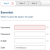
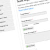
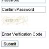
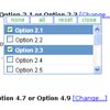
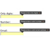
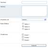
The best forms just got better! Ideal Forms 3 is smaller, faster, and more extensible.
License: GPL or MIT
Support: IE9+ and all modern browsers
Website: http://bit.ly/GFrp55 (not always in sync)
Demo only: http://bit.ly/1ahZalu
Features
- On the spot validation
- Fully adaptive (adapts to the container, no css media queries needed)
- Keyboard support
- Custom checkboxes, radios and file inputs
- Custom seamless jQuery UI datepicker
- Support for third party extensions
- Localization
Major changes since version 2
Ideal Forms 3 is not compatible with version 2. You can still find Ideal Forms 2 under jq-idealforms-old, but support has been dropped. Here's what's new in version 3:
- New architecture, more modularity
- Custom markup
- Extensions
- Improved custom checkbox, radio and file inputs
- Improved built-in theme
- Switch to Stylus
- Drop custom select menu, but check out jquery.idealselect
- Drop support for IE8
TODO
- Image Preview Field
Table of Contents
- Setup
- Options
- Markup
- Adding Rules
- Built-in Rules
- Methods
- Built-in Extensions
- Custom Rules
- Custom Extensions
- Localization
- Themes
- FAQ
- Build & Share
- Update History
Setup
- Load latest jQuery library
- Load
css/jquery.idealforms.cssstylesheet - Load
js/out/jquery.idealforms.min.jsplugin - To localize Ideal Forms load the corresponding file from
js/i18n. See Localization. - Place images in a folder and make sure the path is correct
- For better IE support, replace the opening
htmltag with:
<!--[if IE 9]> <html class="ie9" lang="en"> <![endif]--> <!--[if (gt IE 9)|!(IE)]><!--> <html lang="en"> <!--<![endif]-->- Call Ideal Forms on your form:
$('form').idealforms({ options });Options
defaults = { field: '.field', error: '.error', iconHtml: '<i/>', iconClass: 'icon', invalidClass: 'invalid', validClass: 'valid', silentLoad: true, onValidate: $.noop, onSubmit: $.noop, rules: {}, errors: {} }field
The field container for custom markup.
error
The error container for custom markup.
iconHtml
The element to use as icon. Set to false to disable icons.
iconClass
The class for the icon element.
invalidClass
The class that will be added to invalid fields.
validClass
The class that will be added to valid fields.
silentLoad
Initialize the form silently, otherwise focus the first invalid input.
onValidate(input, rule, valid)
Callback that runs after an input attempts to validate.
- input: The input being validated
- rule: The rule that the input is validating.
- valid: Boolean. Did it validate?
onSubmit(invalid, event)
Callback that runs when the form is submitted.
- invalid: The number of invalid fields if any.
- event: The submit event.
Example:
$('form').idealforms({ onSubmit: function(invalid, e) { e.preventDefault(); if (invalid) { alert(invalid +' fields!'); } else { $.post('save.php', this.$form.serialize(), function(response) { // do something with response }, 'json'); } } });rules
Field rules. See Adding Rules.
errors
User defined errors for added rules. See Custom Errors.
Markup
You can get started quickly using Ideal Forms' default markup:
<form class="idealforms" novalidate autocomplete="off" action="/" method="post"> <!-- Text --> <div class="field"> <label class="main">Username:</label> <input name="username" type="text"> <span class="error"></span> </div> <!-- File --> <div class="field"> <label class="main">Picture:</label> <input id="picture" name="picture" type="file" multiple> <span class="error"></span> </div> <!-- Radio --> <div class="field"> <label class="main">Sex:</label> <p class="group"> <label><input name="sex" type="radio" value="male">Male</label> <label><input name="sex" type="radio" value="female">Female</label> </p> <span class="error"></span> </div> <!-- Checkbox --> <div class="field"> <label class="main">Hobbies:</label> <p class="group"> <label><input name="hobbies[]" type="checkbox" value="football">Football</label> <label><input name="hobbies[]" type="checkbox" value="basketball">Basketball</label> <label><input name="hobbies[]" type="checkbox" value="dancing">Dancing</label> </p> <span class="error"></span> </div> <!-- Select --> <div class="field"> <label class="main">Options:</label> <select name="options"> <option value="default">– Select an option –</option> <option value="1">One</option> <option value="2">Two</option> </select> <span class="error"></span> </div> <!-- Textarea --> <div class="field"> <label class="main">Comments:</label> <textarea name="comments" cols="30" rows="10"></textarea> <span class="error"></span> </div> <!-- Button --> <button type="submit">Submit</button> </form>Markup with Rules
You can build simple forms by adding the rules to the markup, using the data-idealforms-rules attribute:
<form class="idealforms" novalidate autocomplete="off" action="/" method="post"> <!-- Single --> <div class="field"> <label class="main">Username:</label> <input name="username" type="text" data-idealforms-rules="required username"> <span class="error"></span> </div> <!-- Group On inputs that share the same name, you only need to add the rules on the first one --> <div class="field"> <label class="main">Hobbies:</label> <p class="group"> <label><input name="group[]" type="checkbox" value="A" data-idealforms-rules="minoption:1 maxoption:2">A</label> <label><input name="group[]" type="checkbox" value="B">B</label> <label><input name="group[]" type="checkbox" value="C">C</label> </p> <span class="error"></span> </div> </form>Custom Markup
Ideal Forms 3 has been built from scratch with flexibility in mind. The markup is no longer tied to the plugin. If the default markup doesn't work for you, you can create your own markup. Ideal Forms will look for the following:
- A field: A field must contain at least a label, an input and an error.
- A label: The label to identify the field.
- An input or group of inputs: Must be a single input or multiple related inputs such as checkboxes or radios. A field cannot contain inputs with different
nameattributes; this is a limitation by design. - An error container: An element to hold the error.
Then you have to tell Ideal Forms that you want to use custom markup. You can specify these options when initializing the plugin:
$('form').idealforms({ field: '.myfield', // selector error: '.myerror', // selector validClass: 'myvalid', // class name invalidClass: 'myinvalid' // class name });Adding Rules
Pass an object to the rules option, where each key corresponds to a name attribute and each value is a string of rules assigned to that input. Always quote keys for consistency:
$('form').idealforms({ rules: { 'username': 'required username', 'password': 'required password', 'sex': 'minoption:1', 'hobbies[]': 'minoption:1 maxoption:2', 'options': 'select:default' } });You can also add rules after initializing the plugin:
$('form').idealforms('addRules', { 'comments': 'required minmax:50:200' });Custom Errors
To display your own custom errors for the rules you added pass the names and a list of errors for each field:
$('form').idealforms({ rules: { ... }, errors: { 'username': { required: 'Please enter a username', username: 'This username is not valid, try again' }, 'password': { password: 'Please enter a secure password' } } });Built-in Rules
A rule must be in this format rule:param where rule is the name of the rule and param is a rule parameter, for example minmax:10:50 will use the minmax rule with two arguments, 10 and 50.
- required: The field is required. Only works with text inputs.
- digits: Only digits.
- number: Must be a number.
- username: Must be between 4 and 32 characters long and start with a letter. You may use letters, numbers, underscores, and one dot.
- email: Must be a valid email.
- pass: Must be at least 6 characters long, and contain at least one number, one uppercase and one lowercase letter.
- strongpass: Must be at least 8 characters long and contain at least one uppercase and one lowercase letter and one number or special character.
- phone: Must be a valid US phone number.
- zip: Must be a valid US zip code
- url: Must be a valid URL.
- range:min:max: Must be a number between
minandmax. Usually combined withnumberordigits. - min:min: Must be at least
mincharacters long. - max:max: Must be no more that
maxcharacters long. - minmax:min:max: Must be between
minandmaxcharacters long. - minoption:min: Must have at least
mincheckboxes or radios selected. - maxoption:max: Must have no more than
maxcheckboxes or radios selected. - select:default: Make a select required, where
defaultis the value of the default option. - extension:ext: Validates file inputs. You can have as many
extas you want. - equalto:name: Must be equal to another field where
nameis the name of the field. - date:format: Must a valid date in any format. The default is
mm/dd/yyyybut you can pass any format with any separator, ie.date:yyyy-mm-dd. - ajax: See the built-in Ajax Extension.
Methods
To call a method run idealforms on the form and pass the method and arguments:
```javascript` $('form').idealforms('method', arg1, arg2, ...);
Methods that have a colon like `is:valid` return something other than the instance, so they can't be chained. ### .idealforms('addRules', rules) See [Adding Rules](#adding-rules) ### .idealforms('get:invalid') Returns a jQuery collection of all invalid fields. Access the `length` to check how many fields are invalid. ### .idealforms('focusFirstInvalid') Focus the first invalid field. ### .idealforms('is:valid', name) If you pass a `name` it will check if that input is valid, otherwise it will check if all inputs are valid. ### .idealforms('reset', name) If you pass a `name` it will reset that single input, if you don't it will reset all inputs to zero. That means emptying all the values of text inputs, unchecking all checkboxes and radios, and reverting selects to their default option. [](#table-of-contents) ## Built-in Extensions Ideal Forms 3 has been re-designed to be able to extend the core easily. Read on [Custom Extensions](#custom-extensions) to learn more. Ideal Forms comes with a few built-in extensions. Extensions can be disabled with the `disabledExtensions` option by passing a space separated string of extensions. ```javascript $('form').idealforms({ disabledExtensions: 'dynamicFields steps customInputs ajax' }); Extension: Dynamic Fields
Name: dynamicFields
Dynamic Fields extends core with the following methods:
.idealforms('addFields', fields)
Add fields to the form.
- fields: And object where each key corresponds to the
nameattribute. The value of the object is another object that can contain any of the following options (* are required):
{ type*: 'text:subtype | file | group:subtype | select', label*: 'Label', value: 'value', attrs: 'attr="value"', after: 'name', before: 'name', list: [ { value: 'value', text: 'text' } ... ], rules: 'rule rule rule' }Text subtypes include all HMTL5 text types, such as email, number, etc...
Group subtypes include radio and checkbox.
If before or after are not set, the field will be added at the end of the form.
Example:
$('form').idealforms('addFields', { 'fruits[]': { type: 'group:checkbox', label: 'Fruits', list: [ { value: 'apple', text: 'Apple', attrs: 'checked' }, { value: 'orange', text: 'Orange' }, { value: 'banana', text: 'Banana' } ], rules: 'minoption:1 maxoption:2' } });The HTML is generated according to built-in templates. If you're using your own custom markup you may need custom templates. Ideal Forms provides a simple templating system to easy the pain. These are the default templates that you may change in the options when calling the plugin. They are listed as real HTML for convenience but you must pass a string in the options (you can get the HTML from a script tag for example):
<!-- Base --> <div class="field"> <label class="main">{label}</label> {field} <span class="error"></span> </div> <!-- Text --> <input name="{name}" type="{subtype}" value="{value}" {attrs}> <!-- File --> <input id="{name} "name="{name}" type="file" value="{value}" {attrs}> <!-- Textarea --> <textarea name="{name}" {attrs}>{text}</textarea> <!-- Group --> <p class="group"> {@list} <label><input name="{name}" type="{subtype}" value="{#value}" {#attrs}>{#text}</label> {/list} </p> <!-- Select --> <select name={name}> {@list} <option value="{#value}">{#text}</option> {/list} </select>$('form').idealforms({ templates: { base: '...', text: '...', file: '...', textarea: '...', group: '...', select: '...' } });The templating rules are:
- {var}: A variable.
- {@list} html {/list}: A loop.
- {#var}: A loop variable (inside the loop).
.idealforms('removeFields', names)
Remove fields from the form.
- names: A space separated string of
nameattributes.
Example:
$('form').idealforms('removeFields', 'username password hobbies[]');.idealforms('toggleFields', names)
Show or hide fields. When the fields are hidden they will be excluded from the validation.
- names: A space separated string of
nameattributes.
Example:
$('form').idealforms('toggleFields', 'username password hobbies[]');Dynamic Fields adds injection points for addFields:before, addFields:after, removeFields and toggleFields. Read about custom extensions for more info.
Extension: Steps
Name: steps
Steps let you organize your form in sections. Steps expects a container, navigation, wrapper, and at least one step. Using the default options you may build your form like so:
<div class="idealsteps-container"> <nav class="idealsteps-nav"></nav> <form> <div class="idealsteps-wrap"> <!-- Step 1 --> <section class="idealsteps-step"> <!-- Form fields --> </section> <!-- Step 2 --> <section class="idealsteps-step"> <!-- Form fields --> </section> <!-- Step 3 --> <section class="idealsteps-step"> <!-- Form fields --> </section> </div> </form> </div>Steps adds the following options to Ideal Forms:
{ steps: { container: 'idealsteps-container', // the main container nav: '.idealsteps-nav', // navigation navItems: 'li', // navigation element that receives events // Build nav items as "Step 1", "Step 2"... automatically // or pass your own custom function. // Set to `false` to use your own custom markup buildNavItems: function(i) { return 'Step '+ (i+1); }, wrap: '.idealsteps-wrap', step: '.idealsteps-step', activeClass: 'idealsteps-step-active', before: null, // runs before changing steps after: null, // runs after changing steps fadeSpeed: 0 } }For example, you could build the steps with your own text like so:
steps: { MY_stepsItems: ['One', 'Two', 'Three'], buildNavItems: function(i) { return this.opts.steps.MY_stepsItems[i]; } }Steps provides these methods:
.idealforms('goToStep', index)
Go to the step number index. Indices start at 0.
.idealforms('prevStep')
Go to the previous step. It wraps around.
.idealforms('nextStep')
Go to the next step. It wraps around.
.idealforms('firstStep')
Go to the first step.
.idealforms('lastStep')
Go to the last step.
Steps adds the appendToStep:index option to addFields:
$('form').addFields({ 'field': { type: 'text', label: 'Field', appendToStep: 1 }});Extension: Custom Inputs
Adds custom checkboxes, radios and file inputs (yes!) seamlessly. The custom select menu has been dropped from Ideal Forms 3 but you can find a new simple replacement being maintained as jquery.idealselect.
Note: File inputs must have an id as well as a name to work on IE.
This extension has no additional options or methods.
Extension: Ajax
Name: ajax
Adds an ajax rule. First specify a URL on your input:
<input type="text" name="username" data-idealforms-ajax="test-username.php"/>Then add the rule to the field always at last and add an error to handle an invalid response:
$('form').idealforms({ rules: { 'username': 'required username ajax' }, errors: { 'username': { ajax: 'Checking user availability...', ajaxError: 'Username not available, try a different one.' } } });The ajax filter will read the URL and send a POST request to the server. The server side script must return a JSON encoded true (passes validation) or false (fails validation). for example in PHP:
<?php echo json_encode(true);If the response gets delayed the field will switch into "ajax mode" by showing a loading icon until the response comes back.
Extension: Datepicker
Name: datepicker
Adds a datepicker to date inputs. You must include jQuery UI first, then add the class datepicker to your date inputs:
<input name="event" type="text" placeholder="mm/dd/yyyy" class="datepicker">Now you can add the date rule:
$('form').idealforms({ rules: { 'event': 'date' } });The default format is mm/dd/yyyy for Ideal Forms and mm/dd/yy for the jQuery UI datepicker. Note that Ideal Forms represents years with yyyy not yy, but the formats are interchangeable.
$('form').idealforms({ rules: { 'event': 'date:yyyy-mm-dd' } }); $('.datepicker').datepicker('option', 'dateFormat', 'yy-mm-dd');Extension: Adaptive
Name: adaptive
Adapts the form to the container when resizing the browser allowing it to work with any responsive grid system. Ideal Forms will add the class adaptive to the form and Steps navigation (if present) so you can add your own styles if you decide to use custom markup.
Ideal Forms calculates the adaptive width at which the change of layout occurs. If you use custom markup and styles make sure to set the adaptiveWidth plugin option using the formula:
$('form').idealforms({ adaptiveWidth: 600 // the total width of a field (label + input + icon + error) });Custom Rules
You can add rules by extending the global rules object:
$.extend($.idealforms.rules, { ruleRegex: /abc/g, // The rule is added as "ruleFunction:arg1:arg2" // @param input {Node} ruleFunction: function(input, value, arg1, arg2, ...) { } });After you add a rule you must add an error for it, by extending the global errors object. Don't forget this step:
$.extend($.idealforms.errors, { ruleRegex: 'Must be a valid value for this rule', ruleFunction: 'Must be a valid value. {0}, {1}' });If the rule is a function that takes rule parameters pass the parameters as {0}, {1}, etc. If you want to print all the parameters use {*} where the default separator is a comma but you can use your own like {*~} where ~ is the custom separator.
Custom Extensions
To add a custom extension provide a name, extended options and extended methods if any. You can inject code into the following built-in methods:
- _init: Runs when the plugin is initialized, but before any initial input rules are added.
- _buildField(input): Builds the input given the markup options to work with Ideal Forms.
inputis the current input element being built. - _validate(input, rule, valid): Runs right after the input has been validated.
inputis the input element,ruleis the rule that tried to pass validation andvalidis a boolean flag. - addRules: It gets invoked on
_initto add the initial rules and whenever you add more rules to the form. - focusFirstInvalid: Inject code when the first input is focused.
- reset(name): Reset the form.
nameis an input name, if any. Check the reset method.
It is recommended that you always namespace your extension, by prefixing it with a unique identifier. To allow for Ideal Forms localization, add the i18n option and all the strings that may change inside, then build your extension with localization in mind:
$.idealforms.addExtension({ name: 'MY_extensionName', options: { MY_extension: { option: 'default', i18n: { initialized: 'Initialized' } } }, methods: { // @extend _init: function() { console.log(this.opts.i18n.initialized +'!'); }, MY_newMethod: function() { } } });If an extension depends on another extension you may use _hasExtension:
_init: function() { if (this._hasExtension('ajax')) { ... } }Localization
To localize Ideal Forms load the corresponding i18n file from js/i18n after the plugin:
<script src="jquery.idealforms.js"></script> <script src="jquery.idealforms.i18n.es.js"></script>Creating your own locale file:
/** * i18n ES */ jQuery.idealforms.i18n.es = { customInputs: { open: 'Abrir' }, steps: { step: 'Paso' }, errors: { required: 'Este campo es obligatorio', digits: 'Debe contener sólo cifras', name: 'Debe contener al menos 3 caracteres y contener únicamente letras', ... } }; External plugins like the jQuery UI datepicker have to be localized separately in their own way.
Themes
Ideal Forms 3 themes are built with Stylus. To create your own theme to use with the default markup open styl/vars.stly, modify what you need and compile.
valid = #3F9DCC // valid font color valid-bg = #EDF7FC // valid background color invalid = #CC2A18 // invalid font color invalid-bg = #FFEDED // invalid background color ajax = #CFAA19 // ajax font color ajax-bg = #FAF9E8 // ajax background color ui-element = #ddd // buttons, select and steps backgruond color error = #285d85 // error background color label-width = 120px // main labels width input-width = 290px // input width applies to all fields error-width = (input-width/1.5) radius = 3px // border-radius icon = true // disable icons (must disable in plugin options too) icon-size = 16px // must be square icon icon-padding = 8px // padding between icon, input and error radiocheck-sprite = true // `false` to use css-only style radiocheck-size = 18px // size for css-only radiocheck group-horizontal = false // group checkbox and radio horizontallyTo customize the theme in your CSS file make sure to always add the form.idealforms selector so it takes precedence over the default styles, for example, you may change the default label width like:
form.idealforms label.main { width: 200px; }FAQ
How to access the Ideal Forms plugin instance
Ideal Forms attaches an instance of itself to your form(s). To access the instance (prototype) use data:
var instance = $('form').data('idealforms');Now you an use methods like so:
instance.reset(); // reset the formWhy the icons don't show up
Ideal Forms assumes that your site has this common structure:
site + css + img + js index.html When you download Ideal Forms, make sure to place the images inside img. If your folder structure is different you have to open css/jquery.idealforms.css and search and replace ../img/ with the correct path to your images folder relative to the plugin.
Build & Share
Ideal Forms 3 is built using some popular NodeJS tools. This is what you'll need to install globally:
Then clone the repo, cd into the folder and run npm install to install dependencies.
Finally run watch -c sh compile.sh to watch for changes and compile. Now you're ready to edit files and help make Ideal Forms better, or create your own fork.
If you want to test ajax make sure to run it on your localhost.
This instructions have only been tested on Ubuntu, but you should be able to compile on any Unix system. Some Windows terminal emulators don't provide the watch command, but you can still run the script normally with bash sh compile.sh.
Update History
01/25/14
- Fix #30 and #32
09/10/13
- Localization!
07/10/13
- Alternative scalable radiocheck style without sprites
05/10/13
- Adaptive extension brings back responsive theme.
