myAlert.js
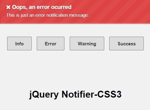
myAlert.js is a Javascript and CSS library for creating custom notifications alerts.
Install
Dependencies
import the css files, if you prefer you can import just the myalert.min.css and create your own theme
<head> ... <link rel="stylesheet" type="text/css" href="css/myalert.min.css" /> <link rel="stylesheet" type="text/css" href="css/myalert-theme.min.css" /> </head> import jQuery and the js file
<body> ... <script type="text/javascript" src="https://code.jquery.com/jquery-3.3.1.min.js"></script> <script type="text/javascript" src="js/myalert.min.js"></script> </body> Usage
Getting Started
First of all you need to set where the myAlert element will appear, you can do this just adding an data-myalert attribute to an element, like this:
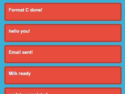
<body> ... <div id="#content" data-myalert> ... </div> ... </body> At the beginning the alert will stack without a limit, so if you want just to show three or four alerts at the most you can set an data-myalert-max attribute to the element, like this:
<body> ... <div id="#content" data-myalert data-myalert-max="3"> ... </div> ... </body> myAlert usage
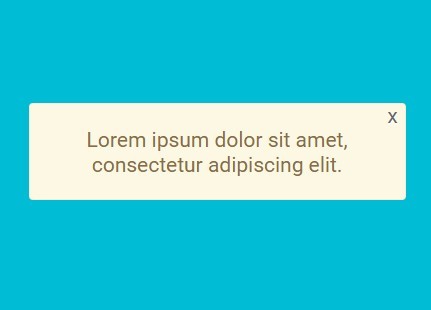
myAlert(message, classes); message: The message it is going to show, you can pass an string with html inside.
classes: The class for styling the alert, you can pass multiples classes, even a custom class.
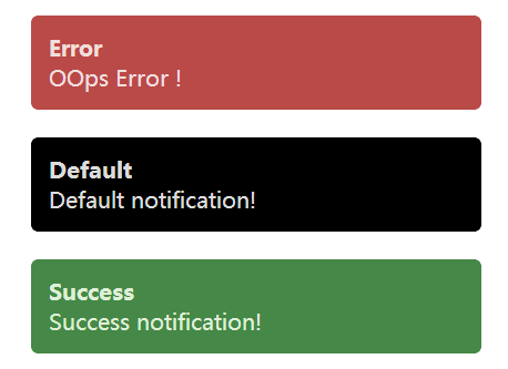
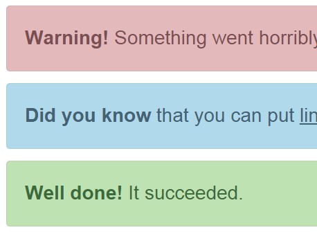
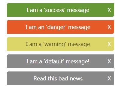
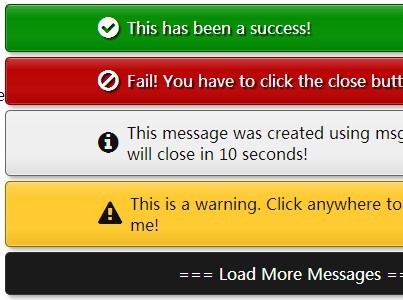
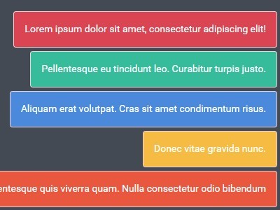
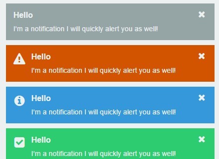
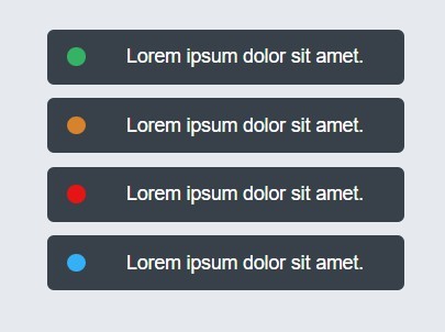
Default style

myAlert("This is a <i>default</i> alert"); Info style

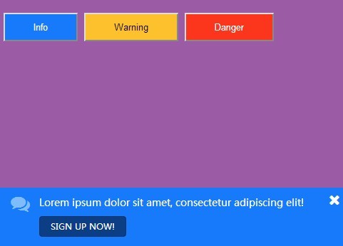
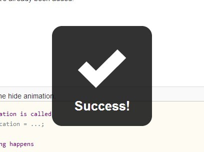
myAlert("This is an <i>info</i> alert", "myalert-info"); Success style

myAlert("This is an <i>success</i> alert", "myalert-success"); Warning style

myAlert("This is an <i>warning</i> alert", "myalert-warning"); Danger style

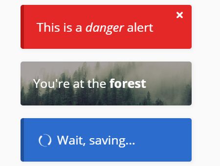
myAlert("This is a <i>danger</i> alert", "myalert-danger"); Custom style

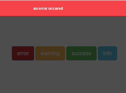
// js file myAlert("You're at the <b>forest</b>", "myalert-custom"); /* css file */ .myalert-custom { background-image: url("../img/alert-custom.jpg"); background-position: center; background-size: cover; border-left: 0; position: relative; z-index: 1; } .myalert-custom:before { content: ''; position: absolute; top: 0; bottom: 0; left: 0; right: 0; background-color: rgba(34, 34, 34, 0.4); z-index: -1; } Saving usage
myAlertSaving(saving, message, classes); saving: The saving status, it can be true as default or false.
message: The message it is going to show, you can pass an string with html inside.
classes: The class for styling the alert, you can pass multiples classes, even a custom class.
Show

myAlertSaving(true, "Wait, saving...", "myalert-info"); Hide
myAlertSaving(false); 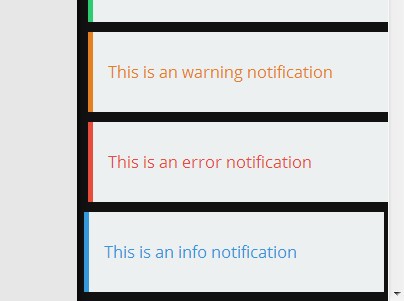


