chewing-grid.css 

A CSS Grid ideal for card listing design like tiles, videos or articles listing.
No media queries, yet chewing-grid will adjust the number of columns depending on the available width and your settings regarding:
- the maximum number of columns
- the minim and maximum card width
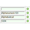
chewing-grid provides atomic classes ready to use in your HTML (1 to 12 columns and widths in 50px intervals). You can also use it with Sass to generate your own classes, or even to build a custom semantic grid.
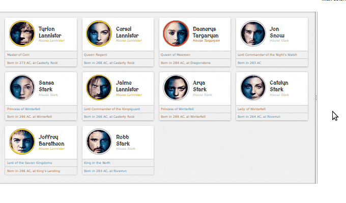
Here's a GIF to show you how it looks. If you want to play with it, check out the live demo.
Quick start
Install chewing-grid via npm
npm install chewing-grid.css --saveor via bower
bower install chewing-grid.css --saveFor example: the following HTML use atomic classes to create a grid where the cells are:
- Maximum 4 in the same row
- Minimum 300px large
- Maximum 500px large
<link rel="stylesheet" type="text/css" href="build/chewing-grid-atomic.css"/> <ul class="chew-row chew-row--col-4 chew-row--card-min-300 chew-row--card-min-500"> <li class="chew-cell"> <div class="chew-card">1</div> </li> <li class="chew-cell"> <div class="chew-card">2</div> </li> <!-- [...] --> </ul>Read the documentation to go further.
How to Contribute
- Star the project!
- Report a bug that you have found.
- Tweet and blog about chewing-grid and Let me know about it.
- Pull requests are also highly appreciated.
Author & Community
chewing-grid is under MIT License.
It was created & is maintained by Thomas ZILLIOX.


