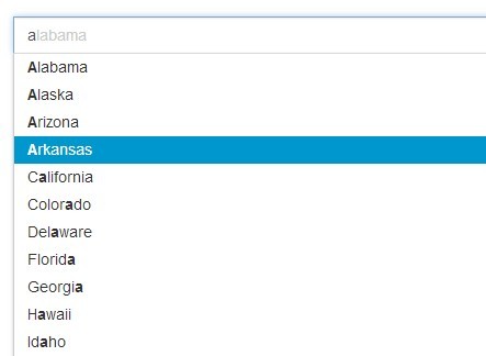
jQuery accessible autocomplete list
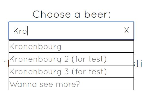
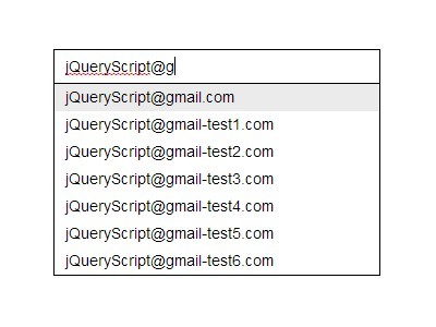
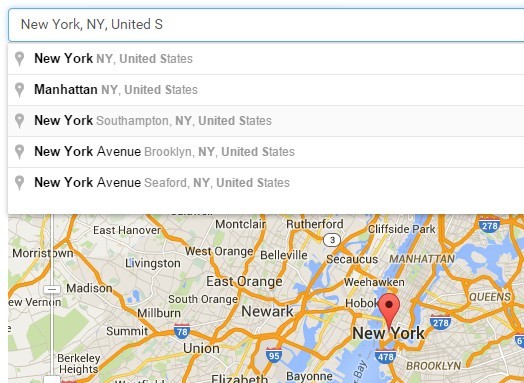
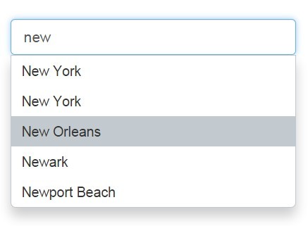
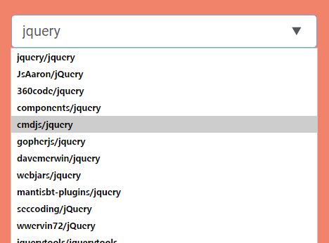
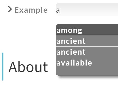
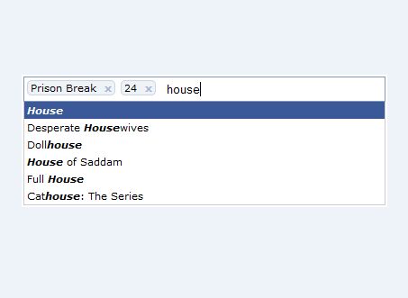
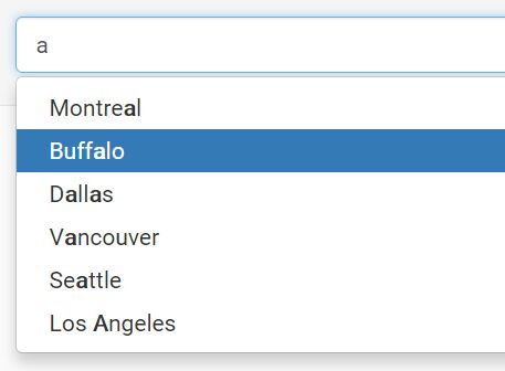
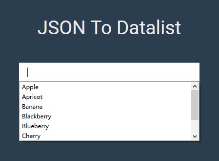
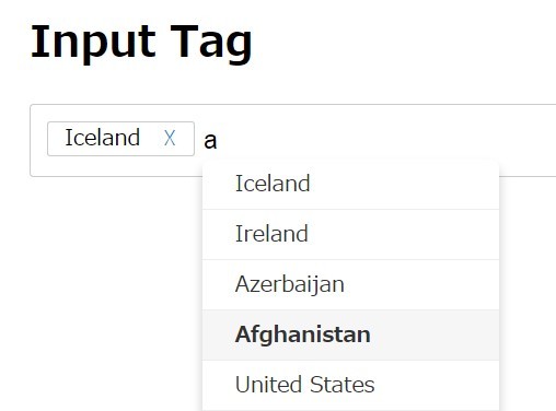
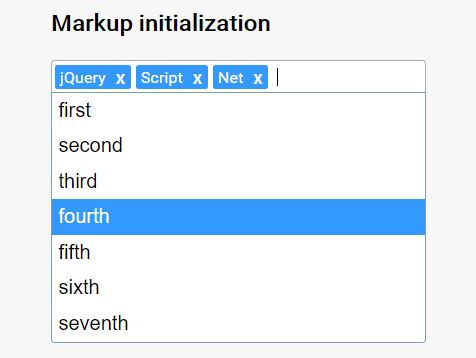
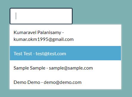
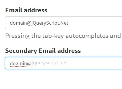
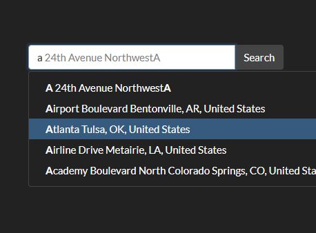
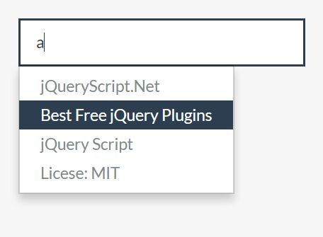
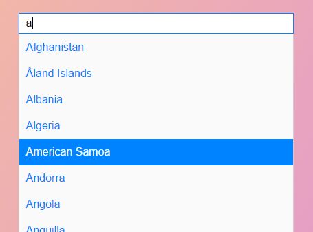
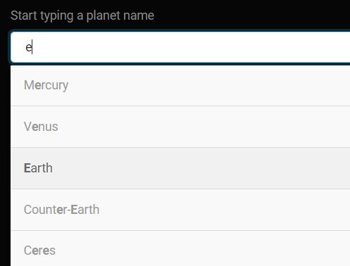
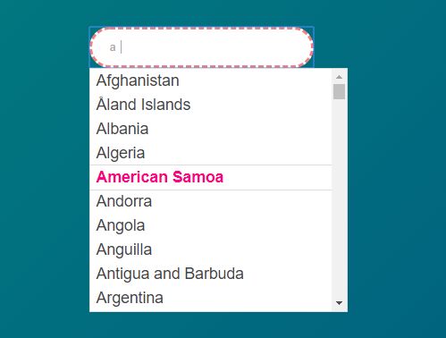
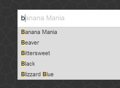
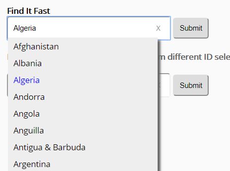
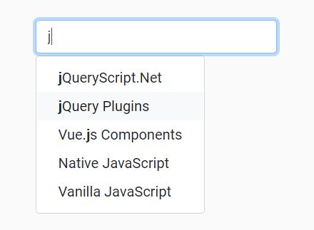
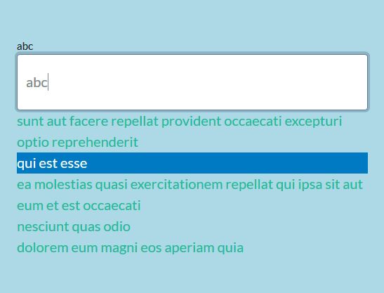
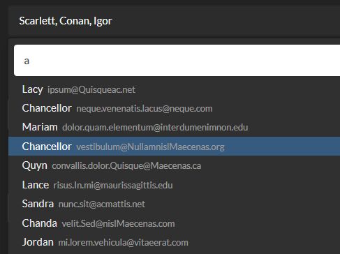
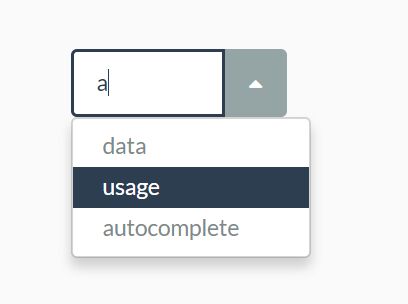
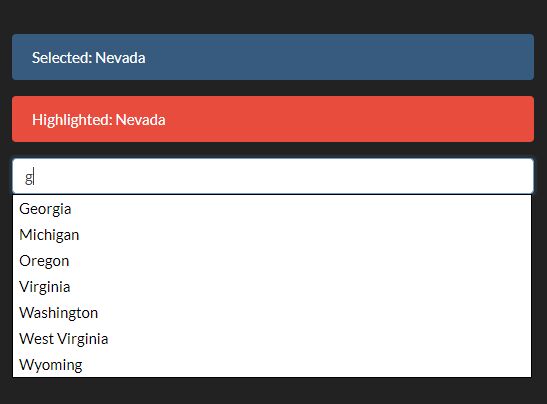
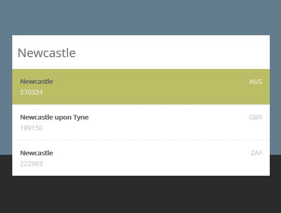
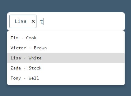
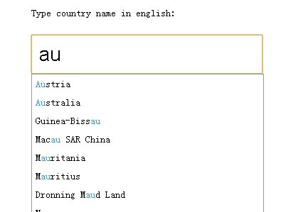
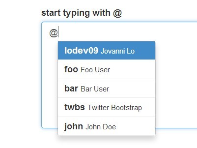
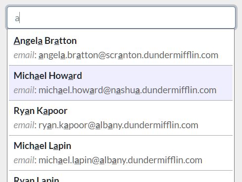
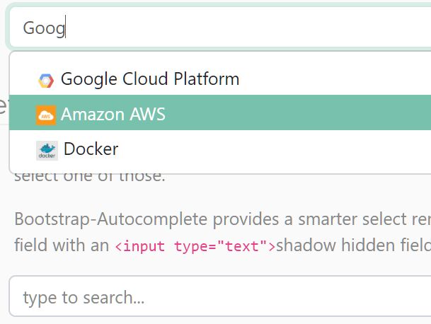
This jQuery plugin will transform and enhance a simple text input with a datalist into a wonderful and shiny input with autocomplete, and accessible.
The demo is here: https://a11y.nicolas-hoffmann.net/autocomplete-list/
How it works
This plugin:
- starts from a classical input completed by a datalist;
- then takes the elements in your datalist, reorder them and store them into Javascript arrays;
- then wraps the input into a container, adds status/help text zones and a “clear” button;
- then it listens when you type something in the field, and proposes you some suggestions.
Why it is cool
As it is made using progressive enhancement, if the JavaScript fails to load or is blocked by your visitor, your website will still be ok.
It is accessible: it works with VoiceOver, NVDA, Jaws, and it loves keyboard.
It is easy to customize there is a default configuration that can be changed/adapted, and you can override it using data-* attributes if you need it.
For the design, you can also customize the CSS to fullfil your needs.
How to use it
First, add a class js-combobox on an input with a working datalist:
<input type="text" name="mysuper_field" id="id_mysuper_field" class="js-combobox" list="beers" data-combobox-prefix-class="combobox" /> <datalist id="beers"> <option value="Meteor"> <option value="Pils"> <option value="Kronenbourg"> <option value="Kronenbourg 2 (for test)"> <option value="Kronenbourg 3 (for test)"> <option value="Grimbergen"> </datalist>Then download the plugin and use jQuery of course. This plugin is also available on NPMjs.com and can be installed using npm i jquery-accessible-autocomplete-list-aria: https://www.npmjs.com/package/jquery-accessible-autocomplete-list-aria
You may also get it from Bower: bower install jquery-accessible-autocomplete-list-aria.
You may use some options, so have a look at plugin options.
Options
At the beginning of the plugin, a global configuration is available:
var $js_combobox = $('.js-combobox'), $body = $('body'), default_text_help = 'Use tabulation (or down) key to access and browse suggestions after input. Confirm your choice with enter key, or esc key to close suggestions box.', default_class_for_invisible_text = 'invisible', suggestion_single = 'There is ', suggestion_plural = 'There are ', suggestion_word = 'suggestion', suggestion_word_plural = 'suggestions', button_clear_title = 'clear this field', button_clear_text = 'X', case_sensitive = 'yes', min_length = 0, limit_number_suggestions = 666, search_option = 'beginning', // or 'containing' see_more_text = 'See more results…', tablo_suggestions = [];You may adapt texts to your need with it. However, if you need to customize one autocomplete field, you may use data-* attributes to override global configuration. Here is the list:
data-combobox-prefix-class="foo": prefix all generated classes byfoo.data-combobox-case-sensitive="yes/no": plugin is case-sensitive by default, which means “KROW” will be before “Kron”. If you set it up to="no", the plugin will order all elements without caring of the case (see first example).data-combobox-help-text: to overridedefault_text_helpin the config.data-combobox-button-title: to overridebutton_clear_titlein the config, will be the title of the clear button.data-suggestion-single: to overridesuggestion_singlein the config, will be vocalized when there is 1 suggestion.data-suggestion-plural: to overridesuggestion_pluralin the config, will be vocalized when there are more several suggestions.data-suggestion-word: to overridesuggestion_wordin the config.data-suggestion-word-plural: to overridesuggestion_word_pluralin the config.data-combobox-min-length="xx": to overridemin_lengthin the config, a minimal length of text from which will be displayed suggestions.data-combobox-limit-number-suggestions="3": to overridelimit_number_suggestions, the maximum number of suggestions displayed.data-combobox-search-option="beginning/containing": when plugin is searching a match with foo in the suggestions,beginningvalue will search suggestions beginning with foo,containingwill search suggestions containing foo.data-combobox-see-more-text="<text>": if the number limit of suggestions is reached, the plugin will put this text as last suggestion.data-combobox-notab-options="yes": if you don’t want to enable the tab key to go into/through suggestions.
Have a look at the second example of the demo if you want to see data attributes in action.
How to style it
In these examples, I’ve used data-combobox-prefix-class="combobox", which means all classes will be prefixed by combobox-. Here are minimal styles needed:
.invisible { border: 0; clip: rect(0 0 0 0); height: 1px; margin: -1px; overflow: hidden; padding: 0; position: absolute; width: 1px; } .combobox-container { position: relative; max-width: 250px; } .combobox-suggestions { position: absolute; } .combobox-suggestion { cursor: pointer; } .combobox-clear-button { position: absolute; right: 1px; font-family: inherit; font-size: 1em; padding: .5em; background: transparent }Here is a full example really nicer and more pleasant to use:
.invisible { border: 0; clip: rect(0 0 0 0); height: 1px; margin: -1px; overflow: hidden; padding: 0; position: absolute; width: 1px; } .combobox-container { position: relative; max-width: 250px; margin: 0 auto; } .combobox-suggestions { position: absolute; left: 0; width: 250px; background: #fff; } .combobox-suggestion { color: #666; border-bottom: 1px solid #000; border-left: 1px solid #000; border-right: 1px solid #000; cursor: pointer; text-align: left; } .combobox-suggestion:first-child { border-top: 1px solid #000; } .combobox-suggestion:hover, .combobox-suggestion:focus { color: #000; } .combobox-clear-button { position: absolute; right: 1px; font-family: inherit; font-size: 1em; padding: .5em; background: transparent } /* http://geektnt.com/how-to-remove-x-from-search-input-field-on-chrome-and-ie.html */ .js-combobox[type=text]::-ms-clear { display: none; width: 0; height: 0; } .js-combobox[type=text]::-ms-reveal { display: none; width: 0; height: 0; }With these styles, the focus/hover looks far better, and a border is added aroung suggestion list.
Keys
When focus is on the text input
- You may use tab to reach suggestions and continue through them (activated by default, can be removed using
data-combobox-notab-options="yes"); - Esc will close suggestion list;
- You can also use Down to reach the suggestion list.
When focus is on the suggestions
- Tab/Shift+Tab allow to navigate through options (activated by default, can be removed using
data-combobox-notab-options="yes"); - Enter or Space update the value of the input with the currently highlighted option, close the drop-down list and move the focus back to the input;
- Esc will close suggestion list, give focus back to the text input and remove suggestion in the input (go back to what was typed in);
- You can also use Down/Up arrows to navigate between suggestions.
Other informations
License
No license problem, it uses MIT license, so it’s free, open-source and you can do whatever you want with it, including commercial use. This permission notice shall be included in all copies or substantial portions of it.
However, it is not prohibited to tell me that you’ve used it, or send me a little “thank you”. ;)
Weight
It is lightweight: 19kb(development), 6.8kb (minified), only 2.1kb minified and gzipped.
Tribute
The idea of this script is inspired by Heydon’s basic autocomplete with listbox demo. Aurélien Levy enhanced it with a working prototype, and I’ve finished the work (packaging, reutilisability, progressive enhancement, etc.) with Aurélien.
