validator

The Validator is cross-browser and will give you the power to use future-proof input types such as tel, email, number, date, time, checkbox and url.
DEMO PAGE
npm i @yaireo/validator --save // usage: import FormValidator from '@yaireo/validator' // or download the `validator.js` file and add load it inside your HTML file <script src='validator.js'></script> Why should you use this?
- Cross browser validation
- Deals with all sorts of edge cases
- Utilize new HTML5 types for unsupported browsers
- Flexible error messaging system
- Light-weight (19kb + comments, unminified)
Validation types support
HTML5 offers a wide selection of input types. I saw no need to support them all, for example, a checkbox should not be validated as ‘required’ because why wouldn’t it be checked in the first place when the form is rendered?
For a full list of all the available Types, visit the working draft page. These input types can be validated by the the JS for – <input type='foo' name='bar' />. (Support is synthesized)
- Text
- Password
- Number
- Date
- Time
- URL
- Search
- File
- Tel
- Checkbox
- Select
- Textarea
- Hidden – Hidden fields can also have the ‘required’ attribute
Basic semantics
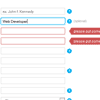
<form action="" method="post" novalidate> <fieldset> <div class="field"> <label> <span>Name</span> <input data-validate-length-range="6" data-validate-words="2" name="name" placeholder="ex. John f. Kennedy" required="required" type="text" /> </label> <div class='tooltip help'> <span>?</span> <div class='content'> <b></b> <p>Name must be at least 2 words</p> </div> </div> </div> <div class="field"> <label> <span>email</span> <input name="email" required="required" type="email" /> </label> </div> ... Explaining the DOM
First, obviously, there is a Form element with the novalidate attribute to make sure to disable the native HTML5 validations (which currently suck). proceeding it there is a Fieldset element which is not a must, but acts as a “binding” box for a group of fields that are under the same “category”. For bigger forms there are many times field groups that are visually separated from each other for example. Now, we treat every form field element the user interacts with, whatsoever, as an “field”, and therefor these “fields” will be wraped with <div class='field'>. This isolation gives great powers. Next, inside an field, there will typically be an input or select or something of the sort, so they are put inside a <label> element, to get rid of the (annoying) for attribute, on the label (which also require us to give an ID to the form field element), and now when a user clicks on the label, the field will get focused. great. Going back to the label’s text itself, we wrap it with a <span> to have control over it’s style.
The whole approach here is to define each form field (input, select, whatever) as much as possible with HTML5 attributes and also with custom attributes.
| Attribute | Purpose |
|---|---|
| required | Defines that this field should be validated (with JS by my implementation and not via native HTML5 browser defaults) |
| placeholder | Writes some placeholder text which usually describes the fields with some example input (not supported in IE8 and below) |
| pattern | Defines a pattern which the field is evaluated with. Available values are: numeric - Allow only numbers alphanumeric - Allow only numbers or letters. No special language characters phone - Allow only numbers, spaces or dashes. Alternatively, you may write your own custom regex here as well. |
| data-validate-words | Defines the minimum amount of words for this field |
| data-validate-length | Defines the length allowed for the field (after trim). Example value: 7,11 (field can only have 7 or 11 characters). you can add how many allowed lengths you wish |
| data-validate-length-range | Defines the minimum and/or maximum number of chars in the field (after trim). value can be 4,8 for example, or just 4 to set minimum chars only |
| data-validate-linked | Defines the field which the current field’s value (the attribute is set on) should be compared to. Value can be a selector or another input's name attribute's value |
| data-validate-minmax | For type number only. Defines the minimum and/or maximum value that can be in that field |
Optional fields
There is also support for optional fields, which are not validated, unless they have a value. The support for this feature is done by adding a class optional to a form element. Note that this should not be done along side the “required” attribute.
Error messages
This is the object which holds all the texts used by the form validator:
{ invalid : 'inupt is not as expected', short : 'input is too short', long : 'input is too long', checked : 'must be checked', empty : 'please put something here', select : 'Please select an option', number_min : 'too low', number_max : 'too high', url : 'invalid URL', number : 'not a number', email : 'email address is invalid', email_repeat : 'emails do not match', date : 'invalid date', time : 'invalid time', password_repeat : 'passwords do not match', no_match : 'no match', complete : 'input is not complete' } This object can be extended easily. The idea is to extend it with new keys which represent the name of the field you want the message to be linked to, and that custom message appear as the general error one. Default messages can be over-ride. Example: for a given type ‘date’ field, lets set a custom (general error) message like so:
// set custom text on initialization: var validator = new FormValidator({ texts : { date:'not a real date' } }); // or post-initialization var validator = new FormValidator(); validator.texts.date = 'not a real date'; Error messages (per field) can be disabled:
validator = new FormValidator({ alerts:false }); // or by: var validator = new FormValidator(); validator.settings.alerts = false; Binding the validation to a form
There are two ways to validate form fields, one is on the submit event of the form itself, then all the fields are evaluated one by one. The other method is by binding the checkField function itself to each field, for events like Blur, Change or whatever event you wish (I prefer on Blur).
Usage example - validate on submit
A generic callback function to have the form validated on the Submit event. You can also include your own personal validations before the checkAll() call.
var validator = new FormValidator(); // select your "form" element from the DOM and attach an "onsubmit" event handler to it: document.forms[0].onsubmit = function(e){ var validatorResult = validator.checkAll(this); return !!validatorResult.valid; }; Usage example - validate on field blur/input/change events
Check every field (using event Capture)
var validator = new FormValidator(); document.forms[0].addEventListener('blur', function(e){ validator.checkField(e.target) }, true); document.forms[0].addEventListener('input', function(e){ validator.checkField(e.target); }, true); document.forms[0].addEventListener('change', function(e){ validator.checkField(e.target) }, true); Utilize the internal events' binding system; pass in the settings the events property and assign it an array which states which events should be inputs be validated for. For a single events, a string may be paassed instead of an Array:
var validator = new FormValidator( document.forms[0], { "events" : ['blur', 'input', 'change'] // for a single one, just pass a string, ex: "blur" }); In case the form is not yet ready, the events maybe be binded later, when the form is ready, using the internal events method for a validator instance:
// validate fields on these events: var validator = new FormValidator(document.forms[0]); // the "<form>" element should be passed when the instance is created or passed to the "events" method below (as the 2nd parameter) // wait for the form, or its' fields, to be ready (for whatever reason), and then bind the events as follows: validator.events(['blur', 'input', 'change']); Tooltips (for each field which did not validate)
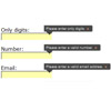
The helper tooltips <div class='tooltip help'>, which work using pure CSS, are element which holds a small '?' icon and when hovered over with the mouse, reveals a text explaining what the field “field” is about or for example, what the allowed input format is.
Classes
validator.settings.classes object can be modified:
var validatorClasses = { field : 'field', // class for each input wrapper alert : 'alert', // call on the alert tooltip bad : 'bad' // classes for bad input }; validator = new FormValidator(null, {classes:validatorClasses}); // or validator = new FormValidator(); validator.settings.classes.bad = 'error'; Bonus – multifields
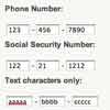
I have a cool feature I wrote which I call “multifields”. These are fields which are often use as to input a credit card or a serial number, and are actually a bunch of input fields which are “connected” to each other, and treated as one. You can see it in the demo page, and it’s included in ‘multifield.js’ file.
