🔔 Alert..!! Get 2 Month Free Cloud Hosting With $200 Bonus From Digital Ocean ACTIVATE DEAL

Responsive & Retina Content Images Redux using Media Queries & a base64 spacer GIF with the rwdImages jQuery plugin to allow the actual image to be saved, shared & printed.Retina screens will be served an image that’s twice the size, but gets scaled down.The key is to use the intrinsic ratio technique to set the height of responsive images to 0, and give them a padding-bottom of the (width/height)*100. When the viewport width is large enough to show the images at the largest, real height, set the padding-bottom to the actual image height so the images don’t continue to create unnecessary padding.The rwdImages jQuery plugin is used to wrap the image in a span and create an overlayed clone of the image with opacity: 0 so users can download or share the image.

Image Effects Plugins Responsive

Documentation

No longer maintained. This has been superceded by rwd.images.js

jQuery RWD Images

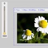
Allows responsive content images using the redux spacer technique (http://mattstow.com/experiment/responsive-images-redux/responsive-images-redux-jquery-plugin.html) to be shared and saved

The plugin has 2 default options which can be overwritten as required:

'display': 'inline-block' // Sets the display property of the images' wrapping .rwd_wrap span 'zindex': false // Sets the z-index property of the images' wrapping .rwd_wrap span 

Usage:

Basic

$('img').rwdImages();

Overriding default options

$('img').rwdImages({ 	'display': 'block', 	'zindex:' 1 }); 

You May Also Like