You should probably use srcset now that it has landed in all major browsers, and the polyfills are more reliable. Check out Using Responsive Images Now and Ben Seymour's book Practical Responsive Images.
I don't have the resources to maintain this project; it's continued stability relies upon the willingness of volunteers to pitch in. I hand out push access quite readily, just sumbit a PR.
Automated integration tests are a requirement for this kind of project; you can't feasibly perform the manual testing that is required.
Bitrot in the automated test suite is the only open bug: https://github.com/imazen/slimmage/issues/58 No source changed, but things broke. Could be the test service, or it could be new browser versions. Why not give debugging it a try?
Check out Imageflow or ImageResizer for a back-end.
When I created Slimmage.js, everything was broken, and I spent months creating a fully tested, cross-browser solution. Today, IE6 is a distant memory, and our integration tests have broken with new releases of SauceLabs (and possibly due to browser changes, although we don't have any open bug reports).
Slimmage - sane & simple responsive images


Your wait for a sane, easily managed path to responsive images has now ended.
With Slimmage, CSS controls which image size is downloaded, not HTML
- Media queries, breakpoints, nested percentages, &
max-widthwork as expected. - Works on > 99% of browsers. 5KB minified vanilla js, 2KB compressed. Download minified version via releases tab.
- Cookie-free; works on first page load. Works with CDNs.
- Fully accessible; degrades gracefully without javascript
- Massive bandwidth reduction. No duplicate requests. Can auto-enable WebP and adjust compression based on pixel density
- Works with any RIAPI-compliant backend. ImageResizer is a great backend if you're on windows.
Not on windows?
Check out imageflow.io
And imazen/libimageflow for an alternate backend.
Handles any viewport size and pixel density with ease. Yes, retina and retina-like displays are supported.
Our automated tests from the last API call - these may not even been a public commit - are below. Click to browse. IE6 and iOS do work, but our (free oss plan!) SauceLabs automated testing on those platforms has been unreliable at best.

0.2.3 was manually tested on IE6-10, Firefox 3.6-23, Opera 11-12, Safari 5-6, Chrome 14-28, Opera Mobile, and over a dozen mobile Webkit browsers. - essentially everything supported by BrowserStack in 2013 to mid-2014 when we were paying customers. In theory we should be supporting over 99.5% of browsers. Starting in 2015, BrowserStack has given us a free OSS subscription, which has been very useful in manual testing. We haven't yet added automated tests with their service, but hope to soon (PR anyone?).
MIT/Apache dual licensed by Imazen.
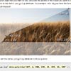
Demo page using PureCSS, slimmage.js, & ImageResizer.
If you're on Windows or IIS, read this guide for the easiest implementation path
Sample markup
<noscript data-slimmage> <img class="halfsize" src="http://z.zr.io/ri/1s.jpg?width=150" /> </noscript> <style type="text/css"> img.halfsize {max-width:50%;} </style> <script src="/slimmage.js" ></script>Sample markup with IE6/7/8 support
IE6, 7, & 8 are unable to access the contents of a noscript tag, and we are therefore required to duplicate the attributes. If you didn't care about non-javascript enabled users, you could drop the inner img element, but we wouldn't advise it.
<noscript data-slimmage data-img-class="halfsize" data-img-src="http://z.zr.io/ri/1s.jpg?width=150"> <img class="halfsize" src="http://z.zr.io/ri/1s.jpg?width=150" /> </noscript>Sample markup with WebP and Quality adjustment
Set tryWebP and webpTimeout to enable webp use (and ensure your back-end server has a webp encoder). webpTimeout makes the execution order of checkResponsiveImages vs other javascript non-deterministic. You should manually call window.slimmage.checkResponsiveImages() after any other DOM manipulations are complete.
Quality adjustment is enabled by default if &quality= is in the query.
<noscript data-slimmage> <img class="halfsize" src="http://z.zr.io/ri/1s.jpg?width=150&format=jpg&quality=90" /> </noscript> <style type="text/css"> img.halfsize {max-width:50%;} </style> <script type="text/javascript"> window.slimmage = {tryWebP:true, webpTimeout:50, verbose:false}; </script> <script src="/slimmage.js" ></script>Sample markup for LQIP (Low-quality image placeholders) mode
Warning - this syntax will cause 2 network requests on many browsers
<img data-slimmage="true" src="http://z.zr.io/ri/1s.jpg?width=100&format=jpg&quality=75" />Sample markup for IE11 and other browsers supporting lazyload
Warning - this syntax will cause 2 network requests on browsers which support image prefetching but don't support Resource Priorities.
<img lazyload data-slimmage="true" src="http://z.zr.io/ri/1s.jpg?width=100&format=jpg&quality=75" />Configuration reference - window.slimmage object
verbose(false) - enables console loggingtryWebP(false) - runs a webp feature test; if it completes before checkResponsiveImages() runs, webp will be used for all image URLs that have a&format=jpgplaceholder in the query.webpTimeout(0) - delayscheckResponsiveImages()(and therefore the loading of all images) by up to the given amount of time, in order to check for webp support before generating image URLs. 50ms is a good value, but anything over 0 will break deterministic execution of Slimmage.js in relation to other javascript on the page. This matters, because some javascript may manupulate the DOM, and affect the sizing of images.display: noneon a parent, or changing the width of a container are common sources of calculation failures. You can clean up after all javascript is ‘done’ by callingwindow.slimmage.checkResponsiveImages();maxWidth(2048) - The maximum pixel width to request for any image.widthStep(160) - Caching is impossible unless we limit the number of image variations. The default, 160, gives us160, 320, 480, 640, 800, 960, 1120, 1280, 1440, 1600, 1760, 1920, 2080(2048)- 13 variants, and keeps bandwidth waste very low.jpegQuality(90) - The jpeg compression quality to use on low-dpr displays ( < 1.5 dppx).jpegRetinaQuality(80) - The jpeg compression quality to use on high-dpr displays, where artifacts are much less visible.enforceCss(false) ALPHA - Sets img.style.width to max the pixel value of the cssmax-widthevery time the img.src value is also updated. Only useful for emulating max-width on IE6/7/8, enable via conditional comments.
Events and extensibility
Slimmage does not have a listener registration system, as any implementation would double its size. If you want your plugins to co-operate, don’t assume anything about this, and call the previous handler if you overwrite it. I.e,
var oldReady = window.slimmage.readyCallback || function(){}; window.slimmage.readyCallback = function(){ oldReady(); //New code here } slimmage.readyCallback(changedElementArray)
readyCallback is executed one or more times. The first time checkResponsiveImages completes, it is called. It is also called every time a subsequent checkResponsiveImages results in changes to image URLs.
slimmage.beforeAdjustSrc
beforeAdjustSrc is called during every checkResponsiveImages() run, between the extraction of img tags from noscript wrappers, and the subsequent adjustment of the URLs on those images. This would be a good place to implement support for other element types, such as background images.
slimmage.adjustImageParameters
adjustImageParameters(data) is called every time an image is evaluated for updates, and can control the resulting image size, format, and quality. Handlers should be fast.
data is an object with the following read-only members
width- The CSS max-width of the element.dpr- window.devicePixelRatio or 1.src- the existing URLelement- the DOM node related to this calculation. May be an image.
And the following read/write members - change these to affect the image URL output.
webp(boolean) defaults to window.slimmage.webp value (set only if tryWebP is true, and tests completed).quality- The jpeg or webp compression percentage to use (read/write). The default value is calcualted usingdpr,jpegQuality, andjpegRetinaQuality.requestedWidth- The image width to request. The default value is calcualted withdpr,maxWidth,widthStep, andwidth(css max-width).
Keep in mind your changes will only take effect if the given image URL already defines the corresponding width=, quality=, and format= querystring keys. Slimmage only updates existing keys.
Slimmage callable API methods
window.slimmage.checkResponsiveImages(delay) is the most frequently used method. It accepts an optional delay in milliseconds, which allows coalescing rapid-fire events like resize. Call this if you’ve recently added or uncovered an image element in the DOM. (Javascript-based tab widgets usually need to do this).
window.slimmage.webp (boolean) - set to true or false if tryWebP=true and test has completed; otherwise undefined.
window.slimmage.adjustImageSrc(imgElement, previouseSrcValue) - Immediately processes the given image element and changes its src value if neccessary.
window.slimmage.adjustImageSrc(img, img.getAttribute("data-src") || img.src); Notes
- Slimmage requires "width=[number]" be present in the URL. This value specifies the image size when javascript is disabled, but is modified by slimmage.js under normal circumstances.
- It can also adjust compression quality based on device pixel ratio, if "quality=[number]" is present.
- If WebP is enabled, it can automatically detect and request WebP images instead.
- The final
max-widthapplied to the element determines which image file size is downloaded. - Images are loaded immediately after stylesheets download. Slimmage adds roughly 2ms of javascript execution time per image.
- Images added to the page after DOMLoaded will not be detected by Slimmage unless you call
window.slimmage.checkResponsiveImages()after they are on the page. If you use a separate lazy-load or jQuery plugin that modifies images, call checkResponsiveImages() after it completes its work.
It's a good idea to use a helper method or HTML filter to generate slimmage's required markup. Everything works cross-browser today, but browser vendors have a long and venerable tradition of breaking responsive image solutions.
- For IIS or ASP.NET, there's SlimResponse, an output filter that simplifes the markup down to
<img src="image.jpg?width=150&slimmage=true" />
Feel free to fork and add links to your HTML filters/helpers here!
Release notes
- 0.1 - Dynamically injected a twin image tag with a sizer gif (4k wide transparent gif) to let the browser calculate the desired size, then used that for the image URI.
- 0.2 - Implemented direct reading of the calculated 'max-width' value and conversion of non-px units via a dynamic sibling div (faster and added IE6,7,8 support).
- 0.2.1 - Fixed IE bug related to console.log: https://github.com/imazen/slimmage/issues/2
- 0.2.2 - Fixed another IE bug related to console.log: https://github.com/imazen/slimmage/issues/2
- 0.2.3 - Added
window.slimmage.readyCallbackcallback - occurs after first adjustment of all images. Addeds.adjustImageParameters(data)to allow size/quality/format customization. Fixed incorrect quality calculation bug. All code contributed by Per Osbäck and Ola Andersson! Release tested on BrowserStack. - 0.2.4 - Added automated test suite. (sorry for the delay in PR acceptance!).
Merge #25 from perosb - Pass image url into data structure to allow logic based on file name.
Merge #27 from dancek - Configurable max-width and quality parameters.
Merge #36 from dancek - Fix behavior when max-width is not defined (IE8) (replaces #18, fixes #29)
Refactored access notations to eliminate both minification errors and lint. Fix bug: Perfect multiples of stepWidth were being rounded up to the next interval (images larger than needed in some instances). - 0.2.5 - Merge #30 from Jeavon - Fix css size calculation when the parent div is floated in Safari (both OS X and iOS). (otherwise 0x0)
- 0.3.0 - Make 'data.element' available to slimmage.adjustImageParameters, so plugins have more information
Add window.slimmage.beforeAdjustSrc callback function - this allows users to inject behavior between noscript parsing and img.src edits.
Replace adjustImageSrcWithWidth with getImageInfo, make adjustImageSrc responsible for more. Simplifies certain kinds of extension, such as background image support. - 0.2.6 - Fix typo causing ‘undefined’ is null error; affects 0.2.4+.
- 0.4.0 - Only fire
window.slimmage.readyCallbackon firstcheckResponsiveImages()and when there have been actual modifications to images. Add window.slimmage.webpTimeout to increase likelyhood of webp usage working. Disable verbose output by default. ApplymaxWidthafterwidthStepinstead of before (lowers upper bound from 2080 to 2048). Stop inverting jpeg and webp quality values. Fix IE6/7 setAttribute bug; class value was not copied from noscript element. Addwindow.slimmage.enforceCSSsetting; can emulate max-width on IE6/7/8, which lack an implementation. - 0.4.1 - Handle resize event on IE 7/8, and increase image size. Fixes “failed to ratched” errors. Improve fluidity of enforceCss when max-width no longer needs to be applied.
- 0.4.2 - Fix bug causing any parameters starting with w or h to be removed or corrupted. Contributed by @Jeavon Also fixes #50
Contributor notes
Please make all pull requests against the 'unstable' branch. Pull requests should include corresponding tests.
FAQ
- I don’t want to be stuck with multiples of
stepWidth(default: 160). Can I use arbitrary sizes? Sure! window.slimmage.adjustImageParameters gives you full control. - Does this support retina? Absolutely! All pixel density variations should work perfectly.
- Do you support lazy loading? That depends on your definition. You can certainly use the
postponeattribute to lower the priority of the image downloading. You can create or enable images at arbitrary times, and callwindow.slimmage.checkResponsiveImages()at any time to ‘fix them’, but slimmage doesn’t in itself, bake in a lazy-loading-as-you-scroll kind of feature/bug. - It doesn’t work with my AJAXY-thingamabob! Slimmage can’t fix what isn’t there. Either ensure Slimmage is loaded before the other script begins messing up the DOM, or call
window.slimmage.checkResponsiveImages()after the DOM-mangling is complete and the images are visible. - On IE6-9 images are appearing full-width; css
max-widthis being ignored. Ensure that the images have a parentdivelement. If they are directly inside thebody,max-widthdoesn’t seem to be noticed by IE. Also, make sure you have a valid doctype to avoid Quirks Mode.
My jQuery plugin doesn’t let me add data attributes. What can I do?
If you don’t need those images to be responsive on IE6/7, you can add this code prior to loading slimmage.js. This injects a handler that identifies images with the class data-slimmage applied, and then subsequently applies the data-slimmage attribute, so they will get dealt with by slimmage (0.3.0+ only).
if (document.querySelectorAll){ window.slimmage = window.slimmage || {}; window.slimmage.beforeAdjustSrc = function(){ var to_tag = document.querySelectorAll("img.data-slimmage"); for (var i = 0, il = to_tag.length; i < il; i++){ to_tag[i].setAttribute("data-slimmage","true"); } }; } Other approaches
- <picture> (good if you need art direction)
- srcset is gaining traction; 36% of users have access to the full syntax (both x and w), while 47.8% have access to pixel density switching. All browser plan on implementing the standard. Srcset requires nearly-impossible reasoning about the viewport and element size relationship (breakpoints and reflow, anyone?), and has a corresponding authorship burden.
- Clown Car Technqiue by Estelle Weyl (SVG media queries for the win!)


