hideShowPassword
Because life's too short to waste time re-typing passwords.
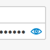
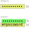
Inspired by a pattern seen in Polar, IE 10+ and LinkedIn and documented by Luke W, hideShowPassword lets you easily hide and show passwords via JavaScript or a nifty inset toggle.
The plugin works in any browser that supports resetting the type attribute of <input> elements (pretty much everything newer than IE8). The plugin should fall back gracefully in cases where this is not supported.
Installation
Include the plugin after you've included jQuery:
<script src="//code.jquery.com/jquery-2.1.3.min.js"></script> <script src="path/to/hideShowPassword.min.js"></script>If Modernizr is also included, the plugin's touch enhancements will default to the value of Modernizr.touchevents.
Using npm and Browserify
npm install --save jquery npm install --save hideshowpassword var $ = require('jquery'); require('hideshowpassword');Using Bower
bower install hideshowpassword <script src="//code.jquery.com/jquery-2.1.3.min.js"></script> <script src="bower_components/hideShowPassword/hideShowPassword.min.js"></script>Usage
The plugin acts on <input> elements (typically password fields):
<input id="password" type="password">Showing, hiding and toggling
You can quickly show, hide or toggle the visibility of the field's contents:
$('#password').showPassword(); // Reveal $('#password').hidePassword(); // Hide $('#password').togglePassword(); // ToggleThese are all shorthand versions of the hideShowPassword method:
$('#password').hideShowPassword(true); // Reveal $('#password').hideShowPassword(false); // Hide $('#password').hideShowPassword('toggle'); // ToggleEnabling the inner toggle button
The inner toggle functionality tends to steal the show for this plugin. You can pass it along as the second argument of the hideShowPassword method:
// Reveal password by default and create an inner toggle $('#password').hideShowPassword(true, true);Or as the first argument of any of the shorthand methods:
// Reveal password by default and create an inner toggle $('#password').showPassword(true);If you would like the inner toggle to be hidden until a specific event, you can pass along that event as a string instead:
// Hide the inner toggle till the #password element is focused $('#password').showPassword('focus');Specifying more options
Any additional options may be modified by passing along an object as the last argument of any of the aformentioned methods. Here's the previous example, but with a custom class for the toggle:
$('#password').hideShowPassword(true, 'focus', { toggle: { className: 'my-toggle' } });In fact, we could pass along all of these arguments as a single object if we want:
$('#password').hideShowPassword({ show: true, innerToggle: 'focus', toggle: { className: 'my-toggle' } });There are many options available if your project's needs are particularly unique.
Events
If you need to respond to changes to the password field's visibility, you can use any of the following events:
$('#password') .on('hideShowPasswordInit', function(){ console.log('plugin initialized'); }) .on('passwordVisibilityChange', function(){ console.log('password shown or hidden'); }) .on('passwordShown', function(){ console.log('password shown'); }) .on('passwordHidden', function(){ console.log('password hidden'); });Options
Here are all of the available options and their defaults:
.hideShowPassword({ // Visibility of the password text. Can be true, false, 'toggle' // or 'infer'. If 'toggle', it will be the opposite of whatever // it currently is. If 'infer', it will be based on the input // type (false if 'password', otherwise true). show: 'infer', // Set to true to create an inner toggle for this input. Can // also be sent to an event name to delay visibility of toggle // until that event is triggered on the input element. innerToggle: false, // If false, the plugin will be disabled entirely. Set to // the outcome of a test to insure input attributes can be // set after input has been inserted into the DOM. enable: canSetInputAttribute, // Event to trigger whenever the element is toggled. // For example, if 'focus' it will focus the cursor in the // input element after toggling. triggerOnToggle: false, // Class to add to input element when the plugin is enabled. className: 'hideShowPassword-field', // Event to trigger when the plugin is initialized and enabled. initEvent: 'hideShowPasswordInit', // Event to trigger whenever the visibility changes. changeEvent: 'passwordVisibilityChange', // Properties to add to the input element. props: { autocapitalize: 'off', autocomplete: 'off', autocorrect: 'off', spellcheck: 'false' }, // Options specific to the inner toggle. toggle: { // The element to create. element: '<button type="button">', // Class name of element. className: 'hideShowPassword-toggle', // Whether or not to support touch-specific enhancements. // Defaults to the value of Modernizr.touchevents if available, // otherwise false. touchSupport: (typeof Modernizr === 'undefined') ? false : Modernizr.touchevents, // Non-touch event to bind to. attachToEvent: 'click.hideShowPassword', // Event to bind to when touchSupport is true. attachToTouchEvent: 'touchstart.hideShowPassword mousedown.hideShowPassword', // Key event to bind to if attachToKeyCodes is an array // of at least one keycode. attachToKeyEvent: 'keyup', // Key codes to bind the toggle event to for accessibility. // If false, this feature is disabled entirely. // If true, the array of key codes will be determined based // on the value of the element option. attachToKeyCodes: true, // Styles to add to the toggle element. Does not include // positioning styles. styles: { position: 'absolute' }, // Styles to add only when touchSupport is true. touchStyles: { pointerEvents: 'none' }, // Where to position the inner toggle relative to the // input element. Can be 'right', 'left' or 'infer'. If // 'infer', it will be based on the text-direction of the // input element. position: 'infer', // Where to position the inner toggle on the y-axis // relative to the input element. Can be 'top', 'bottom' // or 'middle'. verticalAlign: 'middle', // Amount by which to "offset" the toggle from the edge // of the input element. offset: 0, // Attributes to add to the toggle element. attr: { role: 'button', 'aria-label': 'Show Password', title: 'Show Password', tabIndex: 0 } }, // Options specific to the wrapper element, created // when the innerToggle is initialized to help with // positioning of that element. wrapper: { // The element to create. element: '<div>', // Class name of element. className: 'hideShowPassword-wrapper', // If true, the width of the wrapper will be set // unless it is already the same width as the inner // element. If false, the width will never be set. Any // other value will be used as the width. enforceWidth: true, // Styles to add to the wrapper element. Does not // include inherited styles or width if enforceWidth // is not false. styles: { position: 'relative' }, // Styles to "inherit" from the input element, allowing // the wrapper to avoid disrupting page styles. inheritStyles: [ 'display', 'verticalAlign', 'marginTop', 'marginRight', 'marginBottom', 'marginLeft' ], // Styles for the input element when wrapped. innerElementStyles: { marginTop: 0, marginRight: 0, marginBottom: 0, marginLeft: 0 } }, // Options specific to the 'shown' or 'hidden' // states of the input element. states: { shown: { className: 'hideShowPassword-shown', changeEvent: 'passwordShown', props: { type: 'text' }, toggle: { className: 'hideShowPassword-toggle-hide', content: 'Hide', attr: { 'aria-pressed': 'true' title: 'Hide Password', } } }, hidden: { className: 'hideShowPassword-hidden', changeEvent: 'passwordHidden', props: { type: 'password' }, toggle: { className: 'hideShowPassword-toggle-show', content: 'Show', attr: { 'aria-pressed': 'false', title: 'Show Password', } } } } });Known Issues
Competing controls in IE10+ (Windows 8)
Internet Explorer 10 introduced its own controls for password and text input fields that sometimes compete with the inner toggle functionality of this plugin. Thankfully, they are easily overwritten using CSS:
::-ms-reveal, ::-ms-clear { display: none !important; }Error when debugging IE8 or earlier in IE9+ Developer Tools
For some reason the plugin returns a false positive when feature-testing unless honest-to-goodness IE8 or earlier is used.
Toggle quirks in invisible elements
If you use the inner toggle feature on an invisible element, it may not have enough information to correctly style the wrapper and toggle elements. It's recommended that you delay instantiation of the plugin until the elements are visible.
Here's a hypothetical example using a Bootstrap modal:
$('#my-modal').on('shown.bs.modal', function (event) { $('#password').showPassword(true); });History
- 2.1.0: Add
triggerOnTogglefeature (#56) - 2.0.11: Fix for Bower install on Windows (#44)
- 2.0.10: Update Modernizr test (#42)
- 2.0.9: Add
titleattributes to toggle by default (#41) - 2.0.8: Fixing bloated bundles bug (#39)
- 2.0.7: Fixing
inheritStylesbug (#34) - 2.0.6: Revising npm package name (#28)
- 2.0.5: Revising npm package repo URL (#28)
- 2.0.4: Namespaced events (#20), npm support (#21)
- 2.0.3: Removed errant
console.logcall (#13) - 2.0.2:
classNameoption now instantiates oninit(#11) - 2.0.1: Fix for missing innerElementStyles
- 2.0.0: Major rewrite with better accessibility and deeper options
- 1.0.3: Added wrapperWidth option
- 1.0.2: Uses deep merge for options
- 1.0.1: Added AMD support
- 1.0.0: Voila!
License
Released under the MIT License.
This repository contains other libraries that may or may not fall under the same license:
