fuzzy-dropdown
fuzzy-dropdown is a jQuery plugin that converts a select box into a fuzzy searchable dropdown (using https://github.com/krisk/fuse subsequence-search).
What is fuzzy string matching/searching?
In computer science, approximate string matching (often colloquially referred to as fuzzy string searching) is the technique of finding strings that match a pattern approximately (rather than exactly). - Wikipedia
Now, back to your regularly scheduled readme
fuzzy-dropdown proxies your interactions to the underlying select box. Hence you can add event handlers to the select box like before and have everything just work. Also, the dropdown is fully navigable via arrow keys. Look at the example in the examples/ directory for usage. Did you say demo?
Changelog
1.0.0
- Switched from Fuse to subsequence-search to provide a more predictable and expected filtering experience
0.0.11
- Bugfixes
0.0.10
- Added the
enableBrowserDefaultScrolloption
0.0.9
- Minor bugfixes, code rearrangement
0.0.8
- Minor bugfixes, code rearrangement
0.0.7
- Minor bugfixes, code reorganisation and Makefile addition
Installation
npm install fuzzy-dropdownIf you plan on using fuzzy-dropdown as a standalone plugin, i.e., include jquery on your page separately followed by including fuzzy-dropdown separately, then include node_modules/fuzzy-dropdown/dist/fuzzy-dropdown.min.js.
If you plan on importing fuzzy-dropdown as a module (for use with browserify, etc) then just go ahead and require('fuzzy-dropdown') and it'll work like it's supposed to.
Usage
The javascript
$( your_select_box_selector ).fuzzyDropdown( options );fuzzyDropdown takes the following options:
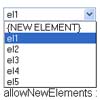
mainContainer: This is the jQuery selector for the parent containerarrowUpClass: Even the arrows are drawn via css and this is the class name that shows the arrow facing upselectedClass: Name of the css class that will be used to highlight dropdown items when arrow keys are used to navigate them. It is usually the same as your dropdown list item :hover style.enableBrowserDefaultScroll(falseby default): A boolean value that enables or disables normal browser behaviour (scroll up and down) on arrow up and down presses. You might want to set this totrueif you have a list that is longer than the current viewport height.transforms: Transforms object passed to subsequence-search. The object is combined with the default ranking transform and run after it.
$('#fuzzOptionsList').fuzzyDropdown({ mainContainer: '#fuzzSearch', arrowUpClass: 'fuzzArrowUp', selectedClass: 'selected', enableBrowserDefaultScroll: true });The markup
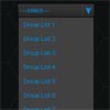
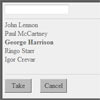
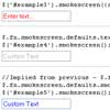
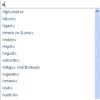
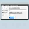
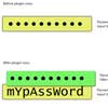
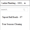
<select id="fuzzOptionsList"> <option value="1">Tapout</option> <option value="2">Four Seasons</option> <option value="3">Ike's Place</option> <option value="4">Coats</option> </select> <div id="fuzzSearch"> <div id="fuzzNameContainer"> <span class="fuzzName"></span> <span class="fuzzArrow"></span> </div> <div id="fuzzDropdownContainer"> <input type="text" value="" class="fuzzMagicBox" placeholder="search.." /> <span class="fuzzSearchIcon"></span> <ul id="fuzzResults"> </ul> </div> </div>Note:
- You can use any class names or ids. The ones in the example above are just the ones that I've used in
examples/fuzzyDropdown.html.
The styling
fuzzy-dropdown by itself does no styling. All the styling is controlled via css.
This gives you complete freedom to style your dropdown however you want and it'll all just work. Below is some example css.
* { box-sizing: border-box; } #fuzzSearch { width: 50%; } #fuzzNameContainer { height: 40px; padding: 4px 10px; border: 1px solid #999; box-shadow: inset 0 0 2px 0px #333; width: 100%; cursor: pointer; line-height: 1.9em; } .fuzzName { display: inline-block; width: 96%; white-space: nowrap; overflow: hidden; text-overflow: ellipsis; } .fuzzArrow { width: 0; border-style: solid; border-color: #333 transparent transparent transparent; border-width: 7px; display: inline-block; cursor: pointer; position: relative; top: -3px; -webkit-transition: all 0.1s ease-in; transition: all 0.1s ease-in; } .fuzzArrow:hover { border-top-color: #888; } .fuzzArrow.fuzzArrowUp { border-color: transparent transparent #333 transparent; top: -11px; } #fuzzDropdownContainer { display: none; width: 100%; margin: 0 0 5px 0; border: 1px solid #999; padding: 12px 4px 4px; position: relative; } .fuzzMagicBox { width: 99%; height: 26px; margin: 0 auto; } .fuzzSearchIcon { width: 20px; height: 30px; position: relative; display: inline-block; background: transparent; top: -20px; left: 95%; } .fuzzSearchIcon:before, .fuzzSearchIcon:after { content: ''; display: block; position: absolute; right: 5px; } .fuzzSearchIcon:before { width: 8px; height: 8px; border-radius: 50%; border: 1px solid #aaa; } .fuzzSearchIcon:after { height: 7px; border-right: 1px solid #aaa; top: 9px; -webkit-transform: rotate(-32deg); -ms-transform: rotate(-32deg); } #fuzzResults { cursor: pointer; } #fuzzResults li:hover { color: #aaa; } #fuzzResults li.selected { color: #aaa; } #fuzzResults li { list-style: none; margin: 20px 0; }And you're done!


