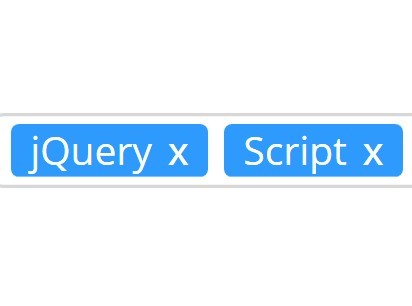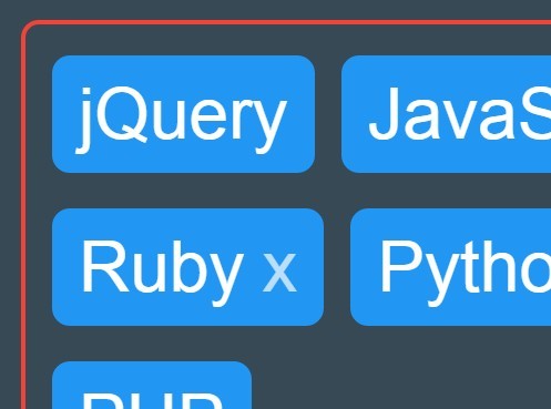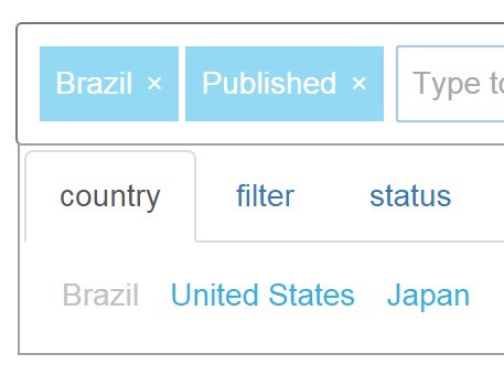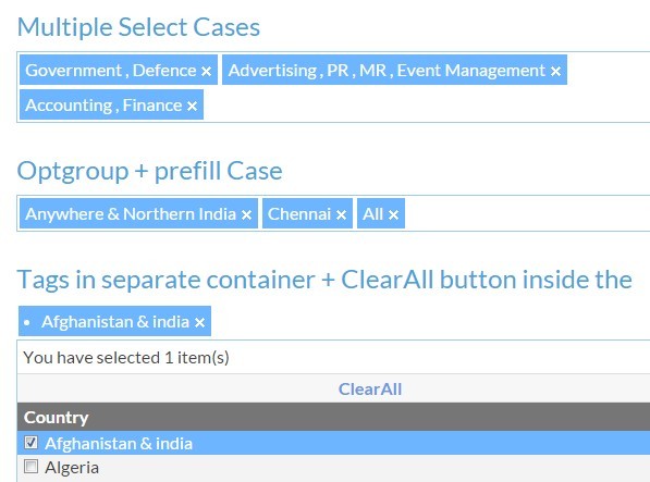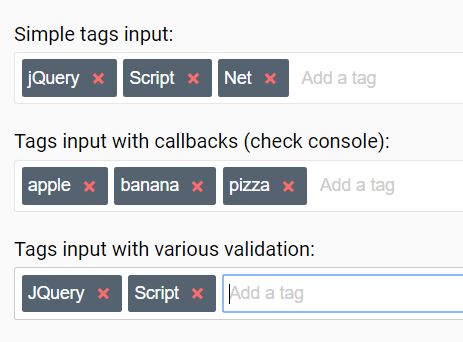
Tagify - lightweight input "tags" script
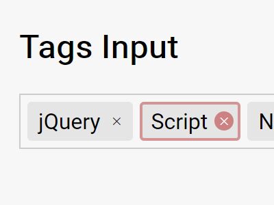
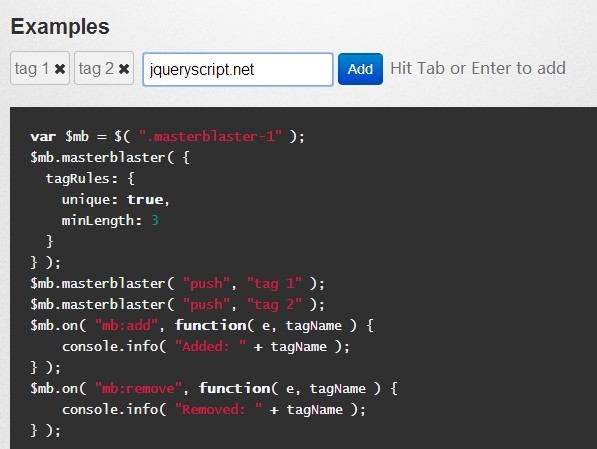
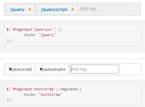
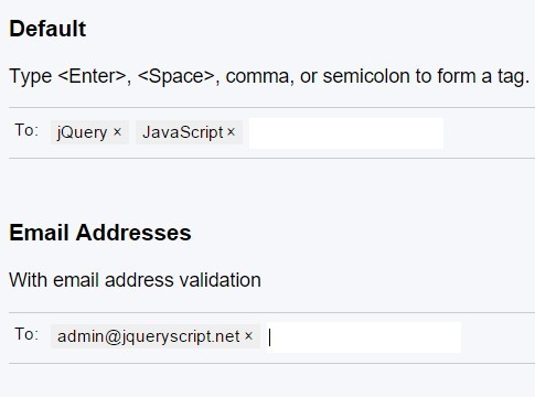
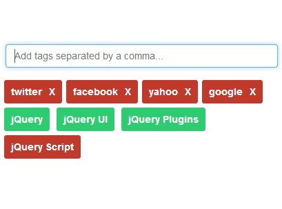
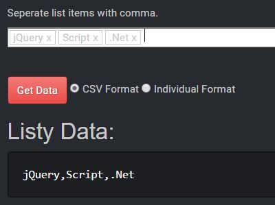
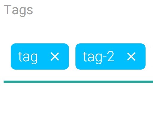
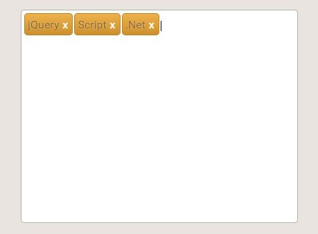
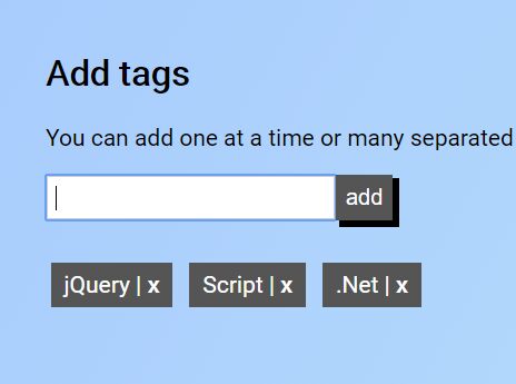
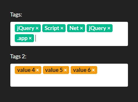
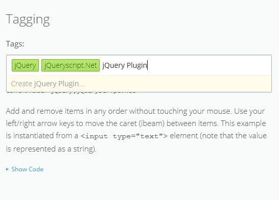
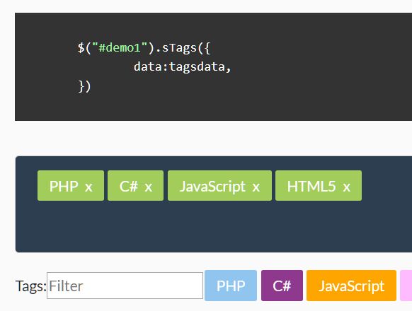
Transforms an input field or a textarea into a Tags component, in an easy, customizable way, with great performance and tiny code footprint.
Documentation & Demos
Table of contents
- Installation
- Selling points
- What can Tagify do
- Building the project
- Adding tags dynamically
- Ajax whitelist
- Edit tags
- DOM Templates
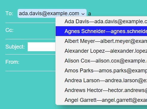
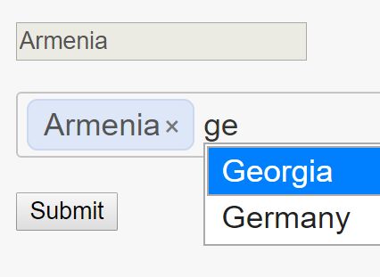
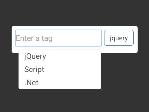
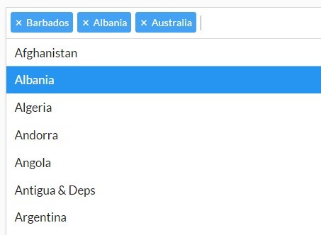
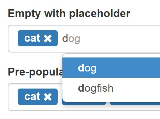
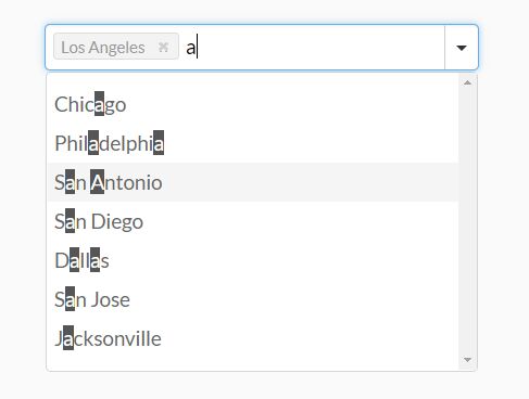
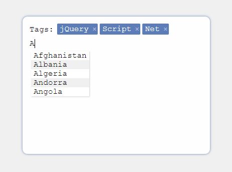
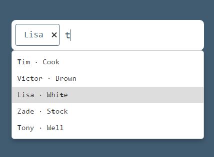
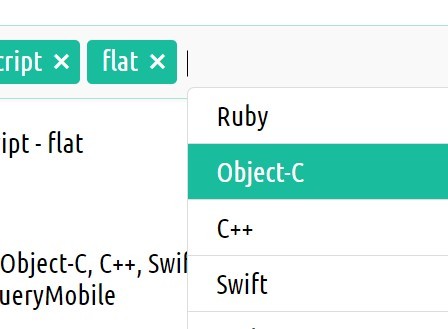
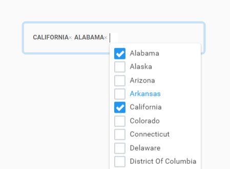
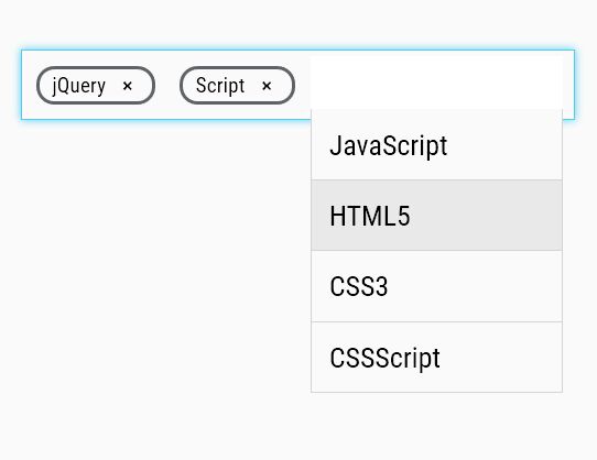
- Suggestions selectbox
- React wrapper
- Angular wrapper
- jQuery version
- FAQ
- Methods
- Events
- Settings
Installation
npm i @yaireo/tagify --save // usage: import Tagify from '@yaireo/tagify' var tagify = new Tagify(...) Selling points
- JS minified
~21kb(~7kbGZIP) - CSS minified
~7kb(~2kbGZIP) - well-crafted flexible code - Easily customized
- Easily change direction to RTL via the SCSS file only
- No other inputs are used beside the original, and its value is kept in sync
- ARIA accessibility support
- Exposed custom events
- Internet Explorer - A polyfill script can be used:
tagify.polyfills.min.jsin/dist
What can Tagify do
- Can be applied on input & textarea elements
- Supports mix content (text and tags together)
- Supports whitelist
- Supports blacklists
- Shows suggestions selectbox (flexiable settings & styling)
- Allows setting aliases to suggestions for easier searching
- Auto-complete input as-you-type (whitelist first match)
- Can paste in multiple values:
tag 1, tag 2, tag 3 - Tags can be created by Regex delimiter or by pressing the "Enter" key / focusing of the input
- Validate tags by Regex pattern
- Tags are editable
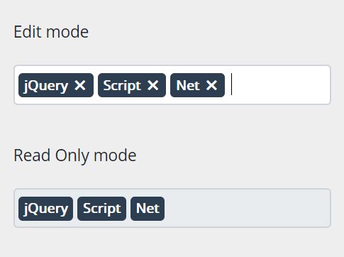
- Supports read-only mode to the whole componenet or per-tag
- Each tag can have any properties desired (class, data-whatever, readonly...)
- Automatically disallow duplicate tags (vis "settings" object)
- Tags can be trimmed via
hellipby givingmax-widthto thetagelement in yourCSS
Building the project
Simply run gulp in your terminal, from the project's path (Gulp should be installed first).
Source files are this path: /src/
Output files, which are automatically generated using Gulp, are in: /dist/
The rest of the files are most likely irrelevant.
Adding tags dynamically
var tagify = new Tagify(...); tagify.addTags(["banana", "orange", "apple"]) // or add tags with pre-defined propeties tagify.addTags([{value:"banana", color:"yellow"}, {value:"apple", color:"red"}, {value:"watermelon", color:"green"}])output value
There are two possible ways to get the value of the tags:
- Access the tagify's instance's
valueprop:tagify.value(Array of tags) - Access the original input's value:
inputElm.value(Stringified Array of tags)
Ajax whitelist
Dynamically-loaded suggestions list (whitelist) from the server (as the user types) is a frequent need to many.
Below is a basic example using the fetch API. I advise to abort the last request on any input before starting a new request.
var input = document.querySelector('input'), tagify = new Tagify(input, {whitelist:[]}), controller; // for aborting the call // listen to any keystrokes which modify tagify's input tagify.on('input', onInput) function onInput( e ){ var value = e.detail; tagify.settings.whitelist.length = 0; // reset the whitelist // https://developer.mozilla.org/en-US/docs/Web/API/AbortController/abort controller && controller.abort(); controller = new AbortController(); fetch('http://get_suggestions.com?value=' + value, {signal:controller.signal}) .then(RES => RES.json()) .then(function(whitelist){ tagify.settings.whitelist = whitelist; tagify.dropdown.show.call(tagify, value); // render the suggestions dropdown }) }Edit tags
Tags which aren't read-only can be edited by double-clicking them.
The value is saved on blur or by pressnig enter key. Pressing Escaspe will revert the change trigger blur. ctrlz will revert the change if an edited tag was marked as not valid (perhaps duplicate or blacklisted)
DOM Templates
It's possible to control the templates for the following HTML elements tagify generates by modying the settings.templates Object with your own custom functions which should output a string.
The defaults are:
templates : { wrapper(input, settings){ return `<tags class="tagify ${settings.mode ? "tagify--mix" : "" } ${input.className}" ${settings.readonly ? 'readonly' : ''}> <span contenteditable data-placeholder="${input.placeholder || '​'}" class="tagify__input"></span> </tags>` }, tag(v, tagData){ return `<tag title='${v}' contenteditable='false' spellcheck="false" class='tagify__tag ${tagData.class ? tagData.class : ""}' ${this.getAttributes(tagData)}> <x title='' class='tagify__tag__removeBtn'></x><div><span class='tagify__tag-text'>${v}</span></div> </tag>` }, dropdownItem( item ){ var sanitizedValue = (item.value || item).replace(/`|'/g, "'"); return `<div ${this.getAttributes(item)} class='tagify__dropdown__item ${item.class ? item.class : ""}'>${sanitizedValue}</div>`; } }Suggestions selectbox
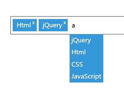
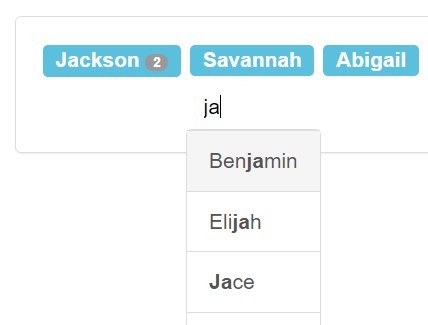
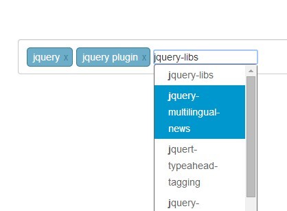
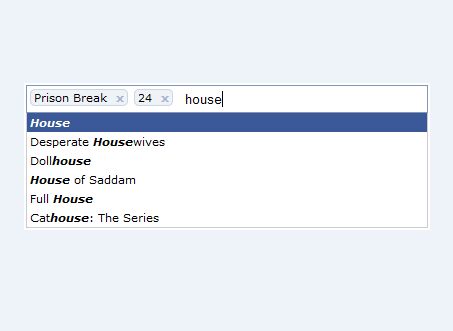
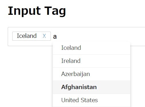
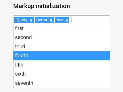
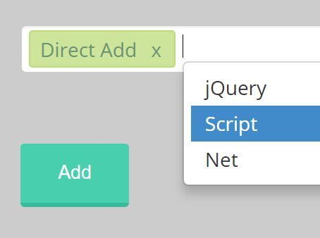
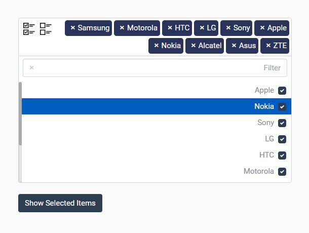
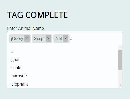
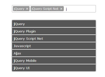
The suggestions selectbox is shown is a whitelist Array of Strings or Objects was passed in the settings when the Tagify instance was created. Suggestions list will only be rendered if there are at least two matching sugegstions (case-insensetive).
The selectbox dropdown will be appended to the document's <body> element and will be rendered by default in a position below (bottom of) the Tagify element. Using the keyboard arrows up/down will highlight an option from the list, and hitting the Enter key to select.
It is possible to tweak the selectbox dropdown via 2 settings:
- enabled - this is a numeral value which tells Tagify when to show the suggestions dropdown, when a minimum of N characters were typed.
- maxItems - Limits the number of items the suggestions selectbox will render
var input = document.querySelector('input'), tagify = new Tagify(input, { whitelist : ['aaa', 'aaab', 'aaabb', 'aaabc', 'aaabd', 'aaabe', 'aaac', 'aaacc'], dropdown : { classname : "color-blue", enabled : 3, maxItems : 5 } });Will render:
<div class="tagify__dropdown" style="left: 993.5px; top: 106.375px; width: 616px;"> <div class="tagify__dropdown__item" value="aaab">aaab</div> <div class="tagify__dropdown__item" value="aaabb">aaabb</div> <div class="tagify__dropdown__item" value="aaabc">aaabc</div> <div class="tagify__dropdown__item" value="aaabd">aaabd</div> <div class="tagify__dropdown__item" value="aaabe">aaabe</div> </div>By default searching the suggestions is using fuzzy-search (see settings).
If you wish to assign alias to items (in your suggestion list), add the searchBy property to whitelist items you wish to have an alias for. In the blow example, when typing any of the words from the searchBy property, the suggestion listen will match "Israel".
Example for a suggestion item alias
whitelist = [ ... { value:'Israel', code:'IL', searchBy:'holy land, desert, middle east' }, ... ]mixed-content
To use this feature it must be toggled - see settings.
When mixing text with tags, the original textarea (or input) element will have a value as follows:
[[cartman]] and [[kyle]] do not know [[Homer simpson]] If the inital value of the textarea or input is formatted as the above example, tagify will try to automatically convert everything between [[ & ]] to a tag, if tag exists in the whitelist, so make sure when the Tagify instance is initialized, that it has tags with the correct value property that match the same values that appear between [[ & ]].
React
A Tagify React component is exported as <Tags> from react.tagify.js:
Check the codepen demo for a live React integration example
Angular
TagifyComponent which will be used by your template as <tagify>
Example:
<div> testing tagify wrapper <tagify [settings]="settings" (add)="onAdd($event)" (remove)="onRemove($event)"> </tagify> <button (click)="clearTags()">clear</button> <button (click)="addTags()">add Tags</button> </div> TagifyService
(The tagifyService is a singletone injected by angular, do not create a new instance of it)
import {Component, OnDestroy} from '@angular/core'; import {TagifyService} from 'ngTagify'; @Component({ selector: 'app-root', templateUrl: './app.component.html', styleUrls: ['./app.component.css'] }) export class AppComponent implements OnDestroy { constructor(private tagifyService: TagifyService) {} public settings = { blacklist: ['fucking', 'shit']}; onAdd(tagify) { console.log('added a tag', tagify); } onRemove(tags) { console.log('removed a tag', tags); } clearTags() { this.tagifyService.removeAll(); } addTags() { this.tagifyService.addTags(['this', 'is', 'cool']); } ngOnDestroy() { this.tagifyService.destroy(); } }jQuery version
jQuery.tagify.js
A jQuery wrapper verison is also available, but I advise not using it because it's basically the exact same as the "normal" script (non-jqueryfied) and all the jQuery's wrapper does is allowing to chain the event listeners for ('add', 'remove', 'invalid')
$('[name=tags]') .tagify() .on('add', function(e, tagName){ console.log('added', tagName) });Accessing methods can be done via the .data('tagify'):
$('[name=tags]').tagify(); // get tags from the server (ajax) and add them: $('[name=tags]').data('tagify').addTags('aaa, bbb, ccc')FAQ
- Double-click tag fires both "edit" & "click" custom events
- Manualy open the suggestions dropdown
- Render your own suggestions dropdown
- Allow max length on mix mode
- Always show dropdown
- Limit the length of a tag value (minimum & maximum)
- Mixed mode initial value
- Random colors for each tag
- Format input value for server side
Methods
| Name | Info |
|---|---|
| destroy | Reverts the input element back as it was before Tagify was applied |
| removeAllTags | Removes all tags and resets the original input tag's value property |
| addTags | Accepts a String (word, single or multiple with a delimiter), an Array of Objects (see above) or Strings |
| removeTag | Removes a specific tag. Argument is the tag DOM element to be removed. When nothing passed, removes last tag (see source code) |
| loadOriginalValues | Converts the input's value into tags. This method gets called automatically when instansiating Tagify |
| getTagIndexByValue | |
| getTagElmByValue | |
| parseMixTags | Converts a String argument ([[foo]] and [[bar]] are..) into HTML with mixed tags & texts |
Events
| Name | Info |
|---|---|
| add | A tag has been added |
| remove | A tag has been removed |
| invalid | A tag has been added but did not pass vaildation. See event detail |
| input | Input event, when a tag is being typed/edited. e.detail exposes value, inputElm & isValid |
| click | Clicking a tag. Exposes the tag element, its index & data |
| edit | A tag has been edited |
| dropdown:show | Suggestions dropdown is to be rendered. The dropdown DOM node is passed in the callback, see demo. |
| dropdown:hide | Suggestions dropdown has been removed from the DOM |
Settings
| Name | Type | Default | Info |
|---|---|---|---|
| delimiters | String | "," | [regex] split tags by any of these delimiters. Example: `", |
| pattern | String | null | Validate input by REGEX pattern (can also be applied on the input itself as an attribute) Ex: `/[1-9]/`` |
| mode | String | null | use 'mix' as value to allow mixed-content. The 'pattern' setting must be set to some character. |
| duplicates | Boolean | false | Should duplicate tags be allowed or not |
| enforceWhitelist | Boolean | false | Should ONLY use tags allowed in whitelist |
| autocomplete | Boolean | true | Tries to autocomplete the input's value while typing (match from whitelist) |
| whitelist | Array | [] | An array of tags which only they are allowed |
| blacklist | Array | [] | An array of tags which aren't allowed |
| addTagOnBlur | Boolean | true | Automatically adds the text which was inputed as a tag when blur event happens |
| callbacks | Object | {} | Exposed callbacks object to be triggered on events: 'add' / 'remove' tags |
| maxTags | Number | Infinity | Maximum number of allowed tags. when reached, adds a class "hasMaxTags" to <Tags> |
| templates | Object | wrapper, tag, dropdownItem | Object consisting of functions which return template strings |
| transformTag | Function | undefined | Takes a tag input as argument and returns a transformed value |
| keepInvalidTags | Boolean | false | If true, do not remove tags which did not pass validation |
| skipInvalid | Boolean | false | If true, do not temporarily add invalid tags before automatically removing them |
| backspace | * | true | On backspace: (true) - remove last tag, (`"edit"``) - edit last tag |
| dropdown.enabled | Number | 2 | Minimum characters to input to show the suggestions list. "false" to disable |
| dropdown.maxItems | Number | 10 | Maximum items to show in the suggestions list dropdown |
| dropdown.classname | String | "" | Custom class name for the dropdown suggestions selectbox |
| dropdown.itemTemplate | Function | "" | Returns a custom string for each list item in the dropdown suggestions selectbox |
| dropdown.fuzzySearch | Boolean | true | Enables filtering dropdown items values' by string containing and not only beginning |
| dropdown.position | String | null | manual will not render the dropdown, and you would need to do it yourself. See "events" section. |
