vue-avatar
An avatar component for vue.js.
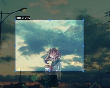
This component display an avatar image and if none is provided fallback to the user initials. This component is highly inspired from react-user-avatar.
Rules used to compute user initials:
- divide the username on space and hyphen
- use the first letter of each parts
- never use more than three letters as initials
- if the username is divided in more than three parts and has part starting with an uppercase, skip parts starting with a lowercase.
You can find a few examples and the documentation here
Installation
npm install vue-avatar
Version
| Vuejs version | vue-avatar version |
|---|---|
| ^1.0.18 | ^1.3.0 |
| ^2.0.0 | ^2.0.0 |
Usage
vue-avatar is a UMD module, which can be used as a module in both CommonJS and AMD modular environments. When in non-modular environment, Avatar will be registered as a global variable.
ES6
import Avatar from 'vue-avatar' export default { ... components: { Avatar }, ... }After that, you can use it in your templates:
<avatar username="Jane Doe"></avatar>CommonJS
var Vue = require('vue') var Avatar = require('vue-avatar') var YourComponent = Vue.extend({ ... components: { 'avatar': Avatar.Avatar }, ... })Browser
<script src="path/to/vue/vue.min.js"></script> <script src="path/to/vue-avatar/dist/vue-avatar.min.js"></script> new Vue({ ... components: { 'avatar': VueAvatar.Avatar }, ... }) Props
| Name | Required | Default | Type | Description |
|---|---|---|---|---|
| username | N | - | String | The user name that will be used to compute user initial. |
| initials | N | - | String | Force the displayed initials by overriding the computed ones. |
| inline | N | false | Boolean | Uses inline-flex instead of flex |
| src | N | - | String | Path to the avatar image to display. |
| :customStyle | N | - | Object | A custom style object to override the base styles. |
| backgroundColor | N | - | String | The avatar background color to use if no image is provided. If none is specified, a background color will be picked depending on the user name length. |
| color | N | - | String | The font color used to render the user initials. If none is provided, the background color is used to compute the font color. |
| :lighten | N | 80 | Number | A factor by which the background color must be lightened to produce the font color. Number between [-100,100]. |
| :size | N | 50 | Number | The avatar size in pixel. |
| :rounded | N | true | Boolean | True if the avatar must be rounded. |
Event
| Name | Arguments | Description |
|---|---|---|
| @avatar-initials | username (the value of the username props), initials (the value of the computed initials or the initials props if any) | This event is trigger when the component is ready with component username and initial. |
Build Setup
# install dependencies npm install # serve gh pages with hot reload at localhost:8080/gh-pages/index.html npm run dev # build npm run bundleTest
npm testLicense
Released under the MIT License.
