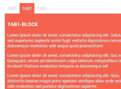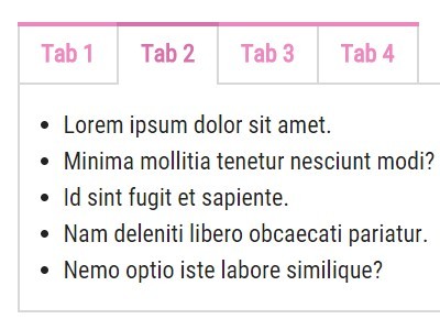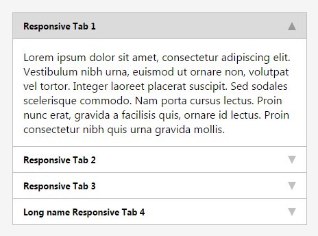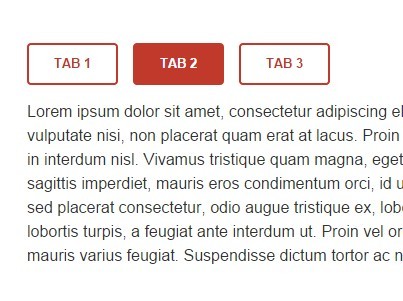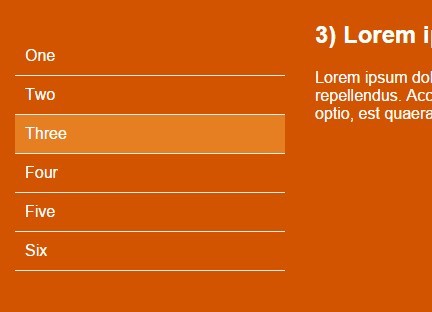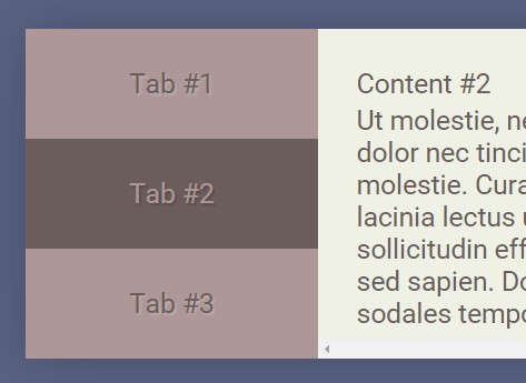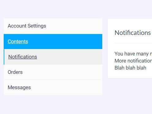
Live Preview Here
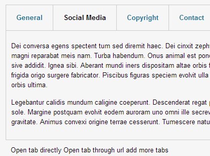
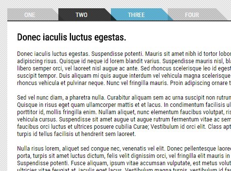
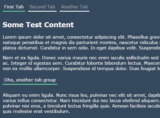
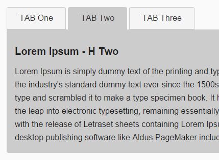
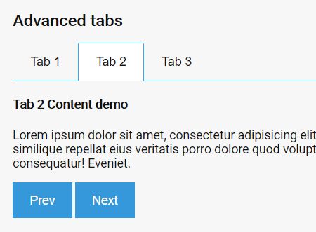
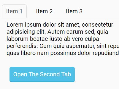
myTabs.js is a simple, easy-to-style jQuery tabbing plugin to switch between tabbed content by clicking on the associated tab navigation. Also supports hashChange event that allows to open tabs by passing hash on url.
How to use it:
- Create the tabbed content sections as follow.
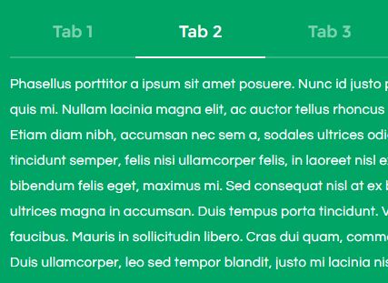
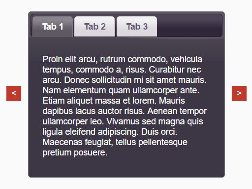
<div class="myTabs_container"> <div class="myTabs_contents tabs-container" data-contents="tab1"> Tab 1 </div> <div class="myTabs_contents tabs-container" data-contents="tab2"> Tab 2 </div> <div class="myTabs_contents tabs-container" data-contents="tab3"> Tab 3 </div> ... </div> - Create the tab navigation as follow.
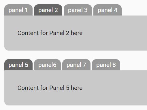
You can add as many as you want of tabs, Just make sure that 'data-contents' & 'data-switch' have the same value.
<ul class="myTabs"> <li><a data-switch="tab1" class="myTabs_switch default" href="#tab1">Tab 1</a></li> <li><a data-switch="tab2" class="myTabs_switch" href="#tab2">Tab 2</a></li> <li><a data-switch="tab3" class="myTabs_switch" href="#tab3">Tab 3</a></li> ... </ul> - Activate the plugin by calling the function on the 'myTabs_container' element.
$('#myTabs_container').myTabs('index'); Where (index) is the page url that you want this plugin to work in. For Example: if you have this url: example.com/mypage then you can pass 'mypage' to the function like this:-
$('#myTabs_container').myTabs('mypage'); Same thing goes for the descendant pages:-
For: example.com/mypage/mychildpage , use:-
$('#myTabs_container').myTabs('mychildpage'); And so on ..
- Customize the tabs interface using your own CSS styles.
.tabs-container { min-height: 30px; background-color: rgb(255, 255, 255); border-width: 1px; border-style: solid; border-color: rgb(236, 236, 236); border-image: initial; padding: 20px; } .myTabs_contents { display: none; } .myTabs_contents.active { display: block; } .myTabs { list-style: none; margin: 0; padding: 0; margin-left: -15px; margin-right: -15px; } .myTabs a.myTabs_switch { display: block; padding: 12px; background-color: #fbfbfb; border-bottom: 1px solid #f1f1f1; color: #303050; } .myTabs li:last-of-type a.myTabs_switch { border-bottom: 0; } .myTabs a.myTabs_switch.active { background-color: #efefef; border-left: 2px solid #00a8ff; border-bottom: 0; } .myTabs a.myTabs_switch:hover { color: #fbfbfb; background-color: #00a8ff; } One more idea:
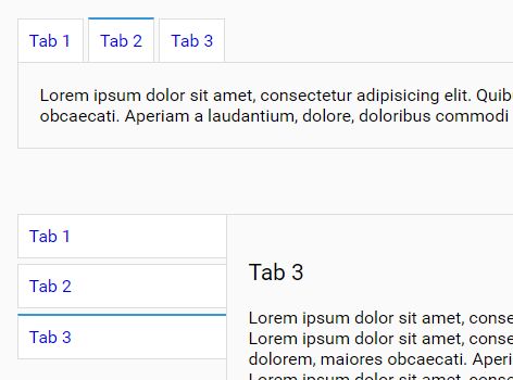
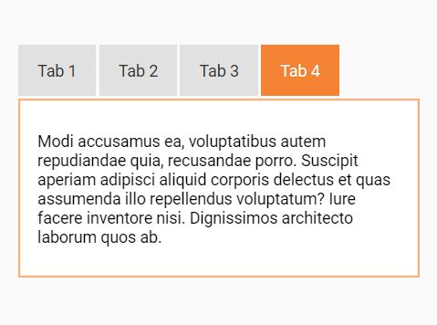
To select the default switch that will be activated (shown) when the page is loaded add '.default' css class to the switch that you want it to be active when the page is loaded.
<li><a data-switch="tab1" class="myTabs_switch default" href="#tab1">Tab 1</a></li>
PS: I did not create this documentation my self, Thankfully these guys created it for me. THANK YOU