Selectator
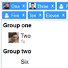
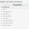
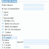
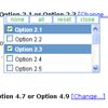
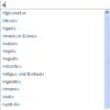
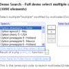
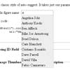
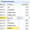
Selectator is a jQuery-based replacement for select boxes. It supports searching, custom renderers, remote data (ajax), search delay, minimum search length, selection remove/clear and placeholders. It affects the original select box directly, which is used as the data container. You can see a demo here.
Usage
include in head:
<link rel="stylesheet" href="fm.selectator.jquery.css"/> <script src="jquery-1.11.0.min.js"></script> <script src="fm.selectator.jquery.js"></script>to activate replacement:
$('#selectBox').selectator();If you don't wan't to meddle with scripting, there is an alternative to activate replacement, by using inline markup.
<select multiple class="selectator" data-selectator-keep-open="true">if you want to change settings:
$('#selectBox').selectator({ prefix: 'selectator_', // CSS class prefix height: 'auto', // Auto or element useDimmer: false, // Dims the screen when option list is visible useSearch: true, // If false, the search boxes are removed and // `showAllOptionsOnFocus` is forced to true showAllOptionsOnFocus: false, // Show the dropdown immediately when the control receives focus selectFirstOptionOnSearch: true, // Selects the topmost option on every search keepOpen: false, // If true, then the dropdown will not close when // selecting options, but stay open until losing focus submitCallback: function(value){}, // Callback function when enter is pressed and // no option is active in multi select box placeholder: '', // Placeholder text for the select, can also be // set on select element load: function(search, callback){ // Callback function when using remote data callback(results); }, delay: 0, // The amount of milleseconds to wait for doing a search minSearchLength: 0, // Mininum length of search string required for searching valueField: 'value', // The name of the property to use as the "value" // (not needed when custom rendering functions are defined) textField: 'text', // The name of the property to use as the "text" // (not needed when custom rendering functions are defined) searchFields: ['value', 'test'], // The fields to search in render: { selected_item: function (_item, escape) { var html = ''; if (typeof _item.left !== 'undefined') html += '<div class="' + self.options.prefix + 'selected_item_left"><img src="' + escape(_item.left) + '"></div>'; if (typeof _item.right !== 'undefined') html += '<div class="' + self.options.prefix + 'selected_item_right">' + escape(_item.right) + '</div>'; html += '<div class="' + self.options.prefix + 'selected_item_title">' + ((typeof _item.text !== 'undefined') ? escape(_item.text) : '') + '</div>'; if (typeof _item.subtitle !== 'undefined') html += '<div class="' + self.options.prefix + 'selected_item_subtitle">' + escape(_item.subtitle) + '</div>'; html += '<div class="' + self.options.prefix + 'selected_item_remove">X</div>'; return html; }, option: function (_item, escape) { var html = ''; if (typeof _item.left !== 'undefined') html += '<div class="' + self.options.prefix + 'option_left"><img src="' + escape(_item.left) + '"></div>'; if (typeof _item.right !== 'undefined') html += '<div class="' + self.options.prefix + 'option_right">' + escape(_item.right) + '</div>'; html += '<div class="' + self.options.prefix + 'option_title">' + ((typeof _item.text !== 'undefined') ? escape(_item.text) : '') + '</div>'; if (typeof _item.subtitle !== 'undefined') html += '<div class="' + self.options.prefix + 'option_subtitle">' + escape(_item.subtitle) + '</div>'; return html; } }, labels: { search: 'Search...' // Placeholder text in search box in single select box } });Extra attributes for option tags
By using data-left, data-right, data-subtitle or any other attributes you can extend the information made available to the renderers. The default ones left, right and subtitle can be styled through css, and are named prefix_title, prefix_left, prefix_right and prefix_subtitle. The class attributes from the original option and optgroup elements are also added to the genererated elements
<select id="selectBox"> <!-- Normal option tag --> <option value="1">This is the title</option> <!-- Extended option tag --> <option value="2" data-left="This is the left section" data-right="This is the right section" data-subtitle="This is the section under the title">This is the title</option> </select>It will be displayed something like this this:
| Left | Title | Right |
| Subtitle |
CSS classes
Here is a list of all the css classes
| Class | Description |
|---|---|
prefix_element | This is the new select box. It has some extra classes called single and multiple, which tell if it is a multiple selection or single selection select box. And also options-visible and options-hidden which tell if the options list is visible or not. |
prefix_selected_items | The holder for the selected items. |
prefix_selected_item | The holder for the selected item. |
prefix_selected_item_title | The title of the selected item. |
prefix_selected_item_left | The left section of the selected item. |
prefix_selected_item_right | The right section of the selected item. |
prefix_selected_item_subtitle | The bottom section of the selected item. |
prefix_selected_item_remove | The remove button for the selected item. |
prefix_input | This is the input box for the selectator. This is used together with options-visible or options-hidden to show and style it differently if it is a multiple selection box or a single selection box. |
prefix_textlength | This is used to calculate the size of the input box for the multiple selection box. |
prefix_options | The options list holder. This is used together with options-visible or options-hidden to show or hide the options. |
prefix_group_header | This is the group title option. |
prefix_group | This is the group options holder. |
prefix_option | This is a result option. It has an extra class called active which tells if the option is the active one. |
prefix_option_title | The title of the result option. |
prefix_option_left | The left section of the result option. |
prefix_option_right | The right section of the result option. |
prefix_option_subtitle | The bottom section of the result option. |
prefix_dimmer | This is the dimmer |
DOM Structure
- dimmer
- element: containing the
single|multipleclass and theoptions-visible|options-hiddenclass- textlength
- selected_items
- selected_item
- selected_item_left
- selected_item_right
- selected_item_title
- selected_item_subtitle
- selected_item_remove
- selected_item...
- selected_item
- input
- options
- group_header
- group
- option: containing the
activeclass- option_left
- option_right
- option_title
- option_subtitle
- option...
- option: containing the
- option: containing the
activeclass- option_left
- option_right
- option_title
- option_subtitle
- option...
jQuery methods
| Method | Description |
|---|---|
| refresh | This method is used to refresh the plugin. A scenario where this would be useful is if the data in the original select box is changed by some other script. |
| destroy | This method is used to remove the instance of the plugin from the select box and restore it to its original state. |
Method usage
$('#selectBox').selectator('refresh');or
$('#selectBox').selectator('destroy');Browser compatibility
- IE 8+
- Chrome 2+
- Firefox 3.5+
- Safari 4+
- Opera 11+
Internationalization
Selectator supports language by setting labels through the plugin options.
Copyright and license
The MIT License (MIT)
Copyright (c) 2013 Qodio
Permission is hereby granted, free of charge, to any person obtaining a copy of this software and associated documentation files (the "Software"), to deal in the Software without restriction, including without limitation the rights to use, copy, modify, merge, publish, distribute, sublicense, and/or sell copies of the Software, and to permit persons to whom the Software is furnished to do so, subject to the following conditions:
The above copyright notice and this permission notice shall be included in all copies or substantial portions of the Software.
THE SOFTWARE IS PROVIDED "AS IS", WITHOUT WARRANTY OF ANY KIND, EXPRESS OR IMPLIED, INCLUDING BUT NOT LIMITED TO THE WARRANTIES OF MERCHANTABILITY, FITNESS FOR A PARTICULAR PURPOSE AND NONINFRINGEMENT. IN NO EVENT SHALL THE AUTHORS OR COPYRIGHT HOLDERS BE LIABLE FOR ANY CLAIM, DAMAGES OR OTHER LIABILITY, WHETHER IN AN ACTION OF CONTRACT, TORT OR OTHERWISE, ARISING FROM, OUT OF OR IN CONNECTION WITH THE SOFTWARE OR THE USE OR OTHER DEALINGS IN THE SOFTWARE.
