Progression.js
A jQuery plugin that gives users real time hints & progress updates as they complete forms
Documentation
..:: Getting Started
Include the relevant files
Firstly include jQuery and the progression.css and progress.js files. Place these before </head> section
<link href='progression.css' rel='stylesheet' type='text/css'> <script type="text/javascript" src="http://ajax.googleapis.com/ajax/libs/jquery/1.7.2/jquery.min.js"></script> <script type="text/javascript" src="progression.js"></script> Create a form
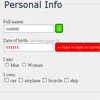
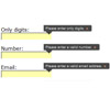
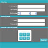
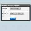
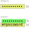
You must give your form a unique ID. You then need to add a data attribute of data-progression to each element that needs to be a step in the form progression.
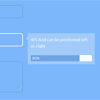
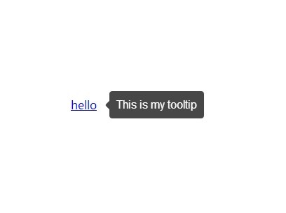
The helper text for the tooltip can be set by adding data-helper to the element. This is demonstrated below
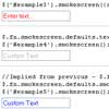
<form id="myform"> <p> <label for="">Name</label> <input data-progression="" type="text" data-helper="Help users through forms by prividing helpful hinters" name="name" value="" placeholder="" /> </p> </form> ##### Initiate the plugin Once you have created your form you will need to initiate the plugin.
At its most basic level you can initiate the plugin like:
$(document).ready(function ($) { $("#myform").progression(); }); If you want to initiate the plugin with options then you can do so like:
$("#myform").progression({ tooltipWidth: '200', tooltipPosition: 'right', tooltipOffset: '50', showProgressBar: true, showHelper: true, tooltipFontSize: '14', tooltipFontColor: 'fff', progressBarBackground: 'fff', progressBarColor: '6EA5E1', tooltipBackgroundColor: 'a2cbfa', tooltipPadding: '10', tooltipAnimate: true }); ..:: Options
<th>Default Value</th> <th>Description</th> <th>Valid Options</th> </tr> </thead> <tbody> <tr> <td>tooltipWidth</td> <td>200</td> <td>The width in pixels that you would like the tooltip to be</td> <td></td> </tr> <tr> <td>tooltipPosition</td> <td>right</td> <td>Whether the tooltip should sit to the left or right of the form</td> <td>left/right</td> </tr> <tr> <td>tooltipOffset</td> <td>50</td> <td>The width in pixels that you would like the offset of the tooltip to be</td> <td></td> </tr> <tr> <td>showProgressBar</td> <td>true</td> <td>Whether the progress bar should be displayed or not</td> <td>true/false</td> </tr> <tr> <td>showHelper</td> <td>true</td> <td>Whether the helper text should be shown or not</td> <td>true/false</td> </tr> <tr> <td>tooltipFontSize</td> <td>14</td> <td>Set the font size of the helper text in pixels</td> <td></td> </tr> <tr> <td>tooltipFontColor</td> <td>ffffff</td> <td>The hash color reference of the helper text</td> <td></td> </tr> <tr> <td>progressBarBackground</td> <td>ffffff</td> <td>The hash color reference of the progress bar background</td> <td></td> </tr> <tr> <td>progressBarColor</td> <td>6EA5E1</td> <td>The hash color reference of the progress bar</td> <td></td> </tr> <tr> <td>tooltipPadding</td> <td>10</td> <td>The padding for the tooltip in pixels</td> <td></td> </tr> <tr> <td>tooltipAnimate</td> <td>true</td> <td>Whether to animate the tooltip or not</td> <td>true/false</td> </tr> </tbody> | Variable |
|---|


