jQuery asTooltip 


A jQuery plugin for showing tooltip text when hover on a element.
Table of contents
- Main files
- Quick start
- Requirements
- Usage
- Examples
- Options
- Methods
- Events
- No conflict
- Browser support
- Contributing
- Development
- Changelog
- Copyright and license
Main files
dist/ ├── jquery-asTooltip.js ├── jquery-asTooltip.es.js ├── jquery-asTooltip.min.js └── css/ ├── asTooltip.css └── asTooltip.min.css Quick start
Several quick start options are available:
Download the latest build
- Development - unminified
- Production - minified
Install From Bower
bower install jquery-asTooltip --saveInstall From Npm
npm install jquery-asTooltip --saveInstall From Yarn
yarn add jquery-asTooltipBuild From Source
If you want build from source:
git clone [email protected]:amazingSurge/jquery-asTooltip.git cd jquery-asTooltip npm install npm install -g gulp-cli babel-cli gulp buildDone!
Requirements
jquery-asTooltip requires the latest version of jQuery.
Usage
Including files:
<link rel="stylesheet" href="/path/to/asTooltip.css"> <script src="/path/to/jquery.js"></script> <script src="/path/to/jquery-asTooltip.js"></script>Required HTML structure
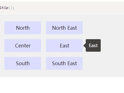
<span class="example" data-asTooltip-position="n" title="This is tip content">trigger</span>Initialization
All you need to do is call the plugin on the element:
jQuery(function($) { $('.example').asTooltip(); });Examples
There are some example usages that you can look at to get started. They can be found in the examples folder.
Options
jquery-asTooltip can accept an options object to alter the way it behaves. You can see the default options by call $.asTooltip.setDefaults(). The structure of an options object is as follows:
{ namespace: 'asTooltip', skin: '', closeBtn: false, position: { value: 'right middle', target: false, //mouse || jqueryObj container: false, auto: false, //if true, judge by positionContainer adjust: { mouse: true, //Work when positionTarget is mouse resize: true, scroll: true } }, show: { target: false, event: 'mouseenter', delay: 0 }, hide: { target: false, event: 'mouseleave', delay: 0, container: false, // only hideEvent is click, it can be body or obj inactive: false //if true, it is always show when tip hovering }, content: null, contentAttr: 'title', ajax: false, tpl: '<div class="{{namespace}}">' + '<div class="{{namespace}}-inner">' + '<div class="{{namespace}}-loading"></div>' + '<div class="{{namespace}}-content"></div>' + '</div>' + '</div>', onInit: null, onShow: null, onHide: null, onFocus: null, onBlur: null } Methods
Methods are called on asTooltip instances through the asTooltip method itself. You can also save the instances to variable for further use.
// call directly $().asTooltip('destroy'); // or var api = $().data('asTooltip'); api.destroy();show()
Show the tooltip.
$().asTooltip('show');hide()
Hide the tooltip.
$().asTooltip('enable');enable()
Enable the tooltip function.
$().asTooltip('enable');disable()
Disable the tooltip functions.
$().asTooltip('disable');destroy()
Destroy the tooltip instance.
$().asTooltip('destroy');Events
jquery-asTooltip provides custom events for the plugin’s unique actions.
$('.the-element').on('asTooltip::ready', function (e) { // on instance ready }); | Event | Description |
|---|---|
| init | Fires when the instance is setup for the first time. |
| ready | Fires when the instance is ready for API use. |
| show | Fired when the show instance method has been called. |
| hide | Fired when the hide instance method has been called. |
| enable | Fired when the enable instance method has been called. |
| disable | Fired when the enable instance method has been called. |
| destroy | Fires when an instance is destroyed. |
No conflict
If you have to use other plugin with the same namespace, just call the $.asTooltip.noConflict method to revert to it.
<script src="other-plugin.js"></script> <script src="jquery-asTooltip.js"></script> <script> $.asTooltip.noConflict(); // Code that uses other plugin's "$().asTooltip" can follow here. </script>Browser support
Tested on all major browsers.
 |  |  |  |  |  |
|---|---|---|---|---|---|
| Latest ✓ | Latest ✓ | Latest ✓ | Latest ✓ | 9-11 ✓ | Latest ✓ |
As a jQuery plugin, you also need to see the jQuery Browser Support.
Contributing
Anyone and everyone is welcome to contribute. Please take a moment to review the guidelines for contributing. Make sure you're using the latest version of jquery-asTooltip before submitting an issue. There are several ways to help out:
- Bug reports
- Feature requests
- Pull requests
- Write test cases for open bug issues
- Contribute to the documentation
Development
jquery-asTooltip is built modularly and uses Gulp as a build system to build its distributable files. To install the necessary dependencies for the build system, please run:
npm install -g gulp npm install -g babel-cli npm installThen you can generate new distributable files from the sources, using:
gulp build More gulp tasks can be found here.
Changelog
To see the list of recent changes, see Releases section.
Copyright and license
Copyright (C) 2016 amazingSurge.
Licensed under the LGPL license.