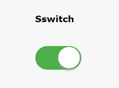
C-Switch
A jQuery plugin to handle radio and checkbox inputs.
The main idea behind this plugin, is that it will handle the code change, but you need to insert the classes to make it look like what you want.
How to user
Call jQuery:
<script src="path/to/jquery.min.js"></script>Call both files on this repository:
<script src="path/to/c-switch.js"></script> <link rel="stylesheet" type="text/css" href="path/to/c-switch.css">Create a input radio or a input checkbox as usual, wrapper in a div with the class "c_switch" and with an unique id.
e.g.
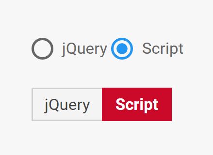
<div id="activate" class="c_switch"> <input type="radio" name="activate" value='yes'> <input type="radio" name="activate" value='no'> </div>Call the c_switch in a script tag.
e.g.
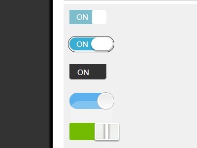
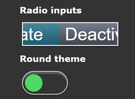
<script> jQuery('#activate').c_switch({ id: 'activate_switch', style: 'text', text_on: 'Activate', text_off: 'Deactivate', background_width: 'auto', }); </script>Radio
This code:
<div id="switch1" class="c_switch"> <input type="radio" name="test_switch1" value='1'> <input type="radio" name="test_switch1" value='0'> </div>$('#switch1').c_switch();Will become this code:
<div id="switch1" class="c_switch"> <input type="radio" name="test_switch1" value="1" style="display: none;"> <input type="radio" name="test_switch1" value="0" style="display: none;"> <div id="c_switch1_back" class="c_switch_inserted text c_square_back" style="zoom: 100%; width: 40px; height: 20px; margin: 2px; border: 1px solid rgb(204, 204, 204); transition: 0.5s ease; background-color: transparent;"> <div id="c_switch1_switch" class="c_square_toggle" style="width: 16px; height: 16px; margin: 2px 2px 2px 22px; transition: 0.5s ease; background-color: rgb(68, 68, 68);"></div> </div> </div>Checkbox
This code:
<div id="switch2" class="c_switch"> <input type="checkbox" name="test_switch2" value='1'> </div>$('#switch2').c_switch();Will become this code:
<div id="switch2" class="c_switch"> <input type="checkbox" name="test_switch2" value="1" style="display: none;"> <div id="c_switch2_back" class="c_switch_inserted text c_square_back" style="zoom: 100%; width: 40px; height: 20px; margin: 2px; border: 1px solid rgb(204, 204, 204); transition: 0.5s ease; background-color: transparent;"> <div id="c_switch2_switch" class="c_square_toggle" style="width: 16px; height: 16px; margin: 2px 2px 2px 22px; transition: 0.5s ease; background-color: rgb(68, 68, 68);"></div> </div> </div>Attributes
| Attribute | Default | Description |
|---|---|---|
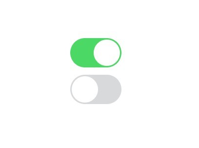
| style | 'square' | Switch style. Can be Text, Round or Square |
| id | 'c_element' | New elements will have this id. You must use it if you are going to insert more than two switches in a single page |
| switch_color_on | '#008000' | Color of the swith when it is on (radio: first option is selected) |
| switch_color_off | '#444444' | Color of the swith when it is off (radio: second option is selected) |
| switch_class | '' | General class that will wrap the switch |
| switch_class_on | '' | General class that will wrap the switch when it is on (radio: first option is selected) |
| switch_class_off | '' | General class that will wrap the switch when it is off (radio: second option is selected) |
| background_color_on | 'transparent' | Background color when it is on (radio: first option is selected) |
| background_color_off | 'transparent' | Backgroun color when it is off (radio: second option is selected) |
| background_border | '1px solid ' | Barckground border |
| background_border_color_on | '#CCCCCC' | Background border color when it is on (radio: first option is selected) |
| background_border_color_off | '#CCCCCC' | Backgroun border color when it is off (radio: second option is selected) |
| background_width | 40 | Width of the switch (If you are using text, will can use 'auto') |
| background_height | 20 | Height of the switch |
| background_margin | 2 | Margin of the switch |
| background_class | '' | Class that will wrap the background of the switch |
| background_class_on | '' | Class that will wrap the background of the switch when it is on (radio: first option is selected) |
| background_class_off | '' | Class that will wrap the background of the switch when it is off (radio: second option is selected) |
| text_on | 'On' | Text of the switch when it is on (radio: first option is selected) - Only works when style is set as text |
| text_off | 'Off' | Text of the switch when it is off (radio: second option is selected) - Only works when style is set as text |
| duration | 500 | Duration of the transition |
| animation | 'ease' | Transition animation (http://www.w3schools.com/cssref/css3_pr_transition-timing-function.asp) |
| zoom | 1 | Size of the switch (1 = 100%) |
| test | false | If test is true, it will show the default radio/checkbox together with the c-switch |
#Sample
Instead of show the defauld On/Off will show Enabled/Disable
jQuery('#switch1').c_switch({ id: 'switch', style: 'text', text_on: 'Enabled', text_off: 'Disabled', background_width: 'auto', });This will show the html standard elements for the radio or checkbox. As well, it will show the switch in a round style.
jQuery('#switch2').c_switch({ id: 'switch2', style: 'round', test: true, background_margin: 0 });This is the same as jQuery('#switch3').c_switch();
jQuery('#switch3').c_switch({ test: false, style: 'square', id: 'c_element', switch_color_on: '#008000', switch_color_off: '#444444', switch_class: '', switch_class_on: '', switch_class_off: '', background_color_on: 'transparent', background_color_off: 'transparent', background_border: '1px solid ', background_border_color_on: '#CCCCCC', background_border_color_off: '#CCCCCC', background_width: 40, background_height: 20, background_margin: 2, background_class: '', background_class_on: '', background_class_off: '', text_on: 'On', text_off: 'Off', duration: 500, animation: 'ease', zoom: 1 });