jquery-tab
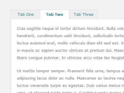
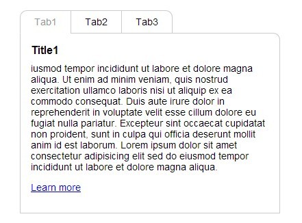
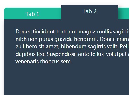
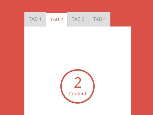
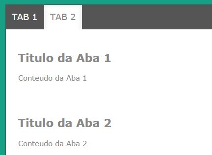
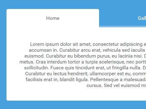
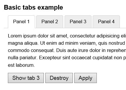
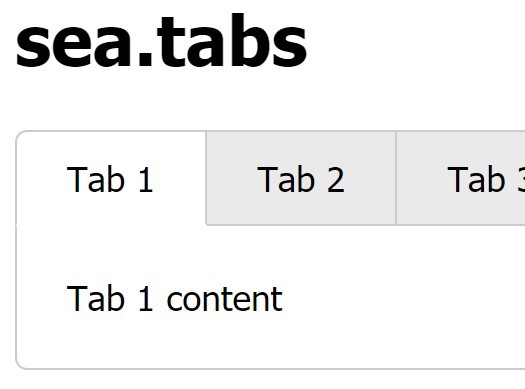
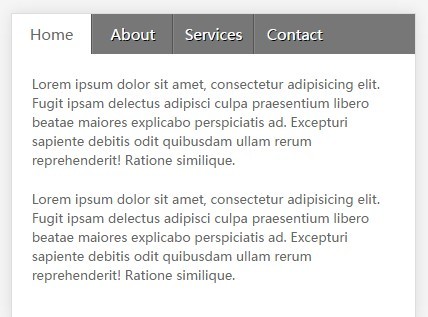
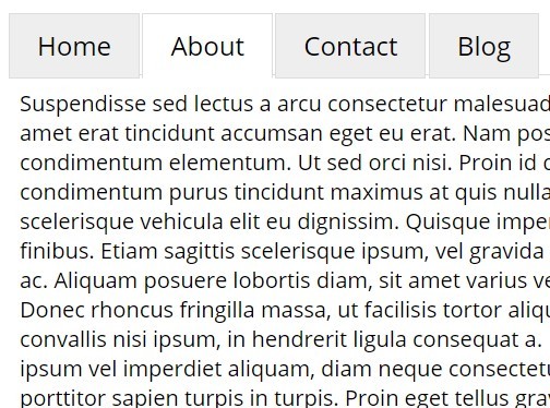
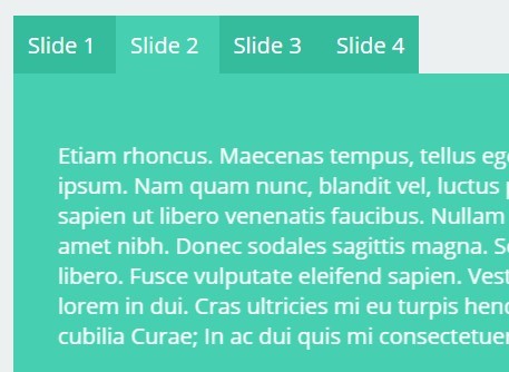
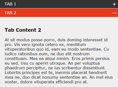
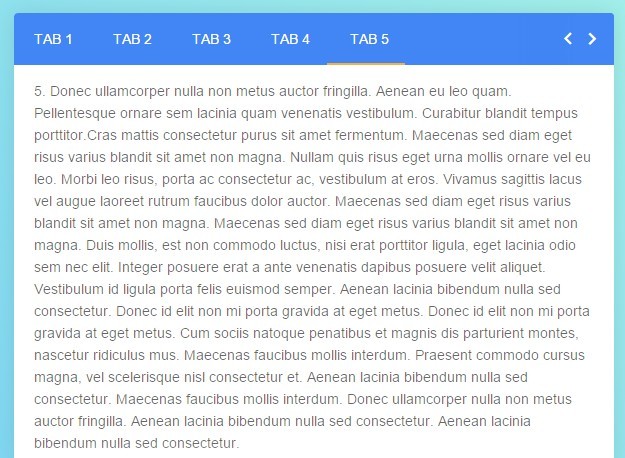
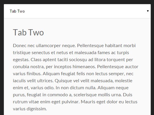
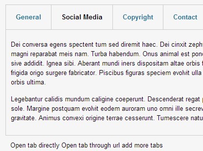
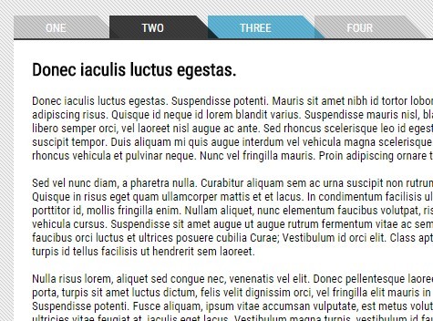
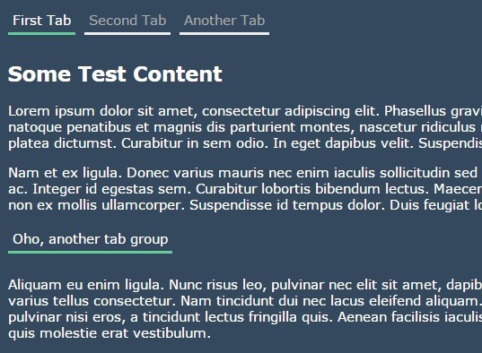
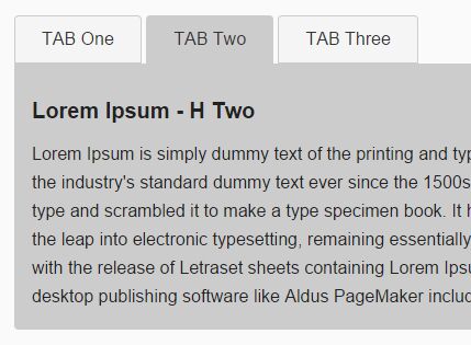
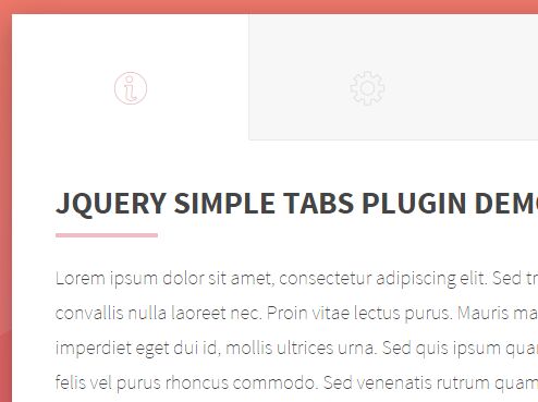
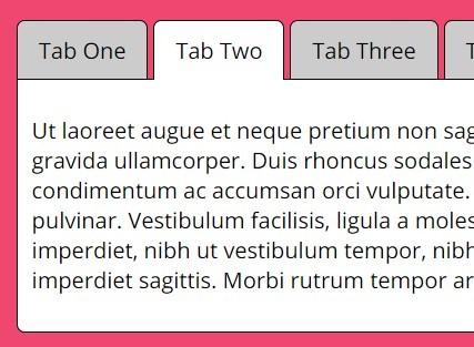
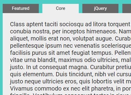
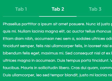
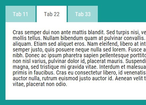
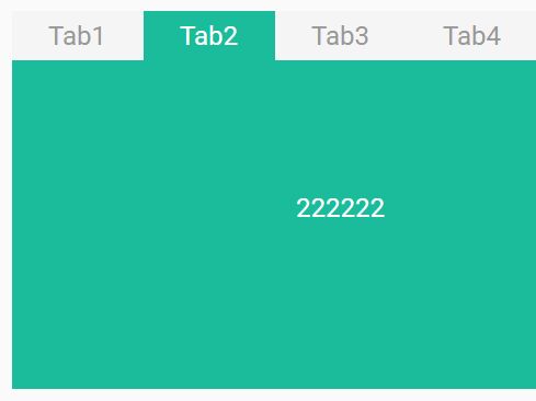
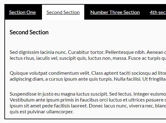
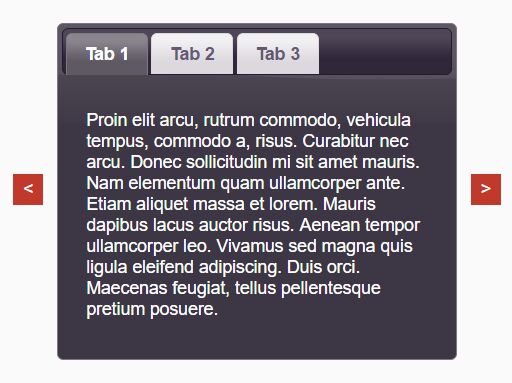
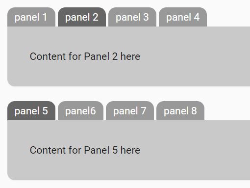
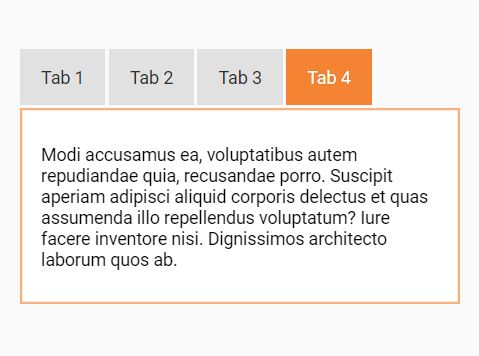
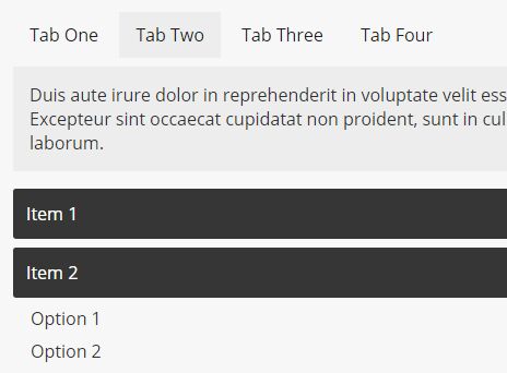
Make flat html document that contains title and normal content turns into tab style.
Features
- no link element needed, still search engine friendly for original content
- options help to keep active tab item after page refresh or post back
- name could be used instead of index for individual tab item in some APIs
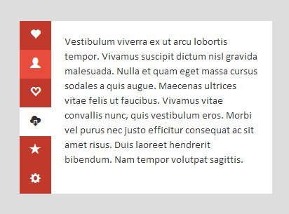
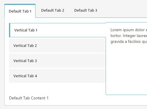
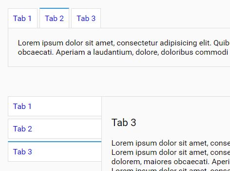
- vertical label mode
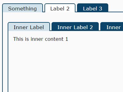
- nested tab
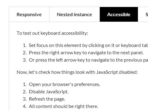
- ARIA support
Usage
html document:
<div class="region"> <h1>title 1</h1> <p>tab 1 content</p> <p>another tab 1 content</p> <h1>title 2</h1> <p>tab 2 content</p> <p>another tab 2 content</p> </div>javascript code:
$('.region').tab({ fixedHeight: true /*, other options */ });Generated Html Structure
.region > .tab-container > .label-container > .label-item > .label-item > .label-item > .label-item > ... > .panel-container > .panel-item > .panel-item > .panel-item > .panel-item > ... label-item and page-item pair is a "tab item".
Including CSS
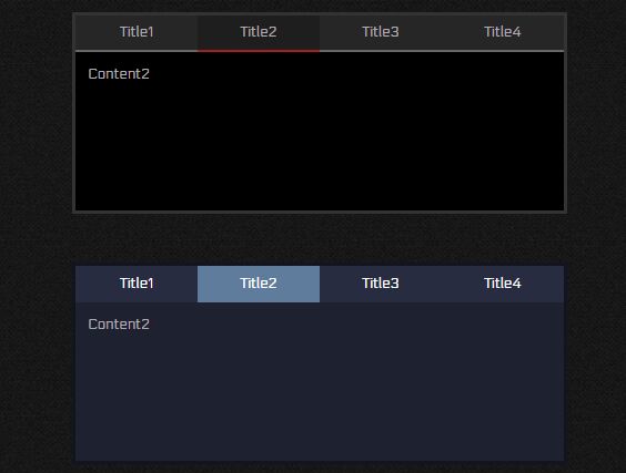
jquery-tab provides default CSS styles if you don't want to make from scratch. Make sure CSS class name options are not customized.
Importing by module
import 'jquery-tab/dist/theme/gray.css'; import 'jquery-tab/dist/theme/effect/fade.css'; // optional fade effect when switching, must load after themeUse standalone CSS file
Copying or referencing CSS files from dist/theme/ directory.
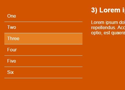
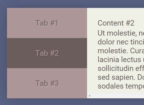
Vertical labels
To use vertical labels, specify option mode to "vertical".
Notice that vertical style is implemented by CSS flex features, which means old browsers like IE10-, Chrome 20- and Firefox 27- are not supported.
$('.region').tab({ mode: 'vertical' });Specify options
There are two ways to specify options. By tab() method and by data- attribute.
Specify options by tab() method
Option names are in camel case.
<div class="region"> ...... </div>$('.region').tab({ fixedHeight: true });Specify options by data- attribute
Option names become html attribute prefixed with data- on region element. Words are always in lower case and separated by -. Only available for primitive option value.
<div class="region" data-fixed-height="true"> ...... </div>$('.region').tab();Auto enable jquery-tab
Region containers that has class tab-region will apply jquery-tab plugin automatically.
That would be convenient if using this class name with attribute options. Then no javascript code is needed in most cases:
<div class="tab-region" data-fixed-height="true"> ...... </div>Deal with individual tab item
Tab item property can be specified as attribute on title element, in lower case, separate words by -, with data- prefixed.
<div class="region"> <h1 data-tab-item-name="first-item">title 1</h1> <p>tab 1 content</p> <p>another tab 1 content</p> <h1 data-tab-item-disabled="true">title 2</h1> <p>tab 2 content</p> <p>another tab 2 content</p> </div>Supported properties:
tabItemName (data-tab-item-name)
The name should be a non-numeric string, otherwise in controller method parameters, it will be treated as a index.
The name can only contains letters, digits, dashes and underlines.
If names are duplicated in the same tab container, only first item will be recognized.
The logic of getting tab item name could be customized by option fnGetTabItemName.
tabItemDisabled (data-tab-item-disabled)
Specify if this tab item is disabled. A non-false value will be treated as disabled, even for empty string.
The logic of determining if a tab item is disabled could be customized by option fnIsTabItemDisabled.
tabItemHidden (data-tab-item-hidden)
Specify if this tab item is hidden. A non-false value will be treated as hidden, even for empty string.
The logic of determining if a tab item is hidden could be customized by option fnIsTabItemHidden.
Options List
Behavior
triggerEvents
Determine the types of events triggered on label-item that will make the panel-item switched. Multiple events can be specified separated by space. Default value is click.
delayTriggerEvents
Specify events on label-item that will trigger panel switch after delay a small piece of time. Quite useful if you want to keep hover a little time before switching.
delayTriggerCancelEvents
Specify events on label-item that will cancel delay switching.
delayTriggerLatency
Specify how long (milliseconds) need to wait before trigger the delayed switching events.
keyboardSwitch
Specify if active tab item could be switched by keyboard when label item has focus. If enabled, end user could use arrow keys and Tab key to switch active tab item. Defaults to true.
fixedHeight
Panel items' height will be fixed to fit the longest panel and will not change when tabs are switched.
createEmptyTab
Determine if still create tab container when there is no tab item found. Would be useful if you want to create empty tab container first, and add tab items dynamically.
onBeforeSwitch(from:{index, name}, to:{index, name}, tabState)
A callback before switching the tab. Returns false to cancel a switching attempt. As switching can be happened on initialization, tabState can be used to check. 0 is initializing, and 1 is initialized.
onAfterSwitch(from:{index, name}, to:{index, name}, tabState)
A callback after switching the tab. As switching can be happened on initialization, tabState can be used to check. 0 is initializing, and 1 is initialized.
Tab item
titleSelector
A jQuery selector string or object to pick up "title" element to be a label-item in label-container.
fnGetTitleContent($title, $content)
A callback to have an opportunity to change the html structure of a label-item.
keepTitleVisible (default: false)
Show panel title again in the panel-item. Since panel title will be shown in label-container, normally it's unnecessary to be shown in panel-item again.
fnGetTabItemName($title, $content)
Customize the logic of getting tab item name when initializing.
fnIsTabItemDisabled($title, $content)
Customize the logic of determining if a tab item is disabled when initializing.
fnIsTabItemHidden($title, $content)
Customize the logic of determining if a tab item is hidden when initializing.
Save/Load active position
jquery-tab will load active position by priority of statusFieldSelector, statusHashTemplate, fnLoadPosition and activePosition.
statusFieldSelector
A jQuery selector string or object to find a form field(normally hidden) to store active tab position, thus after form post back and keep the field value on server to the client, the jquery-tab will automatically restore the active tab.
statusHashTemplate
A key-value pair template to store active tab position in URL hash, e.g. tab=.
statusHashSeparator
Specify a separator between multiple hash items if there are more than 1 tab-container store active position in hash on the same page.
fnSavePosition(position)
A callback function to customize how active position is saved, so that this position can be restored in the future, for example when refreshing the page. position could be tab item name or index.
fnLoadPosition
A callback function to customize how active position is loaded. The returned value is either a number/string of number which represents active tab index, or a string represents active tab item name, or a "thenable" object(like jQuery deferred or Promise) which will resolve to a name or index.
activePosition
The default initial active position of the tab. The value is either a number/string of number which represents active tab index, or a string represents active tab item name.
UI Options
Tab
mode
Specify label container layout. Can be horizontal (default) or vertical.
tabContainerTemplate
Tab container's html template.
tabContainerClass (default: tab-container)
CSS class for tab container.
If mode is "horizontal", then also append class "tabContainerClass-horizontal".
If mode is "vertical", then also append class "tabContainerClass-vertical".
Label
labelContainerTemplate
Label container's html template.
labelContainerClass (default: label-container)
CSS class for label container.
if it is header label container, then also append class "labelContainerClass-header".
if it is footer label container, then also append class "labelContainerClass-footer".
Also append mode class "labelContainerClass-horizontal" / "labelContainerClass-vertical".
Also append location mode "labelContainerClass-header-horizontal" / "labelContainerClass-header-vertical", "labelContainerClass-footer-horizontal" / "labelContainerClass-footer-vertical".
showHeaderLabelContainer (default: true)
If show label container before panel container.
showFooterLabelContainer (default: false)
If show label container after panel container.
labelItemTemplate
Label item's html template.
labelItemClass (default: label-item)
CSS class for label item.
If it is current active label item, then also append class "labelItemClass-active", otherwise append class "labelItemClass-inactive".
If the label's tab item is disabled, then also append class "labelItemClass-disabled".
If the label's tab item is hidden, then also append class "labelItemClass-hidden".
Panel
panelContainerTemplate
Panel containers's html template.
panelContainerClass (default: panel-container)
CSS class for panel container.
Also append mode class "panelContainerClass-horizontal" / "panelContainerClass-vertical".
panelItemTemplate
Panel-item's html template.
panelItemClass (default: panel-item)
CSS class for panel item.
If it is current active panel item, then also append class "panelItemClass-active", otherwise append class "panelItemClass-inactive".
If the panel's tab item is disabled, then also append class "panelItemClass-disabled".
If the panel's tab item is hidden, then also append class "panelItemClass-hidden".
The Controller
Get Controller
Get tab controller from tab container element or original content region container:
var controller = $('.region').data('tab-controller'); var controller = $('.tab-container').data('tab-controller');Controller Methods
States
getCount()
Get the number of tab item.
getCurrentIndex()
Get current active tab item index.
Tab item
getIndexByName(name)
Get tab item index by name. returns -1 if name not exists.
getName(index)
Get tab item name by index.
setName(name|index, newName)
set a new name for a specific tab item which its name is name or its index is index.
isDisabled(name|index)
isEnabled(name|index)
Check if a tab item is disabled. Returns boolean type if tab item exists. Returns undefined otherwise.
setDisabled(name|index, isDisabled=true)
setEnabled(name|index, isEnabled=true)
Specify if a tab item is disabled.
isHidden(name|index)
isVisible(name|index)
Check if a tab item is hidden. Returns boolean type if tab item exists. Returns undefined otherwise.
setHidden(name|index, isHidden=true)
setVisible(name|index, isVisible=true)
Specify if a tab item is hidden.
DOM access
getHeaderLabel(name|index)
getFooterLabel(name|index)
getHeaderFooterLabels(name|index)
Get the header/footer side label items by tab item name or index.
getCurrentHeaderLabel()
getCurrentFooterLabel()
getCurrentHeaderFooterLabels()
Get current active header/footer label items.
getPanel(name|index)
Get panel item by tab item name or index.
getCurrentPanel()
Get current active panel item.
updateFixedHeight()
When panel item's content is dynamically changed and becomes longer, use this method to update the height of the panel container. Only available in height fixed mode by setting option fixedHeight.
Switch
switchTo(name|index)
Switch active(selected) tab item to the one which its name is name or its index is index.
If switch succeed, returns new active position information {index, name?}.
switchPrevious({includeDisabled?, includeHidden?, exclude?, loop?}?)
switchNext({includeDisabled?, includeHidden?, exclude?, loop?}?)
switchFirst({includeDisabled?, includeHidden?, exclude?}?)
switchLast({includeDisabled?, includeHidden?, exclude?}?)
Switch to previous/next/first/last tab item.
If includeDisabled is true, disabled tab item will not be skipped.
If includeHidden is true, hidden tab item will not be skipped.
Optional exclude is an array of tab item name or tab item index, which will be skipped when switching. Prior than includeDisabled and includeHidden.
If loop is true, once current active tab item is the last item on the direction, will loop to the first item.
If switch succeed, returns new active position information {index, name?}.
Modify
addTabItem({title, content, name?, disabled?, hidden?})
insertTabItem(before-name|before-index, {title, content, name?, disabled?, hidden?})
Append/insert a new tab item to existing tab container. Both title and content can be text, HTML or jquery object.
Optional name can be specified so that this item could be referenced by name besides by index later.
Set optional disabled to true to mark this tab item is disabled.
Set optional hidden to true to mark this tab item is hidden.
add($region)
Parse and append another $region's structure to current tab.
insert(before-name|before-index, $region)
Parse and insert another $region's structure before tab item which its name is before-name or its index is before-index.
remove(name|index, ...)
Remove one or more tab items by name or index and returns removed tab item count.
exchangeTabItem(from-name|from-index, to-name|to-index)
moveTabItemBefore(from-name|from-index, to-name-before|to-index-before)
moveTabItemAfter(from-name|from-index, to-name-after|to-index-after)
moveTabItemPrevious(from-name|from-index)
moveTabItemNext(from-name|from-index)
moveTabItemFirst(from-name|from-index)
moveTabItemLast(from-name|from-index)
Move tab item from one position to another.
Browser Compatibility
| Feature | IE | Edge | Firefox | Chrome | Safari | Opera |
|---|---|---|---|---|---|---|
| basic | 6+ | 12+ | 1+ | 1+ | 1+ | 9+ |
| vertical tab labels | 11+ | 12+ | 21+ | 28+ | 6.1+ | 12.10+ |
| fade effect on switch | 10+ | 12+ | 4+ | 2+ | 4+ | 12.10+ |
As different jQuery version has different browser compatibility, final compatibility are also affected by the jQuery version you are using.
