GaugeMeter.js
This is a bug fixed and modified version of the original Ash Alom gauge meter based on minified version 2.0.0.
An elegant and dynamic animated graphical gauge meter built with jQuery. GaugeMeter.js is highly customizable and includes full-radial, semi-radial & arch dials.

GaugeMeter.js Features
- Just one script, there is no dependencies.
- Built-in themes.
- HTML5 renders the Canvas content without images.
- Add custom text & label.
- Support for any page size and page color.
- Configure via data attributes, object properties on call or default settings.
- Update via jQuery call.
Requirements
- jQuery 3.3.1
- HTML5 compatible web browser.
Implementation
Include the following jQuery & JavaScript Code, CSS and HTML code to render a minimal form of the GaugeMeter.
jQuery & JavaScript Code
<script src="./GaugeMeter.js"></script> <script> $(document).ready(function(){ $(".GaugeMeter").gaugeMeter(); }); </script>CSS Styles
.GaugeMeter{ Position: Relative; Text-Align: Center; Overflow: Hidden; Cursor: Default; } .GaugeMeter SPAN, .GaugeMeter B{ Margin: 0 23%; Width: 54%; Position: Absolute; Text-align: Center; Display: Inline-Block; Color: RGBa(0,0,0,.8); Font-Weight: 100; Font-Family: "Open Sans", Arial; Overflow: Hidden; White-Space: NoWrap; Text-Overflow: Ellipsis; } .GaugeMeter[data-style="Semi"] B{ Margin: 0 10%; Width: 80%; } .GaugeMeter S, .GaugeMeter U{ Text-Decoration: None; Font-Size: .5em; Opacity: .5; } .GaugeMeter B{ Color: Black; Font-Weight: 300; Font-Size: .5em; Opacity: .8; }HTML Code
Minimal Implementation. The code below is all you will need to render a basic gauge meter with 0 indication.
<div class="GaugeMeter" id="GaugeMeter_1"></div>Basic Implementation. The code below is all you will need to render a basic gauge meter with 10 indication.
<div class="GaugeMeter" id="GaugeMeter_1" data-percent="10"></div>Update the gauge value and its indication via jQuery.
$("#GaugeMeter_1").gaugeMeter({percent:15});Below is a list of all the optional parameters, see the Parameter Definitions for more details on how to utilize these data attributes.
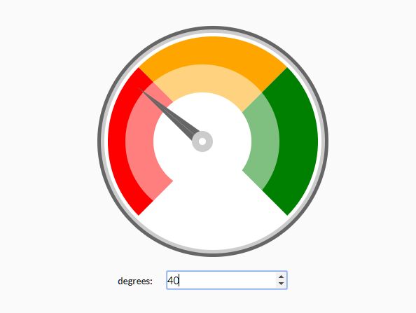
<div class="GaugeMeter" id="GaugeMeter_1" data-percent="10" data-min="-100" data-used="256" data-total="1024" data-size="200" data-prepend="$" data-append=".00" data-theme="Red-Gold-Green" data-color="Blue" data-back="Silver" data-width="2" data-style="Semi" data-stripe="2" data-animationstep = 0 data-animate_gauge_colors="1" data-animate_text_colors="1" data-label="VISA Card" data-label_color="#FF0000" data-text="Spendings" data-text_size="0.22" data-fill="#FFFFFF" data-showvalue=0 ></div>Parameter Definitions
The form of the gauge meter can be manipulated by means of the following parameters. These parameters can be passed in to the library via HTML5 tag data attributes, as illustrated in the HTML example code above or as object properties when calling the library. The following table elaborates upon each of the parameter properties.
| Attribute | Optional | Defaults | Values | Description |
|---|---|---|---|---|
data-percent | No | 0 | Any positive integer, between 0 to 100. | The value to set the gauge meter to. |
data-min | Yes | null | Any integer. | The minimum value of the gauge meter. Negative values show in combination with data-showvalue=true. |
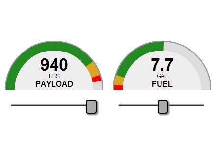
data-used | Yes | null | Any positive integer. | Display a percentage of a value that overrides any data-percent defined count. To show "25%" of 512 GB of RAM being used, you would specify "128" here and "512" for data-total. |
data-total | Yes | null | Any positive integer. | Display a percentage of a value that overrides any data-percent defined count. To show "25%" of 512 GB of RAM being used, you would specify "512" here and "128" for data-used. |
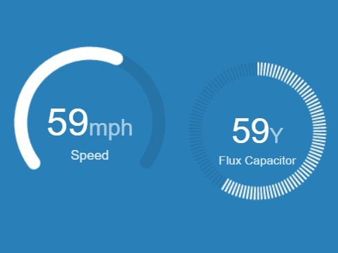
data-text | Yes | null | Any short string. | Replaces the data-percent count in the center of the gauge. |
data-text_size | Yes | 0.22 | Any positive float between 0.0 and 0.5. | Scale factor for text size (indicated value or text in gauge center) in relation to gauge size. |
data-prepend | Yes | null | Any string (2 bytes max). | Adds this text before the percent count in the center of the gauge. |
data-append | Yes | null | Any string (2 bytes max). | Adds this text after the percent count in the center of the gauge. Typical use would be a "%" symbol. |
data-size | Yes | 100 | Any positive integer. | Width & height of the gauge meter in pixels. |
data-width | Yes | 3 | Any positive integer. | Thickness of the gauge meter progress bar in pixels. |
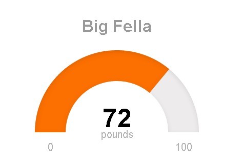
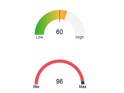
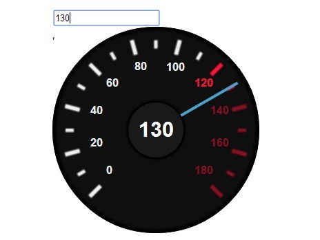
data-style | Yes | Full | Full, Semi or Arch | Displays either a full circle, semi-circle or an arched-circle. |
data-color | Yes | #2C94E0 | Hex values (#FFFFFF), Red-Green-Blue-Alpha color space (RGBa(255,255,255,1.0)) or HTML color-name (Red) | The foreground-color of the gauge meter's progress bar. This value is overridden if data-theme is specified. |
data-back | Yes | RGBa(0,0,0,.06) | Hex values (#FFFFFF), Red-Green-Blue-Alpha color space (RGBa(255,255,255,1.0)) or HTML color-name (Green) | The background-color of the gauge meter's progress bar. |
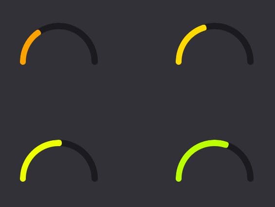
data-theme | Yes | Red-Gold-Green |
| Color & gradient themes to fill the foreground-color of the gauge meter's progress bar with. |
data-animate_gauge_colors | Yes | false | Boolean, false or true. | When enabled, the foreground-color of the gauge meter's progress bar will cycle according to the color value, as directed by the data-theme. If enabled, this overrides any values specified by the data-color. |
data-animate_text_colors | Yes | false | Boolean, false or true. | When enabled, the percentage text color of the gauge meter will cycle according to the color value, as directed by the data-theme. If enabled, this overrides any values specified by the data-label_color. |
data-label | Yes | null | Any short string. | Supplemental text label that can appear below the central percentage or text of the gauge meter. |
data-label_color | Yes | Black | Hex values (#FFFFFF), Red-Green-Blue-Alpha color space (RGBa(255,255,255,1.0)) or HTML color-name (Blue) | The foreground text color of the supplemental text label. |
data-stripe | Yes | 0 | Any positive integers. | Show the gauge meter's progress bar in solid form or stripe form. If the value is greater than 0, the gauge meter's progress bar changes from a solid to a stripe, where the value is the thickness of the stripes. |
data-fill | Yes | null | Hex values (#FFFFFF), Red-Green-Blue-Alpha color space (RGBa(255,255,255,1.0)) or HTML color-name (Blue) | Fill color of internal gauge background area where prepend, append and gauge text is shown. |
data-animationstep | Yes | 0 | Any positive integer. | Step width used for animation when gauge bargraph is drawn. Higher number results in higher animation speed. 0 stops animation. |
data-showvalue | Yes | false | Boolean, false or true. | Label will show value instead of percent. Gauge bargraph will show 0-100% or computation of data-used and data-total. |
| See doc.html for more details. |