bs-stepper
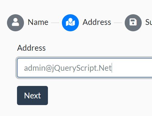
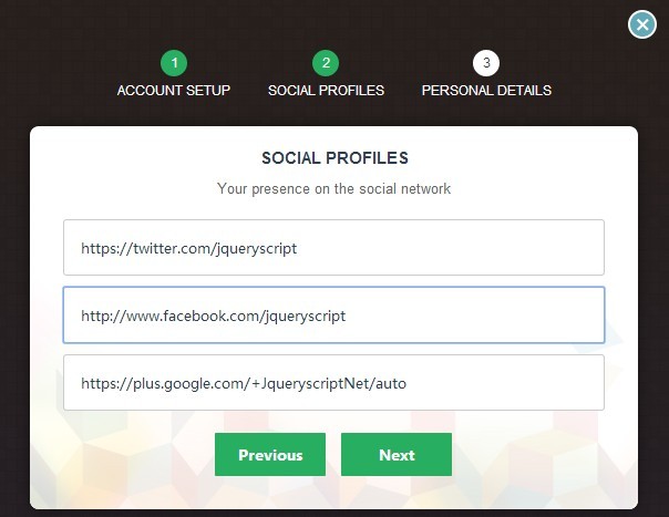
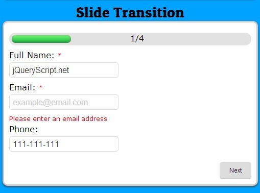
A stepper plugin for Bootstrap 4.
You can use it on React and Angular too because this plugin is written with the most used JavaScript framework: VanillaJS.
If you want to see our last changes it's here: https://bs-stepper.netlify.com/
Features:
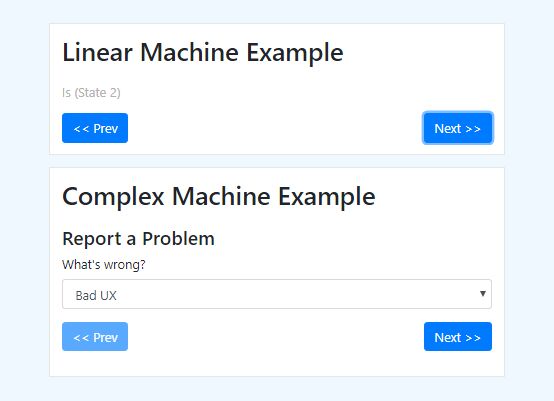
- Linear stepper
- Non linear stepper
- Fade effect with
.fade - Vertical stepper
- Works with Bootstrap 4
- Accessible
- Works without dependencies (so no jQuery needed)
- Built in UMD to be used everywhere
- Small, only 2kb
Table of contents
Install
With npm or yarn
// npm npm install bs-stepper --save // yarn yarn add bs-stepperCDN
| CDN | Link |
|---|---|
| jsDelivr, js minified | https://cdn.jsdelivr.net/npm/bs-stepper/dist/js/bs-stepper.min.js |
| jsDelivr, css minified | https://cdn.jsdelivr.net/npm/bs-stepper/dist/css/bs-stepper.min.css |
How to use it
HTML markup
Include the CSS file:
<link rel="stylesheet" href="bs-stepper.min.css">Add the following HTML:
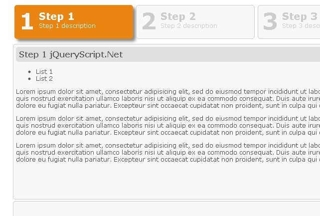
<div class="bs-stepper"> <div class="bs-stepper-header" role="tablist"> <!-- your steps here --> <div class="step" data-target="#logins-part"> <button type="button" class="step-trigger" role="tab" aria-controls="logins-part" id="logins-part-trigger"> <span class="bs-stepper-circle">1</span> <span class="bs-stepper-label">Logins</span> </button> </div> <div class="line"></div> <div class="step" data-target="#information-part"> <button type="button" class="step-trigger" role="tab" aria-controls="information-part" id="information-part-trigger"> <span class="bs-stepper-circle">2</span> <span class="bs-stepper-label">Various information</span> </button> </div> </div> <div class="bs-stepper-content"> <!-- your steps content here --> <div id="logins-part" class="content" role="tabpanel" aria-labelledby="logins-part-trigger"></div> <div id="information-part" class="content" role="tabpanel" aria-labelledby="information-part-trigger"></div> </div> </div>- If you want to use the fade
fadeanimation, add.fadeclass on your.contentand setanimationtotrue. - To create a vertical stepper, just add
.verticalclass on your stepper. All steppers will switch to vertical on small viewports.
JavaScript
In HTML before the end of the <body> tag
<script src="bs-stepper.min.js"></script>Or with npm
import Stepper from 'bs-stepper'Create a stepper
You should wait for the document ready event and create a new instance of Stepper.
Vanilla JS
document.addEventListener('DOMContentLoaded', function () { var stepper = new Stepper(document.querySelector('.bs-stepper')) })With jQuery
$(document).ready(function () { var stepper = new Stepper($('.bs-stepper')[0]) })For more examples check out this file.
This library is UMD ready so you can use it everywhere.
Methods
constructor
Create an instance of Stepper, accept two parameters.
Parameters
element- type:
DOMElement
Pass your Stepper DOMElement
-
options(optional)- type:
Object
default value:
{ linear: true, animation: false, selectors: { steps: '.step', trigger: '.step-trigger', stepper: '.bs-stepper' } }Allows you to customize the stepper selectors and it's behaviour.
- type:
next
Will navigate to the next step of your stepper. This method also emit show.bs-stepper before showing the step and shown.bs-stepper when the step is displayed.
var stepper = new Stepper(document.querySelector('.bs-stepper')) stepper.next()previous
Will navigate to the previous step of your stepper. This method also emit show.bs-stepper before showing the step and shown.bs-stepper when the step is displayed.
to
Will navigate to a step of your stepper. This method also emit show.bs-stepper before showing the step and shown.bs-stepper when the step is displayed.
var stepper = new Stepper(document.querySelector('.bs-stepper')) /// Will navigate to the second step stepper.to(2)reset
Will reset you stepper to the first step (usefull for linear stepper). This method also emit show.bs-stepper before showing the step and shown.bs-stepper when the step is displayed.
destroy
Remove stored data relative to your stepper and listeners.
Events
The methods which trigger a step change trigger two events:
show.bs-steppershown.bs-stepper
You can listen on those events like that:
var stepperEl = document.getElementById('stepper') var stepper = new Stepper(stepperEl) stepperEl.addEventListener('show.bs-stepper', function (event) { // You can call prevent to stop the rendering of your step // event.preventDefault() // indexStep contains the id of the step which will be displayed console.warn(event.detail.indexStep) }) stepperEl.addEventListener('shown.bs-stepper', function (event) { console.warn('step shown') })If you need to prevent the display of a step, you have to call preventDefault on the show.bs-stepper listener.
Compatibility
bsStepper is compatible with:
- IE10+
- Edge
- Firefox
- Chrome
- Safari
- Chrome Android
- Safari iOS
You can find our BrowserStack list of browsers here.
Support me
If you want to thank me or supporting my work:
Thanks
Thanks to BrowserStack for providing the infrastructure that allows us to test in real browsers!
