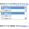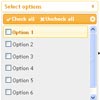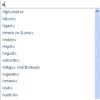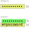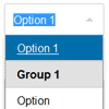
Combo Select
Converts a select box into a searchable and keyboard friendly interface. Fallbacks to native select on mobile and ipad devices.
- Search and filter select items
- Mobile and Tablet friendly (fallbacks to native select)
- Keyboard accessible
- Easily to style
- Data attribute support
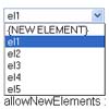
- Support both numeric and string data types in select
- Supports implict
styleattributes
Browser support
- Safari, Chrome, Firefox, Opera
- iOS, Android, IE Mobile
- Internet Explorer IE 8 and above
How to use
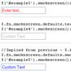
<select data-theme="bootstrap"> <option value="">Select value</option> <option>1</option> <option>2</option> </select> /* Any data-* options can be added */ $('select').comboSelect({ comboClass : 'combo-select', /* outer container class */ comboArrowClass : 'combo-select-arrow', /* arrow class */ comboDropDownClass : 'combo-drop-down', /* dropdown class */ inputClass : 'combobox-input text-input', /* Input element class */ disabledClass : 'option-disabled', /* Disabled class */ hoverClass : 'option-hover', /* dropdown list hover class */ selectedClass : 'option-selected', /* dropdown list selected class */ markerClass : 'combo-marker', /* Search marker class */ maxHeight : 200, /* Max height of dropdown */ themeClass : '', /* Theme using external classes */ extendStyle : true /* Copy all inline styles from original select */ }) Markup after conversion
<div class="combo-select"> <select name="month" tabindex="-1"> </select> <div class="combo-select-arrow"></div> <ul class="combo-drop-down"> <li>....</li> </ul> <input type="text" placeholder="Select Month" class="combobox-input text-input"> </div> Todo
- Support
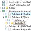
multipleandsizeattributes in select - Optgroup and disabled
optionsupport - Done - API to destroy/update - Done
- Unit tests


