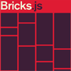
Bricks.js


Momma said, "Stay patient." - Bricks, DJ Carnage
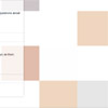
But you don't need to, because Bricks is a blazing fast masonry layout generator for fixed width elements.
Getting Started
Follow these steps:
Install
Bricks was developed with a modern JavaScript workflow in mind. To use it, it's recommended you have a build system in place that can transpile ES6, and bundle modules. For a minimal boilerplate that does so, check out outset.
Using NPM, install Bricks.js, and add it to your package.json dependencies.
$ npm install bricks.js --save Refer to the releases page for version specific information.
Instantiate
Simply import Bricks, then instantiate it.
It's recommended that you assign your Bricks instance to a variable. Using your instance, you can:
- enable and disable the resize handler
- add and remove event handlers
- accommodate dynamically added elements
// import Bricks import Bricks from 'bricks.js' // create an instance const instance = Bricks({ // ... })Parameters passed to the constructor are detailed below.
Parameters
Note that all parameters, except position, are required:
- A container (node or CSS selector)
- A packed attribute
- A sizes array
- A position boolean (defaulting to
true)
container
A node, or CSS selector, that represents the grid wrapper. The direct children of this element must be the grid items.
// passing a node const instance = Bricks({ container: node }) // passing a selector (document.querySelector is used to get the node) const instance = Bricks({ container: '.selector' })packed
An attribute added to the grid items after they're positioned within the grid. If the attribute is not prefixed with data-, it will be added.
// prefixed const instance = Bricks({ packed: 'data-packed' }) // unprefixed const instance = Bricks({ // becomes: 'data-packed' packed: 'packed' })Note that Bricks uses this attribute internally to avoiding unnecessarily repositioning grid items already in place. It's best to avoid manipulating it.
sizes
An array of objects describing the grid's properties at different breakpoints.
When defining your sizes, note the following:
- Sizes must be listed smallest to largest
- Sizes must use
min-widthmedia queries (any unit) - Width of the grid items at each breakpoint should be set in your CSS (in px)
- The size without the
mqproperty is assumed to be your smallest breakpoint, and must appear first
// mq - the minimum viewport width (String CSS unit: em, px, rem) // columns - the number of vertical columns // gutter - the space (in px) between the columns and grid items const sizes = [ { columns: 2, gutter: 10 }, { mq: '768px', columns: 3, gutter: 25 }, { mq: '1024px', columns: 4, gutter: 50 } ] const instance = Bricks({ sizes: sizes })position
A boolean, defaulting to true, indicating that the grid items should be positioned using the top and left CSS properties.
If set to false, the grid items will be positioned using the transform CSS property.
// default ('true') // grid items are positioned via the 'top' and 'left' properties const instance = Bricks({ position: true }) // explicitly 'false' (not any falsy value!) // grid items are positioned via the 'transform' property const instance = Bricks({ position: false })Positioning using transform is done via translate3d for optimal performance. Coupled with a CSS transition, this option allows for smoothly animating the grid items into place.
API / Events
Bricks instances are extended with Knot.js, a browser-based event emitter. Use the event emitter syntax to add and remove handlers for the events emitted by the API methods. Review the emitter syntax here.
Bricks exposes the following methods, and corresponding events:
Note that all methods, including those from the event emitter, are chainable.
.pack()
Used to pack all elements within the container.
// pack ALL grid items instance.pack() // 'pack' is emitted when ALL items have been packed instance.on('pack', () => { // ... })Note that it should be called when creating your instance, to pack the initial items.
.update()
Used to pack elements without the packed attribute within the container.
// pack NEW grid items instance.update() // 'update' is emitted when NEW items have been packed instance.on('update', () => { // ... })Note that this is the preferred method for handling dynamically added items, because it will only operate on items that have not yet been packed (i.e. don't have the packed attribute).
.resize(flag)
Used to add or remove the resize event handler. It's recommended that you add the resize handler when you create your instance.
// add or remove the resize handler instance .resize(true) // 'true' adds it .resize(false) // 'false' removes it // 'resize' is emitted when resizing has resulted in a new matching 'size' object instance.on('resize', size => { // 'size' is the newly matching size object // ... })Note that the resize handler fires the pack method if the resulting screen size matches a size parameter other than the current one. In this case, the pack event will be fired immediately before the resize event. Use the resize event only for breakpoint specific code, not code meant for when the grid has been packed.
Browser Support
Bricks depends on the following browser APIs:
- ES5 array methods: forEach, map, indexOf
- requestAnimationFrame
- matchMedia
Consequently, it supports the following natively:
- Chrome 24+
- Firefox 23+
- Safari 6.1+
- Opera 15+
- IE 10+
- iOS Safari 7.1+
- Android Browser 4.4+
To support older browsers, consider including polyfills/shims for the APIs listed above. There are no plans to include any in the library, in the interest of file size.
Colophon
- Site Design: Chris Allen
License
MIT. © 2017 Michael Cavalea


