ng2-completer
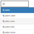
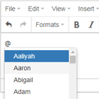
Auto complete component for Angular 2.
This component is based on angucomplete-alt
Installation
npm install ng2-completer --saveUsage
The module you want to use ng2-completer in must import Ng2CompleterModule and FormsModule (to use the ngModel directive on ng2-completer). Ng2CompleterModule provides the CompleterService, and declares the ng2-completer directive.
import { NgModule } from '@angular/core'; import { BrowserModule } from '@angular/platform-browser'; import { FormsModule } from "@angular/forms"; import { HttpClientModule } from "@angular/common/http"; import { AppComponent } from './app.component'; import { Ng2CompleterModule } from "ng2-completer"; @NgModule({ imports: [ BrowserModule, FormsModule, HttpClientModule, Ng2CompleterModule, ], declarations: [ AppComponent ], bootstrap: [ AppComponent ] }) export class AppModule { }Add ng2-completer to your component and create a data source:
import { Component } from '@angular/core'; import { CompleterService, CompleterData } from 'ng2-completer'; @Component({ selector: 'my-component', template: `<h1>Search color</h1> <ng2-completer [(ngModel)]="searchStr" [datasource]="dataService" [minSearchLength]="0"></ng2-completer> <h1>Search captain</h1> <ng2-completer [(ngModel)]="captain" [datasource]="captains" [minSearchLength]="0"></ng2-completer>` }) export class MyComponent { protected searchStr: string; protected captain: string; protected dataService: CompleterData; protected searchData = [ { color: 'red', value: '#f00' }, { color: 'green', value: '#0f0' }, { color: 'blue', value: '#00f' }, { color: 'cyan', value: '#0ff' }, { color: 'magenta', value: '#f0f' }, { color: 'yellow', value: '#ff0' }, { color: 'black', value: '#000' } ]; protected captains = ['James T. Kirk', 'Benjamin Sisko', 'Jean-Luc Picard', 'Spock', 'Jonathan Archer', 'Hikaru Sulu', 'Christopher Pike', 'Rachel Garrett' ]; constructor(private completerService: CompleterService) { this.dataService = completerService.local(this.searchData, 'color', 'color'); } }ng2-completer uses rxjs stream as data sources. There are 2 ready made data sources that can be used to fetch local and remote data but it's also possible to provide a custom source that generates a stream of items.
System.js configuration
Add the following to System.js map configuration:
var map = { ... 'ng2-completer': 'node_modules/ng2-completer/ng2-completer.umd.js' }API
ng2-completer component
| Attribute | Description | Type | Required | Default |
|---|---|---|---|---|
| datasource | Autocomplete list data source can be an array of strings or a URL that results in an array of strings or a CompleterData object | Array<string>|string|CompleterData | Yes | |
| dataService | Deprecated use datasource instead. Autocomplete list data source. | CompleterData | Yes | |
| ngModel | see the angular forms API. | string | Yes | |
| autoMatch | Auto select an item if it is the only result and it is an exact match of the search text. | boolean | No | false |
| autofocus | Set input focus when the page loads | boolean | No | false |
| clearUnselected | Clear the input on blur if not selected. | boolean | No | false |
| clearSelected | Clear the input when a result is selected. | boolean | No | false |
| disableInput | If true disable the input field. | boolean | No | false |
| fieldTabindex | Set the tabIndex of the input. | number | No | |
| initialValue | Initial value for the component. Value is parsed using: titleField, descriptionField and imageField and used as selected value | any | No | |
| inputId | id attribute of the input element. | string | No | |
| inputName | name attribute of the input element. | string | No | |
| inputClass | class attribute of the input element. | string | No | |
| matchClass | CSS class to apply for matching part of the title and description. | string | No | |
| maxChars | Maximal number of characters that the user can type in the component. | number | No | 524288 |
| minSearchLength | Minimal number of characters required for searching. | number | No | 3 |
| overrideSuggested | If true will override suggested and set the model with the value in the input field. | boolean | No | false |
| openOnFocus | If true will open the dropdown and perform search when the input gets the focus. | boolean | No | false |
| openOnClick | If true will open and close the dropdown by click. | boolean | No | false |
| selectOnFocus | If true will select the input text upon focus. | boolean | No | false |
| selectOnClick | If true will select the input text by click. | boolean | No | false |
| fillHighlighted | If true will set the model with the value in the input field when item is highlighted. | boolean | No | true |
| pause | Number of msec. to wait before searching. | number | No | 250 |
| placeholder | Placeholder text for the search field. | string | No | |
| textNoResults | Text displayed when the search returned no results. if the string is falsy it won't be displayed | string | No | |
| textSearching | Text displayed while search is active. if the string is falsy it won't be displayed | string | No | Searching... |
| autoHighlight | Automatically highlight the best matching search result when the input changes. the "best match" is selected by: exact match, starts with and finally includes | boolean | No | false |
ng2-completer events
| Name | Description | Type |
|---|---|---|
| selected | emitted when an item is selected. | (selected: CompleterItem): void |
| highlighted | emitted when an item is highlighted. | (highlighted: CompleterItem): void |
| focus | emitted when the input gets focus | (): void |
| blur | emitted when the input looses focus | (): void |
| opened | emitted when the dropdown is opened or closed | (isOpen: boolean): void |
| keyup | emitted when the input emits keyup | (event: any): void |
| keydown | emitted when the input emits keydown | (event: any): void |
ng2-completer methods
| Method | Description | Parameters |
|---|---|---|
| open() | Open the dropdown | |
| close() | Close the dropdown | |
| focus() | Set the focus to the completer input | |
| blur() | Remove the focus from the completer input | |
| isOpen() | Returns the state of the dropdown |
Local data
Create local data provider by calling CompleterService.local.
Parameters
| Name | Type | Description | Required |
|---|---|---|---|
| data | any[] | Observable<any[]> | A JSON array with the data to use or an Observable that emits one | Yes |
| searchFields | string | Comma separated list of fields to search on. Fields may contain dots for nested attributes; if empty or null all data will be returned. | Yes |
| titleField | string | Name of the field to use as title for the list item. | Yes |
Attributes
| Name | Type | Description |
|---|---|---|
| descriptionField | string | Name of the field to use as description for the list item. |
| imageField | string | Name of the field to use as image url for the list item. |
Remote data
Create remote data provider by calling CompleterService.remote.
Parameters
| Name | Type | Description | Required |
|---|---|---|---|
| url | string | Base url for the search | Yes |
| searchFields | string | Comma separated list of fields to search on. Fields may contain dots for nested attributes; if empty or null all data will be returned. | Yes |
| titleField | string | Name of the field to use as title for the list item. | Yes |
Attributes
| Name | Type | Description |
|---|---|---|
| descriptionField | string | Name of the field to use as description for the list item. |
| imageField | string | Name of the field to use as image url for the list item. |
| urlFormater | (term: string) => string | Function that get's the searchterm and returns the search url before each search. |
| dataField | string | The field in the response that includes the data. |
| requestOptions | RequestOptions (@angular/common/http) | HTTP request options that should be sent with the search request. |
CSS classes
.completer-holder.completer-input.completer-dropdown-holder.completer-dropdown.completer-searching.completer-no-results.completer-row.completer-image-holder.completer-image.completer-image-default.completer-title.completer-description.completer-list-item-holder.completer-list-item.completer-selected-row
Credits
- This product uses the TMDb API but is not endorsed or certified by TMDb
