vue-audio-visual
Vue HTML5 audio visualization components
Overview
An audio spectrum visualizer plugin for VueJS framework. It is built with HTML5 Web Audio API and compatible with all browsers that support HTML5 audio API. It provides several Vue components that allows to draw light and nice visualization for "audio" HTML elements.
Component AvLine. Vue template name <av-line>
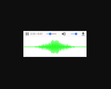
<av-line :line-width="2" line-color="lime" audio-src="/static/music.mp3" ></av-line>This will create following element:
Component AvBars. Vue template name <av-bars>
<av-bars caps-color="#FFF" :bar-color="['#f00', '#ff0', '#0f0']" canv-fill-color="#000" :caps-height="2" audio-src="/static/bach.mp3" ></av-bars>This will create following element:
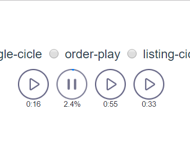
Component AvCircle. Vue template name <av-circle>
<av-circle :outline-width="0" :progress-width="5" :outline-meter-space="5" :playtime="true" playtime-font="18px Monaco" audio-src="/static/bach.mp3" ></av-circle>This will create following element:
Component AvWaveform. Vue template name <av-waveform>
<av-waveform audio-src="/static/bar.mp3" ></av-waveform>This will create following waveform element:
Component will pre-load audio content and generate clickable waveform.
Also, multiple components can connect to the same audio element by using Vue ref element parameter and "ref-link" property.
<table> <tr> <td rowspan="2"> <av-bars ref-link="foo" :bar-color="['#f00', '#ff0', '#0f0']" canv-fill-color="#000" :canv-width="26" :bar-space="1" :bar-width="12" :brick-height="6" /> </td> <td> <audio src="/static/music_4.mp3" ref="foo" controls="true"> </audio> </td> <td rowspan="2"> <av-circle ref-link="foo" :playtime="true" /> </td> </tr> <tr> <td> <av-line ref-link="foo" :canv-height="40" /> </td> </tr> </table>Will look like this:
Install and setup
Install using npm
npm install --save vue-audio-visual Enable plugin in main.js:
import Vue from 'vue' import AudioVisual from 'vue-audio-visual' Vue.use(AudioVisual)Example of usage in App.vue or any other Vue component:
<av-bars audio-src="/static/bach.mp3"> </av-bars>API
There are three components that comes with plugin: av-line, av-bars, av-circle.
There are a lot of props available to configurate each component. The only mandatory "prop" to pass to component: audio-src. Prop audio-src value should contain URL to media file. Example:
audio-src="http://example.com/media/song.mp3" Plugin will generate "audio" to control media playback and "canvas" element for visualization.
Another way is to link to existing Vue element using "ref-link" property. When "ref-link" property is set, then "audio-src" property is ignored.
<audio ref="foo" src="music.mp3"></audio> <av-bars ref-link="foo" /> <av-line ref-link="foo" />However, it will reference only parent component elements.
There are props that are common for all components and special props for each component.
Common props
| Name | Type | Default | Description |
|---|---|---|---|
| audio-src | String | null | Audio element src attribute. When provided creates audio element wrapped in "div". |
| ref-link | String | null | Reference to parent audio element via Vue "ref" attribute. When set, then local audio element is not created and the plugin will connect audio analyser to parent audio element. Multiple plugin instances can connect to the same audio element (see example above). |
| audio-controls | Boolean | true | Audio element controls attribute. When provided should display audio element with controls. |
| cors-anonym | Boolean | false | Set CORS attribute for audio element. Set this attribute when using audio source is pointing to different host/domain. When set, parameter crossOrigin of audio element will be set to 'anonymous'. |
| audio-class | String | null | Audio element css class name. |
| canv-class | String | null | Canvas element css class name. |
| canv-top | Boolean | false | By default plugin creates "audio" element wrapped in "div" and puts "canvas" element below. When "canv-top" is "true" then "canvas" element is set on top. Example: :canv-top="true" or v-bind:canv-top="true" |
| canv-fill-color | String, Array | null | Canvas fill background color. Can be string RGB color or Array of RGB color. When Array is given, plugin creates linear gradient and set it as background. Array value should be binded. Default is null, which makes background transperent. Examples:canv-fill-color="#00AAFF":canv-fill-color="['#FFF', 'rgb(0,255,127)', '#00f']" |
AvLine props
| Name | Type | Default | Description |
|---|---|---|---|
| canv-width | Number | 300 | Canvas element width. Default 300. Example: :canv-width="600" |
| canv-height | Number | 80 | Canvas element height. Default 80. Example: :canv-height="120" |
| line-width | Number | 2 | Graph line width in px. Integer or float number. Example: :line-width="0.5" |
| line-color | String, Array | #9F9 | Graph line color. Can be string RGB color or Array of RGB color. When Array is given, plugin creates linear gradient and set it as background. Array value should be binded. Examples:line-color="#00AAFF":line-color="['#FFF', 'rgb(0,255,127)', '#00f']" |
| fft-size | Number | 128 | Represents the window size in samples that is used when performing a Fast Fourier Transform (FFT) to get frequency domain data. Must be power of 2 between 25 and 215. Example: :fft-size="512" |
AvBars props
AvCircle props
| Name | Type | Default | Description |
|---|---|---|---|
| canv-width | Number | 100 | Canvas element width. Example: :canv-width="600" |
| canv-height | Number | 100 | Canvas element height. Example: :canv-height="120" |
| radius | Number | 0 | Base circle radius. If zero, then will be calculated from canvas width: (canv-width / 2) * 0.7 Example: :radius="20" |
| line-width | Number | 1 | Frequency bit line width to draw. Example: :line-width="0.4" |
| line-space | Number | 1 | Space between lines to draw. Example: :line-space="2" |
| outline-color | String | #0000FF | Outline (contour) style RGB color. Example: outline-color="rgb(0,255,0)" |
| outline-width | Number | 0.3 | Outline (contour) line width. Float value. Example: :outline-width="1" |
| bar-width | Number | 1 | Frequency graph bar width. Example: :bar-width="1" |
| bar-length | Number | 0 | Frequency graph bar length/height. Default is a difference between radius and canvas width. Example: :bar-length="27" |
| bar-color | String, Array | [#FFF,#00F] | Bar style RGB color or radient gradient when array. Example: :bar-color="#12AA55" |
| progress | Boolean | true | Draw playtime progress meter. Example: :progress="false" |
| progress-width | Number | 1 | Playtime progress meter width. Example: :progress-width="2.4" |
| progress-color | String | #0000FF | Playtime progress meter color. Example: :progress-color="green" |
| progress-clockwise | Boolean | false | Playtime progress meter arc draw direction. Example: :progress-clockwise="true" |
| outline-meter-space | Number | 3 | Space between outline and progress meter. The bigger the closer to the circle centre. Example: :outline-meter-space="1" |
| playtime | Boolean | false | Draw played time as text in the center of the circle. Example: :playtime="true" |
| playtime-font | String | 14px Monaco | Played time print font. Example: playtime-font="18px monospace" |
| playtime-color | String | #00f | Played time font color. Example: playtime-color="green" |
| rotate-graph | Boolean | false | Rotate graph clockwise enable. Example: :rotate-graph="true" |
| rotate-speed | Number | 0.001 | Rotate graph speed. Example: :rotate-speed="0.2" |
| fft-size | Number | 1024 | Represents the window size in samples that is used when performing a Fast Fourier Transform (FFT) to get frequency domain data. Must be power of 2 between 25 and 215. Example: :fft-size="2048" |
AvWaveform props
| Name | Type | Default | Description |
|---|---|---|---|
| canv-width | Number | 100 | Canvas element width. Example: :canv-width="500" |
| canv-height | Number | 80 | Canvas element height. Example: :canv-height="120" |
| played-line-width | Number | 0.5 | Waveform line width for played segment of audio. Example: :playtime-line-width="0.8" |
| played-line-color | String | navy | Waveform line color for played segment of audio. Example: :playtime-line-color="#ABC123" |
| noplayed-line-width | Number | 0.5 | Waveform line width for not yet played segment of audio Example: :noplayed-line-width="1" |
| noplayed-line-color | String | lime | Waveform line color for not yet played segment of audio. Example: :noplayed-line-color="grey" |
| playtime | Boolean | true | Display played time next to progress slider. Example: :playtime="false" |
| playtime-with-ms | Boolean | true | Display milliseconds in played when true. For example: 02:55.054. Example: :playtime-with-ms="false" |
| playtime-font-size | Number | 12 | Played time print font size in pixels. Example: :playtime-font-size="14" |
| playtime-font-family | String | monospace | Played time print font family. Example: :playtime-font-family="monaco" |
| playtime-font-color | String | grey | Played time print font RGB color string. Example: :playtime-font-color="#00f" |
| playtime-text-bottom | Boolean | false | Position playtime text bottom. Default on top. Example: playtime-text-bottom |
| playtime-slider | Boolean | true | Draw played time slider on the waveform. Example: :playtime-slider="false" |
| playtime-slider-color | String | red | Played slider color. Example: :playtime-slider-color="#fafafa" |
| playtime-slider-width | Number | 1 | Played slider width. Example: :playtime-slider-width="2.5" |
| playtime-clickable | Boolean | true | Allow click on waveform to change playtime. Example: :playtime-clickable="false" |
License
MIT Copyright (c) 2018-present, Stas Kobzar
