Photoset Grid
A simple jQuery plugin to arrange images into a flexible grid, based on Tumblr's photoset feature. Originally the plugin was created for our Style Hatch Tumblr themes as a way to use the photoset grid in responsive layouts, but we have since expanded it for use outside of the themes.
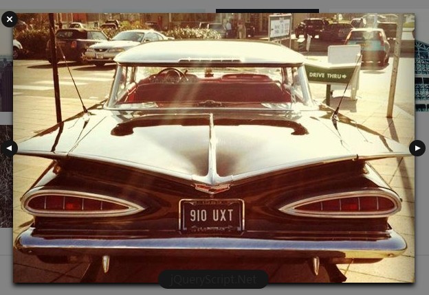
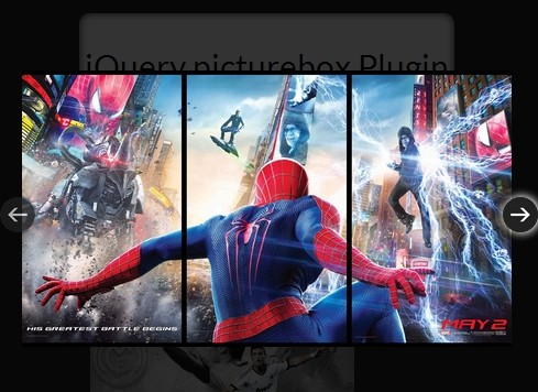
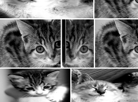
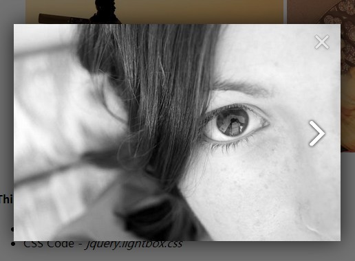
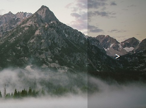
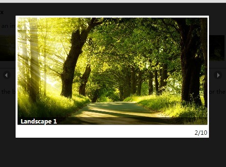
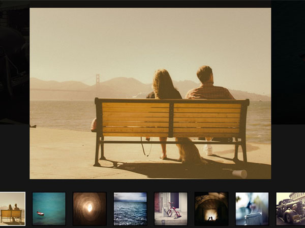
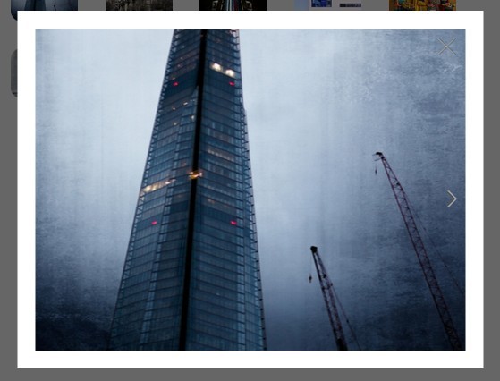
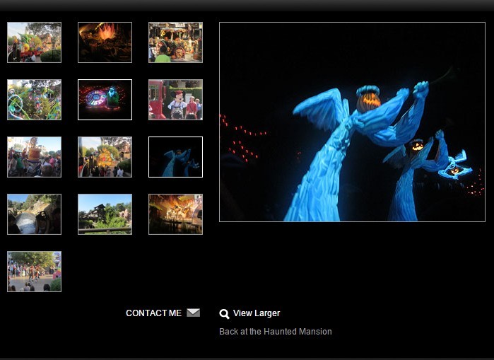
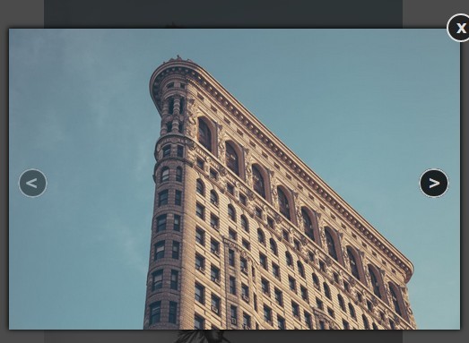
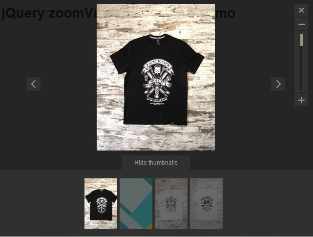
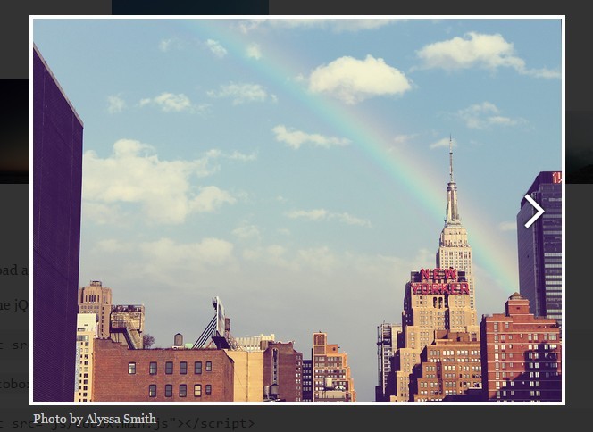
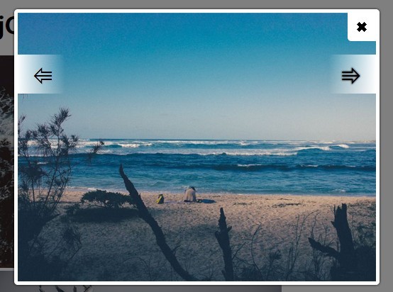
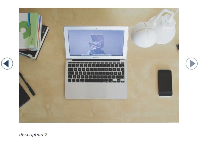
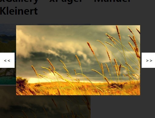
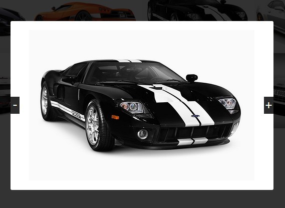
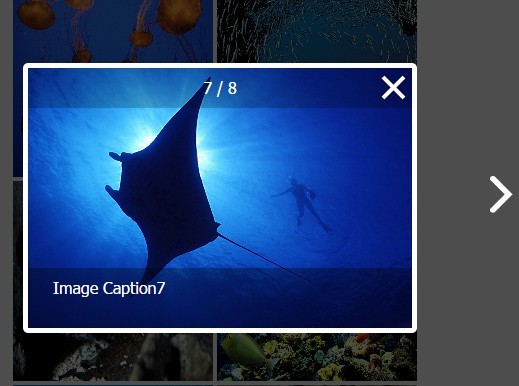
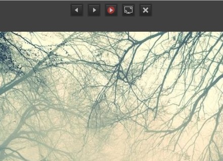
Demo
View the photoset grid Github page for all the examples or jump straight to the following demos:
Usage
Apply the photo set grid layout to a selected div containing images for the grid.
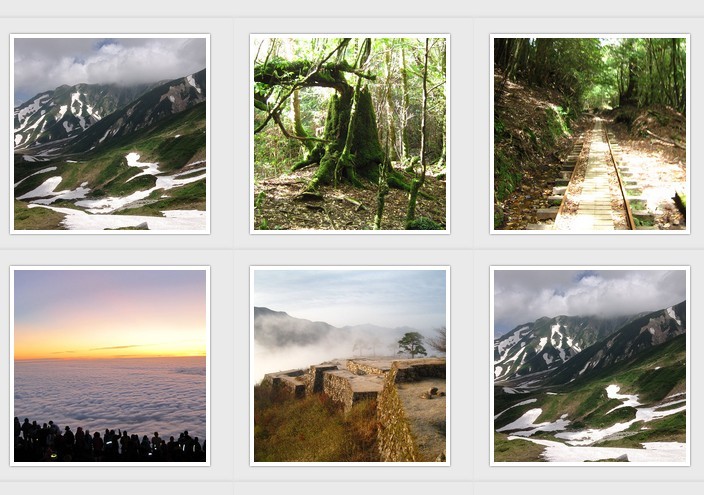
The only markup requirement is a data-layout attribute on the selected div. data-layout should contain a string of numbers representing the number of columns for each row.
If all of the images in a photoset set both a height and a width, the layout of the grid is triggered immediately before all of the images load. Otherwise imagesLoaded is used to wait for all of the images to load in.
Understanding data-layout:
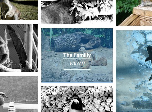
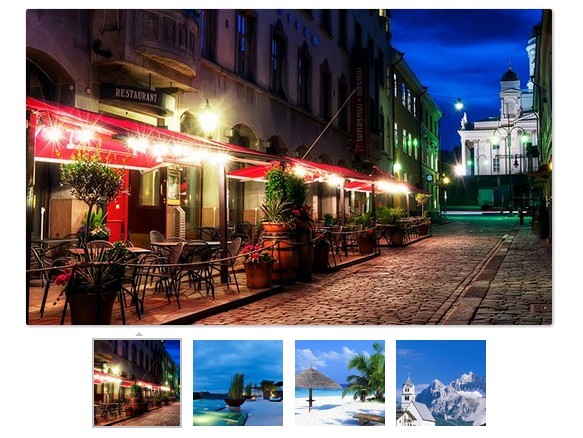
data-layout="2331"1st row has 2 images, 2nd row has 3 images, 3rd row has 3 images, and 4th row has 1 image. Total of 9 images.data-layout="13"1st row has 1 image and 2nd row has 3 images.
Basic Usage
Simply call photosetGrid(); on a div with the data-layout specified and a number of images inside.
HTML:
<div class="photoset-grid" data-layout="13"> <img src="image1.jpg"> <img src="image2.jpg"> <img src="image3.jpg"> <img src="image4.jpg"> </div> Javascript:
$('.photoset-grid').photosetGrid(); Custom Options
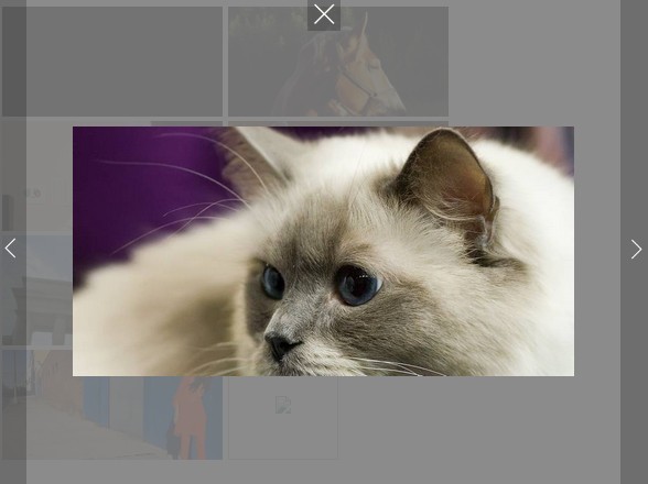
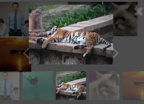
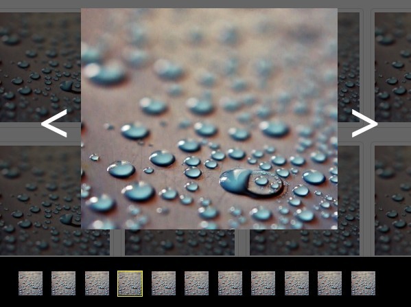
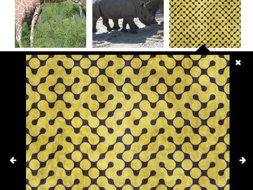
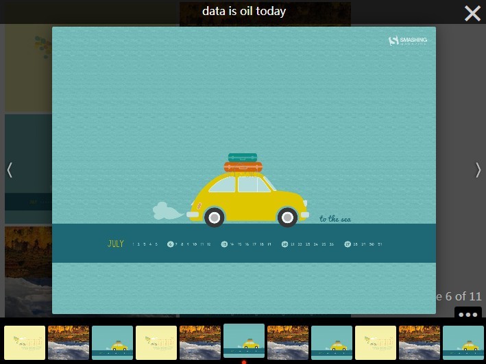
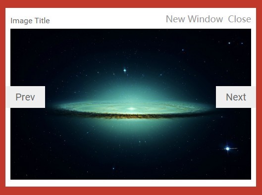
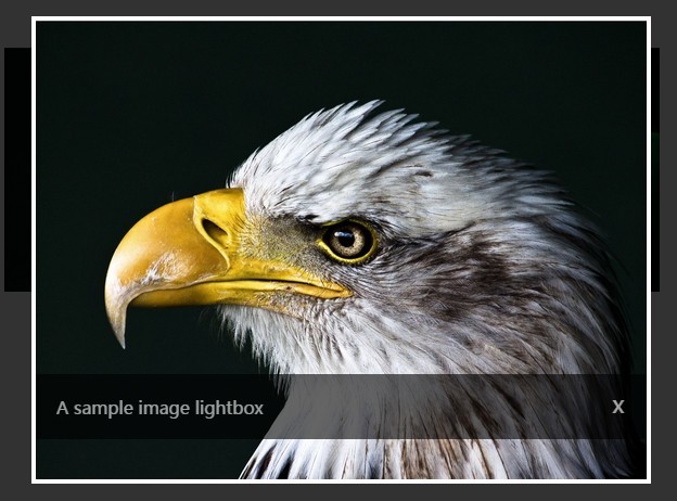
Beyond the basic usage, you can set a number of optional arguments including callback functions that are useful for adding a lightbox for high resolution images.
arguments
width-stringChange the width that the photo set grid will be rendered at. Default:100%automatically fits its container for responsive layoutslayout-stringManually set a string of numbers to specify the number of images each row contains. Default:nullgenerates a stacked layout of one image per rowgutter-stringSet the pixel width between the columns and rows. Default:0pxhighresLinks-booleanSet totrueto automatically swap out the default imagesrcwith thedata-highresattribute once the image is wider thanlowresWidth. This will also wrap each image with anavs.divelement. Default:falselowresWidth-numberSets the width where the default image is swapped out for the high resolution image. Default:500rel-stringThis optional setting useful for lightbox viewers applies a commonrelattribute to the anchor tags wrapping the images.borderActive-booleanThis optional setting is used to wrap each image with a border. Default:falseborderWidth-stringDefine the width of the border wrapping each image. Default:'5px'borderColor-stringDefines the color used for the border wrapping each image. Default:'#000000'borderRadius-stringDefines the border radius of the border wrapping each image. Default:'0'borderRemoveDouble-booleanIf the gutter is set to 0px (or not specified) then this option can be used to remove double borders that would occur between each row/cell. Default:falseonInit-functionDefine a function to be called when the plugin is initialized.onComplete-functionDefine a function to be called when the plugin has completed the grid layout.
HTML:
<div class="photoset-grid" style="visibility: hidden;"> <img src="image1.jpg" data-highres="highres-image1.jpg"> <img src="image2.jpg" data-highres="highres-image2.jpg"> <img src="image3.jpg" data-highres="highres-image3.jpg"> <img src="image4.jpg" data-highres="highres-image4.jpg"> <img src="image5.jpg" data-highres="highres-image5.jpg"> <img src="image6.jpg" data-highres="highres-image6.jpg"> <img src="image7.jpg" data-highres="highres-image7.jpg"> </div> Javascript:
$('.photoset-grid').photosetGrid({ layout: '232', width: '100%', gutter: '5px', highresLinks: true, lowresWidth: 300, rel: 'gallery-01', borderActive: true, borderWidth: '3px', borderColor: '#000000', borderRadius: '3px', borderRemoveDouble: false, onInit: function(){}, onComplete: function(){ $('.photoset-grid').css({ 'visibility': 'visible' }); } }); Installation
Bower package manager
You can easily install photoset-grid as a Bower package by running:
$ bower install photoset-grid Credits
- Jonathan Moore - @moore | jonathanmoore.com
- Mikey Wills - @mukealicious | muke.me
- Additional
MIT License
Copyright (c) 2013 Style Hatch, Inc
Permission is hereby granted, free of charge, to any person obtaining a copy of this software and associated documentation files (the "Software"), to deal in the Software without restriction, including without limitation the rights to use, copy, modify, merge, publish, distribute, sublicense, and/or sell copies of the Software, and to permit persons to whom the Software is furnished to do so, subject to the following conditions:
The above copyright notice and this permission notice shall be included in all copies or substantial portions of the Software.
THE SOFTWARE IS PROVIDED "AS IS", WITHOUT WARRANTY OF ANY KIND, EXPRESS OR IMPLIED, INCLUDING BUT NOT LIMITED TO THE WARRANTIES OF MERCHANTABILITY, FITNESS FOR A PARTICULAR PURPOSE AND NONINFRINGEMENT. IN NO EVENT SHALL THE AUTHORS OR COPYRIGHT HOLDERS BE LIABLE FOR ANY CLAIM, DAMAGES OR OTHER LIABILITY, WHETHER IN AN ACTION OF CONTRACT, TORT OR OTHERWISE, ARISING FROM, OUT OF OR IN CONNECTION WITH THE SOFTWARE OR THE USE OR OTHER DEALINGS IN THE SOFTWARE.