

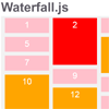
Waterfall.js
Tired of using creepy hacks or heavy ways to get a grid based on Pinterest?
1KB and works without any dependency, also UMD support available too \o/
The "Why"
Currently the best option today to do this job is Masonry, but it's very heavy and has a jQuery dependency. Please understand: this isn't a problem in most cases, but when perfomance and page weight matters, it's best to try other options: maybe pure CSS? Is it possible?
This question has a good point. Yes, there are CSS ways to solve this, using flexbox or columns technic, but this doesn't work well when you don't know about your data/structure. So we have to use JavaScript. The challenge is create a decent algorithm where the structure doesn't matter: Waterfall will work.
However; Waterfall always will consider items with same width :)
How to Use?
Getting
First at all, get Waterfall using Download Option
Get it using npm or yarn by running this command
npm install [email protected]or
yarn add [email protected]You can import
import waterfall from 'waterfall.js/src/waterfall'Or add the source before the closing body tag:
<script src="waterfall.min.js"></script> </body>Another option: Waterfall.js is currently available in cdnjs, so you can use it from there too.
<script src="//cdnjs.cloudflare.com/ajax/libs/waterfall.js/1.0.2/waterfall.min.js"></script> </body>Usage
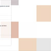
Define your grid structure:
<div class="grid"> <div class="item">Solid Snake</div> <div class="item">Riou</div> <div class="item">Jack Russel</div> </div>Call Waterfall function with your grid as a argument and let the magic happen :)
waterfall('.grid'); // or var grid = document.querySelector('.grid'); waterfall(grid); Responsive
Just call Waterfall function again on window resize event:
window.addEventListener('resize', function () { waterfall(grid); });Many images to load
In this case we highly recommend you run the waterfall only after the images have been loaded. Because Waterfall.js requires information about height / width of the images.
A quick solution is to use imgStatus (no dependencies and only 855bytes) to check the images were loaded.
Browser Support
 |  |  |  |  |
|---|---|---|---|---|
| 42+ ✔ | 40+ ✔ | 8+ ✔ | 29+ ✔ | 8+ ✔ |
Credits
A special thanks to @israelst and @eduardostalinho.
License
The MIT License (MIT)
Copyright (c) 2015 Raphael Amorim
Permission is hereby granted, free of charge, to any person obtaining a copy of this software and associated documentation files (the "Software"), to deal in the Software without restriction, including without limitation the rights to use, copy, modify, merge, publish, distribute, sublicense, and/or sell copies of the Software, and to permit persons to whom the Software is furnished to do so, subject to the following conditions:
The above copyright notice and this permission notice shall be included in all copies or substantial portions of the Software.
THE SOFTWARE IS PROVIDED "AS IS", WITHOUT WARRANTY OF ANY KIND, EXPRESS OR IMPLIED, INCLUDING BUT NOT LIMITED TO THE WARRANTIES OF MERCHANTABILITY, FITNESS FOR A PARTICULAR PURPOSE AND NONINFRINGEMENT. IN NO EVENT SHALL THE AUTHORS OR COPYRIGHT HOLDERS BE LIABLE FOR ANY CLAIM, DAMAGES OR OTHER LIABILITY, WHETHER IN AN ACTION OF CONTRACT, TORT OR OTHERWISE, ARISING FROM, OUT OF OR IN CONNECTION WITH THE SOFTWARE OR THE USE OR OTHER DEALINGS IN THE SOFTWARE.


