[ DEPRECATED ]
Due to limited time, lack of contributions and also due to the advancements of alternatives I've stopped supporting this library. Fork it and adjust it as you wish, but I think BBC Imager or Blazy are the best alternatives to use. And due to the advancements in browsers (<picture> / srcset) the need for a library as this will only decline.
RIMG
"Responsive-image" (Rimg) supports responsive websites to provide a way to optimize images (like CMS-content) in a simple and performant way. Pure Javascript, no server-side code and 2 lines of code (library + definition).
It is based on the idea that when the DOM is loaded, it will traverse the DOM, looking for <img>-nodes, and alter the src-property. You can also manually execute this task. Rimg uses an adapted version of the srcset specification, while you don't need to define with every image 3(+) breakpoints. Just provide the image basename and let Rimg do the adjustments.
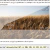
See the demo or look here how the breakpoints are used. Current version: v2.1.0.
Features
- responsive (background) images that respond to retina-screens, browser-resizes, DOMContentLoaded-events and DOM-changes
- lazy loading of images: scroll down and Rimg will load the almost visible images (offset option).
- pure frontend ( javascript ) solution and no server-side setup/code is necessary.
- independent library, it is NO plugin for jQuery, you don't need to load any other javascript library.
- no user agent sniffing and no cookies just JS reacting on the environment it is executed in.
- reconfigure after Rimg is loaded/executed by using
Rimg.configure({breakpoint:'',...}); - art direction support, respect the chosen filenaming strategy and alter your
<img>in any way (square?) and save the file used in that breakpoint and everything works! - small package : 6,4 kB (gzip) or 9,6 kB (plain)
Nice to know features
- only
<img>elements with adata-srcproperty will be adjusted by Rimg, so implement on one, some or all images. - only elements with a
data-background-imageproperty will be adjusted by Rimg, so implement on one, some or all images. This is needed for images that will usebackground-size: cover. - supports all file extensions (
jpg,png,webp,etc.) while it uses (and does not filter) the file extension.svgandgiffiles are ignored. - disable auto introspection, so only manually adjustable by using
Rimg.configure(breakpoints);andRimg.execute(targetElement);
Getting Started
- Define custom filenaming strategy, like
-micro,-tiny,-small,-medium,-regular,-largeand-hugeto have a clear distinction between all breakpoint-steps. - Define initial breakpoints, like
var RimgOptions = { breakpoint:'-micro 160w 1x, -micro-retina 160w 2x, -tiny 320w 1x, -tiny-retina 320w 2x, -small 480w 1x, -small-retina 480w 2x, -medium 600w 1x, -medium-retina 600w 2x, -regular 768w 1x, -regular-retina 768w 2x, -large 1024w 1x, -large-retina 1024w 2x, -huge 1200w 1x, -huge-retina 1200w 2x'};before you load the minified version of Rimg.
- Load the script, like
<script src="rimg.min.js"></script>. You can put it before the</body>or before the</head>tag.
will result in something like:
<script> var RimgOptions = { breakpoint:'-tiny 320w 1x, -tiny-retina 320w 2x, -small 480w 1x, -small-retina 480w 2x, -medium 600w 1x, -medium-retina 600w 2x, -regular 768w 1x, -regular-retina 768w 2x, -large 1024w 1x, -large-retina 1024w 2x, -huge 1200w 1x, -huge-retina 1200w 2x'}; </script> <script src="rimg.min.js"></script> </head> <body> <img data-src="image.jpg"/>Now you have a working setup that will check your DOM-element dimensions to determine which image-file suits best to show in the HTML page.
Dependencies
- A clear filenaming strategy that you will use with all your image-filenames you use.
- Use CSS or
style=""to adjust<img>dimensions and Rimg will only listen to that values. - If you use lazy loading (which is default on), please be advised that you want to define the min-height / height of the images. So when scrolling Rimg will know what images to load, while during initialization it is not clear what height the image has.
Tips
Due to adding IE8 support, the mechanism works the same, but using HTML5 features are still preferred to prevent issues.
- Mediaqueries support in the browser you want to support.
- Use
<meta name="viewport" content="width=device-width, initial-scale=1">or another scale, but use the viewport-meta-tag to let Rimg do the work.
Background-size support
While CSS3 added many features the most important one is to correctly scale background images with background-size:cover. Rimg supports altering the background-image (CSS3) property depending on the dimensions of the element to adjust. You need to do 1 thing only
<div data-background-image="image.jpg"></div>
Rimg will recognize the data-background-image property and will alter the background image property depending on the CSS dimensions of the element. Let background-size (which you define yourself) determine how to scale the provided image inside the container, but let Rimg determine which file is appropriate.
Documentation
API
- Rimg.execute(target) (Element) - provide a DOM element to determine if it is or has
<img>elements to change. - Rimg.configure(breakpoints) (String) - provide the breakpoints so Rimg can determine which picture to use. If Rimg.disableIntrospection is false it will also do Rimg.execute(document);
- Rimg.disableIntrospection() (Boolean) - prevents scan for images after a DOM-load or DOM-changes or a resize, so manually select
to adjust.
- Rimg.disableLazyLoading() (Boolean) - prevents the ability to only load the images that are (almost) visible in your browser-view.
- Use the example below before loading the script itself to set initial breakpoints.
var RimgOptions = { breakpoint: '-small 480w 1x, -small-retina 480w 2x, -regular 768w 1x, -regular-retina 768w 2x, -large 1024w 1x, -large-retina 1024w 2x, -huge 1200w 1x, -huge-retina 1200w 2x' disableIntrospection: false, disableLazyLoading: false};RimgOptions
To initialize Rimg, you will need to define the breakpoints, but you can also change some optional parameters:
- disableIntrospection (Boolean - false) : adjust only the selected images you want to be responsive by your own script.
- disableLazyLoading (Boolean - false) : skip smart loading of images by forcing Rimg load all images when the DOM is loaded.
- offset (Object - default {x:100,y:100}) : define how quickly Rimg needs to react to load the next image.
- complete (Function - null) : when all images are loaded (Rimg is ready) then this function will be called if set.
Breakpoints
Define a custom filenaming setup. It is based on the srcset specification. For example:
<img data-src="image.jpg"/>will become
<img src="image-small.jpg" data-src="image.jpg"/>in the situation where the -small 480w 1x breakpoint is valid. image.jpg is non-existent, but it is the base filename to use with all images.
var RimgOptions = { breakpoint: '-small 480w 1x, -small-retina 480w 2x, -regular 768w 1x, -regular-retina 768w 2x, -large 1024w 1x, -large-retina 1024w 2x'};gives you all the freedom by defining 1 (or more) breakpoints with the flexibility to add specific image-files for retina-screens like the iPad, iPhone or Samsung Galaxy S.., etc.
While the srcset specification only references 2x as maximum pixel aspect ratio, this is not current. Because devices already exist with devicePixelRatio as high as 3x or even higher (with a 1080p screen). Rimg has no restriction on the maximum pixel aspect ratio, just define yourself the -small 3x or even -small 4x images. Of course this will have effect on the bandwidth (due to its download size), but it is possible.
You can skip the retina option or skip certain breakpoints (480w or 768w) or even add weird ones (like -special 456w 1x).
The w in 480w defines the width property to check. During development of responsive websites I haven't found many examples to use h for the height, but I did found issues with javascript returning 0 as the height of non-loaded images; even when the height is set in %. This is why I removed height-support in version 2.0 of RIMG,so use the width as a breakpoint (kind of best practice).
Examples
To view the examples in the /test-directory, clone the project and go to your commandline:
- run
npm run checkto update all npm modules - run
gulpto parseRimg.jsinto the correct places - run
npm run serverto run the test examples onhttp://localhost:8080 - run
npm testto run the Casperjs tests!
These tasks let you check the examples locally, but you can also see a demo online.
Remark: nodejs or iojs needed!
Contributing
Please do test, check and create pull requests/issues/remarks to further extend/stabilize this library.
Changelog
2.1.0 fixed blurry images by scaling down and not up (more bandwidth usage!)
2.0.2 fixed MutationObserver bug
2.0.1 fixed issue with SVG/GIF not being copied/executed
2.0.0 added Casperjs tests + rewrote the workflow + removed height-breakpoints
1.9.1 ignore empty data-src values
1.9.0 support for background-size (CSS3) + ignore svg file extension
1.7.0 support for -320x naming of files
1.6.0 added complete-event + gulpjs
1.5.0 async bug fixed + scroll/lazy-load added + breaking change with RimgBreakpoint into RimgOptions + faster looping through images + better input-validation + added more examples in /test
1.0.0 IE8 support + fixed bugs
0.9.0 version bump + fixed visual performance (less latency) + cleaned error when no breakpoint defined
0.4.1 fixed issue with body element not always as 2nd option
0.4.0 fixed issue with html comments blocking its execution
0.3.5 moved bandwidth detection into a separate branch
0.3.0 firefox bug (width=0) fixed
0.2.5 mutations fix
0.2.0 retina-fix + tests made
0.1.0 initial release
FAQ
See the Wiki for more information.
You can build rimg.js yourself by using grunt or gulp. Of course install first all the necessary modules with npm install
Supports
- IE8+
- Chrome
- Firefox
- Safari
- Android (Chrome / Firefox / default browser)
- iOS (default browser)
WORDPRESS
Rimg is also fully capable to implement in your Wordpress setup. For more information check this wiki page here.
Alternatives
Many alternatives are available, but be aware of the differences. Some use APIs that do not have cross-browser support or provide features you do not need. Still there are interesting alternatives to Rimg like:
- Riloadr ~ client-side JS-only script
- Responsive.io ~ service
- Blazy ~ client-side JS-only script
- Echo ~ client-side JS-only script
- BBC Imager ~ client-side JS-only script
