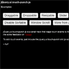
Restive.JS
Restive.js is a designer-friendly jQuery toolkit for responsive Web design.
Using a combination of smart device detection, advanced breakpoints management, and timely CSS class additions, restive.js will make it easier for you to build mobile-friendly and/or responsive Web pages.
To learn more, please visit restivejs.com.
Why Restive.JS?!
The main reason restive.js exists is to make it easier for you as a Web designer to add responsive and/or mobile-friendly enhancements to your Web pages. Yes, CSS media queries does this, but it has some major limitations.
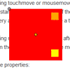
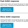
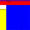
Say you need to build a Web page, and you also need to make that Web page mobile-friendly. With CSS media queries, you have to contrive breakpoints that break the flow of the cascade, and don't really work exactly as you might expect.
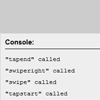
With restive.js, you simply use classes to do some really powerful layout customization.
So your CSS becomes this:
/* Smartphones (all orientations) */ .r_mobi #my-element-1 {color: #ff0000;} /* Smartphones (landscape) */ .r_mobi.r_phone.r_landscape #my-element-1 {color: #00ff00;} /* Smartphones (portrait) */ .r_mobi.r_phone.r_portrait #my-element-1 {color: #0000ff;}Instead of this:
/* Smartphones (all orientations) */ @media only screen and (min-device-width : 320px) and (max-device-width : 480px) { #my-element-1 {color: #ff0000;} } /* Smartphones (landscape) */ @media only screen and (min-device-width : 320px) and (max-device-width : 480px) and (orientation : landscape) { #my-element-1 {color: #00ff00;} } /* Smartphones (portrait) */ @media only screen and (min-device-width : 320px) and (max-device-width : 480px) and (orientation : portrait) { #my-element-1 {color: #0000ff;} }Restive.js makes your CSS code cleaner, smaller, and a lot more definitive. You can be sure of what your CSS is going to do 99% of the time, plus you'll spend a lot less time testing your Web pages (unlike when using CSS media queries).
Restive.js is also great for retro-fitting existing Web pages and websites to make them mobile-friendly and/or responsive. No need to start from scratch when making those old and wonky websites mobile-friendly and/or responsive.
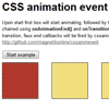
Getting Started
It's really quick and easy to get started with restive.js:
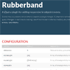
// Link CSS <link rel="stylesheet" href="your-stylesheet.css"/> // Link JQuery (1.7.1 or higher) <script type="text/javascript" src="jquery.min.js"></script> // Link restive.JS <script type="text/javascript" src="restive.min.js"></script> // Energize restive.JS <script type="text/javascript"> $(document).ready(function () { $('body').restive(options); }); </script>where options are the setup parameters [in JSON object format] that you pass to restive.js.
You can see some examples on restivejs.com.
Documentation
To dive deeper into restive.js and learn more about what it can do, please review the docs. You can find it at restivejs.com/docs
Need Help?
StackOverflow is a great platform to get answers to your questions. Simply ask your question using the restivejs tag.
If you need professional help with a commercial project, we also offer development and support services provided by the core Restive Team.
License
Click here to view the License Agreement for Restive.JS.
Changelog
Click here to view the Changelog
Acknowledgements
A big thank you to BrowserStack for sponsoring this project.


