
Description
Powerange is a range slider control, inspired heavily by iOS 7 and the "Power Rangers" TV series. It is easily customizable, both by CSS and JavaScript. With it's many features, including changing color and overall style, switching between horizontal and vertical style, custom min, max and start values, custom step interval, displaying decimal values, displaying icons instead of min/max numbers, it is a really powerful UI tool to use on your website.
A great cross-browser solution, supporting: Google Chrome 14+, Mozilla Firefox 6.0+, Opera 11.6+, Safari 5+, IE 9+
Licensed under The MIT License.

If you like this module and you're a fan of iOS 7 style UI widgets, check out Switchery.
Installation
Standalone:
<link rel="stylesheet" href="dist/powerange.css" /> <script src="dist/powerange.js"></script>Component:
$ component install abpetkov/powerangeBower:
$ bower install powerangeUsage
var elem = document.querySelector('.js-range'); var init = new Powerange(elem);Use the above for the standalone version.
NOTE: your element must be a text input
Settings and Defaults
defaults = { callback : function() {} , decimal : false , disable : false , disableOpacity: 0.5 , hideRange : false , klass : '' , min : 0 , max : 100 , start : null , step : null , vertical : false };callback: function invoked on initialization and on slider handle movementdecimal: display decimal numberdisable: enable or disable sliderdisableOpacity: opacity of the disabled sliderhideRange: show or hide min and max range valuesklass: additional class for the slider wrapper for extra customizationmin: minimum range valuemax: maximum range valuestart: starting valuestep: step of the handlevertical: toggle between horizontal or vertical slider
Examples
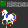
Basic style customization
You are free to customize the range slider as much as you wish, using only CSS.
The width (for horizontal) or height (for vertical) of the slider, depends on the container in which it's placed and take 100%.
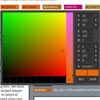
Play around with the background-color of .range-bar and .range-quantity, add a background-image to .range-handle, add some nice background-image to .range-min and .range-max, get use of the hideRange option and you may end up with something as fun as this:

The sky is the limit.
Hint: Use the klass option to add an additional class to the slider and apply different style to it
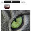
Minimum, maximum and start values
Changing your default min, max and start values is pretty easy. The start value has to be a number in your min-max interval, otherwise it takes the value of either min or max, depending on which is closer. Negative values are supported as well.
var init = new Powerange(elem, { min: 16, max: 256, start: 128 });Decimal
Display decimal number with 2 characters after the decimal point.
var init = new Powerange(elem, { decimal: true });Slider step
You can change the step with which the handle moves, using the step option.
var init = new Powerange(elem, { step: 10 });Hide range values
You can hide the min and max values, by using the hideRange option.
var init = new Powerange(elem, { hideRange: true });
Disabled
Disable the range slider and change it's default disabledOpacity if needeed.
var init = new Powerange(elem, { disable: true, disabledOpacity: 0.75 });You can still give it a value, by changing the start option.

Horizontal and vertical slider
The default Powerange slider is horizontal. However, you can make it vertical, by setting vertical: true.
var init = new Powerange(elem, { vertical: true });
Checking value
Check the current value of the range slider, by looking at the value of the text input element.
On click:
var clickInput = document.querySelector('.js-check-click') , clickButton = document.querySelector('.js-check-click-button'); clickButton.addEventListener('click', function() { alert(clickInput.value); });On change:
var changeInput = document.querySelector('.js-check-change'); changeInput.onchange = function() { alert(changeInput.value); };Callback
The callback function is invoked on slider initialization and on slider handle movement. It's very appropriate for displaying the current value in another element.
var elem = document.querySelector('.js-range'); var init = new Powerange(elem, { callback: displayValue }); function displayValue() { document.getElementById('display-box').innerHTML = elem.value; }
Interacting with another elements
Just a simple example of how you can interact with an element, when changing the slider value.
var elem = document.querySelector('.js-range'); var init = new Powerange(elem, { callback: setOpacity, decimal: true, min: 0, max: 1 }); function setOpacity() { document.querySelector('.target').style.opacity = elem.value; }Development
If you've decided to go in development mode and tweak this module, there are few things you should do.
Make your own build files, by using Grunt command:
$ grunt buildAdd the following code before the initialization:
var Powerange = require('powerange');Make sure you're using the build/build.js and build/build.css files and you're ready.
There are some useful commands you can use:
$ grunt watch - watches for changes in the CSS and JS files in lib/ and updates the build files
$ grunt componentbuild - updates the files in build/
$ grunt uglify - makes new JS standalone files
$ grunt cssmin - makes new CSS standalone files
$ grunt clean - empties the contents of build/ and dist/ folders
Contact
If you like this component, share your appreciation by following me in Twitter, GitHub or Dribbble.
License
The MIT License (MIT)
Copyright (c) 2014 Alexander Petkov
Permission is hereby granted, free of charge, to any person obtaining a copy of this software and associated documentation files (the "Software"), to deal in the Software without restriction, including without limitation the rights to use, copy, modify, merge, publish, distribute, sublicense, and/or sell copies of the Software, and to permit persons to whom the Software is furnished to do so, subject to the following conditions:
The above copyright notice and this permission notice shall be included in all copies or substantial portions of the Software.
THE SOFTWARE IS PROVIDED "AS IS", WITHOUT WARRANTY OF ANY KIND, EXPRESS OR IMPLIED, INCLUDING BUT NOT LIMITED TO THE WARRANTIES OF MERCHANTABILITY, FITNESS FOR A PARTICULAR PURPOSE AND NONINFRINGEMENT. IN NO EVENT SHALL THE AUTHORS OR COPYRIGHT HOLDERS BE LIABLE FOR ANY CLAIM, DAMAGES OR OTHER LIABILITY, WHETHER IN AN ACTION OF CONTRACT, TORT OR OTHERWISE, ARISING FROM, OUT OF OR IN CONNECTION WITH THE SOFTWARE OR THE USE OR OTHER DEALINGS IN THE SOFTWARE.


