PlainDraggable
The simple and high performance library to allow HTML/SVG element to be dragged.
Document and Examples https://anseki.github.io/plain-draggable/
Features:
- Accept HTML/SVG element as an element that comes to be draggable.
- Support both mouse and touch interfaces.
- Restrict the draggable area.
- Snap the draggable element to other elements, points, lines, consecutive points (i.e. grid) or something.
- Scroll an element or window automatically when the draggable element was moved to edge of the area.
- Use
requestAnimationFrameAPI,translateandwill-changeCSS if possible, for high performance.

- Provide only basic methods, easy and simple usage.
- No dependency.
- Single file.
- Support modern browsers.
Usage
Load PlainDraggable into your web page.
<script src="plain-draggable.min.js"></script>This is simplest case:
draggable = new PlainDraggable(element);Now, the element can be moved by mouse-dragging (or touch interfaces) operation.
The element might be a <div>, <span>, <circle> or something.
By default, the moving is restricted to inside of the element's parent element.
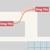
<div style="background-color: gray;"> <div id="draggable">Drag This</div> </div>The <div id="draggable"> can be moved within the gray box. (See containment option.)
You can specify a "Grid" that the draggable element snaps to.
draggable.snap = {step: 30};For options, methods and more details, refer to the following.
Constructor
draggable = new PlainDraggable(element[, options])The element argument is a HTML or SVG element that will be a draggable element. Any element that has a bounding-box is accepted. Other elements such as <g> can not be specified.
The options argument is an Object that can have properties as options (and leftTop option). You can also change the options by setOptions method or properties of the PlainDraggable instance.
leftTop option
By default, PlainDraggable tries to move the draggable element by using the translate CSS transform function.
If true is specified for leftTop option of the constructor, it uses the left and top CSS properties instead. You may use this to make it synchronize with the layout of something.
Note that the left and top CSS properties may be performance degradation.
Also, this is an option for constructor, that is, you can not change this after.
Methods
setOptions
self = draggable.setOptions(options)Set one or more options.
The options argument is an Object that can have properties as options.
position
self = draggable.position()Re-calculate the position of the draggable element, containment option, snap option and autoScroll option, with current layout of a page.
Those are re-calculated as needed automatically when a window is resized, or a window or something is scrolled.
You should call position method if you changed the layout without resizing the window or scrolling something.
remove
draggable.remove()Remove the current PlainDraggable instance.
Never use the removed instance.
Options
containment
Type: HTML/SVG element or Rect
Default: Parent element
A rectangle that restricts the moving of the draggable element. The draggable element can not move to the outside of this rectangle even if a mouse pointer is moved to there.
It can be a HTML or SVG element, or a Rect object like {left: '10%', top: 20, right: '90%', height: 300} (See Rect). The base of the Rect object is the current document.
Note that the rectangle is "padding-box" of the element if an element is specified. That is, it is the inside of borders of the element.
The width or height can be less than the size of the draggable element, such as zero, to disable the moving on that axis.
For example, this draggable element can be moved in a horizontal direction only.
draggable.containment = {left: 20, top: 20, width: 800, height: 0}; // See next code too.When the moving on an axis is disabled, the draggable element is not moved in that axis direction at all. Therefore the position of the containment on that axis has no meaning.
For example, when 0 is specified for height to disable the moving on that Y-axis, even if 0, 999 or another value is specified for top, the draggable element is not moved to 0 or 999 in Y-axis.
Therefore the above example code can be replaced with:
draggable.containment = {left: 20, top: 0, width: 800, height: 0}; // The element is not moved to `top: 0` even if it is positioned at `top: 480` now.The default is the draggable element's parent element.
You can specify a <body> element that means all of a page, or {left: 0, top: 0, width: '100%', height: '100%'} means all of a document (the document height might differ from the <body> height).
snap
Type: number, string, HTML/SVG element, Rect, Array, Object or undefined
Default: undefined
See Snap.
autoScroll
Type: boolean, window, HTML element, Object or undefined
Default: undefined
Scroll a scrollable area when the draggable element is moved to near the edges of the area. The scrollable area can be the current window or a HTML element.
For example:
draggable.autoScroll = true;If true is specified, the autoScroll is enabled with all default options.
If a HTML element is specified, it is enabled with {target: element} option.
Or, you can specify an Object that can have properties as following options.
target
Type: window or HTML element
Default: window
A scrollable area. Maybe, that contains the containment or that is the containment itself.
speed
Type: number or Array
Default: [40, 200, 1000]
A number determining the speed of scrolling, pixels per second.
You can specify an Array that contains multiple values. Then, scroll it with the first speed when the draggable element was moved near the edges of the area, and scroll it with the next speed when the draggable element was moved near more..., in this way. At most, you can specify three numbers.
Those must be sorted in ascending order.
See sensitivity option for lines of demarcation that switch the speed.
sensitivity
Type: number or Array
Default: [100, 40, 0]
A number determining the starting or switching the speed, the distance from the edge of the area, in pixels.
When you specify multiple values for speed option, you can specify an Array that contains multiple values. Then, scroll it with the first speed when the draggable element was moved at less than the first distance from the edges of the area, and scroll it with the next speed when the draggable element was moved at less than the next distance..., in this way. At most, you can specify three numbers.
Those must be sorted in descending order.
See speed option for the speed.
minX / maxX / minY / maxY
Type: number or undefined
Default: undefined
A number setting a limit to scrolling. These values are returned value by pageXOffset, pageYOffset, scrollLeft or scrollTop.
You can specify 0 for maxX or maxY to disable scrolling for that axis only. For example, maxX: 0 disables horizontal scrolling only.
Note that this is a limit of the autoScroll, not scrolling of UI. That is, user can scroll manually, regardless of this.
handle
Type: HTML/SVG element
Default: Draggable element
A part element of the draggable element that receives mouse (or touch interfaces) operations. A user seizes and drags this element to move the draggable element.
The default is the draggable element itself, and all of the draggable element can be seized and dragged.
zIndex
Type: number or boolean
Default: 9000
A z-index CSS property that is applied to the draggable element when it is being dragged. It is restored when the dragging finished.
If false is specified, it is not changed.
left / top
Type: number or undefined
Default: undefined
The distance between a left or top edge of the draggable element and a left or top edge of the document, in pixels.
It can be used for initial position when constructing new PlainDraggable instance. Also, it can be used to move the draggable element after constructing.
For example, move it rightward:
draggable.left += 10;onDrag
Type: function or undefined
Default: undefined
A function that is called when the draggable element was dragged. That is not moved yet.
It is called even if the draggable element is not moved because containment or snap avoided the moving. Use onMove if you want to do something when the draggable element was moved.
In the function, this refers to the current PlainDraggable instance.
An Object that has left and top properties as new position is passed to the function. These are numbers that were calculated the same as left / top options.
It is new position that the draggable element is about to go to. Therefore it might differ from a position of a mouse pointer. And also, you can change these properties.
For example:
draggable.onDrag = function(newPosition) { if (newPosition.left > this.rect.left) { newPosition.left = this.rect.left + 48; // Move it 48px to the right forcibly. } };Also, snapped property is true if the position was determined by the draggable element being snapped (See Snap).
If the function returns false, the moving is canceled.
For example:
draggable.onDrag = function(newPosition) { return !!newPosition.snapped; // It is moved only when it is snapped. }; // The `gravity` option also can be used for the same purpose.onMove
Type: function or undefined
Default: undefined
A function that is called when the draggable element was moved.
It is not called when the draggable element is not moved because containment or snap avoided the moving even if the draggable element is dragged.
In the function, this refers to the current PlainDraggable instance.
An Object that has left and top properties is passed to the function. It might have snapped property too. See onDrag for those properties.
And also, autoScroll property is true if it tried scroll (See autoScroll option). This means that the draggable element was moved to near the edges of the area, it might have been not scrolled.
For example:
draggable.onMove = function(newPosition) { console.log('left: %d top: %d width: %d height: %d it is scrolling: %s' // determined position that was changed by snap and onDrag newPosition.left, newPosition.top, this.rect.width, this.rect.height, newPosition.autoScroll); };onDragStart
Type: function or undefined
Default: undefined
A function that is called when a mouse button or touch interface was pressed on the draggable element. That is not dragged yet.
It is called even if the draggable element is not dragged. Use onDrag if you want to do something when the draggable element was dragged.
In the function, this refers to the current PlainDraggable instance.
An Object that has clientX and clientY properties pointing a position of a mouse pointer or touch interface is passed to the function. That might be MouseEvent or first Touch object of TouchEvent.
If the function returns false, the dragging is canceled.
For example:
draggable.onDragStart = function(pointerXY) { if (isEar(pointerXY)) { alert('Do not pull my ear!!'); return false; } return true; };onMoveStart
Type: function or undefined
Default: undefined
A function that is called when the moving the draggable element started.
It is not called until the draggable element is moved even if it was dragged, and it is called at most once, while a mouse button is being pressed.
In the function, this refers to the current PlainDraggable instance.
An Object that has left and top properties is passed to the function. It might have snapped and autoScroll properties too. See onMove for those properties.
onDragEnd
Type: function or undefined
Default: undefined
A function that is called when a mouse button was released.
It is called even if the mouse pointer was not moved.
In the function, this refers to the current PlainDraggable instance.
An Object that has left and top properties is passed to the function. See onDrag for those properties.
Properties
disabled
Type: boolean
Default: false
If true is specified, the draggable element stops the moving immediately, and it does not receive mouse operations.
element
Read-only
Type: HTML/SVG element
The element that was passed to constructor.
rect
Read-only
Type: Rect
A Rect object to indicate current position and size of the draggable element.
The base of the Rect object is the current document.
Accessor Properties
Properties with the same name as each option to get or set following options:
containmentsnapautoScrollhandlezIndexleft/toponDragonMoveonDragStartonMoveStartonDragEnd
For example:
draggable.containment = wideArea; draggable.handle = newHandle; draggable.left += 10;You can use setOptions method instead to set multiple options.
PlainDraggable.draggableCursor / PlainDraggable.draggingCursor
Static Property
Type: string or Array
Default: (depend on web browser)
PlainDraggable.draggableCursor:
['grab', 'all-scroll', 'move']or['all-scroll', 'move'](For Webkit)PlainDraggable.draggingCursor:
['grabbing', 'move']or'move'(For Webkit)
PlainDraggable.draggableCursor is a cursor CSS property that is applied to the handle element.
PlainDraggable.draggingCursor is a cursor CSS property that is applied to the handle element while a mouse button is being pressed.
If an Array that contains multiple values is specified, PlainDraggable tries it with each value until any of them succeeded.
Note that the allowed values of the cursor CSS property depend on each web browser. And also, Webkit has a bug about the cursor CSS property, and the bug is being ignored a long time.
If false is specified, it is not changed.
If false is specified for both PlainDraggable.draggableCursor and PlainDraggable.draggingCursor, PlainDraggable does nothing to a cursor CSS property.
PlainDraggable.draggableClass / PlainDraggable.draggingClass / PlainDraggable.movingClass
Static Property
Type: string
Default:
PlainDraggable.draggableClass:'plain-draggable'PlainDraggable.draggingClass:'plain-draggable-dragging'PlainDraggable.movingClass:'plain-draggable-moving'
PlainDraggable.draggableClass is a class name that is added to the draggable element.
PlainDraggable.draggingClass is a class name that is added to the draggable element within the period from when a mouse button is pressed until the button is released. Then, the draggable element has both classes.
PlainDraggable.movingClass is a class name that is added to the draggable element within the period from when the draggable element starts moving until a mouse button is released. Then, the draggable element has three classes.
For example:
PlainDraggable.draggableClass = 'cat'; PlainDraggable.draggingClass = 'lift'; PlainDraggable.movingClass = 'swing';Rect
An Object to indicate a position and size of a rectangle, like DOMRect.
It has following properties:
leftorxtoporywidthorrightheightorbottom
Also, it is relative to a "base".
The left / top / right / bottom indicate distance between the left or top edge of the base and the left or top side of the rectangle. Note that right / bottom also indicate distance from the left or top edge of the base, not from the right or bottom edge.
The x is an alias for left, and the y is an alias for top.
The width / height indicate a size of the rectangle. The width is required if right is not specified, and the height is required if bottom is not specified.
All values are a number as pixels or string as percentage (e.g. '30%').
The "base" determines the origin of coordinates, and the number of pixels of 100%.
- When the
Rectobject is specified for thecontainmentoption, the base is the current document. - When the
Rectobject is specified for thesnapoption, the base is determined bybaseoption. - When the
Rectobject is got by therectproperty, the base is the current document.
Note that the right must be greater than or equal to left, and the bottom must be greater than or equal to top. In other words, the width and height can not be negative value. PlainDraggable does not invert these to avoid behavior that you don't want. For example, {left: 400, right: '50%'} is ignored when the base is resized to smaller than 800px width.
For example, when the base width is 600px and height is 400px:
{left: 20, top: '10%', width: '50%', bottom: 390}indicates a rectangle that isleft: 20px; top: 40px; width: 300px; height: 350px;, positioned relative to the top-left corner of the base.{left: '50%', top: 0, width: '50%', height: '100%'}indicates a rectangle that is the right half of the base.{left: '10%', top: '10%', right: '90%', bottom: '90%'}indicates a rectangle that has10%margin at all sides.
Snap
You can specify snap option.
The snap option makes one or more "snap-targets". The draggable element gravitates toward a snap-target when it is moved to near the snap-target, and it sticks to the snap-target.
Each snap-target can be one of the following:
- Point
- Line
- Element or
Rectobject
The point acts on both a horizontal direction and a vertical direction, and the line acts on either direction.
The point and line are the basic of snap-target. The element and Rect object create multiple lines.
Single value creates a point that the value indicates both X and Y coordinates of the point. Then a top-left corner (default) of the draggable element snaps to this point.
This is simplest case.
draggable.snap = 60; // Point (X: 60px, Y: 60px)A value as coordinate is a number as pixels or string as percentage (e.g. '30%'). The percentage is calculated the same as the x and y of Rect.
For example, this indicates the center of the base.
draggable.snap = '50%'; // Point (X: 50%, Y: 50%) i.e. the centerAn Object that has x and y properties creates a point that the properties indicate coordinates of the point.
draggable.snap = {x: 160, y: '40%'}; // Point (X: 160px, Y: 40%)That is, a value that does not have both x and y is considered as a point that the value indicates the same value for the x and y. For example, 30 is considered as {x: 30, y: 30}.
An Object that has either one of x and y properties creates a line that the property indicates a coordinate on the axis. Then two sides (default) of the draggable element along a direction of this line snap to this line.
draggable.snap = {x: 130}; // Vertical Line (from top edge to bottom edge)By default, the line has full length of size of the base.
The other property can be an Object that has one or both of start and end properties that indicate a coordinate on the axis. This Object indicates the range on the axis for the line.
draggable.snap = {x: 130, y: {start: 5, end: '50%'}}; // Vertical LineNote that the end must be greater than or equal to start. PlainDraggable does not invert these to avoid behavior that you don't want. For example, x: {start: 400, end: '50%'} is ignored when the base is resized to smaller than 800px width.
A step property of the Object copies the point or line repeatedly at specified intervals. This may be called "Grid". It can be also grid on only either one of X and Y axis.
Its value is a number as pixels or string as percentage (e.g. '30%'). The percentage is calculated the same as the width or height of Rect.
// Consecutive Points at 40px intervals, on X and Y draggable.snap = {step: 40}; // As previously mentioned, this is considered as {x: {step: 40}, y: {step: 40}}.// Consecutive Points at X: 10px and Y: 20px intervals draggable.snap = {x: {step: 10}, y: {step: 20}};// Consecutive Horizontal Lines at 25% intervals (from left edge to right edge) draggable.snap = {y: {step: '25%'}};// 4 Consecutive Horizontal Lines (from left edge to right edge) draggable.snap = {y: {step: '20%', end: '60%'}};// 4 Consecutive Horizontal Lines (300px length) draggable.snap = {x: {end: 300}, y: {step: '20%', end: '60%'}};An element or a Rect object creates four lines that overlap with edges of its rectangle.
draggable.snap = document.getElementById('snap-box'); // Elementdraggable.snap = {left: '10%', top: 0, width: '80%', height: 280}; // Rect objectThe base of the Rect object is determined by base option.
You can specify options for the snap-target via properties of the Object that is passed to the snap option, or an Object instead of something that is not Object. For example, you can specify {x: 80, y: 80, gravity: 30} instead of 80 to specify the gravity option.
Also, you can specify an Array that contains multiple snap-targets.
For options and more details, refer to the following.
Structure and Abbreviation
Actually, you saw shortened structure of a snap option in the above.
Its basic structure is here:
SnapOptions:
{ targets: [snapTarget1, snapTarget2...], // Array containing `SnapTarget`s // Common options for all `SnapTarget`s in the `targets` option1: optionValue1, option2: optionValue2, : }SnapTarget:
{ x: xValue, // number, string or Object y: yValue, boundingBox: elementOrRect, // Element or Rect object // Options for this `SnapTarget`, that override each common option option1: optionValue1, option2: optionValue2, : }The x and y can be one of the following:
- Coordinate:
A value that indicates a coordinate on the axis. - Range:
An Object that indicates a range on the axis, that can havestartandendproperties that are each coordinate on the axis. - Repeated Coordinates:
An Object that indicates repeated coordinates on the axis, that hasstepproperty that is interval between repeated coordinates. It can havestartandendproperties as a range.
All these values are a number as pixels or a string as percentage (e.g. '30%'). The step as percentage is calculated the same as the width or height of Rect, and the other values as percentage are calculated the same as the x or y of that.
The combination of the x and y determines what the SnapTarget indicates.
- If both
xandyindicate each coordinate, thisSnapTargetindicates a point. - If either one of
xandyindicates a coordinate and the other indicates a range, thisSnapTargetindicates a line. - If either one of
xandyindicates a coordinate and the other indicates repeated coordinates, thisSnapTargetindicates consecutive points arranged linearly. - If both
xandyindicate repeated coordinates, thisSnapTargetindicates consecutive points arranged in the horizontal and vertical directions. - If either one of
xandyindicates a range and the other indicates repeated coordinates, thisSnapTargetindicates consecutive parallel lines. - If both
xandyindicate each range, thisSnapTargetindicates four lines as a rectangle. UnlikeboundingBox,edgeoption is not applied.
An important point, the default for the x and y is a range, and the default for the start is 0, and the default for the end is '100%'.
Therefore, you can specify either one of the x and y to indicate a line. For example, {y: 30} indicates a horizontal line. The x having either one or both of the start and end is required only when the line should be shortened.
Also, you can specify only the step to indicate consecutive points or consecutive lines. For example, {y: {step: 50}} indicates consecutive horizontal lines.
The boundingBox is used instead of the x and y, to indicate a rectangle.
You can specify an element or Rect object, then this SnapTarget indicates four lines that overlap with edges of its rectangle.
You can specify one or more SnapTargets for the targets Array of SnapOptions.
And you can specify one or more options in both SnapTarget and SnapOptions. The options in SnapTarget override each option in SnapOptions.
For example:
draggable.snap = { targets: [ {x: 100}, {x: 200, gravity: 60}, {x: 300} ], gravity: 50, center: true };A 50 is applied to the gravity option of first and third snap-targets.
A 60 is applied to the gravity option of second snap-target only.
A true is applied to the center option of all three snap-targets.
Abbreviation
As above, you can specify the snap option in detail. Or, you can also specify it simply as follows.
You can specify something for the SnapTarget directly. It is considered as both x and y, or boundingBox.
For example, the following two codes work same:
draggable.snap = { targets: [ 100, document.getElementById('snap-box'), {x: 20, y: 0, width: 400, height: 200} ] };draggable.snap = { targets: [ {x: 100, y: 100}, {boundingBox: document.getElementById('snap-box')}, {boundingBox: {x: 20, y: 0, width: 400, height: 200}} ] };You can specify single SnapTarget for the targets directly instead of an Array.
For example:
draggable.snap = { targets: 100 // The same as [100] and [{x: 100, y: 100}] };You can specify the targets for the SnapOptions directly.
For example:
draggable.snap = 100; // The same as {targets: 100} and {targets: [100]} and {targets: [{x: 100, y: 100}]} draggable.snap = [100, {x: 200, gravity: 60}]; // 2 targetsOptions for Snap
These are specified in the SnapOptions and SnapTarget.
gravity
Type: number
Default: 20
Distance from the draggable element, in pixels.
The draggable element gravitates toward the snap-target when the distance becomes less than or equal to this.
To avoid staying between "repeated coordinates", you can specify a number greater than or equal to the half of the step. Or, onDrag option also can be used for the same purpose.
corner
For snap-target as point
Type: string
Default: 'tl'
One or more corners of the draggable element that gravitate toward the snap-target.
It is a value that indicates a corner or a list of the values separated by space or comma.
Allowed values are:
'top-left'(Alias:'tl','left-top','lt')'top-right'(Alias:'tr','right-top','rt')'bottom-left'(Alias:'bl','left-bottom','lb')'bottom-right'(Alias:'br','right-bottom','rb')'all'(The same as'tl tr bl br')
side
For snap-target as line
Type: string
Default: 'both'
One or more sides of the draggable element that gravitate toward the snap-target.
It is a value that indicates a side or a list of the values separated by space or comma.
Allowed values are:
'start': Indicate a left side of the draggable element if the snap-target is vertical line, otherwise a top side.'end': Indicate a right side of the draggable element if the snap-target is vertical line, otherwise a bottom side.'both'(The same as'start end')
center
For snap-target as point or line
Type: boolean
Default: false
If true is specified, the center of the draggable element gravitates toward the snap-target. The corner and side options are ignored.
edge
For snap-target as element or Rect object
Type: string
Default: 'both'
One or more sides of each edge of the rectangle that the draggable element gravitates toward. The rectangle is that of the element or Rect object that is specified for the boundingBox.
It is a value that indicates a side or a list of the values separated by space or comma.
Allowed values are:
'inside''outside''both'(The same as'inside outside')
base
Type: string
Default: 'containment'
A base for the Rect object. The x and y also are relative to this.
Allowed values are:
'containment': Indicate the element orRectobject that is specified for thecontainmentoption.'document': Indicate the current document.
