Tag Selector
Lightweight (~2kb gzipped), ES6 Class-based library for turning select fields into customizable and user friendly tag clouds.
Features include:
- ES6 Class-based (Transpiled to ES5 / CommonJS)
- ~2kb in size gzipped
- 100% Dependency free
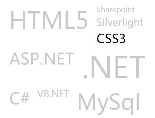
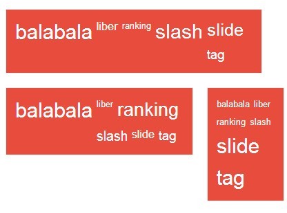
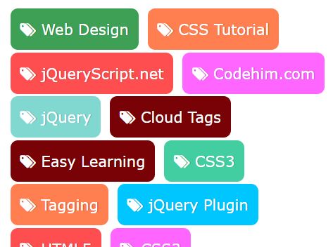
- Comes completely unstyled or with an optional base theme (see screenshot)
- Easy to style with well-named CSS classes
- Mobile Friendly

See demo here
This library works by simply hiding and changing the hidden select field behind the scenes as user selects tags. The way you handle forms with selects remains the same, however users get a much more user friendly experience.
Installation
Via NPM:
npm install --save tagselector Or simply download dist/tagselector.js manually if not using NPM.
Then simply include it however you like:
const TagSelector = require('tagselector');or
<script src="path/to/tagselector.js"></script>Usage
To use, simply create a select field with a unique ID, as well as some options with text and values:
<select id="someSelect"> <option value="orange">Orange</option> <option value="apple">Apple</option> </select>Note: Add multiple to the select in order to get multiselect functionality with the tag cloud.
Next, create a new instance of tagselector and pass in the Javascript Object reference:
var selectField = document.getElementById('someSelect'); var tagSelector = new TagSelector(selectField);To reload a current instance, simply do the following:
var selectField = document.getElementById('someSelect'); var tagSelector = new TagSelector(selectField); tagSelector.reload();You can also destroy the instance as follows:
var selectField = document.getElementById('someSelect'); var tagSelector = new TagSelector(selectField); tagSelector.destroy();Customization
Tag selector comes with a number of customizations that can be passed as an optional parameter:
var selectField = document.getElementById('someSelect'); var tagSelector = new TagSelector(selectField, { max: 2, onInit: function() { console.log('inited!') }, onDestroy: function() { console.log('destroyed!') }, onSelect: function(value, text) { console.log(`Selected item with value: '${value}' and text: '${text}'`) }, onDeselect: function(value, text) { console.log(`Deselected item with value: '${value}' and text: '${text}'`) } });| Setting | Description | Default |
|---|---|---|
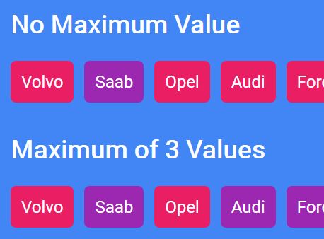
| max | Sets a maximum number of selects at a given time (only works with multiselect) | false |
| onInit | Callback function after new instance of tag selector is created | false |
| onDestroy | Callback function after instance of tag selector is destroyed | false |
| onSelect | Callback function after a new tag is selected. Params received are option value and text | false |
| onDeselect | Callback function after a tag is deselected. Params received are option value and text | false |
Styles
By default, the wrapper and tags don't come with any styling, leaving the look and feel completely up to you. The classes available to style are as follows:
| Class Name | Description |
|---|---|
| .tagselector-wrap | The wrapper div surrounding all tags |
| .tagselector-tag | Each individiual tag span |
| .active | Class applied to any actively selected tag |
If you would also like some basic styling out of the box (like in the screenshot above), include the CSS: dist/tagselector.css.
License
MIT License. See LICENSE.MD