
load images only when they are in (and remain in) the viewport.
in only about 400 bytes of javascript
<img class="lazyestload" src="images/placeholder/sunset.jpg" data-src="images/sunset.jpg" > <script src="js/lazyestload.min.js"></script> </body>or with data-srcset
<img class="lazyestload" src="images/placeholder/sunset.jpg" data-srcset="images/sunset-1x.jpg 1x, images/sunset-2x.jpg 2x, images/sunset-3x.jpg 3x" > <img class="lazyestload" src="images/placeholder/sunset.jpg" data-srcset="images/sunset-400.jpg 400w, images/sunset.jpg 1600w" >or with picture and source
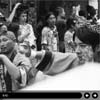
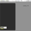
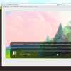
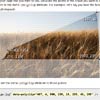
<picture> <source media="(max-width: 400px)" data-srcset="images/sunset-400.jpg" > <source media="(max-width: 401px)" data-srcset="images/sunset.jpg" > <img class="lazyestload" src="images/placeholder/sunset.jpg" > </picture>demo lazyestload load images only when they are in the viewport (or within 100px) and when the user has stopped scrolling (meaning the user can scroll past images and they wont be loaded)
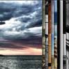
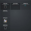
demo lazyload load images only when they are in the viewport or 100px beneath
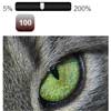
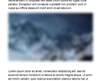
When using placeholders the image should be less than 1kb, ~40px wide, and should have the same aspect ratio as the image that will replace it. (to avoid any layout jank) Also the "blur up" affect in the first demo works by adding the following css.
img { transition: filter 0.3s; } img.lazyestload { width: 100%; filter: blur(8px); }I've added a placeholder generator. To use run npm i and then npm build you can also serve the demo locally with npm bsw (build, serve, watch)


