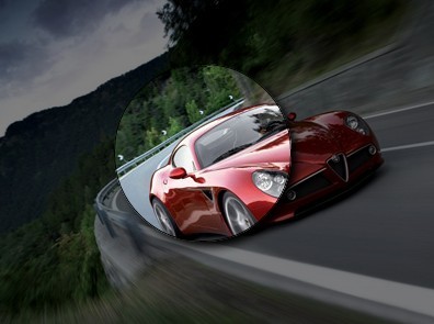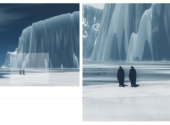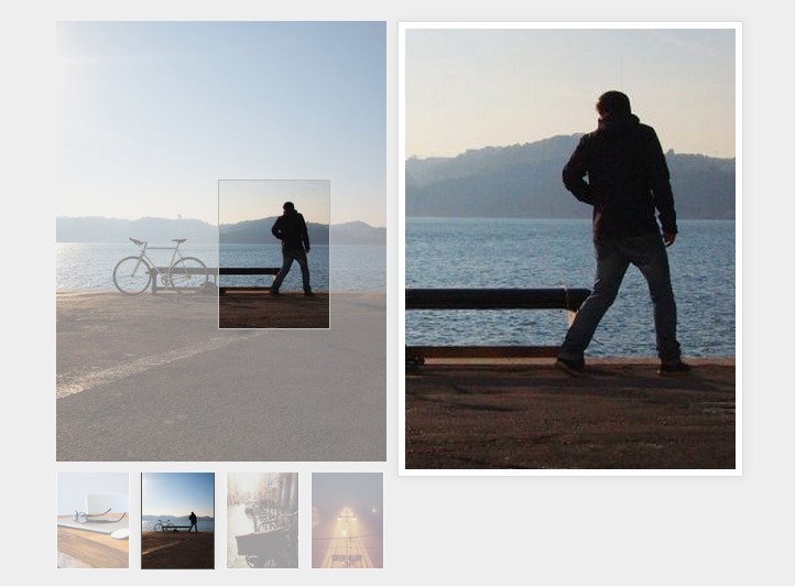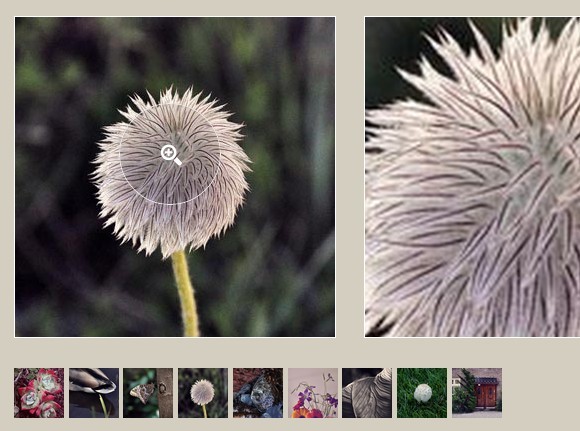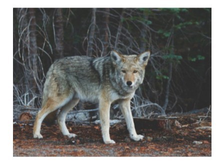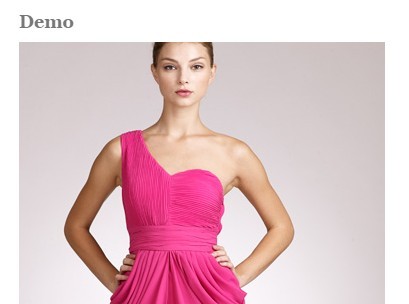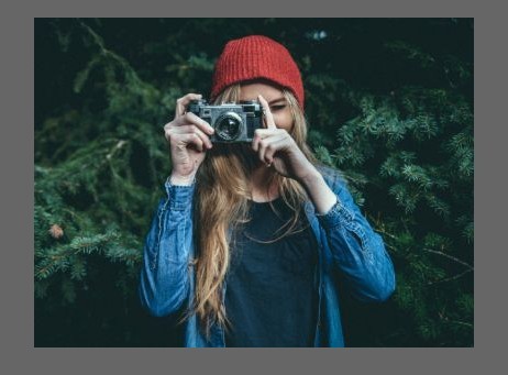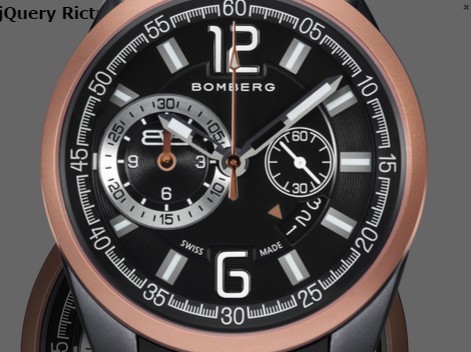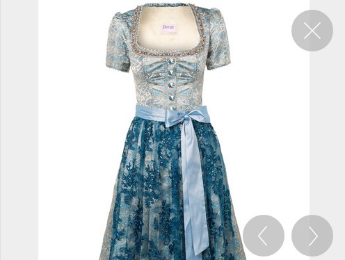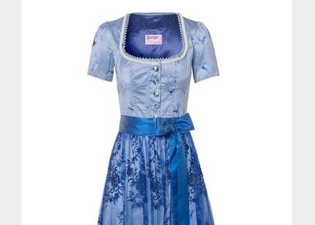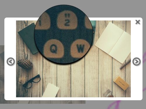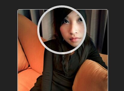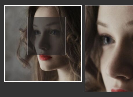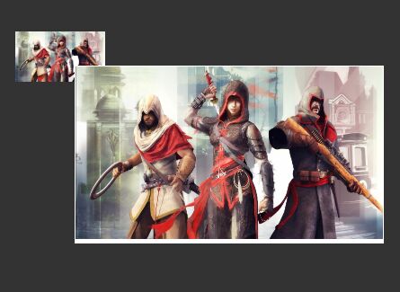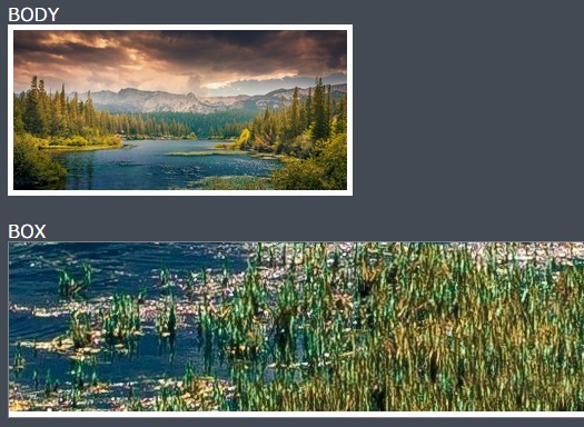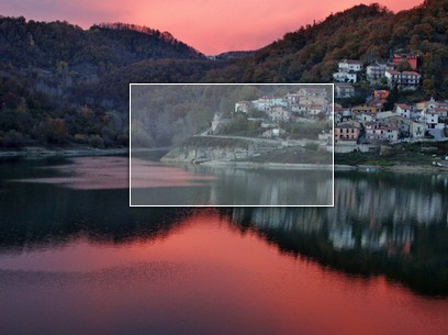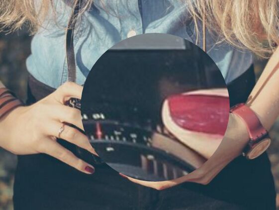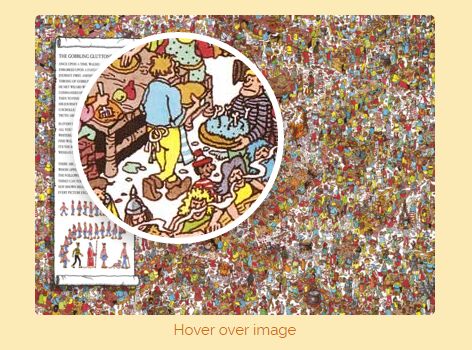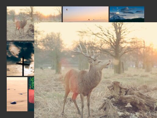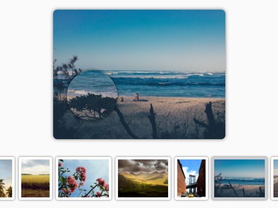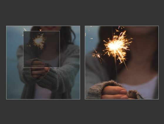
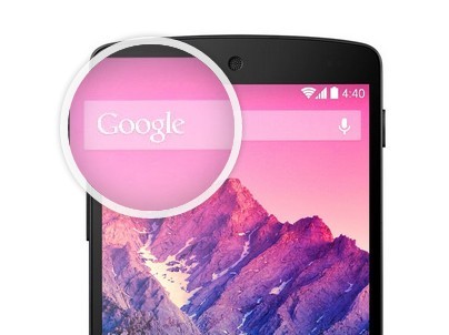
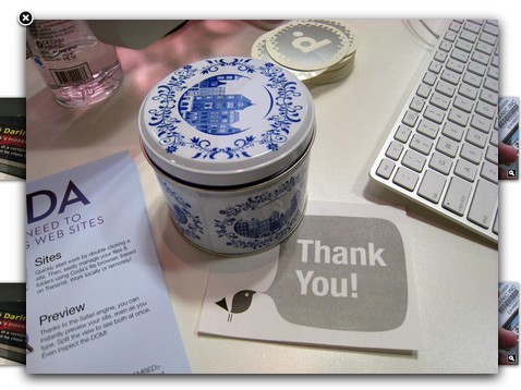
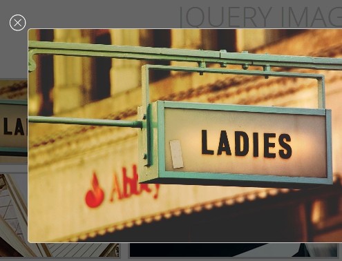
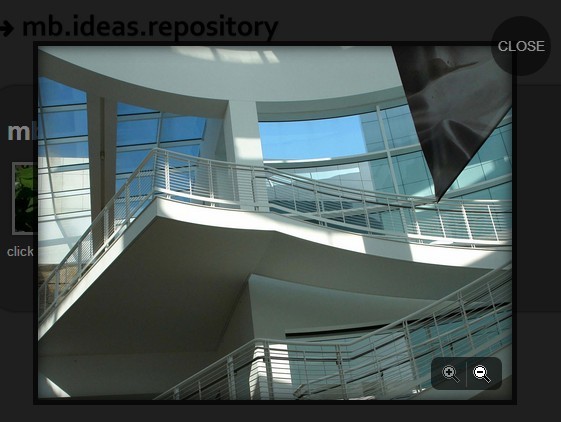
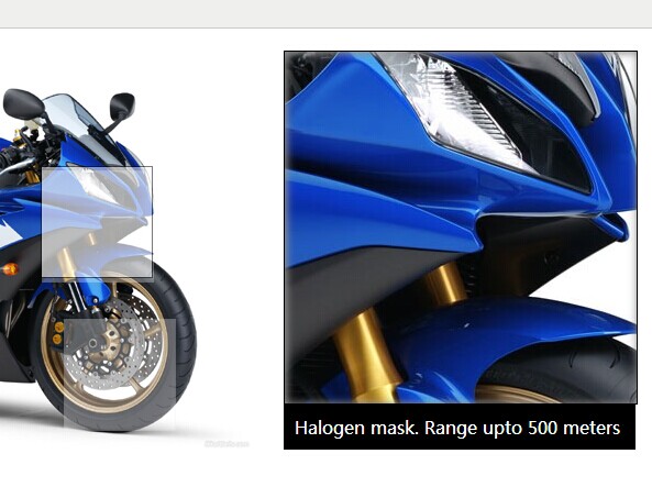
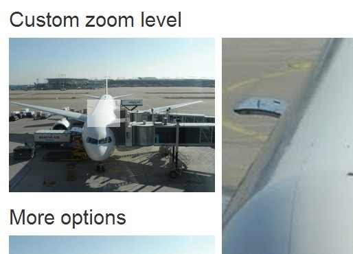
Zoom Image
Add mouseover zooming to images.
Support: Chrome, Firefox, Safari, IE9+. Browsers that do not support CSS3 drop transition effects but retain basic functionality.
Setup
Include the Zoom Image stylesheet and script.
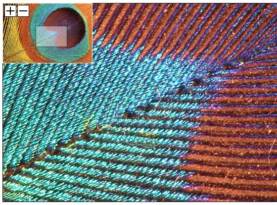
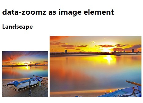
<!-- Zoom Image Stylesheet --> <link rel="stylesheet" href="zoom-image/zoom-image.css"> <!-- Zoom Image Script --> <script src="zoom-image/zoom-image.js"></script>Insert an element classified zoom-image and add the image that you want to zoom as its background-image. This will be used as the initial, zoomed-out version of the image, so a smaller version of the image can be used if desired. Inside of that element, include a figure element and add the full-size (zoomed) image as its background-image.
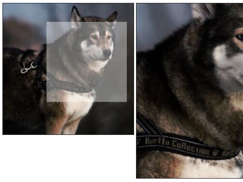
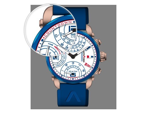
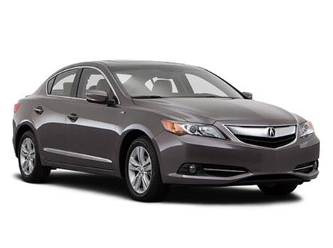
<figure class="zoom-image" style="background-image: url( img/zoom.png );"> <figure style="background-image: url( img/zoom.png );"></figure> </figure>Call the plugin on the image element.
// vanilla JavaScript with default settings var zoomImage = new ZoomImage( '.zoom-image' ); // vanilla JavaScript with custom settings var zoomImage = new ZoomImage( '.zoom-image', { touch: true } ); // jQuery (1.7+) with default settings $( '.zoom-image' ).zoomImage(); // jQuery (1.7+) with custom settings $( '.zoom-image' ).zoomImage({ touch: true });Settings
There is only one setting: touch. If set true, the zooming functionality work on touch devices. If false, zooming functionality is disabled for touch devices. If unset, the plugin defaults to true.
Scaling Element Dimensions Proportionally
The following information outlines a general CSS trick, not particular to this plugin. But, it may be relevant to your Zoom Image project and can be used on the zoom-image element.
If non-<img> elements (like <figure>s) need to scale their dimensions proportionally as they resize, like height: auto responsive <img>s, the following method can be used in lieu of setting up tedious incremental media-query rules or a calculation listener.
Often, setting a percentage value for an element's height property is not an option, because this value is calculated relative to the height of the element's parent and if the parent's height is not explicitly set, the percentage will yield a value of 0.
Percentage padding values, however, are relative to their their parent element's width, which usually is set. This includes (perhaps counterintuitively) vertical padding, padding-top and padding-bottom. This means that vertical padding can usually be used to control an element's height in a proportional manner.
For example, if a height of 120px is desired for an element when its parent is 600px wide, assign a padding-top value of 20% to the element. 120 is 20% of 600. Do not set an explicit height value, let the padding set the height. As the parent's width scales, so does the value calculated for the vertical padding, giving height to the element. So the height of the element will be 140px when the parent container is 700px, 160px when the parent container is 800px, and etc. Obviously, media-querys can be used in addition to this method to fine-tune styling if necessary.
If an element's height should be proportional to its own width (versus its parent's), give that element a transparent (pseudo) child element with its display set to block and apply the vertical padding to that child element. That way, the height is proportional to the width of the element itself.


