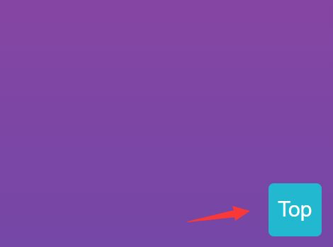
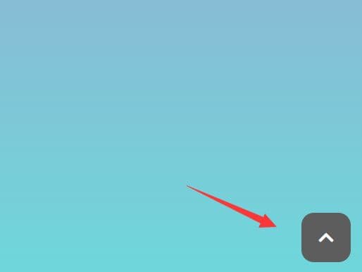
Floating ToTop Button
This project contains a simple and full configurable jQuery plugin which appends a customizable floating ToTop button to a DOM node of a HTML page. On the following website, gantryprojects, you can see the button and it's behavior in action. If you want to try it yourself, simply download the latest version and follow the installation guide below.
Prerequisites
- Basic web frontend knowledge
- jQuery core library
Download / Installation
- Download v1.0.0 of the Floating ToTop Button
- Extract the files and copy them to your website folder
- Define the CSS and JS resource files in your HTML page. You can also place the
<script>tag after your<body>content. Basic resource import example:- CSS:
<link href="css/floating-totop-button.min.css" rel="stylesheet"> - JS:
<script src="js/floating-totop-button.min.js"></script>
- CSS:
- Initialize the plugin with basic values as follows
- Plugin Initialization:
$("body").toTopButton({});orjQuery("body").toTopButton({});
- Plugin Initialization:
- If you want to further customize the appearance or behavior please take a closer look on the plugin parameters and their explanation listed in the next section.
Configuration and Parameters
The plugin can be easily configured during the initialization and the following parameters are currently available. The listing contains the parameters together with their default values.
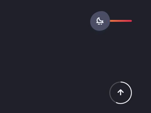
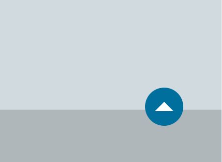
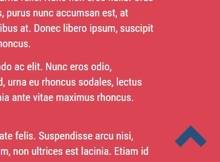
imagePath: './img/icons',| Base path for the icon files which can be changed if the default location doesn't fit your folder hierarchy.arrowType: 'arrow',| Defines the icon appearance, available default options arearrow,arrow-circle,caret,caret-circle,circle,circle-o,arrow-l,drop,rise,top. You can also use your own SVG image. But take a look on the/imgpath and how black and white icons are distinguished and identified.scrollTrigger: 300,| Scroll amount in pixel to trigger the button ifautoHideis on.animationTime: 700,| Animation time when scrolling back to top after click.opacity: 20,| Opacity default value range from0-20 (0-1.00).shape: 10,| Button shape can be defined in the value range0-10 (0-50%)- border radius.margin: 2,| Margin of the button, with the value range from0-10 (0-100px).palette: '',| Default color palette (CSS color names can be used in lower case). The additional value'transparent'makes the button background transparent.iconColor: 'w',| Icon color either black or white ('b'or'w').backgroundColor: '',| HEX or RGB(A) value for the background color.border: {| Border optionswidth: 0,| Border width default values range from0-3 (0-3px).color: '' }| HEX or RGB(A) value for the border color.
position: 'br',| The following four options are available:'tl'= top-left,'tr'= top-right,'bl'= bottom-left,'br'= bottom-right.size: 4,| Different button sizes are available, values range from1-6 (30-80px).fadeInSpeed: 'fast',| Time to fade in,'fast','slow'or a numerical value in milliseconds e.g.200.fadeOutSpeed: 'fast',| Time to fade out,'fast','slow'or a numerical value in milliseconds e.g.200.iconShadow: 4,| Icon shadow values range from1-16for different stylings.btnShadow: 2,| Button shadow values range from1-5for different stylings.mobileHide: 768,| If the value is 0 then the button will always be shown otherwise the button will only be visible if the window width exceeds the specified pixel value.autoHide: true,| If enabled, the button will automatically hide depending on thescrollTriggervalue.filter: true,| Defines whether a CSS filter should be used instead of the default color rollover (be aware of browser support).linkClasses: [],| Array of link classes in the form['a','b','c'].imgClasses: [],| Array of images classes in the form['d','e','f'].clickSelectors: [],| Additional selectors for the button click event in the form['g','h','i'].animateScroll: function(opts){ ... }| Custom function for the scroll animation (callback).fadeScroll: function(opts){ ... }| Custom function for the scroll button fading (callback).
Example:
The following example shows how you can specify plugin parameters to change the default icon, set the opacity to 0.5 and increases the button dimension to 80px.
$("body").toTopButton({arrowType: 'circle', opacity: 10, size: 6});CSS Customization
For most of the plugins basic CSS styling options there exists a way to create your own selector and simply pass it as a new identifier to the plugin so that it will be used during the plugin initialization. This sounds a bit abstract so the following examples should help to understand the attachment of CSS customizations.
Opacity
Set the opacity parameter as follows - opacity: 21 - and create the following CSS selector:
a.to-top-button.op-21{ opacity: 0.98; }Shape
Set the shape parameter as follows - shape: 11 - and create the following CSS selector:
a.to-top-button.sh-11 { border-radius: 2%; ... }Margin
Set the margin parameter as follows - margin: 11 - and create the following CSS selectors:
a.to-top-button.bp-tl.bm-11{ top: 150px; left: 150px; }a.to-top-button.bp-tr.bm-11{ top: 150px; right: 150px; }a.to-top-button.bp-bl.bm-11{ bottom: 150px; left: 150px; }a.to-top-button.bp-br.bm-11{ bottom: 150px; right: 150px; }Border
Set the border.width parameter as follows - border: 4 - and create the following CSS selectors:
white mode:
a.to-top-button.bw-4w{ border: 4px solid #FFF; }black mode:
a.to-top-button.bw-4b{ border: 4px solid #000; }Size
Set the size parameter as follows - size: 7 - and create the following CSS selector:
a.to-top-button.sz-7{ width: 100px; height: 100px; }Be aware that changing the size might negatively influence the icon positioning.
Shadows
Set the iconShadow and btnShadow parameters as follows - iconShadow: 16, btnShadow: 6 - and create the following CSS selectors:
Icon Shadow:
a.to-top-button .arrow-img.is-16{ filter: drop-shadow(10px 10px 10px #EEE); ... }Button Shadow:
a.to-top-button.bs-6 { box-shadow: 3px 3px 4px 0 rgba(0, 0, 0, 1); ... }Features
- customization of icons with 10 different arrow types
- additional icon images can be easily added and used (SVG)
- button styling with opacity, shape, margin, border, icon and background color
- a huge selection of default color palettes
- different button sizes and screen positions
- different shadows for both icon and button
- custom CSS classes can be attached on the button and the icon
- support for the easy extensiblity of predefined default options
- customization of the default scroll and fade animation
- behavior control options like auto/mobile hide, fade-in and fade-out speed
- attach additional click selectors on external DOM elements
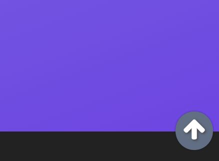
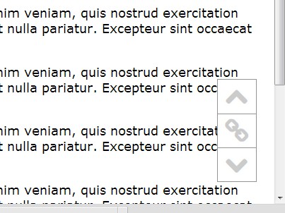
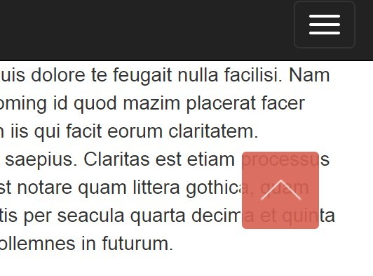
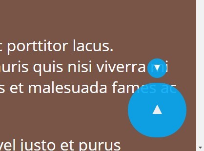
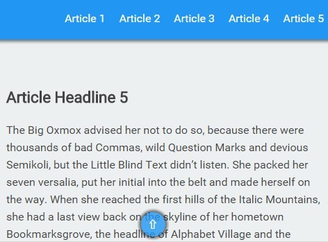
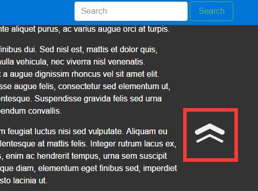
Showroom
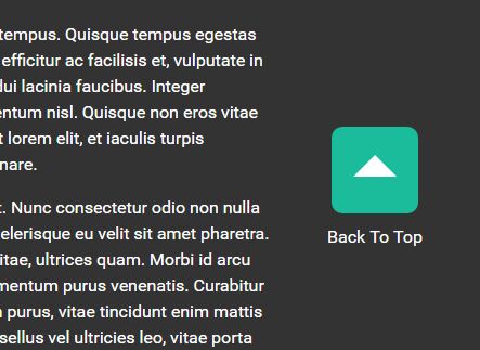
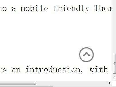
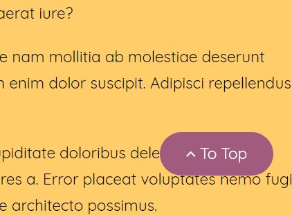
Basic examples of the Floating To Top Button in action:
Button - Styling 1

Button - Styling 2

Button - Styling 3

Future Tasks
- auto switch to footer on mobile
- more customization options
Known Issues
None
Dependencies
Credits
Thanks to the jQuery team for this great plugin tutorial.
This project uses SVG icons from leungwensen/svg-icon.
by thex
Copyright (c) 2018, free to use in personal and commercial software as per the license.

