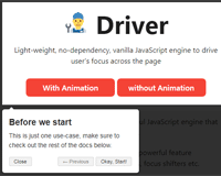

Driver.js

Powerful yet light-weight, vanilla JavaScript engine to drive the user's focus across the page
Only ~4kb, no external dependency, supports all major browsers and highly customizable
- Simple: is simple to use and has no external dependency at all
- Light-weight: ~4kb in size, vanilla JavaScript and no external dependency
- Highly customizable: has a powerful API and can be used however you want
- Highlight anything: highlight any (literally any) element on page
- Feature introductions: create powerful feature introductions for your web applications
- Focus shifters: add focus shifters for users
- User friendly: Everything is controllable by keyboard
- Consistent behavior: usable across all browsers (including in-famous IE)
- MIT Licensed: free for personal and commercial use

For Usage and Examples, have a look at demo
So, yet another tour library?
No, it is not. Tours are just one of the many use-cases. Driver.js can be used wherever you need some sort of overlay for the page; some common usecases could be: e.g. dimming the background when user is interacting with some component i.e. the way Facebook does when you try to create a post, using it as a focus shifter to bring user's attention to some component on page, or using it to simulate those "Turn off the Lights" widgets that you might have seen on video players online, etc.
Driver.js is written in Vanilla JS, has zero dependencies and is highly customizable. It has several options allowing you to manipulate how it behaves and also provides you the hooks to manipulate the elements as they are highlighted, about to be highlighted, or deselected.
Installation
You can install it using yarn or npm, whatever you prefer.
yarn add driver.js npm install driver.jsOr include it using CDN. If you want a specific version, put it as [email protected] in the name
<script src="https://unpkg.com/driver.js/dist/driver.min.js"></script> <link rel="stylesheet" href="https://unpkg.com/driver.js/dist/driver.min.css">Or grab the code from dist directory and include it directly.
<link rel="stylesheet" href="/dist/driver.min.css"> <script src="/dist/driver.min.js"></script>
Usage and Demo
If you are using some sort of module bundler, import the library and the CSS file
import Driver from 'driver.js'; import 'driver.js/dist/driver.min.css';otherwise use the script and link tags to import the JavaScript and CSS files.
Demos and many more usage examples can be found in the docs page.
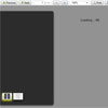
Highlighting Single Element – Demo
You can highlight a single element by simply passing the selector.
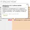
const driver = new Driver(); driver.highlight('#create-post');A real world usage example for this is: using it to dim the background and highlight the required element e.g. the way Facebook does it when creating a post.
Highlight and Popover – Demo
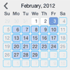
You can show additional details beside the highlighted element using the popover.
const driver = new Driver(); driver.highlight({ element: '#some-element', popover: { title: 'Title for the Popover', description: 'Description for it', } });Also, title and description can have HTML as well.
Positioning the Popover – Demo
By default, driver automatically finds the suitable position for the popover and displays it. You can override it using position property.
const driver = new Driver(); driver.highlight({ element: '#some-element', popover: { title: 'Title for the Popover', description: 'Description for it', // position can be left, left-center, left-bottom, top, // top-center, top-right, right, right-center, right-bottom, // bottom, bottom-center, bottom-right, mid-center position: 'left', } });You can also add offset to the popover position by using the offset property
const driver = new Driver(); driver.highlight({ element: '#some-element', popover: { title: 'Title for the Popover', description: 'Description for it', position: 'bottom', // Will show it 20 pixels away from the actual position of popover // You may also provide the negative values offset: 20, } });Creating Feature Introductions – Demo
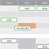
Feature introductions are helpful when onboarding new users and giving them an idea about different parts of the application; you can create them seamlessly with Driver. Define the steps and call the start when you want to start presenting. User will be able to control the steps using the keyboard or using the buttons on popovers.
const driver = new Driver(); // Define the steps for introduction driver.defineSteps([ { element: '#first-element-introduction', popover: { className: 'first-step-popover-class', title: 'Title on Popover', description: 'Body of the popover', position: 'left' } }, { element: '#second-element-introduction', popover: { title: 'Title on Popover', description: 'Body of the popover', position: 'top' } }, { element: '#third-element-introduction', popover: { title: 'Title on Popover', description: 'Body of the popover', position: 'right' } }, ]); // Start the introduction driver.start();You can also hide the buttons and control the introductions programmatically by using the API methods listed below.
Asynchronous Actions – Demo
For any asynchronous actions between the transition steps, you may delay the execution till the action completes. All you have to do is stop the transition using driver.preventMove() in your onNext or onPrevious callbacks and initiate it manually using driver.moveNext(). Here is a sample implementation where it will stop at the second step for four seconds and then move on to the next step.
const driver = new Driver(); // Define the steps for introduction driver.defineSteps([ { element: '#first-element-introduction', popover: { title: 'Title on Popover', description: 'Body of the popover', position: 'left' } }, { element: '#second-element-introduction', popover: { title: 'Title on Popover', description: 'Body of the popover', position: 'top' }, onNext: () => { // Prevent moving to the next step driver.preventMove(); // Perform some action or create the element to move to // And then move to that element setTimeout(() => { driver.moveNext(); }, 4000); } }, { element: '#third-element-introduction', popover: { title: 'Title on Popover', description: 'Body of the popover', position: 'right' } }, ]); // Start the introduction driver.start();You can also hide the buttons and control the introductions programmatically by using the API methods listed below.
API
Driver comes with several options that you can manipulate to make Driver behave as you like
Driver Definition
Here are the options that Driver understands:
const driver = new Driver({ className: 'scoped-class', // className to wrap driver.js popover animate: true, // Whether to animate or not opacity: 0.75, // Background opacity (0 means only popovers and without overlay) padding: 10, // Distance of element from around the edges allowClose: true, // Whether the click on overlay should close or not overlayClickNext: false, // Whether the click on overlay should move next doneBtnText: 'Done', // Text on the final button closeBtnText: 'Close', // Text on the close button for this step stageBackground: '#ffffff', // Background color for the staged behind highlighted element nextBtnText: 'Next', // Next button text for this step prevBtnText: 'Previous', // Previous button text for this step showButtons: false, // Do not show control buttons in footer keyboardControl: true, // Allow controlling through keyboard (escape to close, arrow keys to move) scrollIntoViewOptions: {}, // We use `scrollIntoView()` when possible, pass here the options for it if you want any onHighlightStarted: (Element) => {}, // Called when element is about to be highlighted onHighlighted: (Element) => {}, // Called when element is fully highlighted onDeselected: (Element) => {}, // Called when element has been deselected onReset: (Element) => {}, // Called when overlay is about to be cleared onNext: (Element) => {}, // Called when moving to next step on any step onPrevious: (Element) => {}, // Called when moving to previous step on any step });Note that all the button options that you provide in the driver definition can be overridden for a specific step by giving them in the step definition
Step Definition
Here are the set of options that you can pass while defining steps defineSteps or the object that you pass to highlight method:
const stepDefinition = { element: '#some-item', // Query selector string or Node to be highlighted stageBackground: '#ffffff', // This will override the one set in driver popover: { // There will be no popover if empty or not given className: 'popover-class', // className to wrap this specific step popover in addition to the general className in Driver options title: 'Title', // Title on the popover description: 'Description', // Body of the popover showButtons: false, // Do not show control buttons in footer doneBtnText: 'Done', // Text on the last button closeBtnText: 'Close', // Text on the close button nextBtnText: 'Next', // Next button text prevBtnText: 'Previous', // Previous button text }, onNext: () => {}, // Called when moving to next step from current step onPrevious: () => {}, // Called when moving to previous step from current step };For example, here is how it would look when highlighting a single element:
const driver = new Driver(driverOptions); driver.highlight(stepDefinition);And this is how it would look when creating a step by step guide:
const driver = new Driver(driverOptions); driver.defineSteps([ stepDefinition1, stepDefinition2, stepDefinition3, stepDefinition4, ]);API Methods
Below are the set of methods that are available:
const driver = new Driver(driverOptions); // Checks if the driver is active or not if (driver.isActivated) { console.log('Driver is active'); } // In case of the steps guide, you can call below methods driver.defineSteps([ stepDefinition1, stepDefinition2, stepDefinition3 ]); driver.start(stepNumber = 0); // Starts driving through the defined steps driver.moveNext(); // Moves to next step in the steps list driver.movePrevious(); // Moves to previous step in the steps list driver.hasNextStep(); // Checks if there is next step to move to driver.hasPreviousStep(); // Checks if there is previous step to move to // Prevents the current move. Useful in `onNext` or `onPrevious` if you want to // perform some asynchronous task and manually move to next step driver.preventMove(); // Highlights the element using query selector or the step definition driver.highlight(string|stepDefinition); // Reposition the popover and highlighted element driver.refresh(); // Resets the overlay and clears the screen driver.reset(); // Additionally you can pass a boolean parameter // to clear immediately and not do the animations etc // Could be useful when you, let's say, want to run // a different instance of driver while one was running driver.reset(clearImmediately = false); // Checks if there is any highlighted element if(driver.hasHighlightedElement()) { console.log('There is an element highlighted'); } // Gets the currently highlighted element on screen // It would be an instance of `/src/core/element.js` const activeElement = driver.getHighlightedElement(); // Gets the last highlighted element, would be an instance of `/src/core/element.js` const lastActiveElement = driver.getLastHighlightedElement(); activeElement.getCalculatedPosition(); // Gets screen co-ordinates of the active element activeElement.hidePopover(); // Hide the popover activeElement.showPopover(); // Show the popover activeElement.getNode(); // Gets the DOM Element behind this element
Note – Do not forget to add e.stopPropagation() to the click binding that triggers driver.
Contributions
Feel free to submit pull requests, create issues or spread the word.
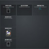
Sponsored By
Thanks to BrowserStack for sponsoring the compatibility testing needs.

License
MIT © Kamran Ahmed


