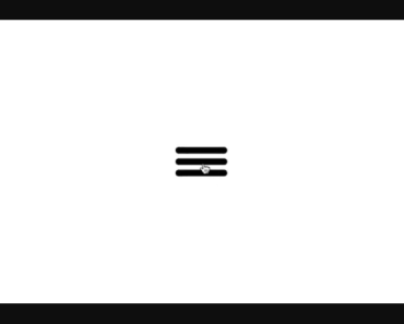
vue-burguer-button
A Vue burger button as functional component, which is faster than a regular component, and is pretty small (JS min+gzip is lower than 700b and CSS min+gzip is lower than 400b).

Installation
This module is published under NPM registry, so you can install from any package manager.
npm install vue-burger-button --save # Use the command bellow for Yarn. yarn add vue-burger-buttonUsage
Import the BurgerButton component and its CSS.
<template> <burger-button :active="isActive" @click="isActive = !isActive" /> </template> <script> import BurgerButton from 'vue-burger-button'; export default { components: { BurgerButton }, data: () => ({ isActive: false }) }; </script> <style src="vue-burger-button/dist/vue-burger-button.css" />Usage as global component
If you need <burger-button /> available everywhere, you can register it as a global component and don't forget to import its CSS.
import 'vue-burger-button/dist/vue-burger-button.css'; import Vue from 'vue'; import BurgerButton from 'vue-burger-button'; Vue.component('burger-button', BurgerButton);Usage from CDN
You can import burger button UMD module and CSS from Unpkg.
<!-- Import vue-burger-button CSS --> <link rel="stylesheet" href="https://unpkg.com/[email protected]/dist/vue-burger-button.css" /> <!-- Import vue-burger-button UMD bundle --> <script src="https://unpkg.com/[email protected]"></script> <script src="https://unpkg.com/[email protected]"></script> <script> /** * vue-burger-button is available through VueBurgerButton. */ console.dir(VueBurgerButton); /** * Vue.use will add burger button as global component. */ Vue.component('burger-button', VueBurgerButton); </script>Props
You can customize your burger button using props.
<template> <burger-button :active="isActive" :bar-color="isActive ? 'red' : 'black'" :bar-height="15" :bar-width="120" @click="isActive = !isActive" /> </template>| Name | Type | Default | Description |
|---|---|---|---|
| active | Boolean | false | If true it switches to a close button. |
| barColor | String | '#000000' | Change the bars colors. |
| barHeight | Number | 10 | Change the bars heights. |
| barWidth | Number | 80 | Change the bars widths. |
Events
The burger button emits every <button /> events. So, you can use @click, @mouseover etc.
License
Released under MIT License.