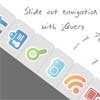
slimMenu jQuery Navigation Menu Plugin.
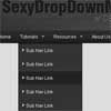
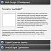
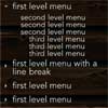
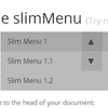
slimMenu is a lightweight jQuery plugin, which is made to create responsive and multi-level navigation menus on the fly.
With slimMenu, you'll no longer struggle with media queries to create responsive menus, or any other heavy plugins to create multi-level nested menus. slimMenu does both job for you and it's only 5KB(2.5KB minified)!
Features:
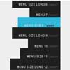
- Multi-level nested menus.
- 100% mobile responsive menus.
- Multiple slimMenu navigations on the same page.
- Tap areas to toggle sub menus easily in touch devices.
- Hover option and effects for desktop version.
- Sub menu indentation options for responsive version.
Browser Support:
(Tested on following browsers and confirmed that the slimMenu is working.)
- IE 9+
- Latest Chrome
- Latest Firefox
- Latest Safari
- Latest Opera
- Android 2.2+
- Mobile Safari
Installation:
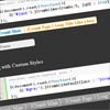
Add dist/css/slimmenu.min.css to the head of your document:
<link rel="stylesheet" href="slimmenu.min.css" type="text/css"> Add dist/js/jquery.slimmenu.min.js after jQuery plugin and before closing body tag.
<script src="jquery.slimmenu.min.js"></script> Create your navigation menu using an ordered list and add slimmenu class:
<ul class="slimmenu">...</ul> Initilalize the plugin:
$('.slimmenu').slimmenu( { resizeWidth: '767', /* Navigation menu will be collapsed when document width is below this size or equal to it. */ initiallyVisible: false, /* Make main navigation menu initially visible on mobile devices without the need to click on expand/collapse icon. */ collapserTitle: 'Main Menu', /* Collapsed menu title. */ animSpeed: 'medium', /* Speed of the sub menu expand and collapse animation. */ easingEffect: null, /* Easing effect that will be used when expanding and collapsing menu and sub menus. */ indentChildren: false, /* Indentation option for the responsive collapsed sub menus. If set to true, all sub menus will be indented with the value of the option below. */ childrenIndenter: ' ' /* Responsive sub menus will be indented with this character according to their level. */ expandIcon: '<i>▼</i>', /* An icon to be displayed next to parent menu of collapsed sub menus. */ collapseIcon: '<i>▲</i>' /* An icon to be displayed next to parent menu of expanded sub menus. */ }); Optional Add easing plugin after jQuery plugin and before closing body tag if you want to use easing effects.
<script src="**PATH_TO_PLUGIN**/jquery.easing.min.js"></script> Support
If you need help using slimMenu, have a suggestion or idea, or have found a bug, please create an issue.