jQuery Responsive Menu Plugin
A Plugin which turns your site's navigation into a dropdown (<select>) when your browser is at mobile widths.
Options
The options available for the plugin are listed below. Their default value appears next to their names, and available values below the description.
combine [true]
Convert multiple navigation lists into a single dropdown for mobiles [true/false]
groupPageText ['Main']
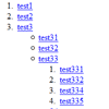
Any <li> elements with <ul>/<ol> present get converted to an <optgroup>. As <optgroup> isn't selectable, a "dummy" <option> is added at the top of the group with the <li>'s value. This option sets the text for the "dummy" <option> ['string']
nested [true]
This turns the <optgroup>s on and off [true/false]
prependTo ['body']
Sets the container element for the menu to be put into. ['CSS-selector']
switchWidth [480]
Sets the width (in pixels) at which the site's menu(s) will change to a <select>
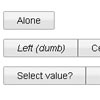
topOptionText ['Select a page']
Sets the very first <option>'s display text. Setting this to NULL will prevent it from displaying ['string'/null]
Usage
The plugin can be used like any other jQuery plugin:
$('css-selector').mobileMenu({option:value, option:value});
Licence
There isn't one, because I'm nice. Feel free to say "thanks" or attribute the script to this page if you find it useful.