#Full Page Navigation by Pete R. Create a fully responsive and dynamic full page navigation with one JS call Created by Pete R., Founder of BucketListly
Demo
Compatibility
Modern browsers such as Chrome, Firefox, and Safari on both desktop and smartphones have been tested. I have not test this on IE.
Basic Usage
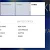
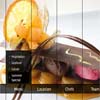
Full Page Navigation is a simple script that let you create a full page navigation (navigation shown as columns) dynamically with one JS call. You can define how your navigation will be divided, how fast/slow the animation will be and many more features.
To add this to your website, simply include the latest jQuery library together with jquery.fullpagenav.js, and fullpagenav.css into your document's <head> and create an HTML markup as follows:
<body> ... <ul class="nav"> <li> ... </li> <li> ... </li> <li> ... </li> ... </ul> ... </body>And you can add any kind of HTML tags that you wish for it to display in each column inside the <li> tag. You can use different tags if you wish. You will need to assign a new selector though. More info on that below. Once this is done, call the script like this:
$(".nav").fullpagenav({ columns: 5, // Number of columns you wish the script to divide your navigation into. This should be relative to the number of li tags you have. The column should be 3 for the example above. The default value is 5. selector: "> li", // In case you don't want to use ul and li, you can change the selector here. This option accepts CSS selector. The Default value is "> li" hover_size: "30%", // This option let you determine how big to expand the navigation when the cursor is hovering the area. The option accepts a percentage value. The default value is "30%" animateDuration: 500, // You can define the animation duration here which will be used globally throughout the plugin. This option accepts milliseconds without the unit. The default value is 500. animateFrom: "left", // Determine which direction the hovered navigation should expand to. Available options are "left", "right", and "auto". Auto will determine the direction from where you cursor enters the navigation area. The default value is "left". clickable: true, // Toggle this to true if you want the area to be clickable. Make sure to add an extra data-link attribute to the li tag containing the URL you wish the navigation to take to user to once clicked. The default value is true. afterClicked: null // A callback which will be fired after the user clicked the navigation });Making it Clickable
Here's an example on how to make the navigation clickable. Make sure you have the HTML markup as follows:
<body> ... <ul class="nav"> <li data-link="http://www.bucketlistly.com"> ... </li> <li data-link="http://www.bucketlistly.com"> ... </li> <li data-link="http://www.bucketlistly.com"> ... </li> ... </ul> ... </body>Note: Don't forget to change the data-link attribute to the URL you prefer.
Now, simply toggle the clickable option to true like this.
$(".nav").fullpagenav({ clickable: true });And the script will automatically make the whole area clickable, with a nice animation expanding the clicked area to full page and load the URL.
Callbacks
You can use this callback to perform actions after you clicked the navigation. This is perfect for when you want to populate the page with an ajax instead of a traditional page load.
afterClicked(URL)
This callback gets called after the user clicked the navigation.
$(".main").fullpagenav({ afterClicked: function(link) { ... } });And that's a wrap for all the features available for this plugin. If you want to see more of my plugins, visit The Pete Design, or follow me on Twitter and Github.


