Ciao Vue Dialog
Vue Dialog Component
Feature
- Basic title, content in dialog
- Three size(large, middle, small)
- Can catch and handle accept/dismiss action like JavasScript confirm
- Inject custom vue component into dialog
Dependencies
- jQuery
- jquery-mousewheel
- Animate.css
- Bootstrap 3/4 (just for footer button, your can custom it's class name for your Bootstrap version)
- Vue.js
Required
- Vue.js 2.x
Installation
npm
npm install ciao-vue-dialog --saveor yarn
yarn add ciao-vue-dialogBase Usage
Install VueDialog component in App.vue
<template> <div id="app"> <!--plugin will auto mount dialog in here--> <VueDialog/> <button @click="showDialog">show dialog</button> </div> </template> <script> import CiaoVueDialog from 'ciao-vue-dialog' Vue.use(CiaoVueDialog) export default { methods: { showDialog() { this.$dialog('hello world') } }, } </script>Remember import style file in App.vue
<style src="ciao-vue-dialog/dist/ciao-vue-dialog.css"></style>style
String
You can setup style by style property
There has four Bootstrap style(success, primary, info, warning, danger)
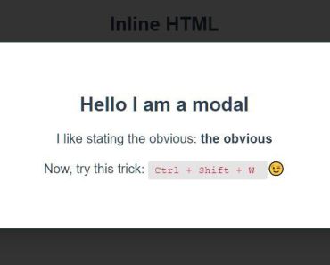
this.$dialog({ title: 'foo', style: 'warning' })content
String
this.$dialog({ title: 'foo', content: 'bar', })close
Number
You can let dialog close automatically by configuring this property
Just pass delay time(milliseconds)
this.$dialog({ title: 'Auto Close', close: 2000, })closeCallback
Function
You can do something by using closeCallback property
this.$dialog({ title: 'Close Callback', closeCallback: () => alert('CloseCallback'), })size
String
We provide three size: 'lg', 'md', 'sm'
Default size is md
this.$dialog({ title: 'foo', size: 'lg', })z-index
You can setup z-index by zIndex property of component
Default value is 1000
App.vue
<VueDialog :zIndex="6000"/>accept
Object
When you wanna use dialog as confirm's accept action
accept.callback
You can do anything when user accept confirm by config callback property
export default { methods: { deleteConfirm() { this.$dialog({ title: 'Delete', content: 'Do you really want to delete', accept: { callback: this.onAccept, }, }) }, onAccept() { // do something here after accept }, }, },accept.label
Custom accept button label
Default is 'Accept'
String
this.$dialog({ // ... accept: { label: 'Yes', callback: someCallback, } })accept.style
Custom accept button style by using Bootstrap class name
Default is 'primary'
String
this.$dialog({ // ... accept: { style: 'success', callback: someCallback, } })accept.commitOnEnter
If this property set as true
User can commit accept action by pressing Enter key
Boolean
dismiss
Object
When you wanna use dialog as confirm's dismiss action
dismiss.callback
You can do anything when user dismiss confirm by config callback property
If you don't want to do anything after dismiss, you can skip this property
export default { methods: { deleteConfirm() { this.$dialog({ title: 'Delete', content: 'Do you really want to delete', dismiss: { callback: this.onDismiss, }, }) }, onDismiss() { // do something here after dismiss }, }, },dismiss.label
Custom dismiss button label
Default is 'Dismiss'
String
this.$dialog({ // ... dismiss: { label: 'Cancel', callback: someCallback, } })dismiss.style
Custom dismiss button style by using Bootstrap class name
Or if you want to use Bootstrap 4 button's class name
Default is 'light'
String
this.$dialog({ // ... dismiss: { style: 'warning', callback: someCallback, } })dismiss.commitOnEsc
If this property set as true
User can commit dismiss action by pressing ESC key
Boolean
component
Vue Component
You can inject a custom vue component into dialog by this property
import CustomComponent from 'path/to/custom/component' export default { methods: { showDialog() { this.$dialog({ title: 'Custom Component', component: CustomComponent, }) }, }, }Bind data to custom component, and get it in accept/dismiss callback
Sometimes you need to inject a custom vue component and bind a data like a subscription button
You can use updateData event to sync data and get data in accept callback by this way
Main
import FormCustomComponent from './FormCustomComponent.vue' export default { methods: { dialog() { this.$dialog({ title: 'Send Product Menu', component: FormCustomComponent, accept: { callback: this.onAccept }, dismiss: { callback: this.onDismiss }, }) }, // you can get data which bind in custom component in accept callback onAccept(data) { if(!data) return alert(`We had sent email to ${data}`) }, onDismiss(data) { // You can get data on dismiss, too }, }, }FormCustomComponent.vue
<template> <div> <h5>Enter your email, we will send you product menu</h5> <input type="text" v-model="localData"> </div> </template> <script> export default { // use props get data props: { data: { default: null, }, }, data() { return { // this is local data for this custom vue component localData: null, } }, watch: { // when localData is change, you should sync data immediately localData(value) { this.$emit('updateData', value) }, // when data change, you should update localData immediately too data(value) { this.localData = value }, }, } </script>Commit accept/dismiss action in custom component
You can commit accept/dismiss action by using $emit('commitAccept')、$emit('commitDismiss') in custom component
You should use this two event be carefully
Here is example which commit accept action when user press Enter key
<template> <input type="text" @keyup.enter="$emit('commitAccept')" v-model="localData"> </template> <script> export default { // .... } </script>Pass more data when inject custom component
Sometimes you may want pass more data (like user profile) into custom component
You can use meta property like this way when you active $dialog
this.$dialog({ title: 'Send Product Menu', component: CustomComponent, meta: { name: 'Ciao', age: 26, email: '[email protected]', }, accept: { // ... }, })And you can get meta in custom component by using vue props feature
export default { props: { meta: { default: null, }, }, created() { alert(`Hi ${meta.name}`) }, }Loading
If your accept/dismiss callback is async, it will trigger loading before async process is finished.
Also, if you has some async process in custom component, you can use setLoader method to set loading status.
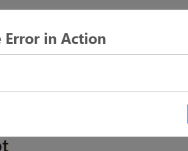
export default { created() { this.init() }, methods: { async init() { // start loading this.$emit('setLoader', true) await someAsyncProcess() // stop loading this.$emit('setLoader', false) }, }, }Action Error
When some error throw from actions(accept/dismiss) callback.
Dialog component will catch this error and pass it to your custom component.
You can get and handle error property in your custom component.
Script
this.$dialog({ title: 'Handle Error in Action', component: CustomComponent, accept: { callback() { return new Promise((resolve, reject) => { setTimeout(() => { reject({ reason1: 'some error message', reason2: 'another error message', }) }, 3000) }) }, }, })CustomComponent
<template> <div> <input type="text"> <div v-if="error" style="color: red"> <p>{{error.reason1}}</p> <p>{{error.reason2}}</p> </div> </div> </template> <script> export default { props: { error: { default: () => null, }, }, } </script>